Caramel color guide
HEX
#FFD59A
RGB
255, 213, 154
HSL
35°, 100%, 80%
HSV
35°, 40%, 100%
Brown lit from within — golden, sticky-sweet, and high-key enough to read as a highlight color. #FFD59A suggests melted sugar and late-afternoon light. It can warm a palette without dragging it into heavy earth tones.
Best for
Email templates, blog headers, and content marketing visuals.
Accessibility
Check contrast before using caramel for text-heavy layouts, especially on low-contrast backgrounds.
How does caramel compare to nearby colors?
What is the difference between caramel and peach?
Caramel (#FFD59A) and Peach (#FFCBA4) are close enough that the split is more about finish than headline contrast: Caramel feels more kraft-paper, while Peach reads more peach-wash. The practical difference is not raw contrast so much as project fit: Caramel reads more naturally in natural skincare, packaging, and craft-led surfaces, while Peach fits more easily into beauty, lifestyle, and soft campaign backgrounds. Begin with caramel when the family needs its current undertone and surface character; keep peach for the nearby alternative that shifts the mood without leaving the same hue neighborhood.
What color is caramel?
Caramel appears constantly in dessert photography, confection branding, hair-color marketing, and autumn fashion editorials.
What is the hex code for caramel?
| Format | Value |
|---|---|
| HEX | #FFD59A |
| RGB | rgb(255, 213, 154) |
| HSL | hsl(35°, 100%, 80%) |
| HSV / HSB | hsv(35°, 40%, 100%) |
| CMYK (approx.) | cmyk(0%, 16%, 40%, 0%) |
Convert Caramel to other color formats
Open the color converter with Caramel (#FFD59A) prefilled to copy RGB, HSL, HSV, CMYK, or OKLCH values.
Convert Caramel in the color converter →What does caramel mean in design?
Caramel is often associated with indulgence, glow, and friendly richness. Next to fawn it is typically more yellow-amber; next to chocolate it is much lighter and more luminous.
How do I use caramel in code?
| CSS (hex) | color: #FFD59A; |
| CSS (rgb) | color: rgb(255, 213, 154); |
| CSS (hsl) | color: hsl(35, 100%, 80%); |
| RGB % | rgb(100%, 84%, 60%) |
| Tailwind | text-[#FFD59A] |
| SwiftUI | Color(red: 1.000, green: 0.835, blue: 0.604) |
| UIKit | UIColor(red: 1.000, green: 0.835, blue: 0.604, alpha: 1.0) |
| Android | Color.rgb(255, 213, 154) |
| Compose | Color(0xFFFFD59A) |
| Web Safe | #FFCC99 |
Is caramel accessible?
| Combination | Ratio | AA | AA lg | AAA | AAA lg | UI |
|---|---|---|---|---|---|---|
| AaWhite text on this color | 1.38:1 | ✗ | ✗ | ✗ | ✗ | ✗ |
| AaBlack text on this color | 15.24:1 | ✓ | ✓ | ✓ | ✓ | ✓ |
| AaThis color as text on white | 1.38:1 | ✗ | ✗ | ✗ | ✗ | ✗ |
| AaThis color as text on black | 15.24:1 | ✓ | ✓ | ✓ | ✓ | ✓ |
WCAG 2.1: AA normal ≥ 4.5:1, AA large text ≥ 3:1, AAA normal ≥ 7:1, AAA large ≥ 4.5:1, UI components ≥ 3:1.
How does caramel look with color blindness?
Simulated appearance for common types of color vision deficiency. Actual perception varies by individual.
What colors go with caramel
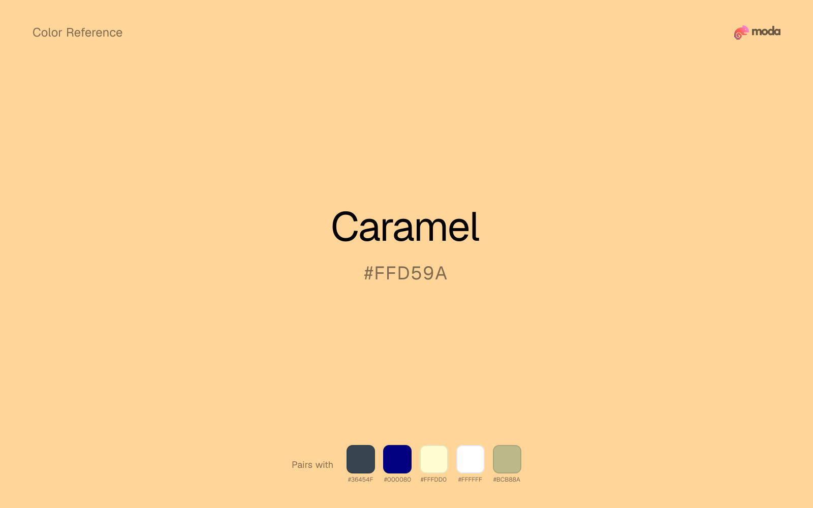
Charcoal lets caramel stay light and atmospheric while still giving the layout a readable dark value for text and hierarchy.
Because caramel already carries warmth, navy blue gives the pair a steadier backbone and keeps it closer to packaging and campaign work than to one-note seasonal color.
Cream lets caramel stay expressive without turning the whole composition stark; the result feels closer to editorial or packaging work than to raw UI default.
With a bright color like caramel, white acts like clean paper around the swatch and prevents the palette from feeling packed too tightly.
Sage Green keeps the palette in the same neighborhood as caramel, which is handy when you want related colors that do not feel cloned.
What colors clash with caramel
Neon Green is so artificial beside caramel that the source color starts to look accidental instead of rooted and deliberate.
Magenta pushes caramel toward a nightclub or cosmetic register that is hard to square with calmer editorial or product work.
With caramel, cyan introduces a colder display-driven cast that strips away some of the source color's tactile character.
Light Gray sits too close to caramel in value, so the palette can wash out before it ever establishes a clear hierarchy.
How should I use caramel in design?
- •Caramel works best as a background tint, card fill, or section divider — it adds warmth without competing with foreground content. Pair with dark text for readability.
- •Pair caramel with cool accents (navy, sage, steel blue) for sharp contrast, or keep it with other warm tones (cream, gold, tan) for a cohesive, editorial feel.
- •Caramel's lightness makes it a good candidate for email backgrounds, slide canvases, and page sections where you want atmosphere, not distraction.
What are good caramel palettes?
Soft landing
Brand guidelines, design systems, and visual identity documents.
Design with caramel in Moda
Create a presentation or document using caramelas your accent color. Moda's AI applies your color palette automatically.
Create a design with caramel →What are the shades and tints of caramel?
Shades (darker)
Tints (lighter)
Tones (desaturated)
Hue variations
What are the color harmonies for caramel?
Harmonies are calculated from the base swatch. When a harmony matches a named color page, it links there; otherwise it appears here as a computed reference swatch.
Similar colors
Peach
Peach sits close to caramel in hue, but its orange-warm cast changes the mood of the palette even when the contrast shift is small.
Apricot
Apricot sits close to caramel on the wheel, but it carries less chroma, which makes it better for steadier surfaces and calmer long-form use than for sharper emphasis and quicker visual pickup.
Papaya
Papaya stays in the same color family as caramel, but the change in value moves it into different layout jobs, especially once backgrounds, charts, or section dividers enter the system.
Champagne
Champagne stays very close to caramel in hue, but it lands lighter, which makes it better for backgrounds, tints, and softer supporting areas than for accents, stronger hierarchy, and firmer structure.
Tan
Tan is almost the same hue as caramel; the real difference is value, with tan feeling more grounded and anchor-ready.
Frequently asked questions
What is the hex code for caramel?
The hex code for caramel is #FFD59A. In RGB, that's 255 red, 213 green, and 154 blue. The approximate CMYK equivalent is 0% cyan, 16% magenta, 40% yellow, and 0% key (black).
Is caramel a warm or cool color?
Caramel reads as warm. It feels most natural with creams, golds, rusts, and other warm accents, while cooler partners like navy or teal create sharper contrast.
Is caramel better as an accent or a full-palette color?
Caramel is usually best when it leads in short bursts rather than covering everything. It can headline a palette, but most layouts work better when the color handles accents, highlights, or one main hero role instead of every surface.
How should I use caramel in a design?
Caramel works as a soft background or supporting color for slide canvases, section panels, and marketing surfaces. Use dark text for readability and reserve stronger accents for buttons, charts, and key takeaways.
Can I use caramel for text or backgrounds?
Caramel works better with dark text than white text. Black text reaches 15.24:1 contrast on the swatch, which makes the color more usable as a background or highlight surface than as a dark panel.
More brown colors
Keep exploring color resources
All color pages
Browse the full library of color references, pairings, and palettes.
Brown colors
Compare caramel with other brown tones.
Neutral colors
Explore nearby color families to build stronger palettes and contrasts.
Orange colors
Explore nearby color families to build stronger palettes and contrasts.
Red colors
Explore nearby color families to build stronger palettes and contrasts.
Last updated April 6, 2026
Color values are computed from the listed hex code using standard conversion formulas. RGB, HSL, and HSV are exact screen-ready conversions. CMYK is an approximate on-screen reference, not a press-ready print specification. Pairings, palettes, and use-case guidance are heuristic recommendations derived from color relationships, contrast behavior, and common presentation, document, and UI patterns.