Mocha meaning and palette guide
HEX
#967117
RGB
150, 113, 23
HSL
43°, 73%, 34%
HSV
43°, 85%, 59%
Brown softened by gray and milk — smooth, drinkable, and modern-neutral. #967969 behaves like a taupe that still admits it came from beans. It pairs cleanly with metallics without feeling industrial.
Best for
Corporate branding, executive reports, and enterprise-level web design.
Accessibility
Mocha text on white passes AA at 4.5:1, which makes it usable for headings and short labels.
How does mocha compare to nearby colors?
What is the difference between mocha and brown?
Mocha (#967117) feels more softened on screen, while Brown (#964B00) pushes the family in the opposite direction. Mocha behaves more like a system color and Brown more like a spotlight, so the decision changes how busy the layout feels. Use mocha for the more restrained version of the idea, and move to brown when the palette needs a brighter front-facing accent.
What color is mocha?
Mocha as a color name follows the café drink's popular palette in cosmetics, athleisure, and interior paint lines.
What is the hex code for mocha?
| Format | Value |
|---|---|
| HEX | #967117 |
| RGB | rgb(150, 113, 23) |
| HSL | hsl(43°, 73%, 34%) |
| HSV / HSB | hsv(43°, 85%, 59%) |
| CMYK (approx.) | cmyk(0%, 25%, 85%, 41%) |
Convert Mocha to other color formats
Open the color converter with Mocha (#967117) prefilled to copy RGB, HSL, HSV, CMYK, or OKLCH values.
Convert Mocha in the color converter →What does mocha mean in design?
Mocha is often associated with cozy refinement and calm luxury. Compared with taupe it can feel slightly warmer; compared with umber it is usually lighter and less shadowy.
How do I use mocha in code?
| CSS (hex) | color: #967117; |
| CSS (rgb) | color: rgb(150, 113, 23); |
| CSS (hsl) | color: hsl(43, 73%, 34%); |
| RGB % | rgb(59%, 44%, 9%) |
| Tailwind | text-[#967117] |
| SwiftUI | Color(red: 0.588, green: 0.443, blue: 0.090) |
| UIKit | UIColor(red: 0.588, green: 0.443, blue: 0.090, alpha: 1.0) |
| Android | Color.rgb(150, 113, 23) |
| Compose | Color(0xFF967117) |
| Web Safe | #996600 |
Is mocha accessible?
| Combination | Ratio | AA | AA lg | AAA | AAA lg | UI |
|---|---|---|---|---|---|---|
| AaWhite text on this color | 4.5:1 | ✓ | ✓ | ✗ | ✓ | ✓ |
| AaBlack text on this color | 4.67:1 | ✓ | ✓ | ✗ | ✓ | ✓ |
| AaThis color as text on white | 4.5:1 | ✓ | ✓ | ✗ | ✓ | ✓ |
| AaThis color as text on black | 4.67:1 | ✓ | ✓ | ✗ | ✓ | ✓ |
WCAG 2.1: AA normal ≥ 4.5:1, AA large text ≥ 3:1, AAA normal ≥ 7:1, AAA large ≥ 4.5:1, UI components ≥ 3:1.
How does mocha look with color blindness?
Simulated appearance for common types of color vision deficiency. Actual perception varies by individual.
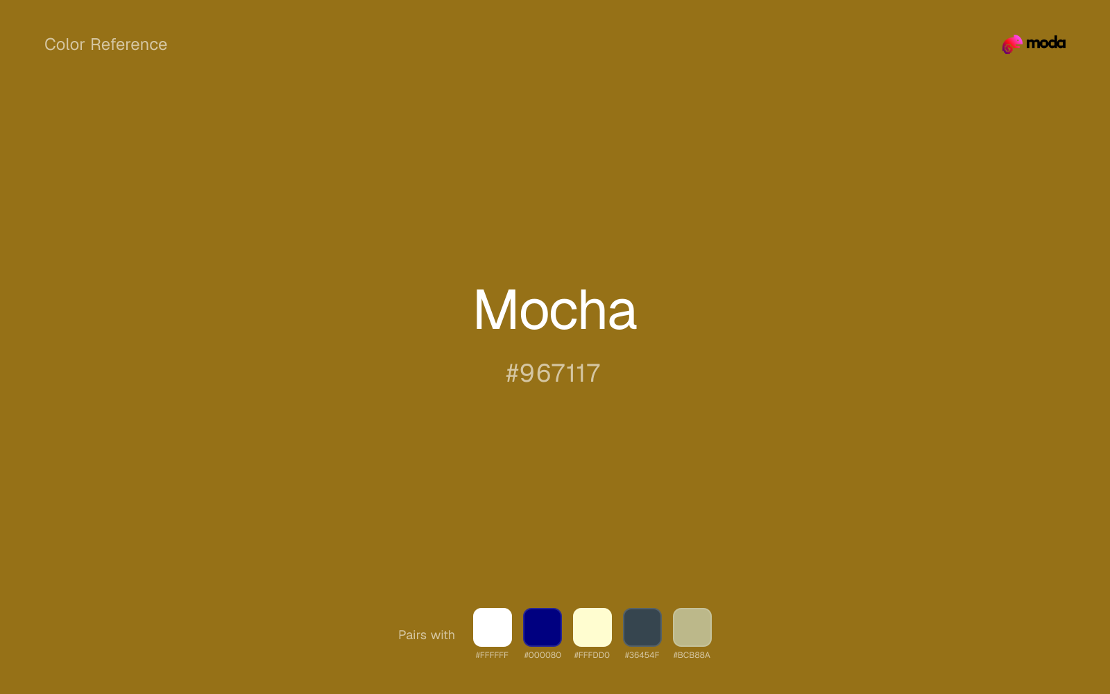
What colors go with mocha
White helps mocha stay legible in charts, labels, and UI states where a muddier light neutral would blur the edges.
Navy blue gives mocha a cooler anchor that keeps the palette from turning too sepia or overly heritage-coded.
Cream takes the hard digital edge off mocha and makes the color feel more printed, paper-backed, and approachable.
When mocha is already bright, charcoal absorbs some of the visual heat and keeps the combination closer to hospitality, food, and grounded heritage brands than to novelty graphics.
Sage Green helps mocha feel more complete in practice because the pairing combines coffee, leather, and wood qualities with sage and moss support instead of leaving the source color to do every job alone.
What colors clash with mocha
Neon Green makes mocha feel cheaper and less material, which is exactly the opposite of what these grounded colors usually contribute.
Magenta remaps mocha too aggressively, dragging it away from hospitality, food, and grounded heritage brands and into a brighter, more performative palette.
Cyan redirects mocha toward a more technical, backlit interpretation, which is risky when the goal is warmth, polish, or print-minded editorial work.
Pastel Pink can undercut mocha's authority by turning the combination more decorative than decisive.
How should I use mocha in design?
- •Use mocha for headlines, sidebar accents, and key data points where you need strong presence without going full dark-mode.
- •Mocha leans warm, so cool counterparts like navy, teal, or slate create the cleanest contrast. For a softer, tonal look, stay within neighboring warm hues and let value differences do the work.
- •Mocha fits food packaging, hospitality branding, and editorial layouts where natural warmth and material texture are more important than synthetic brightness.
What are good mocha palettes?
Onyx foundation
Corporate branding, executive reports, and enterprise-level web design.
Design with mocha in Moda
Create a presentation or document using mochaas your accent color. Moda's AI applies your color palette automatically.
Create a design with mocha →What are the shades and tints of mocha?
Shades (darker)
Tints (lighter)
Tones (desaturated)
Hue variations
What are the color harmonies for mocha?
Harmonies are calculated from the base swatch. When a harmony matches a named color page, it links there; otherwise it appears here as a computed reference swatch.
Similar colors
Brown
Brown is nearly adjacent to mocha in hue; what separates them is intensity, with brown reading cleaner and more assertive.
Sepia
Sepia is almost the same hue as mocha; the real difference is value, with sepia feeling more grounded and anchor-ready.
Sienna
Sienna occupies a similar depth to mocha, though it pushes the family toward a more warm reading and a different material feel.
Copper
Copper tracks close to mocha in hue, but the value shift changes where each one earns its place: copper is easier to use for backgrounds, tints, and softer supporting areas, while mocha holds onto accents, stronger hierarchy, and firmer structure.
Chocolate
Chocolate is almost the same hue as mocha; the real difference is value, with chocolate feeling more grounded and anchor-ready.
Frequently asked questions
What is the hex code for mocha?
The hex code for mocha is #967117. In RGB, that's 150 red, 113 green, and 23 blue. The approximate CMYK equivalent is 0% cyan, 25% magenta, 85% yellow, and 41% key (black).
Is mocha a warm or cool color?
Mocha sits on the warm side of the palette, so it pairs easily with other warm tones and becomes more energetic when you place it against cooler blues or blue-grays.
Should mocha lead the palette or stay in supporting roles?
Mocha has enough chroma to take the lead, but it usually performs best when the surrounding system stays quieter. Treat it as the voice of emphasis, not the answer to every layout need.
Where does mocha work best in a layout?
Mocha sits in the middle of the spectrum in a useful way: strong enough for emphasis, but controlled enough to support a broader brand or presentation system when the contrast is handled well.
Is mocha accessible?
Mocha works better with dark text than white text. Black text reaches 4.67:1 contrast on the swatch, which makes the color more usable as a background or highlight surface than as a dark panel.
More brown colors
Keep exploring color resources
All color pages
Browse the full library of color references, pairings, and palettes.
Brown colors
Compare mocha with other brown tones.
Neutral colors
Explore nearby color families to build stronger palettes and contrasts.
Orange colors
Explore nearby color families to build stronger palettes and contrasts.
Red colors
Explore nearby color families to build stronger palettes and contrasts.
Last updated April 6, 2026
Color values are computed from the listed hex code using standard conversion formulas. RGB, HSL, and HSV are exact screen-ready conversions. CMYK is an approximate on-screen reference, not a press-ready print specification. Pairings, palettes, and use-case guidance are heuristic recommendations derived from color relationships, contrast behavior, and common presentation, document, and UI patterns.