Sienna meaning and palette guide
HEX
#A0522D
RGB
160, 82, 45
HSL
19°, 56%, 40%
HSV
19°, 72%, 63%
Brown with a kiln in its DNA — earthy, iron-tinged, and historically painterly. #A0522D feels like clay that decided to be dramatic. A little red goes a long way, and this color uses it confidently.
Best for
Consulting deliverables, strategy documents, and data-driven layouts.
Accessibility
Sienna text on white passes AA at 5.62:1, which makes it usable for headings and short labels.
How does sienna compare to nearby colors?
What is the difference between sienna and rust?
Sienna (#A0522D) looks dustier and more restrained than Rust (#B7410E) when the two are shown together. Sienna keeps the overall palette calmer, while Rust introduces more visual insistence with less area. Reach for sienna when you want less chroma pressure on the page; keep rust for the version that announces itself more readily.
What color is sienna?
Burnt sienna is a traditional earth pigment used in fine art supplies. The name also maps to Tuscan tile and terracotta associations in interiors and ceramics.
What is the hex code for sienna?
| Format | Value |
|---|---|
| HEX | #A0522D |
| RGB | rgb(160, 82, 45) |
| HSL | hsl(19°, 56%, 40%) |
| HSV / HSB | hsv(19°, 72%, 63%) |
| CMYK (approx.) | cmyk(0%, 49%, 72%, 37%) |
Convert Sienna to other color formats
Open the color converter with Sienna (#A0522D) prefilled to copy RGB, HSL, HSV, CMYK, or OKLCH values.
Convert Sienna in the color converter →What does sienna mean in design?
Sienna is often associated with craftsmanship, warmth, and Mediterranean earth. Compared with chestnut it can feel more mineral; compared with mahogany it is usually less saturated.
How do I use sienna in code?
| CSS (hex) | color: #A0522D; |
| CSS (rgb) | color: rgb(160, 82, 45); |
| CSS (hsl) | color: hsl(19, 56%, 40%); |
| RGB % | rgb(63%, 32%, 18%) |
| Tailwind | text-[#A0522D] |
| SwiftUI | Color(red: 0.627, green: 0.322, blue: 0.176) |
| UIKit | UIColor(red: 0.627, green: 0.322, blue: 0.176, alpha: 1.0) |
| Android | Color.rgb(160, 82, 45) |
| Compose | Color(0xFFA0522D) |
| Web Safe | #996633 |
Is sienna accessible?
| Combination | Ratio | AA | AA lg | AAA | AAA lg | UI |
|---|---|---|---|---|---|---|
| AaWhite text on this color | 5.62:1 | ✓ | ✓ | ✗ | ✓ | ✓ |
| AaBlack text on this color | 3.74:1 | ✗ | ✓ | ✗ | ✗ | ✓ |
| AaThis color as text on white | 5.62:1 | ✓ | ✓ | ✗ | ✓ | ✓ |
| AaThis color as text on black | 3.74:1 | ✗ | ✓ | ✗ | ✗ | ✓ |
WCAG 2.1: AA normal ≥ 4.5:1, AA large text ≥ 3:1, AAA normal ≥ 7:1, AAA large ≥ 4.5:1, UI components ≥ 3:1.
How does sienna look with color blindness?
Simulated appearance for common types of color vision deficiency. Actual perception varies by individual.
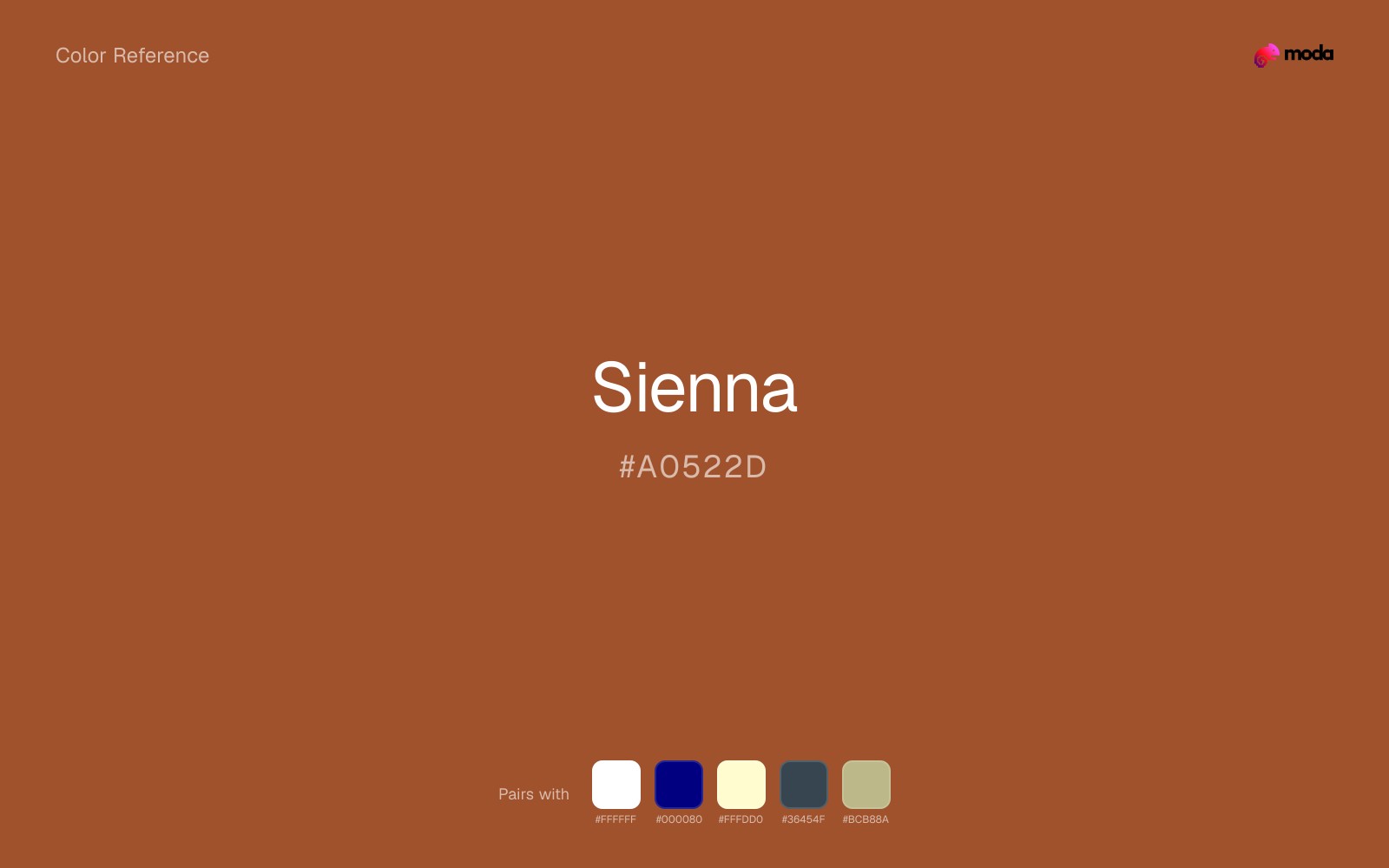
What colors go with sienna
White helps sienna stay legible in charts, labels, and UI states where a muddier light neutral would blur the edges.
Navy blue sharpens sienna without stripping away its warmth, which is helpful when the work needs both tactility and control.
Cream gives sienna a quieter backdrop and preserves a more natural editorial feel than a colder off-white would.
Charcoal helps sienna feel grounded and architectural, especially when the design needs a darker value that still reads refined.
Sage Green gives sienna a second note that is different enough to feel intentional but not so different that the palette loses coherence.
What colors clash with sienna
Neon Green is so artificial beside sienna that the source color starts to look accidental instead of rooted and deliberate.
Magenta pushes sienna toward a nightclub or cosmetic register that is hard to square with calmer editorial or product work.
With sienna, cyan introduces a colder display-driven cast that strips away some of the source color's tactile character.
Pastel Pink can undercut sienna's authority by turning the combination more decorative than decisive.
How should I use sienna in design?
- •Sienna carries enough visual weight for headlines, key UI elements, and section anchors — dark enough to command attention but clearly distinct from black.
- •Cool neutrals like charcoal and slate sharpen sienna's warm character, while warm companions like cream and gold amplify its inviting quality.
- •Sienna fits food packaging, hospitality branding, and editorial layouts where natural warmth and material texture are more important than synthetic brightness.
What are good sienna palettes?
Dark precision
Consulting deliverables, strategy documents, and data-driven layouts.
Neutral ground
Startup branding, pitch materials, and product landing pages.
Design with sienna in Moda
Create a presentation or document using siennaas your accent color. Moda's AI applies your color palette automatically.
Create a design with sienna →What are the shades and tints of sienna?
Shades (darker)
Tints (lighter)
Tones (desaturated)
Hue variations
What are the color harmonies for sienna?
Harmonies are calculated from the base swatch. When a harmony matches a named color page, it links there; otherwise it appears here as a computed reference swatch.
Similar colors
Chestnut
Chestnut is nearly adjacent to sienna in hue; what separates them is intensity, with chestnut reading dustier and easier to extend across a layout.
Rust
Rust is nearly adjacent to sienna in hue; what separates them is intensity, with rust reading cleaner and more assertive.
Copper
Copper stays very close to sienna in hue, but it lands lighter, which makes it better for backgrounds, tints, and softer supporting areas than for accents, stronger hierarchy, and firmer structure.
Coffee
Coffee is almost the same hue as sienna; the real difference is value, with coffee feeling more grounded and anchor-ready.
Mahogany
Mahogany is nearly adjacent to sienna in hue; what separates them is intensity, with mahogany reading cleaner and more assertive.
Frequently asked questions
What is the hex code for sienna?
The hex code for sienna is #A0522D. In RGB, that's 160 red, 82 green, and 45 blue. The approximate CMYK equivalent is 0% cyan, 49% magenta, 72% yellow, and 37% key (black).
Is sienna a warm or cool color?
Sienna sits on the warm side of the palette, so it pairs easily with other warm tones and becomes more energetic when you place it against cooler blues or blue-grays.
Is sienna better for accents, structure, or surfaces?
Sienna sits in the usable middle: strong enough to anchor a section or call attention to a key moment, but calm enough to support a broader system when the surrounding values are well managed.
Where does sienna work best in a layout?
Sienna sits in the middle of the spectrum in a useful way: strong enough for emphasis, but controlled enough to support a broader brand or presentation system when the contrast is handled well.
Is sienna accessible?
Sienna can work as text on white at 5.62:1 contrast, but it is usually safest in headings, labels, and accent moments rather than long body copy.
More brown colors
Keep exploring color resources
All color pages
Browse the full library of color references, pairings, and palettes.
Brown colors
Compare sienna with other brown tones.
Neutral colors
Explore nearby color families to build stronger palettes and contrasts.
Orange colors
Explore nearby color families to build stronger palettes and contrasts.
Red colors
Explore nearby color families to build stronger palettes and contrasts.
Last updated April 6, 2026
Color values are computed from the listed hex code using standard conversion formulas. RGB, HSL, and HSV are exact screen-ready conversions. CMYK is an approximate on-screen reference, not a press-ready print specification. Pairings, palettes, and use-case guidance are heuristic recommendations derived from color relationships, contrast behavior, and common presentation, document, and UI patterns.