Mahogany color guide
HEX
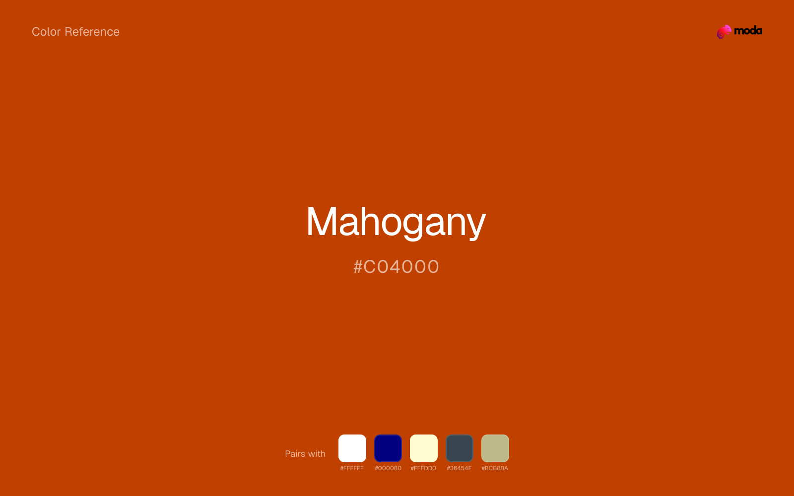
#C04000
RGB
192, 64, 0
HSL
20°, 100%, 38%
HSV
20°, 100%, 75%
Varnished depth — brown pushed toward ember and fine furniture. #C04000 reads as expensive wood and low light in a study. It is dramatic in a way tan never tries to be.
Best for
Legal and institutional branding across web and print.
Accessibility
Mahogany text on white passes AA at 5.28:1, which makes it usable for headings and short labels.
How does mahogany compare to nearby colors?
What is the difference between mahogany and rust?
The visible difference between Mahogany (#C04000) and Rust (#B7410E) is subtle, but it still nudges the family from warm wood toward citrus-bright. The practical difference is not raw contrast so much as project fit: Mahogany reads more naturally in outdoor, food, and lifestyle systems, while Rust fits more easily into food, promotion, and social-first graphics. Start with mahogany when the palette wants more warm wood; switch to rust when the better fit is citrus-bright.
What color is mahogany?
Mahogany references the prized hardwood used in furniture, musical instruments, and luxury interiors. The color name persists in wood stains, classic menswear, and automotive interiors marketing.
What is the hex code for mahogany?
| Format | Value |
|---|---|
| HEX | #C04000 |
| RGB | rgb(192, 64, 0) |
| HSL | hsl(20°, 100%, 38%) |
| HSV / HSB | hsv(20°, 100%, 75%) |
| CMYK (approx.) | cmyk(0%, 67%, 100%, 25%) |
Convert Mahogany to other color formats
Open the color converter with Mahogany (#C04000) prefilled to copy RGB, HSL, HSV, CMYK, or OKLCH values.
Convert Mahogany in the color converter →What does mahogany mean in design?
Mahogany is often associated with prestige, gravity, and old-world craft. Next to chestnut it is typically deeper and more red-orange; next to chocolate it can feel more "polished wood" than "cocoa."
How do I use mahogany in code?
| CSS (hex) | color: #C04000; |
| CSS (rgb) | color: rgb(192, 64, 0); |
| CSS (hsl) | color: hsl(20, 100%, 38%); |
| RGB % | rgb(75%, 25%, 0%) |
| Tailwind | text-[#C04000] |
| SwiftUI | Color(red: 0.753, green: 0.251, blue: 0.000) |
| UIKit | UIColor(red: 0.753, green: 0.251, blue: 0.000, alpha: 1.0) |
| Android | Color.rgb(192, 64, 0) |
| Compose | Color(0xFFC04000) |
| Web Safe | #CC3300 |
Is mahogany accessible?
| Combination | Ratio | AA | AA lg | AAA | AAA lg | UI |
|---|---|---|---|---|---|---|
| AaWhite text on this color | 5.28:1 | ✓ | ✓ | ✗ | ✓ | ✓ |
| AaBlack text on this color | 3.97:1 | ✗ | ✓ | ✗ | ✗ | ✓ |
| AaThis color as text on white | 5.28:1 | ✓ | ✓ | ✗ | ✓ | ✓ |
| AaThis color as text on black | 3.97:1 | ✗ | ✓ | ✗ | ✗ | ✓ |
WCAG 2.1: AA normal ≥ 4.5:1, AA large text ≥ 3:1, AAA normal ≥ 7:1, AAA large ≥ 4.5:1, UI components ≥ 3:1.
How does mahogany look with color blindness?
Simulated appearance for common types of color vision deficiency. Actual perception varies by individual.
What colors go with mahogany
White sharpens mahogany without cooling it off, which is useful when you need a clean interface or slide layout around the color.
Navy blue reins in mahogany without deadening it, which is useful when you want warmth to stay present but not dominate every part of the page.
Cream takes the hard digital edge off mahogany and makes the color feel more printed, paper-backed, and approachable.
Charcoal gives mahogany a darker, quieter partner, which helps vivid accents look deliberate instead of loud for their own sake.
Sage Green gives mahogany a second note that is different enough to feel intentional but not so different that the palette loses coherence.
What colors clash with mahogany
Neon Green makes mahogany feel cheaper and less material, which is exactly the opposite of what these grounded colors usually contribute.
Magenta remaps mahogany too aggressively, dragging it away from outdoor, food, and lifestyle systems and into a brighter, more performative palette.
Cyan redirects mahogany toward a more technical, backlit interpretation, which is risky when the goal is warmth, polish, or print-minded editorial work.
Pastel Pink can make mahogany feel softer and sweeter than intended, which weakens palettes that rely on gravity or structure.
How should I use mahogany in design?
- •Mahogany carries enough visual weight for headlines, key UI elements, and section anchors — dark enough to command attention but clearly distinct from black.
- •Mahogany leans warm, so cool counterparts like navy, teal, or slate create the cleanest contrast. For a softer, tonal look, stay within neighboring warm hues and let value differences do the work.
- •Mahogany's high saturation makes it most effective in small doses — buttons, chart highlights, notification badges, and social media accents.
What are good mahogany palettes?
Design with mahogany in Moda
Create a presentation or document using mahoganyas your accent color. Moda's AI applies your color palette automatically.
Create a design with mahogany →What are the shades and tints of mahogany?
Shades (darker)
Tints (lighter)
Tones (desaturated)
Hue variations
What are the color harmonies for mahogany?
Harmonies are calculated from the base swatch. When a harmony matches a named color page, it links there; otherwise it appears here as a computed reference swatch.
Similar colors
Rust
Rust is nearly adjacent to mahogany in hue; what separates them is intensity, with rust reading dustier and easier to extend across a layout.
Burnt Orange
Burnt Orange is near enough to mahogany to swap into the same palette, yet the undertone shift still decides whether the family reads warmer or cooler overall.
Brown
Brown is almost the same hue as mahogany; the real difference is value, with brown feeling more grounded and anchor-ready.
Persimmon
Persimmon is almost the same hue as mahogany; the real difference is value, with persimmon feeling more open and surface-friendly.
Sienna
Sienna is nearly adjacent to mahogany in hue; what separates them is intensity, with sienna reading dustier and easier to extend across a layout.
Frequently asked questions
What is the hex code for mahogany?
The hex code for mahogany is #C04000. In RGB, that's 192 red, 64 green, and 0 blue. The approximate CMYK equivalent is 0% cyan, 67% magenta, 100% yellow, and 25% key (black).
Is mahogany a warm or cool color?
Mahogany sits on the warm side of the palette, so it pairs easily with other warm tones and becomes more energetic when you place it against cooler blues or blue-grays.
Should mahogany lead the palette or stay in supporting roles?
Mahogany has enough chroma to take the lead, but it usually performs best when the surrounding system stays quieter. Treat it as the voice of emphasis, not the answer to every layout need.
Where does mahogany work best in a layout?
Mahogany carries a lot of chroma, so it is usually strongest as punctuation rather than wallpaper. Use it for focal accents and let low-saturation surfaces do the balancing.
Is mahogany accessible?
Mahogany can work as text on white at 5.28:1 contrast, but it is usually safest in headings, labels, and accent moments rather than long body copy.
More brown colors
Keep exploring color resources
All color pages
Browse the full library of color references, pairings, and palettes.
Brown colors
Compare mahogany with other brown tones.
Neutral colors
Explore nearby color families to build stronger palettes and contrasts.
Orange colors
Explore nearby color families to build stronger palettes and contrasts.
Red colors
Explore nearby color families to build stronger palettes and contrasts.
Last updated April 6, 2026
Color values are computed from the listed hex code using standard conversion formulas. RGB, HSL, and HSV are exact screen-ready conversions. CMYK is an approximate on-screen reference, not a press-ready print specification. Pairings, palettes, and use-case guidance are heuristic recommendations derived from color relationships, contrast behavior, and common presentation, document, and UI patterns.