Persimmon color guide
HEX
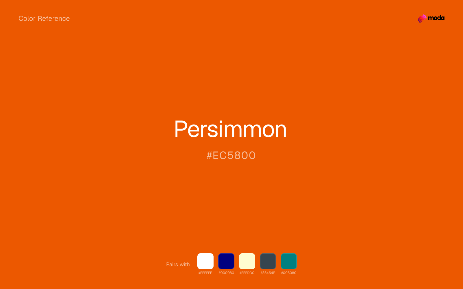
#EC5800
RGB
236, 88, 0
HSL
22°, 100%, 46%
HSV
22°, 100%, 93%
An intense orange that can feel almost ember-like — vivid, slightly serious, and high-impact in small doses. #EC5800 is the kind of orange that reads "ripe fruit" and "heat" at the same time, making it effective for accents, food photography, and dramatic UI highlights.
Best for
SaaS dashboards, admin panels, and professional UI themes.
Compare with
Accessibility
Check contrast before using persimmon for text-heavy layouts, especially on low-contrast backgrounds.
How does persimmon compare to nearby colors?
What is the difference between persimmon and mahogany?
Persimmon (#EC5800) and Mahogany (#C04000) are close enough that the split is more about finish than headline contrast: Persimmon feels more citrus-bright, while Mahogany reads more warm wood. Persimmon makes the composition feel less compact, which is useful when the darker alternative starts to dominate too early. Begin with persimmon when the family needs its current undertone and surface character; keep mahogany for the nearby alternative that shifts the mood without leaving the same hue neighborhood.
What color is persimmon?
Named for persimmon fruit, valued in East Asian cuisines and horticulture. The hex represents a saturated orange-red that appears in fashion and interiors as a punchy accent tied to global food culture.
What is the hex code for persimmon?
| Format | Value |
|---|---|
| HEX | #EC5800 |
| RGB | rgb(236, 88, 0) |
| HSL | hsl(22°, 100%, 46%) |
| HSV / HSB | hsv(22°, 100%, 93%) |
| CMYK (approx.) | cmyk(0%, 63%, 100%, 7%) |
Convert Persimmon to other color formats
Open the color converter with Persimmon (#EC5800) prefilled to copy RGB, HSL, HSV, CMYK, or OKLCH values.
Convert Persimmon in the color converter →What does persimmon mean in design?
Persimmon is often associated with richness, appetite, and assertive warmth — less playful than tangerine, more gourmet. Versus pumpkin, persimmon can read hotter and more red-orange; versus terracotta, it is usually cleaner, brighter, and less dusty.
How do I use persimmon in code?
| CSS (hex) | color: #EC5800; |
| CSS (rgb) | color: rgb(236, 88, 0); |
| CSS (hsl) | color: hsl(22, 100%, 46%); |
| RGB % | rgb(93%, 35%, 0%) |
| Tailwind | text-[#EC5800] |
| SwiftUI | Color(red: 0.925, green: 0.345, blue: 0.000) |
| UIKit | UIColor(red: 0.925, green: 0.345, blue: 0.000, alpha: 1.0) |
| Android | Color.rgb(236, 88, 0) |
| Compose | Color(0xFFEC5800) |
| Web Safe | #FF6600 |
Is persimmon accessible?
| Combination | Ratio | AA | AA lg | AAA | AAA lg | UI |
|---|---|---|---|---|---|---|
| AaWhite text on this color | 3.52:1 | ✗ | ✓ | ✗ | ✗ | ✓ |
| AaBlack text on this color | 5.96:1 | ✓ | ✓ | ✗ | ✓ | ✓ |
| AaThis color as text on white | 3.52:1 | ✗ | ✓ | ✗ | ✗ | ✓ |
| AaThis color as text on black | 5.96:1 | ✓ | ✓ | ✗ | ✓ | ✓ |
WCAG 2.1: AA normal ≥ 4.5:1, AA large text ≥ 3:1, AAA normal ≥ 7:1, AAA large ≥ 4.5:1, UI components ≥ 3:1.
How does persimmon look with color blindness?
Simulated appearance for common types of color vision deficiency. Actual perception varies by individual.
What colors go with persimmon
White keeps persimmon poster-clean instead of crowded, which is especially useful when the color already arrives with a strong screen presence.
Navy blue gives persimmon the dark-value contrast it needs to feel designed rather than just bright.
Cream takes the hard digital edge off persimmon and makes the color feel more printed, paper-backed, and approachable.
What colors clash with persimmon
Neon Green changes the meaning of persimmon too abruptly, replacing the source color's food, promotion, and social-first graphics cues with something much louder and less stable.
With persimmon, magenta introduces a second emotional story instead of reinforcing the first one, so the palette can feel internally split.
How should I use persimmon in design?
- •Use persimmon where you need a clear, ownable color — logos, primary CTAs, and hero sections where it carries the visual identity.
- •Pair persimmon with cool accents (navy, sage, steel blue) for sharp contrast, or keep it with other warm tones (cream, gold, tan) for a cohesive, editorial feel.
- •Persimmon's high saturation makes it most effective in small doses — buttons, chart highlights, notification badges, and social media accents.
What are good persimmon palettes?
Design with persimmon in Moda
Create a presentation or document using persimmonas your accent color. Moda's AI applies your color palette automatically.
Create a design with persimmon →What are the shades and tints of persimmon?
Shades (darker)
Tints (lighter)
Tones (desaturated)
Hue variations
What are the color harmonies for persimmon?
Harmonies are calculated from the base swatch. When a harmony matches a named color page, it links there; otherwise it appears here as a computed reference swatch.
Similar colors
Burnt Orange
Burnt Orange stays very close to persimmon in hue, but it lands darker, which makes it better for headlines, anchors, and darker sections than for lighter surfaces and more open applications.
Pumpkin
Pumpkin is almost the same hue as persimmon; the real difference is value, with pumpkin feeling more open and surface-friendly.
Mahogany
Mahogany is almost the same hue as persimmon; the real difference is value, with mahogany feeling more grounded and anchor-ready.
Rust
Rust is almost the same hue as persimmon; the real difference is value, with rust feeling more grounded and anchor-ready.
Scarlet
Scarlet lives in the same neighborhood as persimmon, but the finish shift is enough to make one feel better for retail, sports, and high-urgency graphics and the other for food, promotion, and social-first graphics.
Frequently asked questions
What is the hex code for persimmon?
The hex code for persimmon is #EC5800. In RGB, that's 236 red, 88 green, and 0 blue. The approximate CMYK equivalent is 0% cyan, 63% magenta, 100% yellow, and 7% key (black).
Is persimmon a warm or cool color?
Persimmon sits on the warm side of the palette, so it pairs easily with other warm tones and becomes more energetic when you place it against cooler blues or blue-grays.
Should persimmon lead the palette or stay in supporting roles?
Persimmon has enough chroma to take the lead, but it usually performs best when the surrounding system stays quieter. Treat it as the voice of emphasis, not the answer to every layout need.
Where does persimmon work best in a layout?
Persimmon carries a lot of chroma, so it is usually strongest as punctuation rather than wallpaper. Use it for focal accents and let low-saturation surfaces do the balancing.
Is persimmon accessible?
Persimmon works better with dark text than white text. Black text reaches 5.96:1 contrast on the swatch, which makes the color more usable as a background or highlight surface than as a dark panel.
More orange colors
Keep exploring color resources
All color pages
Browse the full library of color references, pairings, and palettes.
Orange colors
Compare persimmon with other orange tones.
Brown colors
Explore nearby color families to build stronger palettes and contrasts.
Neutral colors
Explore nearby color families to build stronger palettes and contrasts.
Red colors
Explore nearby color families to build stronger palettes and contrasts.
Last updated April 6, 2026
Color values are computed from the listed hex code using standard conversion formulas. RGB, HSL, and HSV are exact screen-ready conversions. CMYK is an approximate on-screen reference, not a press-ready print specification. Pairings, palettes, and use-case guidance are heuristic recommendations derived from color relationships, contrast behavior, and common presentation, document, and UI patterns.