Orange color guide
HEX
#FFA500
RGB
255, 165, 0
HSL
39°, 100%, 50%
HSV
39°, 100%, 100%
Web orange (#FFA500) is a bright, golden-leaning orange — more amber than traffic-cone red-orange and less brown than most autumn palettes. As one of the few CSS named colors that doubles as everyday shorthand for the hue, it reads instantly as "default orange" on screens. It separates clearly from deeper #FF6600-style oranges that push harder into red, and compared with peach or coral, #FFA500 stays firmly in the orange family rather than drifting into skin-tone neutrals.
Best for
Event branding, newsletters, and customer-facing web pages.
Accessibility
Check contrast before using orange for text-heavy layouts, especially on low-contrast backgrounds.
How does orange compare to nearby colors?
What is the difference between orange and goldenrod?
Orange (#FFA500) feels more signal-like on screen, while Goldenrod (#DAA520) pushes the family in the opposite direction. Orange pushes the palette toward sharper emphasis, while Goldenrod leaves more room for typography, photography, or adjacent accents. Use orange when you want more pigment and immediate screen energy, and goldenrod when the same family should feel calmer or more spreadable.
What color is orange?
The CSS/HTML named color orange (#FFA500) aligns with the long-standing X11 "Orange" swatch used in early computer color systems. The English word comes from the fruit (via Sanskrit, Persian, and Arabic trade routes), and the hue is widely used in consumer packaging, safety marking, and sports identity where high noticeability matters.
What is the hex code for orange?
| Format | Value |
|---|---|
| HEX | #FFA500 |
| RGB | rgb(255, 165, 0) |
| HSL | hsl(39°, 100%, 50%) |
| HSV / HSB | hsv(39°, 100%, 100%) |
| CMYK (approx.) | cmyk(0%, 35%, 100%, 0%) |
Convert Orange to other color formats
Open the color converter with Orange (#FFA500) prefilled to copy RGB, HSL, HSV, CMYK, or OKLCH values.
Convert Orange in the color converter →What does orange mean in design?
In interface and marketing contexts, #FFA500 often reads as upbeat and attention-getting without feeling as urgent as red. It tends to feel friendly and everyday rather than luxury, partly because it is so recognizable as a baseline screen orange. Next to deeper burnt oranges it can feel lighter and more playful; next to yellow it usually feels steadier and less glaring.
How do I use orange in code?
| CSS (hex) | color: #FFA500; |
| CSS (rgb) | color: rgb(255, 165, 0); |
| CSS (hsl) | color: hsl(39, 100%, 50%); |
| RGB % | rgb(100%, 65%, 0%) |
| Tailwind | text-[#FFA500] |
| SwiftUI | Color(red: 1.000, green: 0.647, blue: 0.000) |
| UIKit | UIColor(red: 1.000, green: 0.647, blue: 0.000, alpha: 1.0) |
| Android | Color.rgb(255, 165, 0) |
| Compose | Color(0xFFFFA500) |
| Web Safe | #FF9900 |
Is orange accessible?
| Combination | Ratio | AA | AA lg | AAA | AAA lg | UI |
|---|---|---|---|---|---|---|
| AaWhite text on this color | 1.97:1 | ✗ | ✗ | ✗ | ✗ | ✗ |
| AaBlack text on this color | 10.63:1 | ✓ | ✓ | ✓ | ✓ | ✓ |
| AaThis color as text on white | 1.97:1 | ✗ | ✗ | ✗ | ✗ | ✗ |
| AaThis color as text on black | 10.63:1 | ✓ | ✓ | ✓ | ✓ | ✓ |
WCAG 2.1: AA normal ≥ 4.5:1, AA large text ≥ 3:1, AAA normal ≥ 7:1, AAA large ≥ 4.5:1, UI components ≥ 3:1.
How does orange look with color blindness?
Simulated appearance for common types of color vision deficiency. Actual perception varies by individual.
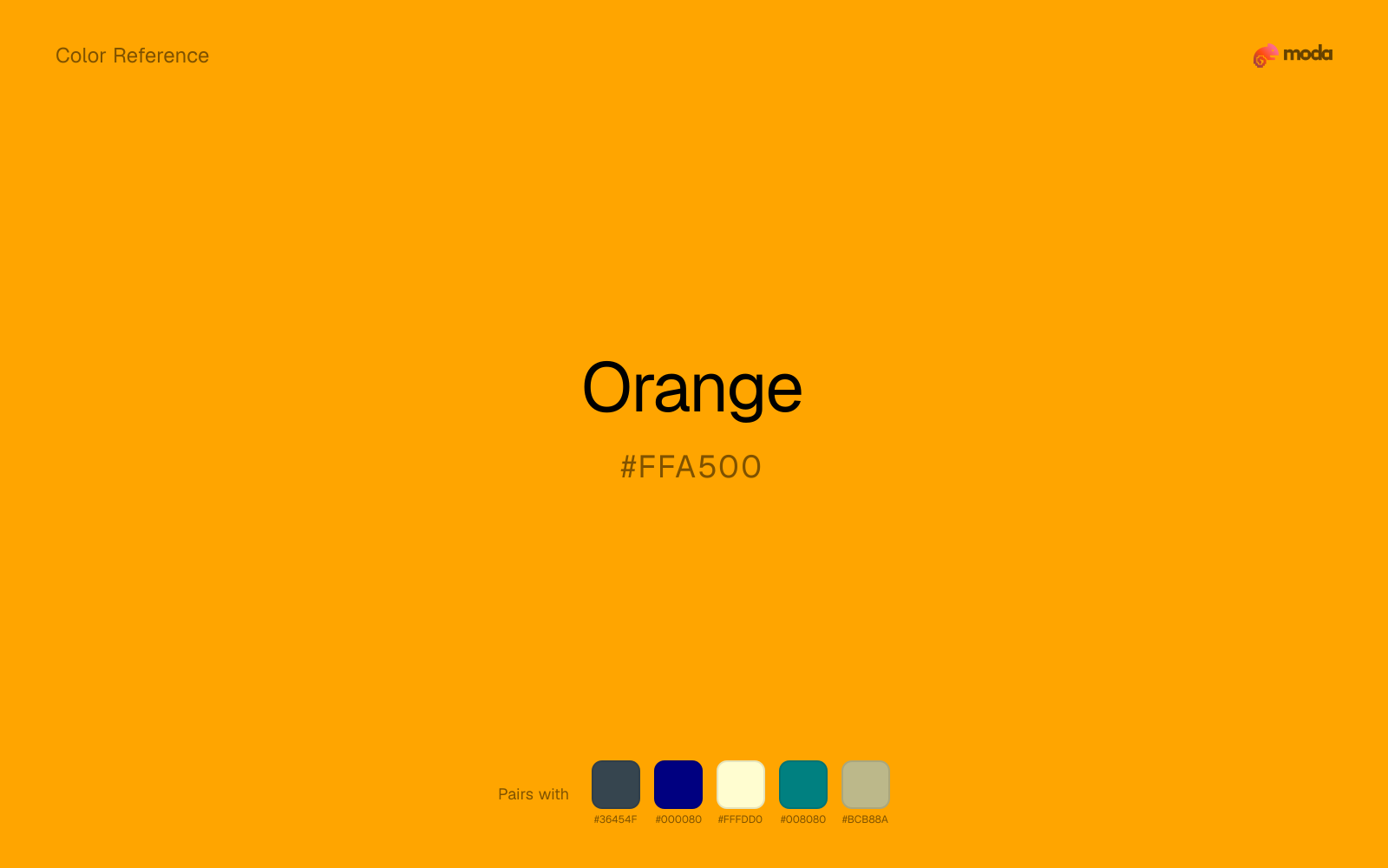
What colors go with orange
Charcoal gives orange a darker, quieter partner, which helps vivid accents look deliberate instead of loud for their own sake.
Navy blue gives orange the dark-value contrast it needs to feel designed rather than just bright.
With a vivid orange, cream is gentler than white, so the palette keeps warmth and avoids looking overlit.
Teal changes the temperature story around orange: orange-warm on its own, more finance, outdoors, and institutional systems once the cooler or warmer partner is introduced.
Sage Green helps orange feel more complete in practice because the pairing combines citrus-bright qualities with sage and moss support instead of leaving the source color to do every job alone.
What colors clash with orange
Neon Green competes with orange so aggressively that the palette never really settles into a clear primary-secondary relationship.
Magenta remaps orange too aggressively, dragging it away from food, promotion, and social-first graphics and into a brighter, more performative palette.
How should I use orange in design?
- •On dark UI chrome, pair #FFA500 with off-white text labels rather than pure #FFFFFF to reduce simultaneous contrast halos around the orange.
- •Use #FFA500 as the single accent in charts or callouts where you need a warm hue that stays distinct from both red error states and yellow caution cues.
- •When placing orange next to brand reds, shift one of the hues in saturation or lightness so the two do not collapse into a single "hot" band on compressed displays.
What are good orange palettes?
Design with orange in Moda
Create a presentation or document using orangeas your accent color. Moda's AI applies your color palette automatically.
Create a design with orange →What are the shades and tints of orange?
Shades (darker)
Tints (lighter)
Tones (desaturated)
Hue variations
What are the color harmonies for orange?
Harmonies are calculated from the base swatch. When a harmony matches a named color page, it links there; otherwise it appears here as a computed reference swatch.
Similar colors
Honey
Honey lives in the same neighborhood as orange, but the finish shift is enough to make one feel better for alerts, signage, and data callouts and the other for food, promotion, and social-first graphics.
Amber
Amber sits close to orange in hue, but its sunlit yellow cast changes the mood of the palette even when the contrast shift is small.
Goldenrod
Goldenrod is nearly adjacent to orange in hue; what separates them is intensity, with goldenrod reading dustier and easier to extend across a layout.
Gold
Gold is near enough to orange to swap into the same palette, yet the undertone shift still decides whether the family reads warmer or cooler overall.
Pumpkin
Pumpkin is near enough to orange to swap into the same palette, yet the undertone shift still decides whether the family reads warmer or cooler overall.
Frequently asked questions
What is the hex code for orange?
The hex code for orange is #FFA500. In RGB, that's 255 red, 165 green, and 0 blue. The approximate CMYK equivalent is 0% cyan, 35% magenta, 100% yellow, and 0% key (black).
Is orange a warm or cool color?
Orange sits on the warm side of the palette, so it pairs easily with other warm tones and becomes more energetic when you place it against cooler blues or blue-grays.
Should orange lead the palette or stay in supporting roles?
Orange has enough chroma to take the lead, but it usually performs best when the surrounding system stays quieter. Treat it as the voice of emphasis, not the answer to every layout need.
Where does orange work best in a layout?
Orange carries a lot of chroma, so it is usually strongest as punctuation rather than wallpaper. Use it for focal accents and let low-saturation surfaces do the balancing.
Is orange accessible?
Orange works better with dark text than white text. Black text reaches 10.63:1 contrast on the swatch, which makes the color more usable as a background or highlight surface than as a dark panel.
More orange colors
Keep exploring color resources
All color pages
Browse the full library of color references, pairings, and palettes.
Orange colors
Compare orange with other orange tones.
Brown colors
Explore nearby color families to build stronger palettes and contrasts.
Neutral colors
Explore nearby color families to build stronger palettes and contrasts.
Red colors
Explore nearby color families to build stronger palettes and contrasts.
Last updated April 6, 2026
Color values are computed from the listed hex code using standard conversion formulas. RGB, HSL, and HSV are exact screen-ready conversions. CMYK is an approximate on-screen reference, not a press-ready print specification. Pairings, palettes, and use-case guidance are heuristic recommendations derived from color relationships, contrast behavior, and common presentation, document, and UI patterns.