Terracotta meaning and palette guide
HEX
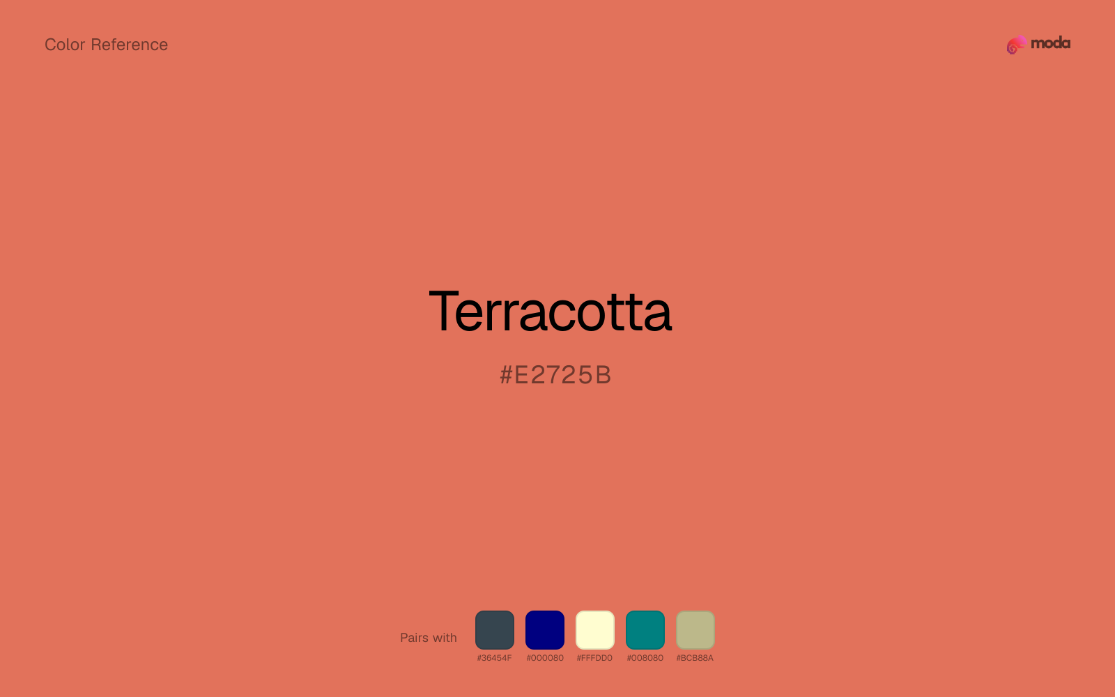
#E2725B
RGB
226, 114, 91
HSL
10°, 70%, 62%
HSV
10°, 60%, 89%
A muted orange-red that looks like sun-baked clay — dusty, grounded, and slightly desaturated compared with fruit oranges. #E2725B carries warmth with weight, making it strong for interiors, ceramics branding, and earthy fashion palettes. It reads as material rather than neon.
Best for
Internal tools, team dashboards, and knowledge-base layouts.
Accessibility
Check contrast before using terracotta for text-heavy layouts, especially on low-contrast backgrounds.
How does terracotta compare to nearby colors?
What is the difference between terracotta and salmon?
Salmon (#FA8072) carries more pigment punch than Terracotta (#E2725B), so the pair separates by finish as much as hue. Terracotta is easier to live with across large areas, because it carries less chroma pressure than Salmon. Start with terracotta when the palette wants more citrus-bright; switch to salmon when the better fit is peach-wash.
What color is terracotta?
Terracotta (Italian: "baked earth") refers to fired clay used for pottery and architectural elements worldwide, from Mediterranean roofs to pre-Columbian sculpture.
What is the hex code for terracotta?
| Format | Value |
|---|---|
| HEX | #E2725B |
| RGB | rgb(226, 114, 91) |
| HSL | hsl(10°, 70%, 62%) |
| HSV / HSB | hsv(10°, 60%, 89%) |
| CMYK (approx.) | cmyk(0%, 50%, 60%, 11%) |
Convert Terracotta to other color formats
Open the color converter with Terracotta (#E2725B) prefilled to copy RGB, HSL, HSV, CMYK, or OKLCH values.
Convert Terracotta in the color converter →What does terracotta mean in design?
Terracotta is often associated with stability, handmade quality, and sun-warmed landscapes. Next to pumpkin or persimmon, terracotta tends to read as dustier and more red-brown; next to salmon, it is deeper, earthier, and less pink.
How do I use terracotta in code?
| CSS (hex) | color: #E2725B; |
| CSS (rgb) | color: rgb(226, 114, 91); |
| CSS (hsl) | color: hsl(10, 70%, 62%); |
| RGB % | rgb(89%, 45%, 36%) |
| Tailwind | text-[#E2725B] |
| SwiftUI | Color(red: 0.886, green: 0.447, blue: 0.357) |
| UIKit | UIColor(red: 0.886, green: 0.447, blue: 0.357, alpha: 1.0) |
| Android | Color.rgb(226, 114, 91) |
| Compose | Color(0xFFE2725B) |
| Web Safe | #CC6666 |
Is terracotta accessible?
| Combination | Ratio | AA | AA lg | AAA | AAA lg | UI |
|---|---|---|---|---|---|---|
| AaWhite text on this color | 3.09:1 | ✗ | ✓ | ✗ | ✗ | ✓ |
| AaBlack text on this color | 6.79:1 | ✓ | ✓ | ✗ | ✓ | ✓ |
| AaThis color as text on white | 3.09:1 | ✗ | ✓ | ✗ | ✗ | ✓ |
| AaThis color as text on black | 6.79:1 | ✓ | ✓ | ✗ | ✓ | ✓ |
WCAG 2.1: AA normal ≥ 4.5:1, AA large text ≥ 3:1, AAA normal ≥ 7:1, AAA large ≥ 4.5:1, UI components ≥ 3:1.
How does terracotta look with color blindness?
Simulated appearance for common types of color vision deficiency. Actual perception varies by individual.
What colors go with terracotta
Charcoal lets terracotta stay light and atmospheric while still giving the layout a readable dark value for text and hierarchy.
Beside terracotta, navy blue turns a hot palette into something more usable for documents, product surfaces, and brand systems.
Pairing terracotta with cream keeps the palette relaxed and material, which is useful when a bright white would feel too crisp.
Teal changes the temperature story around terracotta: red-hot on its own, more finance, outdoors, and institutional systems once the cooler or warmer partner is introduced.
Sage Green gives terracotta a second note that is different enough to feel intentional but not so different that the palette loses coherence.
What colors clash with terracotta
Neon Green competes with terracotta so aggressively that the palette never really settles into a clear primary-secondary relationship.
With terracotta, magenta introduces a second emotional story instead of reinforcing the first one, so the palette can feel internally split.
How should I use terracotta in design?
- •Use terracotta for buttons, badges, and chart accents where it can stand out. Test text contrast with WCAG tools before using it for body copy on light backgrounds.
- •Terracotta leans warm, so cool counterparts like navy, teal, or slate create the cleanest contrast. For a softer, tonal look, stay within neighboring warm hues and let value differences do the work.
- •Terracotta suits consumer-facing campaigns, food and beverage branding, and creative-industry materials where warmth and friendliness drive engagement.
What are good terracotta palettes?
Bright horizon
Internal tools, team dashboards, and knowledge-base layouts.
Design with terracotta in Moda
Create a presentation or document using terracottaas your accent color. Moda's AI applies your color palette automatically.
Create a design with terracotta →What are the shades and tints of terracotta?
Shades (darker)
Tints (lighter)
Tones (desaturated)
Hue variations
What are the color harmonies for terracotta?
Harmonies are calculated from the base swatch. When a harmony matches a named color page, it links there; otherwise it appears here as a computed reference swatch.
Similar colors
Coral
Coral is nearly adjacent to terracotta in hue; what separates them is intensity, with coral reading cleaner and more assertive.
Salmon
Salmon stays very close to terracotta in hue, but it lands lighter, which makes it better for backgrounds, tints, and softer supporting areas than for accents, stronger hierarchy, and firmer structure.
Indian Red
Indian Red sits close to terracotta on the wheel, but it carries less chroma, which makes it better for steadier surfaces and calmer long-form use than for sharper emphasis and quicker visual pickup.
Mango
Mango sits close to terracotta on the wheel, but it carries more pigment pressure, which makes it better for faster emphasis and brighter accent work than for broader coverage and quieter supporting roles.
Tangerine
Tangerine is almost the same hue as terracotta; the real difference is value, with tangerine feeling more open and surface-friendly.
Frequently asked questions
What is the hex code for terracotta?
The hex code for terracotta is #E2725B. In RGB, that's 226 red, 114 green, and 91 blue. The approximate CMYK equivalent is 0% cyan, 50% magenta, 60% yellow, and 11% key (black).
Is terracotta a warm or cool color?
Terracotta reads as warm. It feels most natural with creams, golds, rusts, and other warm accents, while cooler partners like navy or teal create sharper contrast.
Where does terracotta work best in a layout?
Terracotta is flexible enough to move between accents, section blocks, and supporting roles depending on the contrast around it. It works best when the rest of the palette gives it a clear job instead of asking it to do everything at once.
How should I use terracotta in a design?
Terracotta is versatile enough for headlines, accent bars, buttons, charts, or section backgrounds depending on the contrast around it. It works as either a primary or supporting color in decks, documents, and brand systems.
Can I use terracotta for text or backgrounds?
Terracotta works better with dark text than white text. Black text reaches 6.79:1 contrast on the swatch, which makes the color more usable as a background or highlight surface than as a dark panel.
More orange colors
Keep exploring color resources
All color pages
Browse the full library of color references, pairings, and palettes.
Orange colors
Compare terracotta with other orange tones.
Brown colors
Explore nearby color families to build stronger palettes and contrasts.
Neutral colors
Explore nearby color families to build stronger palettes and contrasts.
Red colors
Explore nearby color families to build stronger palettes and contrasts.
Last updated April 6, 2026
Color values are computed from the listed hex code using standard conversion formulas. RGB, HSL, and HSV are exact screen-ready conversions. CMYK is an approximate on-screen reference, not a press-ready print specification. Pairings, palettes, and use-case guidance are heuristic recommendations derived from color relationships, contrast behavior, and common presentation, document, and UI patterns.