Peach palettes and pairings
HEX
#FFCBA4
RGB
255, 203, 164
HSL
26°, 100%, 82%
HSV
26°, 36%, 100%
A pale, warm wash that behaves like a tinted neutral — enough chroma to feel sunny, but gentle enough for backgrounds and skin-adjacent tones in beauty and lifestyle visuals. #FFCBA4 reads soft and powdery rather than punchy, helping it carry warmth without dominating a layout.
Best for
Marketing websites, social media graphics, and campaign landing pages.
Accessibility
Check contrast before using peach for text-heavy layouts, especially on low-contrast backgrounds.
How does peach compare to nearby colors?
What is the difference between peach and caramel?
Peach (#FFCBA4) and Caramel (#FFD59A) may look neighboring at first glance, yet their surface character diverges once they sit next to whites, charcoals, and other real layout neutrals. The practical difference is not raw contrast so much as project fit: Peach reads more naturally in beauty, lifestyle, and soft campaign backgrounds, while Caramel fits more easily into natural skincare, packaging, and craft-led surfaces. Choose peach when the surrounding system aligns better with beauty, lifestyle, and soft campaign backgrounds, and move to caramel when the stronger contextual fit is natural skincare, packaging, and craft-led surfaces.
What color is peach?
The name references the peach fruit's skin and blush. Pastel peach tones are common in cosmetics, bridal palettes, and soft UI themes where friendly warmth is preferred over high saturation.
What is the hex code for peach?
| Format | Value |
|---|---|
| HEX | #FFCBA4 |
| RGB | rgb(255, 203, 164) |
| HSL | hsl(26°, 100%, 82%) |
| HSV / HSB | hsv(26°, 36%, 100%) |
| CMYK (approx.) | cmyk(0%, 20%, 36%, 0%) |
Convert Peach to other color formats
Open the color converter with Peach (#FFCBA4) prefilled to copy RGB, HSL, HSV, CMYK, or OKLCH values.
Convert Peach in the color converter →What does peach mean in design?
Peach is often associated with comfort, delicacy, and approachable warmth. Versus apricot, peach can skew slightly pinker and duskier; versus papaya, it is typically more clearly "orange-pastel" and less milky.
How do I use peach in code?
| CSS (hex) | color: #FFCBA4; |
| CSS (rgb) | color: rgb(255, 203, 164); |
| CSS (hsl) | color: hsl(26, 100%, 82%); |
| RGB % | rgb(100%, 80%, 64%) |
| Tailwind | text-[#FFCBA4] |
| SwiftUI | Color(red: 1.000, green: 0.796, blue: 0.643) |
| UIKit | UIColor(red: 1.000, green: 0.796, blue: 0.643, alpha: 1.0) |
| Android | Color.rgb(255, 203, 164) |
| Compose | Color(0xFFFFCBA4) |
| Web Safe | #FFCC99 |
Is peach accessible?
| Combination | Ratio | AA | AA lg | AAA | AAA lg | UI |
|---|---|---|---|---|---|---|
| AaWhite text on this color | 1.47:1 | ✗ | ✗ | ✗ | ✗ | ✗ |
| AaBlack text on this color | 14.33:1 | ✓ | ✓ | ✓ | ✓ | ✓ |
| AaThis color as text on white | 1.47:1 | ✗ | ✗ | ✗ | ✗ | ✗ |
| AaThis color as text on black | 14.33:1 | ✓ | ✓ | ✓ | ✓ | ✓ |
WCAG 2.1: AA normal ≥ 4.5:1, AA large text ≥ 3:1, AAA normal ≥ 7:1, AAA large ≥ 4.5:1, UI components ≥ 3:1.
How does peach look with color blindness?
Simulated appearance for common types of color vision deficiency. Actual perception varies by individual.
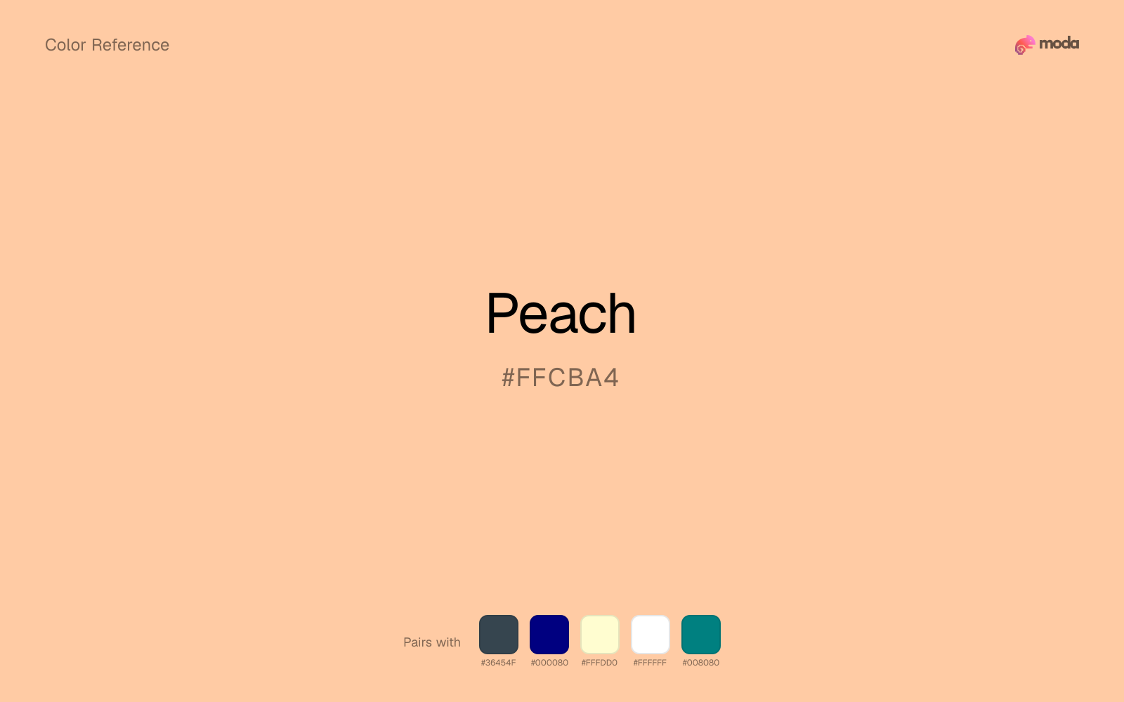
What colors go with peach
Charcoal gives peach the dark frame it is missing, so pale surfaces do not drift into a washed-out page.
Because peach already carries warmth, navy blue gives the pair a steadier backbone and keeps it closer to beauty and lifestyle work than to one-note seasonal color.
With a vivid peach, cream is gentler than white, so the palette keeps warmth and avoids looking overlit.
What colors clash with peach
Neon Green competes with peach so aggressively that the palette never really settles into a clear primary-secondary relationship.
With peach, magenta introduces a second emotional story instead of reinforcing the first one, so the palette can feel internally split.
Cyan can make peach feel more software-default than designed, especially when the rest of the palette is trying to hold onto material nuance.
Light Gray sits too close to peach in value, so the palette can wash out before it ever establishes a clear hierarchy.
How should I use peach in design?
- •Use peach for soft backgrounds and supporting surfaces rather than foreground text — it creates a gentle atmosphere while keeping the layout open and readable.
- •Cool neutrals like charcoal and slate sharpen peach's warm character, while warm companions like cream and gold amplify its inviting quality.
- •Peach's lightness makes it a good candidate for email backgrounds, slide canvases, and page sections where you want atmosphere, not distraction.
What are good peach palettes?
Bright horizon
Marketing websites, social media graphics, and campaign landing pages.
Design with peach in Moda
Create a presentation or document using peachas your accent color. Moda's AI applies your color palette automatically.
Create a design with peach →What are the shades and tints of peach?
Shades (darker)
Tints (lighter)
Tones (desaturated)
Hue variations
What are the color harmonies for peach?
Harmonies are calculated from the base swatch. When a harmony matches a named color page, it links there; otherwise it appears here as a computed reference swatch.
Similar colors
Apricot
Apricot sits close to peach on the wheel, but it carries less chroma, which makes it better for steadier surfaces and calmer long-form use than for sharper emphasis and quicker visual pickup.
Caramel
Caramel sits close to peach in hue, but its orange-warm cast changes the mood of the palette even when the contrast shift is small.
Papaya
Papaya stays very close to peach in hue, but it lands lighter, which makes it better for backgrounds, tints, and softer supporting areas than for accents, stronger hierarchy, and firmer structure.
Tangerine
Tangerine stays in the same color family as peach, but the change in value moves it into different layout jobs, especially once backgrounds, charts, or section dividers enter the system.
Fawn
Fawn is close enough to peach to keep the palette cohesive, yet the lighter-darker shift still decides whether the family behaves more like atmosphere or more like structure.
Frequently asked questions
What is the hex code for peach?
The hex code for peach is #FFCBA4. In RGB, that's 255 red, 203 green, and 164 blue. The approximate CMYK equivalent is 0% cyan, 20% magenta, 36% yellow, and 0% key (black).
Is peach a warm or cool color?
Peach reads as warm. It feels most natural with creams, golds, rusts, and other warm accents, while cooler partners like navy or teal create sharper contrast.
Is peach better as an accent or a full-palette color?
Peach is usually best when it leads in short bursts rather than covering everything. It can headline a palette, but most layouts work better when the color handles accents, highlights, or one main hero role instead of every surface.
How should I use peach in a design?
Peach is light enough that it belongs on surfaces rather than in small text. Use it for backgrounds, soft section breaks, or gentle table shading and keep dark typography on top.
Can I use peach for text or backgrounds?
Peach works better with dark text than white text. Black text reaches 14.33:1 contrast on the swatch, which makes the color more usable as a background or highlight surface than as a dark panel.
More orange colors
Keep exploring color resources
All color pages
Browse the full library of color references, pairings, and palettes.
Orange colors
Compare peach with other orange tones.
Brown colors
Explore nearby color families to build stronger palettes and contrasts.
Neutral colors
Explore nearby color families to build stronger palettes and contrasts.
Red colors
Explore nearby color families to build stronger palettes and contrasts.
Last updated April 6, 2026
Color values are computed from the listed hex code using standard conversion formulas. RGB, HSL, and HSV are exact screen-ready conversions. CMYK is an approximate on-screen reference, not a press-ready print specification. Pairings, palettes, and use-case guidance are heuristic recommendations derived from color relationships, contrast behavior, and common presentation, document, and UI patterns.