What color is Fawn?
HEX
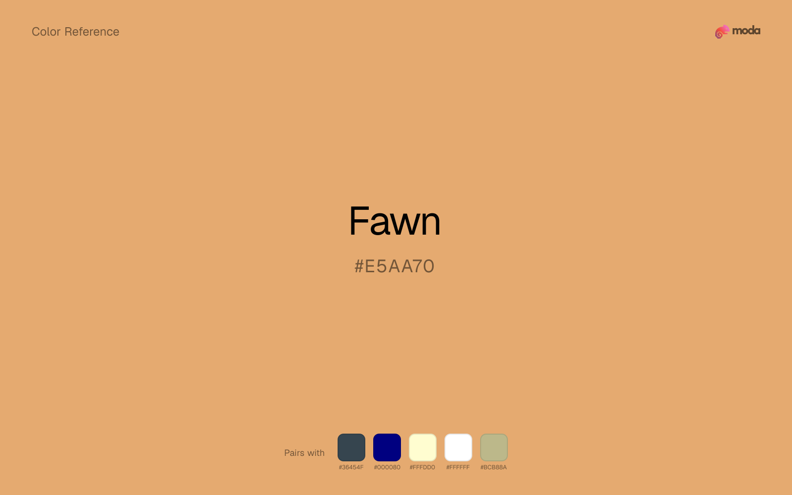
#E5AA70
RGB
229, 170, 112
HSL
30°, 69%, 67%
HSV
30°, 51%, 90%
Animal-soft brown with peach in its coat — gentle, outdoorsy, and a little storybook. #E5AA70 suggests hide and hay without harsh contrast. It is the friendly edge of the brown family.
Best for
Internal tools, team dashboards, and knowledge-base layouts.
Accessibility
Check contrast before using fawn for text-heavy layouts, especially on low-contrast backgrounds.
How does fawn compare to nearby colors?
What is the difference between fawn and khaki?
Fawn (#E5AA70) feels more signal-like on screen, while Khaki (#C3B091) pushes the family in the opposite direction. Fawn pushes the palette toward sharper emphasis, while Khaki leaves more room for typography, photography, or adjacent accents. Use fawn when you want more pigment and immediate screen energy, and khaki when the same family should feel calmer or more spreadable.
What color is fawn?
Fawn appears in children's illustration palettes, equestrian and countryside branding, and warm cosmetics shades.
What is the hex code for fawn?
| Format | Value |
|---|---|
| HEX | #E5AA70 |
| RGB | rgb(229, 170, 112) |
| HSL | hsl(30°, 69%, 67%) |
| HSV / HSB | hsv(30°, 51%, 90%) |
| CMYK (approx.) | cmyk(0%, 26%, 51%, 10%) |
Convert Fawn to other color formats
Open the color converter with Fawn (#E5AA70) prefilled to copy RGB, HSL, HSV, CMYK, or OKLCH values.
Convert Fawn in the color converter →What does fawn mean in design?
Fawn is often associated with innocence, approachability, and pastoral calm. Next to caramel it is typically less golden-yellow; next to chestnut it is much paler and less red.
How do I use fawn in code?
| CSS (hex) | color: #E5AA70; |
| CSS (rgb) | color: rgb(229, 170, 112); |
| CSS (hsl) | color: hsl(30, 69%, 67%); |
| RGB % | rgb(90%, 67%, 44%) |
| Tailwind | text-[#E5AA70] |
| SwiftUI | Color(red: 0.898, green: 0.667, blue: 0.439) |
| UIKit | UIColor(red: 0.898, green: 0.667, blue: 0.439, alpha: 1.0) |
| Android | Color.rgb(229, 170, 112) |
| Compose | Color(0xFFE5AA70) |
| Web Safe | #CC9966 |
Is fawn accessible?
| Combination | Ratio | AA | AA lg | AAA | AAA lg | UI |
|---|---|---|---|---|---|---|
| AaWhite text on this color | 2.04:1 | ✗ | ✗ | ✗ | ✗ | ✗ |
| AaBlack text on this color | 10.32:1 | ✓ | ✓ | ✓ | ✓ | ✓ |
| AaThis color as text on white | 2.04:1 | ✗ | ✗ | ✗ | ✗ | ✗ |
| AaThis color as text on black | 10.32:1 | ✓ | ✓ | ✓ | ✓ | ✓ |
WCAG 2.1: AA normal ≥ 4.5:1, AA large text ≥ 3:1, AAA normal ≥ 7:1, AAA large ≥ 4.5:1, UI components ≥ 3:1.
How does fawn look with color blindness?
Simulated appearance for common types of color vision deficiency. Actual perception varies by individual.
What colors go with fawn
Charcoal balances fawn by turning the palette into a usable light-dark system rather than a field of soft midtones.
With fawn, navy blue adds a cleaner dark note than black and keeps the pair usable in more modern systems.
Cream helps fawn read warmer, softer, and less screen-hard than it would beside pure white.
White is a reliable partner for fawn when the goal is clarity: it adds separation, preserves brightness, and avoids extra mood-shifting.
Sage Green helps fawn feel more complete in practice because the pairing combines warm wood qualities with sage and moss support instead of leaving the source color to do every job alone.
What colors clash with fawn
Neon Green is so artificial beside fawn that the source color starts to look accidental instead of rooted and deliberate.
Magenta pushes fawn toward a nightclub or cosmetic register that is hard to square with calmer editorial or product work.
Cyan redirects fawn toward a more technical, backlit interpretation, which is risky when the goal is warmth, polish, or print-minded editorial work.
Pastel Pink can make fawn feel softer and sweeter than intended, which weakens palettes that rely on gravity or structure.
How should I use fawn in design?
- •Fawn works as a primary accent or highlight color — bright enough to draw attention but check contrast carefully if using it for text on white backgrounds.
- •Fawn leans warm, so cool counterparts like navy, teal, or slate create the cleanest contrast. For a softer, tonal look, stay within neighboring warm hues and let value differences do the work.
- •Fawn fits food packaging, hospitality branding, and editorial layouts where natural warmth and material texture are more important than synthetic brightness.
What are good fawn palettes?
Fresh canvas
Internal tools, team dashboards, and knowledge-base layouts.
Autumn light
Brand guidelines, design systems, and visual identity documents.
Design with fawn in Moda
Create a presentation or document using fawnas your accent color. Moda's AI applies your color palette automatically.
Create a design with fawn →What are the shades and tints of fawn?
Shades (darker)
Tints (lighter)
Tones (desaturated)
Hue variations
What are the color harmonies for fawn?
Harmonies are calculated from the base swatch. When a harmony matches a named color page, it links there; otherwise it appears here as a computed reference swatch.
Similar colors
Tan
Tan sits close to fawn on the wheel, but it carries less chroma, which makes it better for steadier surfaces and calmer long-form use than for sharper emphasis and quicker visual pickup.
Khaki
Khaki is nearly adjacent to fawn in hue; what separates them is intensity, with khaki reading dustier and easier to extend across a layout.
Tangerine
Tangerine sits close to fawn on the wheel, but it carries more pigment pressure, which makes it better for faster emphasis and brighter accent work than for broader coverage and quieter supporting roles.
Caramel
Caramel tracks close to fawn in hue, but the value shift changes where each one earns its place: caramel is easier to use for backgrounds, tints, and softer supporting areas, while fawn holds onto accents, stronger hierarchy, and firmer structure.
Coral
Coral sits close to fawn on the wheel, but it carries more pigment pressure, which makes it better for faster emphasis and brighter accent work than for broader coverage and quieter supporting roles.
Frequently asked questions
What is the hex code for fawn?
The hex code for fawn is #E5AA70. In RGB, that's 229 red, 170 green, and 112 blue. The approximate CMYK equivalent is 0% cyan, 26% magenta, 51% yellow, and 10% key (black).
Is fawn a warm or cool color?
Fawn sits on the warm side of the palette, so it pairs easily with other warm tones and becomes more energetic when you place it against cooler blues or blue-grays.
Is fawn better for accents, structure, or surfaces?
Fawn sits in the usable middle: strong enough to anchor a section or call attention to a key moment, but calm enough to support a broader system when the surrounding values are well managed.
Where does fawn work best in a layout?
Fawn sits in the middle of the spectrum in a useful way: strong enough for emphasis, but controlled enough to support a broader brand or presentation system when the contrast is handled well.
Is fawn accessible?
Fawn works better with dark text than white text. Black text reaches 10.32:1 contrast on the swatch, which makes the color more usable as a background or highlight surface than as a dark panel.
More brown colors
Keep exploring color resources
All color pages
Browse the full library of color references, pairings, and palettes.
Brown colors
Compare fawn with other brown tones.
Neutral colors
Explore nearby color families to build stronger palettes and contrasts.
Orange colors
Explore nearby color families to build stronger palettes and contrasts.
Red colors
Explore nearby color families to build stronger palettes and contrasts.
Last updated April 6, 2026
Color values are computed from the listed hex code using standard conversion formulas. RGB, HSL, and HSV are exact screen-ready conversions. CMYK is an approximate on-screen reference, not a press-ready print specification. Pairings, palettes, and use-case guidance are heuristic recommendations derived from color relationships, contrast behavior, and common presentation, document, and UI patterns.