Using White in design
HEX
#FFFFFF
RGB
255, 255, 255
HSL
0°, 0%, 100%
HSV
0°, 0%, 100%
White (#FFFFFF) is the lightest color and the default background in most design systems. It provides maximum contrast for dark text and creates breathing room in layouts.
Best for
Mobile app interfaces, onboarding screens, and light-mode UI themes.
Accessibility
Check contrast before using white for text-heavy layouts, especially on low-contrast backgrounds.
How does white compare to nearby colors?
What is the difference between white and snow?
Snow (#FFFAFA) carries more pigment punch than White (#FFFFFF), so the pair separates by finish as much as hue. White behaves more like a system color and Snow more like a spotlight, so the decision changes how busy the layout feels. Choose white when the family should feel quieter, more material, or easier to live with across a full layout; use snow when you need more punch.
What color is white?
White is the foundation of clean, modern design. It is the default background for documents, slides, and web pages. In color theory, white reflects all wavelengths of visible light.
What is the hex code for white?
| Format | Value |
|---|---|
| HEX | #FFFFFF |
| RGB | rgb(255, 255, 255) |
| HSL | hsl(0°, 0%, 100%) |
| HSV / HSB | hsv(0°, 0%, 100%) |
| CMYK (approx.) | cmyk(0%, 0%, 0%, 0%) |
Convert White to other color formats
Open the color converter with White (#FFFFFF) prefilled to copy RGB, HSL, HSV, CMYK, or OKLCH values.
Convert White in the color converter →What does white mean in design?
White is often associated with clarity, cleanliness, and blank-slate possibility. In editorial systems it can feel modern and disciplined; in product UI it can feel efficient or sterile depending on how much breathing room and contrast support it gets. Next to snow, alabaster, or cream, pure white tends to look more clinical and less atmospheric, which is useful when you want precision rather than softness.
How do I use white in code?
| CSS (hex) | color: #FFFFFF; |
| CSS (rgb) | color: rgb(255, 255, 255); |
| CSS (hsl) | color: hsl(0, 0%, 100%); |
| RGB % | rgb(100%, 100%, 100%) |
| Tailwind | text-[#FFFFFF] |
| SwiftUI | Color(red: 1.000, green: 1.000, blue: 1.000) |
| UIKit | UIColor(red: 1.000, green: 1.000, blue: 1.000, alpha: 1.0) |
| Android | Color.rgb(255, 255, 255) |
| Compose | Color(0xFFFFFFFF) |
| Web Safe | #FFFFFF |
Is white accessible?
| Combination | Ratio | AA | AA lg | AAA | AAA lg | UI |
|---|---|---|---|---|---|---|
| AaWhite text on this color | 1:1 | ✗ | ✗ | ✗ | ✗ | ✗ |
| AaBlack text on this color | 21:1 | ✓ | ✓ | ✓ | ✓ | ✓ |
| AaThis color as text on white | 1:1 | ✗ | ✗ | ✗ | ✗ | ✗ |
| AaThis color as text on black | 21:1 | ✓ | ✓ | ✓ | ✓ | ✓ |
WCAG 2.1: AA normal ≥ 4.5:1, AA large text ≥ 3:1, AAA normal ≥ 7:1, AAA large ≥ 4.5:1, UI components ≥ 3:1.
How does white look with color blindness?
Simulated appearance for common types of color vision deficiency. Actual perception varies by individual.
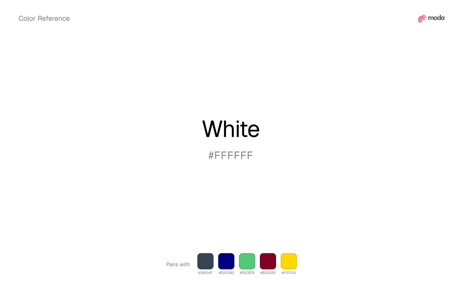
What colors go with white
Charcoal gives white the dark frame it is missing, so pale surfaces do not drift into a washed-out page.
Navy blue makes white easier to organize in real layouts by separating the bright surface role from the dark-value role.
Emerald changes how white comes across: more product UI, sustainability, and general brand work in mood, and less likely to feel isolated or unfinished.
What colors clash with white
Magenta injects more cosmetic or nightlife energy than white can comfortably absorb, so restrained neutral palettes start to feel accidental.
Light Gray sits too close to white in value, so the palette can wash out before it ever establishes a clear hierarchy.
How should I use white in design?
- •White space is a design tool — generous margins and padding make content feel more premium and easier to scan.
- •Use white as your primary background and let accent colors do the work. Resist the urge to fill every white area.
- •On dark-background slides, use white text for maximum readability. Cream or off-white can feel softer.
What are good white palettes?
Vivid clarity
Mobile app interfaces, onboarding screens, and light-mode UI themes.
Design with white in Moda
Create a presentation or document using whiteas your accent color. Moda's AI applies your color palette automatically.
Create a design with white →What are the shades and tints of white?
Shades (darker)
Tints (lighter)
Tones (desaturated)
Similar colors
Snow
Snow does what white cannot: it nudges the palette toward a warm mood while still behaving like a supporting color.
Light Gray
Light Gray stays neutral like white, yet the lighter-or-darker move changes how much hierarchy the palette gets before any accent color enters.
Off-White
Off-White does what white cannot: it nudges the palette toward a warm mood while still behaving like a supporting color.
Alabaster
Alabaster does what white cannot: it nudges the palette toward a warm mood while still behaving like a supporting color.
Silver
Silver stays neutral like white, yet the lighter-or-darker move changes how much hierarchy the palette gets before any accent color enters.
Frequently asked questions
What is the hex code for white?
The hex code for white is #FFFFFF. In RGB, that's 255 red, 255 green, and 255 blue. The approximate CMYK equivalent is 0% cyan, 0% magenta, 0% yellow, and 0% key (black).
Is white a warm or cool color?
White behaves like a neutral with very little chromatic push, so surrounding colors do more to set the palette temperature than the swatch itself.
Is white better for backgrounds or accents?
White is usually stronger as a background, card tint, or section surface than as a sharp accent. It works best when darker typography or controls can sit on top and do the hierarchy work.
How should I use white in a design?
White is light enough that it belongs on surfaces rather than in small text. Use it for backgrounds, soft section breaks, or gentle table shading and keep dark typography on top.
Can I use white for text or backgrounds?
White works better with dark text than white text. Black text reaches 21:1 contrast on the swatch, which makes the color more usable as a background or highlight surface than as a dark panel.
More neutral colors
Keep exploring color resources
All color pages
Browse the full library of color references, pairings, and palettes.
Neutral colors
Compare white with other neutral tones.
Blue colors
Explore nearby color families to build stronger palettes and contrasts.
Brown colors
Explore nearby color families to build stronger palettes and contrasts.
Green colors
Explore nearby color families to build stronger palettes and contrasts.
Last updated April 6, 2026
Color values are computed from the listed hex code using standard conversion formulas. RGB, HSL, and HSV are exact screen-ready conversions. CMYK is an approximate on-screen reference, not a press-ready print specification. Pairings, palettes, and use-case guidance are heuristic recommendations derived from color relationships, contrast behavior, and common presentation, document, and UI patterns.