Where Alabaster works best
HEX
#F2F0EB
RGB
242, 240, 235
HSL
43°, 21%, 94%
HSV
43°, 3%, 95%
Fine-grained and softly mineral, alabaster suggests carved stone rather than painted drywall. #EDEADE gives whitespace a sense of craft and permanence. The warmth is gentle — more "aged plaster" than "buttercream."
Best for
Trade show graphics, signage, and booth displays.
Compare with
Accessibility
Check contrast before using alabaster for text-heavy layouts, especially on low-contrast backgrounds.
How does alabaster compare to nearby colors?
What is the difference between alabaster and platinum?
Alabaster (#F2F0EB) and Platinum (#E5E4E2) are close enough that the split is more about finish than headline contrast: Alabaster feels more paper, plaster, and interface chrome, while Platinum reads more foil warmth. Alabaster and Platinum are close enough to substitute for each other, but they do not create the same supporting cast once typography, photography, and neutrals are added. Begin with alabaster when the family needs its current undertone and surface character; keep platinum for the nearby alternative that shifts the mood without leaving the same hue neighborhood.
What color is alabaster?
Alabaster is a translucent mineral historically carved for sculpture and vessels. As a color name it signals pale, creamy neutrals in luxury packaging and interiors.
What is the hex code for alabaster?
| Format | Value |
|---|---|
| HEX | #F2F0EB |
| RGB | rgb(242, 240, 235) |
| HSL | hsl(43°, 21%, 94%) |
| HSV / HSB | hsv(43°, 3%, 95%) |
| CMYK (approx.) | cmyk(0%, 1%, 3%, 5%) |
Convert Alabaster to other color formats
Open the color converter with Alabaster (#F2F0EB) prefilled to copy RGB, HSL, HSV, CMYK, or OKLCH values.
Convert Alabaster in the color converter →What does alabaster mean in design?
Alabaster is often associated with refinement, delicacy, and timeless craft. Compared with off-white it tends to read as more stone-like and creamy; next to snow it is usually less pink-tinged.
How do I use alabaster in code?
| CSS (hex) | color: #F2F0EB; |
| CSS (rgb) | color: rgb(242, 240, 235); |
| CSS (hsl) | color: hsl(43, 21%, 94%); |
| RGB % | rgb(95%, 94%, 92%) |
| Tailwind | text-[#F2F0EB] |
| SwiftUI | Color(red: 0.949, green: 0.941, blue: 0.922) |
| UIKit | UIColor(red: 0.949, green: 0.941, blue: 0.922, alpha: 1.0) |
| Android | Color.rgb(242, 240, 235) |
| Compose | Color(0xFFF2F0EB) |
| Web Safe | #FFFFFF |
Is alabaster accessible?
| Combination | Ratio | AA | AA lg | AAA | AAA lg | UI |
|---|---|---|---|---|---|---|
| AaWhite text on this color | 1.14:1 | ✗ | ✗ | ✗ | ✗ | ✗ |
| AaBlack text on this color | 18.44:1 | ✓ | ✓ | ✓ | ✓ | ✓ |
| AaThis color as text on white | 1.14:1 | ✗ | ✗ | ✗ | ✗ | ✗ |
| AaThis color as text on black | 18.44:1 | ✓ | ✓ | ✓ | ✓ | ✓ |
WCAG 2.1: AA normal ≥ 4.5:1, AA large text ≥ 3:1, AAA normal ≥ 7:1, AAA large ≥ 4.5:1, UI components ≥ 3:1.
How does alabaster look with color blindness?
Simulated appearance for common types of color vision deficiency. Actual perception varies by individual.
What colors go with alabaster
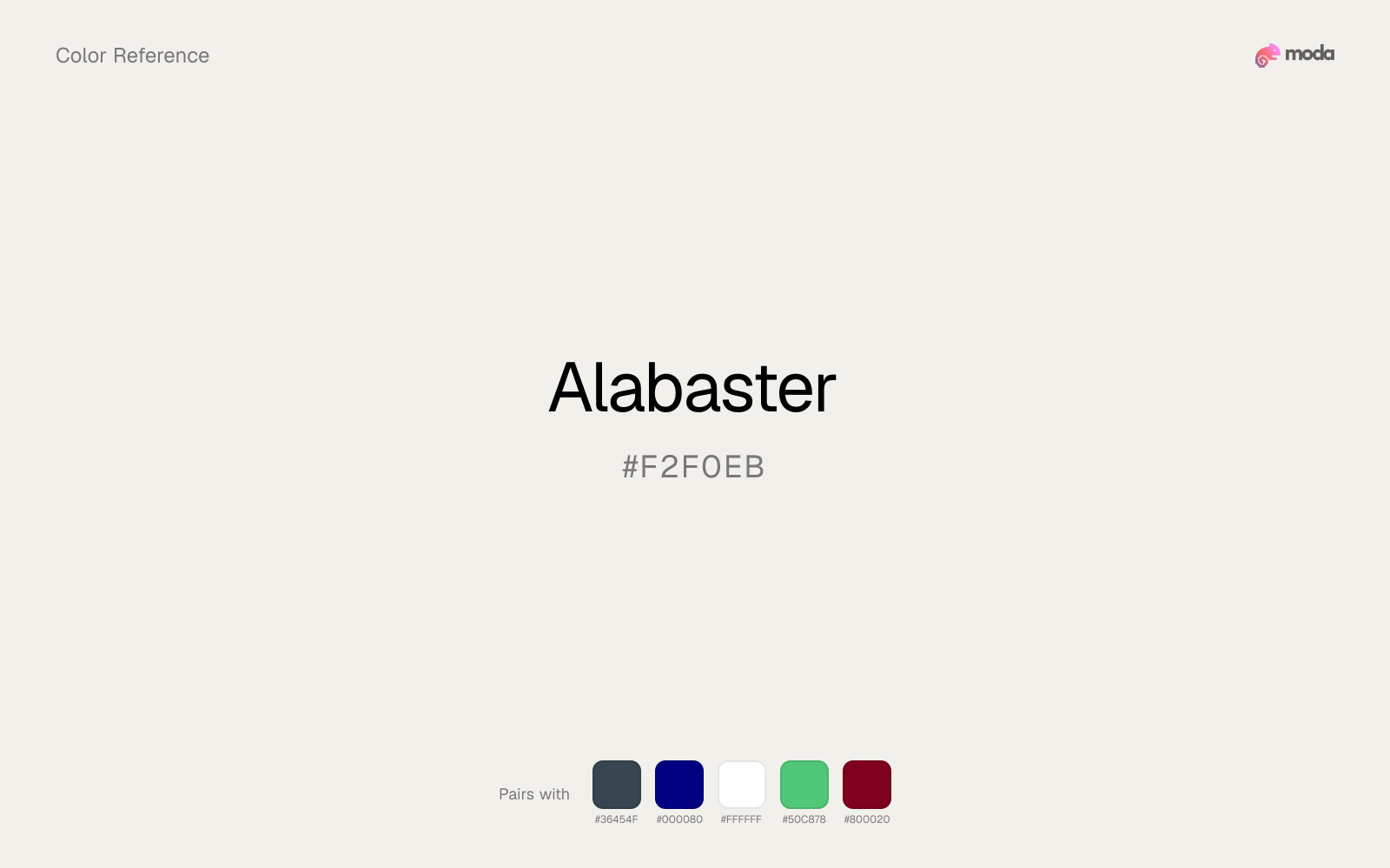
Because alabaster behaves like a tint, charcoal supplies the typography, dividers, and anchors that make the palette feel finished.
Navy blue gives alabaster a cooler structural note, which helps the palette feel intentional rather than merely restrained.
White is a reliable partner for alabaster when the goal is clarity: it adds separation, preserves brightness, and avoids extra mood-shifting.
What colors clash with alabaster
Magenta remaps alabaster too aggressively, dragging it away from inviting editorial surfaces and into a brighter, more performative palette.
With alabaster, cyan introduces a colder display-driven cast that strips away some of the source color's tactile character.
Light Gray sits too close to alabaster in value, so the palette can wash out before it ever establishes a clear hierarchy.
How should I use alabaster in design?
- •Use alabaster as a near-white alternative for backgrounds and paper-like surfaces where you want a hint of color without any visual weight.
- •Cool neutrals like charcoal and slate sharpen alabaster's warm character, while warm companions like cream and gold amplify its inviting quality.
- •Alabaster's lightness makes it a good candidate for email backgrounds, slide canvases, and page sections where you want atmosphere, not distraction.
What are good alabaster palettes?
Sunlit warmth
Startup branding, pitch materials, and product landing pages.
Design with alabaster in Moda
Create a presentation or document using alabasteras your accent color. Moda's AI applies your color palette automatically.
Create a design with alabaster →What are the shades and tints of alabaster?
Shades (darker)
Tints (lighter)
Tones (desaturated)
Hue variations
What are the color harmonies for alabaster?
Harmonies are calculated from the base swatch. When a harmony matches a named color page, it links there; otherwise it appears here as a computed reference swatch.
Similar colors
Off-White
Off-White is nearly adjacent to alabaster in hue; what separates them is intensity, with off-white reading cleaner and more assertive.
Platinum
Platinum sits close to alabaster on the wheel, but it carries less chroma, which makes it better for steadier surfaces and calmer long-form use than for sharper emphasis and quicker visual pickup.
Champagne
Champagne sits close to alabaster on the wheel, but it carries more pigment pressure, which makes it better for faster emphasis and brighter accent work than for broader coverage and quieter supporting roles.
Beige
Beige sits close to alabaster on the wheel, but it carries more pigment pressure, which makes it better for faster emphasis and brighter accent work than for broader coverage and quieter supporting roles.
Ivory
Ivory is nearly adjacent to alabaster in hue; what separates them is intensity, with ivory reading cleaner and more assertive.
Frequently asked questions
What is the hex code for alabaster?
The hex code for alabaster is #F2F0EB. In RGB, that's 242 red, 240 green, and 235 blue. The approximate CMYK equivalent is 0% cyan, 1% magenta, 3% yellow, and 5% key (black).
Is alabaster a warm or cool color?
Alabaster reads as warm. It feels most natural with creams, golds, rusts, and other warm accents, while cooler partners like navy or teal create sharper contrast.
Is alabaster better for backgrounds or accents?
Alabaster is usually stronger as a background, card tint, or section surface than as a sharp accent. It works best when darker typography or controls can sit on top and do the hierarchy work.
How should I use alabaster in a design?
Alabaster is light enough that it belongs on surfaces rather than in small text. Use it for backgrounds, soft section breaks, or gentle table shading and keep dark typography on top.
Can I use alabaster for text or backgrounds?
Alabaster works better with dark text than white text. Black text reaches 18.44:1 contrast on the swatch, which makes the color more usable as a background or highlight surface than as a dark panel.
More neutral colors
Keep exploring color resources
All color pages
Browse the full library of color references, pairings, and palettes.
Neutral colors
Compare alabaster with other neutral tones.
Blue colors
Explore nearby color families to build stronger palettes and contrasts.
Brown colors
Explore nearby color families to build stronger palettes and contrasts.
Green colors
Explore nearby color families to build stronger palettes and contrasts.
Last updated April 6, 2026
Color values are computed from the listed hex code using standard conversion formulas. RGB, HSL, and HSV are exact screen-ready conversions. CMYK is an approximate on-screen reference, not a press-ready print specification. Pairings, palettes, and use-case guidance are heuristic recommendations derived from color relationships, contrast behavior, and common presentation, document, and UI patterns.