Using Ivory in design
HEX
#FFFFF0
RGB
255, 255, 240
HSL
60°, 100%, 97%
HSV
60°, 6%, 100%
Ivory (#FFFFF0) is a warm, yellowish off-white that feels softer and more luxurious than pure white. It is a staple in wedding design, editorial layouts, and premium branding.
Best for
Event branding, newsletters, and customer-facing web pages.
Accessibility
Check contrast before using ivory for text-heavy layouts, especially on low-contrast backgrounds.
How does ivory compare to nearby colors?
What is the difference between ivory and beige?
Beige (#F5F5DC) carries less pigment punch than Ivory (#FFFFF0), so the pair separates by finish as much as hue. Ivory reads faster on screen, so it changes the palette from steady to attention-seeking more quickly than Beige does. Choose ivory when the color needs to register quickly and act like the headline accent; keep beige when the rest of the layout needs a quieter companion.
What color is ivory?
Ivory is named after the material from elephant tusks and has long been associated with weddings, formal events, and luxury. In bridal fashion, ivory is the most popular alternative to pure white, offering a warmer, more flattering tone.
What is the hex code for ivory?
| Format | Value |
|---|---|
| HEX | #FFFFF0 |
| RGB | rgb(255, 255, 240) |
| HSL | hsl(60°, 100%, 97%) |
| HSV / HSB | hsv(60°, 6%, 100%) |
| CMYK (approx.) | cmyk(0%, 0%, 6%, 0%) |
Convert Ivory to other color formats
Open the color converter with Ivory (#FFFFF0) prefilled to copy RGB, HSL, HSV, CMYK, or OKLCH values.
Convert Ivory in the color converter →What does ivory mean in design?
Ivory communicates elegance, purity, and quiet luxury. Unlike stark white, ivory feels warmer and more human — it is the color of aged paper, fine porcelain, and wedding gowns. In design, ivory signals taste and refinement.
How do I use ivory in code?
| CSS (hex) | color: #FFFFF0; |
| CSS (rgb) | color: rgb(255, 255, 240); |
| CSS (hsl) | color: hsl(60, 100%, 97%); |
| RGB % | rgb(100%, 100%, 94%) |
| Tailwind | text-[#FFFFF0] |
| SwiftUI | Color(red: 1.000, green: 1.000, blue: 0.941) |
| UIKit | UIColor(red: 1.000, green: 1.000, blue: 0.941, alpha: 1.0) |
| Android | Color.rgb(255, 255, 240) |
| Compose | Color(0xFFFFFFF0) |
| Web Safe | #FFFFFF |
Is ivory accessible?
| Combination | Ratio | AA | AA lg | AAA | AAA lg | UI |
|---|---|---|---|---|---|---|
| AaWhite text on this color | 1.01:1 | ✗ | ✗ | ✗ | ✗ | ✗ |
| AaBlack text on this color | 20.81:1 | ✓ | ✓ | ✓ | ✓ | ✓ |
| AaThis color as text on white | 1.01:1 | ✗ | ✗ | ✗ | ✗ | ✗ |
| AaThis color as text on black | 20.81:1 | ✓ | ✓ | ✓ | ✓ | ✓ |
WCAG 2.1: AA normal ≥ 4.5:1, AA large text ≥ 3:1, AAA normal ≥ 7:1, AAA large ≥ 4.5:1, UI components ≥ 3:1.
How does ivory look with color blindness?
Simulated appearance for common types of color vision deficiency. Actual perception varies by individual.
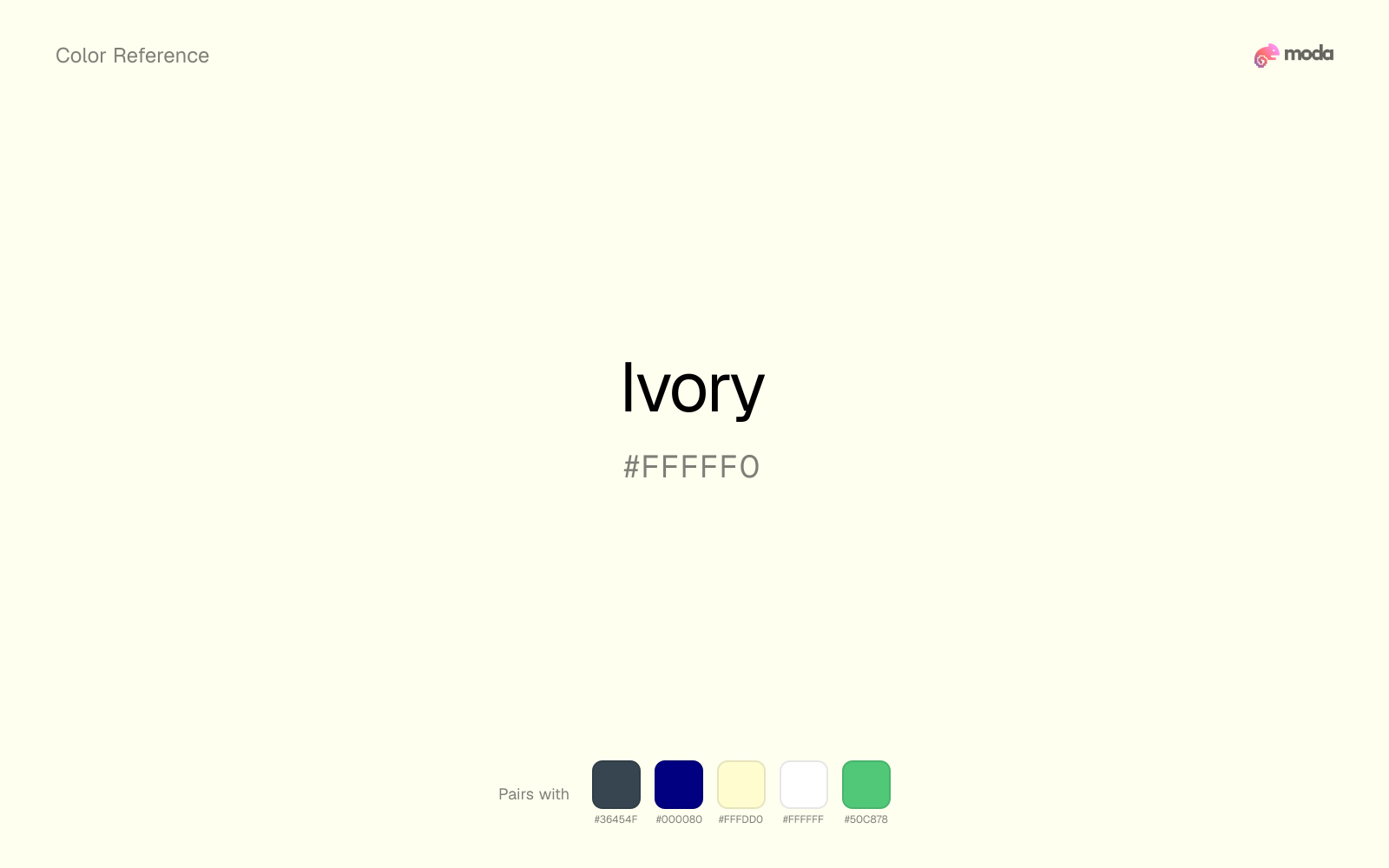
What colors go with ivory
Charcoal keeps very light ivory from disappearing into the canvas and adds the structure needed for documents, interfaces, and tables.
Beside ivory, navy blue adds a specific dark hue that makes the neutral feel less default and more authored.
Cream takes the hard digital edge off ivory and makes the color feel more printed, paper-backed, and approachable.
What colors clash with ivory
Neon Green makes ivory feel cheaper and less material, which is exactly the opposite of what these grounded colors usually contribute.
Magenta pushes ivory toward a nightclub or cosmetic register that is hard to square with calmer editorial or product work.
With ivory, cyan introduces a colder display-driven cast that strips away some of the source color's tactile character.
Light Gray sits too close to ivory in value, so the palette can wash out before it ever establishes a clear hierarchy.
How should I use ivory in design?
- •Use ivory instead of white for backgrounds when you want a warmer, more editorial feel — it reduces harshness.
- •Pair ivory with gold and burgundy for a classic luxury palette.
- •Ivory works exceptionally well for typography backgrounds in long-form content — it is easier on the eyes than pure white.
What are good ivory palettes?
Design with ivory in Moda
Create a presentation or document using ivoryas your accent color. Moda's AI applies your color palette automatically.
Create a design with ivory →What are the shades and tints of ivory?
Shades (darker)
Tints (lighter)
Tones (desaturated)
Hue variations
What are the color harmonies for ivory?
Harmonies are calculated from the base swatch. When a harmony matches a named color page, it links there; otherwise it appears here as a computed reference swatch.
Similar colors
Cream
Cream stays very close to ivory in hue, but it lands darker, which makes it better for headlines, anchors, and darker sections than for lighter surfaces and more open applications.
Beige
Beige stays very close to ivory in hue, but it lands darker, which makes it better for headlines, anchors, and darker sections than for lighter surfaces and more open applications.
Off-White
Off-White is nearly adjacent to ivory in hue; what separates them is intensity, with off-white reading dustier and easier to extend across a layout.
Alabaster
Alabaster is nearly adjacent to ivory in hue; what separates them is intensity, with alabaster reading dustier and easier to extend across a layout.
Champagne
Champagne is useful when ivory is the right weight but the wrong mood: the swap changes temperature and finish more than contrast.
Frequently asked questions
What is the hex code for ivory?
The hex code for ivory is #FFFFF0. In RGB, that's 255 red, 255 green, and 240 blue. The approximate CMYK equivalent is 0% cyan, 0% magenta, 6% yellow, and 0% key (black).
Is ivory a warm or cool color?
Ivory sits near the warm-cool boundary but tips warm, which makes the surrounding neutrals especially important in deciding how the palette finally reads.
Is ivory better for backgrounds or accents?
Ivory is usually stronger as a background, card tint, or section surface than as a sharp accent. It works best when darker typography or controls can sit on top and do the hierarchy work.
How should I use ivory in a design?
Ivory is light enough that it belongs on surfaces rather than in small text. Use it for backgrounds, soft section breaks, or gentle table shading and keep dark typography on top.
Can I use ivory for text or backgrounds?
Ivory works better with dark text than white text. Black text reaches 20.81:1 contrast on the swatch, which makes the color more usable as a background or highlight surface than as a dark panel.
More neutral colors
Keep exploring color resources
All color pages
Browse the full library of color references, pairings, and palettes.
Neutral colors
Compare ivory with other neutral tones.
Blue colors
Explore nearby color families to build stronger palettes and contrasts.
Brown colors
Explore nearby color families to build stronger palettes and contrasts.
Green colors
Explore nearby color families to build stronger palettes and contrasts.
Last updated April 6, 2026
Color values are computed from the listed hex code using standard conversion formulas. RGB, HSL, and HSV are exact screen-ready conversions. CMYK is an approximate on-screen reference, not a press-ready print specification. Pairings, palettes, and use-case guidance are heuristic recommendations derived from color relationships, contrast behavior, and common presentation, document, and UI patterns.