What color is Emerald?
HEX
#50C878
RGB
80, 200, 120
HSL
140°, 52%, 55%
HSV
140°, 60%, 78%
Emerald (#50C878) is a bright, vivid green inspired by the gemstone. It conveys luxury, vitality, and growth — making it a strong choice for brands in finance, sustainability, and premium consumer products.
Best for
Product launches, promotional banners, and e-commerce storefronts.
Compare with
Accessibility
Check contrast before using emerald for text-heavy layouts, especially on low-contrast backgrounds.
How does emerald compare to nearby colors?
What is the difference between emerald and spring green?
Emerald (#50C878) looks dustier and more restrained than Spring Green (#00FF7F) when the two are shown together. Emerald behaves more like a system color and Spring Green more like a spotlight, so the decision changes how busy the layout feels. Reach for emerald when you want less chroma pressure on the page; keep spring green for the version that announces itself more readily.
What color is emerald?
Emerald was Pantone's Color of the Year in 2013. It sits between the trust of blue-greens and the energy of pure green, giving it a premium quality that pure green lacks.
What is the hex code for emerald?
| Format | Value |
|---|---|
| HEX | #50C878 |
| RGB | rgb(80, 200, 120) |
| HSL | hsl(140°, 52%, 55%) |
| HSV / HSB | hsv(140°, 60%, 78%) |
| CMYK (approx.) | cmyk(60%, 0%, 40%, 22%) |
Convert Emerald to other color formats
Open the color converter with Emerald (#50C878) prefilled to copy RGB, HSL, HSV, CMYK, or OKLCH values.
Convert Emerald in the color converter →What does emerald mean in design?
Emerald communicates prosperity, momentum, and premium freshness. It carries the positive associations of green but feels more polished than a standard brand green, which makes it useful for finance, hospitality, and high-end consumer branding.
How do I use emerald in code?
| CSS (hex) | color: #50C878; |
| CSS (rgb) | color: rgb(80, 200, 120); |
| CSS (hsl) | color: hsl(140, 52%, 55%); |
| RGB % | rgb(31%, 78%, 47%) |
| Tailwind | text-[#50C878] |
| SwiftUI | Color(red: 0.314, green: 0.784, blue: 0.471) |
| UIKit | UIColor(red: 0.314, green: 0.784, blue: 0.471, alpha: 1.0) |
| Android | Color.rgb(80, 200, 120) |
| Compose | Color(0xFF50C878) |
| Web Safe | #66CC66 |
Is emerald accessible?
| Combination | Ratio | AA | AA lg | AAA | AAA lg | UI |
|---|---|---|---|---|---|---|
| AaWhite text on this color | 2.13:1 | ✗ | ✗ | ✗ | ✗ | ✗ |
| AaBlack text on this color | 9.87:1 | ✓ | ✓ | ✓ | ✓ | ✓ |
| AaThis color as text on white | 2.13:1 | ✗ | ✗ | ✗ | ✗ | ✗ |
| AaThis color as text on black | 9.87:1 | ✓ | ✓ | ✓ | ✓ | ✓ |
WCAG 2.1: AA normal ≥ 4.5:1, AA large text ≥ 3:1, AAA normal ≥ 7:1, AAA large ≥ 4.5:1, UI components ≥ 3:1.
How does emerald look with color blindness?
Simulated appearance for common types of color vision deficiency. Actual perception varies by individual.
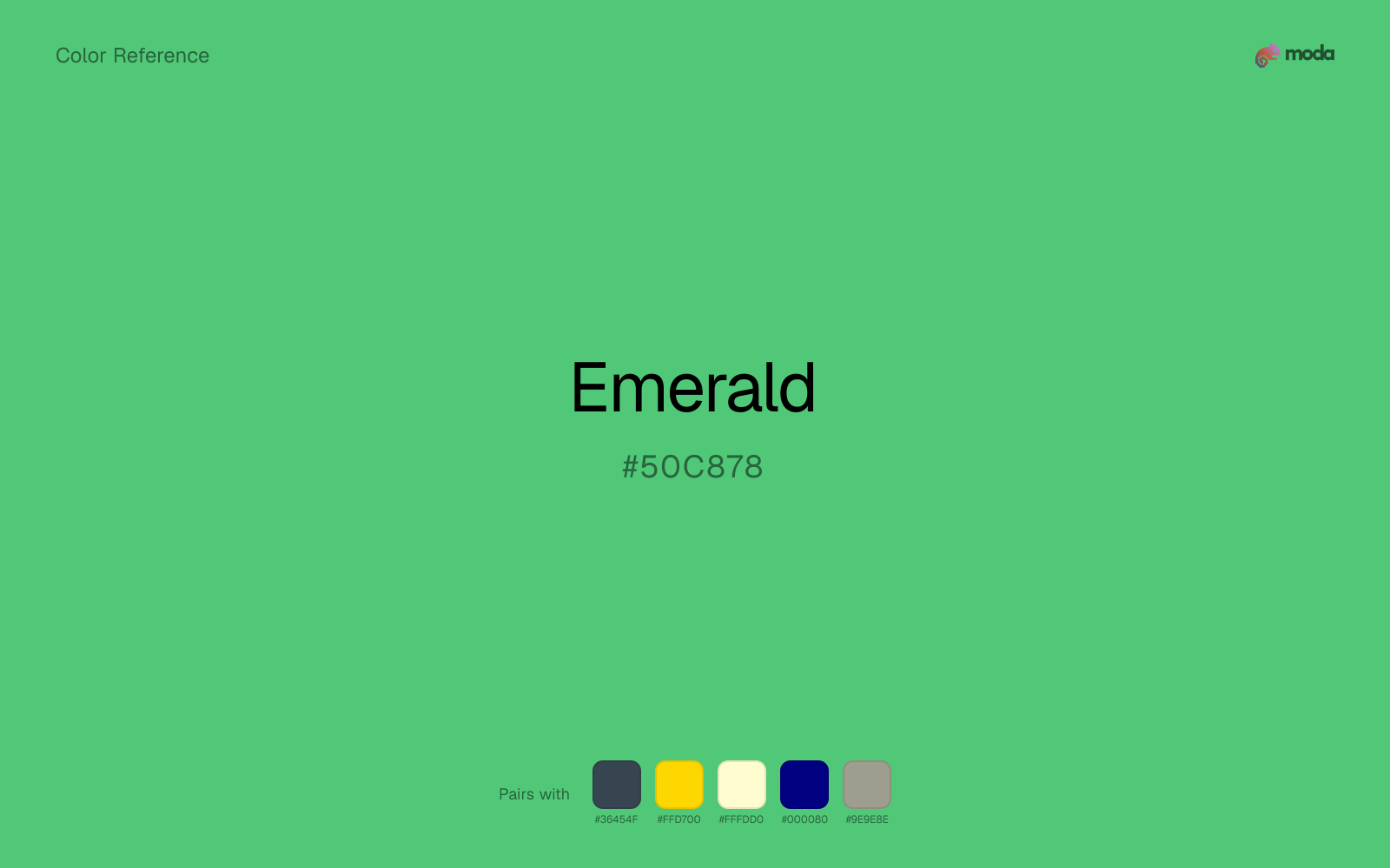
What colors go with emerald
Pairing emerald with charcoal adds useful depth while keeping the palette flexible for interfaces, decks, and editorial layouts.
Gold warms emerald enough to keep the palette from feeling chilly or overly technical, while still reading intentional rather than decorative-for-its-own-sake.
Cream helps emerald read warmer, softer, and less screen-hard than it would beside pure white.
What colors clash with emerald
With emerald, Neon Green pushes the work toward novelty or screen-effect territory faster than most brand or editorial systems can tolerate.
With emerald, magenta introduces a second emotional story instead of reinforcing the first one, so the palette can feel internally split.
How should I use emerald in design?
- •Emerald works as a primary brand color for companies that want to signal growth and premium quality simultaneously.
- •Pair emerald with white and gold for a luxurious palette, or with charcoal and cream for a more grounded look.
- •Use emerald for key metrics and positive indicators in data presentations — it reads as "positive" more clearly than other greens.
What are good emerald palettes?
Vivid clarity
Product launches, promotional banners, and e-commerce storefronts.
Design with emerald in Moda
Create a presentation or document using emeraldas your accent color. Moda's AI applies your color palette automatically.
Create a design with emerald →What are the shades and tints of emerald?
Shades (darker)
Tints (lighter)
Tones (desaturated)
Hue variations
What are the color harmonies for emerald?
Harmonies are calculated from the base swatch. When a harmony matches a named color page, it links there; otherwise it appears here as a computed reference swatch.
Similar colors
Lime Green
Lime Green keeps roughly the same visual weight as emerald but changes the undertone story, which is often enough to move a palette from warmer and tactile to cooler and more technical, or the reverse.
Spring Green
Spring Green is nearly adjacent to emerald in hue; what separates them is intensity, with spring green reading cleaner and more assertive.
Light Green
Light Green is close enough to emerald to keep the palette cohesive, yet the lighter-darker shift still decides whether the family behaves more like atmosphere or more like structure.
Seafoam
Seafoam tracks close to emerald in hue, but the value shift changes where each one earns its place: seafoam is easier to use for backgrounds, tints, and softer supporting areas, while emerald holds onto accents, stronger hierarchy, and firmer structure.
Pistachio
Pistachio keeps some overlap with emerald, but the shift in finish and association is enough to make one feel better suited to this particular layout than the other.
Frequently asked questions
What is the hex code for emerald?
The hex code for emerald is #50C878. In RGB, that's 80 red, 200 green, and 120 blue. The approximate CMYK equivalent is 60% cyan, 0% magenta, 40% yellow, and 22% key (black).
Is emerald a warm or cool color?
Emerald falls on the cool side of the palette, so warm companions create the clearest contrast while other cool tones keep the system more restrained.
Is emerald better for accents, structure, or surfaces?
Emerald sits in the usable middle: strong enough to anchor a section or call attention to a key moment, but calm enough to support a broader system when the surrounding values are well managed.
Where does emerald work best in a layout?
Emerald sits in the middle of the spectrum in a useful way: strong enough for emphasis, but controlled enough to support a broader brand or presentation system when the contrast is handled well.
Is emerald accessible?
Emerald works better with dark text than white text. Black text reaches 9.87:1 contrast on the swatch, which makes the color more usable as a background or highlight surface than as a dark panel.
More green colors
Keep exploring color resources
All color pages
Browse the full library of color references, pairings, and palettes.
Green colors
Compare emerald with other green tones.
Blue colors
Explore nearby color families to build stronger palettes and contrasts.
Brown colors
Explore nearby color families to build stronger palettes and contrasts.
Neutral colors
Explore nearby color families to build stronger palettes and contrasts.
Last updated April 6, 2026
Color values are computed from the listed hex code using standard conversion formulas. RGB, HSL, and HSV are exact screen-ready conversions. CMYK is an approximate on-screen reference, not a press-ready print specification. Pairings, palettes, and use-case guidance are heuristic recommendations derived from color relationships, contrast behavior, and common presentation, document, and UI patterns.