Green color guide
HEX
#008000
RGB
0, 128, 0
HSL
120°, 100%, 25%
HSV
120°, 100%, 50%
HTML/CSS green (#008000) is a mid-dark, moderately saturated green that sits between the neon punch of #00FF00 lime and the deep forest greens common in outdoor branding. Its relative darkness makes it usable for text and icons on white backgrounds in ways lime green cannot manage. For nature or sustainability cues it reads as classic "leaf green" on screens, without the jewel tone of emerald or the gray of sage.
Best for
SaaS dashboards, admin panels, and professional UI themes.
Accessibility
Green text on white passes AA at 5.14:1, which makes it usable for headings and short labels.
How does green compare to nearby colors?
What is the difference between green and forest green?
Green (#008000) feels more signal-like on screen, while Forest Green (#228B22) pushes the family in the opposite direction. Green pushes the palette toward sharper emphasis, while Forest Green leaves more room for typography, photography, or adjacent accents. Use green when you want more pigment and immediate screen energy, and forest green when the same family should feel calmer or more spreadable.
What color is green?
The named web color green (#008000) comes from the X11 color set that influenced early graphical Unix systems and later CSS. It appears in tutorials, default stylesheets, and legacy UI examples, so many developers encounter it as the canonical "medium green" before learning broader palettes.
What is the hex code for green?
| Format | Value |
|---|---|
| HEX | #008000 |
| RGB | rgb(0, 128, 0) |
| HSL | hsl(120°, 100%, 25%) |
| HSV / HSB | hsv(120°, 100%, 50%) |
| CMYK (approx.) | cmyk(100%, 0%, 100%, 50%) |
Convert Green to other color formats
Open the color converter with Green (#008000) prefilled to copy RGB, HSL, HSV, CMYK, or OKLCH values.
Convert Green in the color converter →What does green mean in design?
In product UI, #008000 often reads as confirmation, success, or "go" when paired with checkmarks or positive labels — largely through convention rather than any intrinsic property of the wavelength. It tends to feel straightforward and utilitarian next to fashion-forward emeralds or muted sage greens. Beside lime, it usually reads more serious and less arcade.
How do I use green in code?
| CSS (hex) | color: #008000; |
| CSS (rgb) | color: rgb(0, 128, 0); |
| CSS (hsl) | color: hsl(120, 100%, 25%); |
| RGB % | rgb(0%, 50%, 0%) |
| Tailwind | text-[#008000] |
| SwiftUI | Color(red: 0.000, green: 0.502, blue: 0.000) |
| UIKit | UIColor(red: 0.000, green: 0.502, blue: 0.000, alpha: 1.0) |
| Android | Color.rgb(0, 128, 0) |
| Compose | Color(0xFF008000) |
| Web Safe | #009900 |
Is green accessible?
| Combination | Ratio | AA | AA lg | AAA | AAA lg | UI |
|---|---|---|---|---|---|---|
| AaWhite text on this color | 5.14:1 | ✓ | ✓ | ✗ | ✓ | ✓ |
| AaBlack text on this color | 4.09:1 | ✗ | ✓ | ✗ | ✗ | ✓ |
| AaThis color as text on white | 5.14:1 | ✓ | ✓ | ✗ | ✓ | ✓ |
| AaThis color as text on black | 4.09:1 | ✗ | ✓ | ✗ | ✗ | ✓ |
WCAG 2.1: AA normal ≥ 4.5:1, AA large text ≥ 3:1, AAA normal ≥ 7:1, AAA large ≥ 4.5:1, UI components ≥ 3:1.
How does green look with color blindness?
Simulated appearance for common types of color vision deficiency. Actual perception varies by individual.
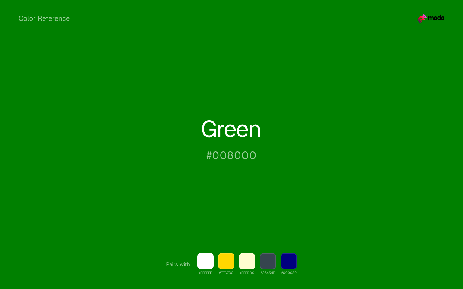
What colors go with green
White helps green stay legible in charts, labels, and UI states where a muddier light neutral would blur the edges.
With a cooler color like green, gold adds richness and turns the system toward premium packaging, hospitality, or ceremonial branding.
Cream takes the hard digital edge off green and makes the color feel more printed, paper-backed, and approachable.
What colors clash with green
With green, Neon Green pushes the work toward novelty or screen-effect territory faster than most brand or editorial systems can tolerate.
Magenta pushes green toward a nightclub or cosmetic register that is hard to square with calmer editorial or product work.
Orange changes the context around green so quickly that the palette can start looking campaign-specific rather than durable.
With green, Pastel Pink often steers the system toward nursery or confectionery cues instead of the more grounded mood the source color supports.
How should I use green in design?
- •Use #008000 for small status pills and table "positive" indicators where you need a green that passes contrast expectations against white without resorting to near-black forest.
- •On maps and diagrams, outline green fills with a slightly darker or desaturated stroke so boundaries remain visible on budget projectors and conference-room displays.
- •When pairing #008000 with orange or red error states, keep one color in a supporting role (smaller area or lower saturation) to avoid a Christmas-candy clash in marketing layouts.
What are good green palettes?
Noir refinement
SaaS dashboards, admin panels, and professional UI themes.
Neutral ground
Workshop handouts, training guides, and presentation templates.
Design with green in Moda
Create a presentation or document using greenas your accent color. Moda's AI applies your color palette automatically.
Create a design with green →What are the shades and tints of green?
Shades (darker)
Tints (lighter)
Tones (desaturated)
Hue variations
What are the color harmonies for green?
Harmonies are calculated from the base swatch. When a harmony matches a named color page, it links there; otherwise it appears here as a computed reference swatch.
Similar colors
Dark Green
Dark Green lives in the same neighborhood as green, but the finish shift is enough to make one feel better for finance, outdoors, and institutional systems and the other for a different visual context.
Forest Green
Forest Green stays very close to green in hue, but it lands lighter, which makes it better for backgrounds, tints, and softer supporting areas than for accents, stronger hierarchy, and firmer structure.
Hunter Green
Hunter Green is nearly adjacent to green in hue; what separates them is intensity, with hunter green reading dustier and easier to extend across a layout.
Lime Green
Lime Green is close enough to green to keep the palette cohesive, yet the lighter-darker shift still decides whether the family behaves more like atmosphere or more like structure.
Avocado
Avocado keeps some overlap with green, but the shift in finish and association is enough to make one feel better suited to this particular layout than the other.
Frequently asked questions
What is the hex code for green?
The hex code for green is #008000. In RGB, that's 0 red, 128 green, and 0 blue. The approximate CMYK equivalent is 100% cyan, 0% magenta, 100% yellow, and 50% key (black).
Is green a warm or cool color?
Green reads as cool. It settles naturally beside blues, greens, silver, and charcoal, and feels more animated when paired with warm accents like gold, coral, or rust.
Is green better as an accent or a full-palette color?
Green is usually best when it leads in short bursts rather than covering everything. It can headline a palette, but most layouts work better when the color handles accents, highlights, or one main hero role instead of every surface.
How should I use green in a design?
Green works well as a dark background with light text, or as a bold accent for headlines, callout bars, and key visuals. It adds weight and authority without the starkness of pure black.
Can I use green for text or backgrounds?
Green can work as text on white at 5.14:1 contrast, but it is usually safest in headings, labels, and accent moments rather than long body copy.
More green colors
Keep exploring color resources
All color pages
Browse the full library of color references, pairings, and palettes.
Green colors
Compare green with other green tones.
Blue colors
Explore nearby color families to build stronger palettes and contrasts.
Brown colors
Explore nearby color families to build stronger palettes and contrasts.
Neutral colors
Explore nearby color families to build stronger palettes and contrasts.
Last updated April 6, 2026
Color values are computed from the listed hex code using standard conversion formulas. RGB, HSL, and HSV are exact screen-ready conversions. CMYK is an approximate on-screen reference, not a press-ready print specification. Pairings, palettes, and use-case guidance are heuristic recommendations derived from color relationships, contrast behavior, and common presentation, document, and UI patterns.