Avocado color guide
HEX
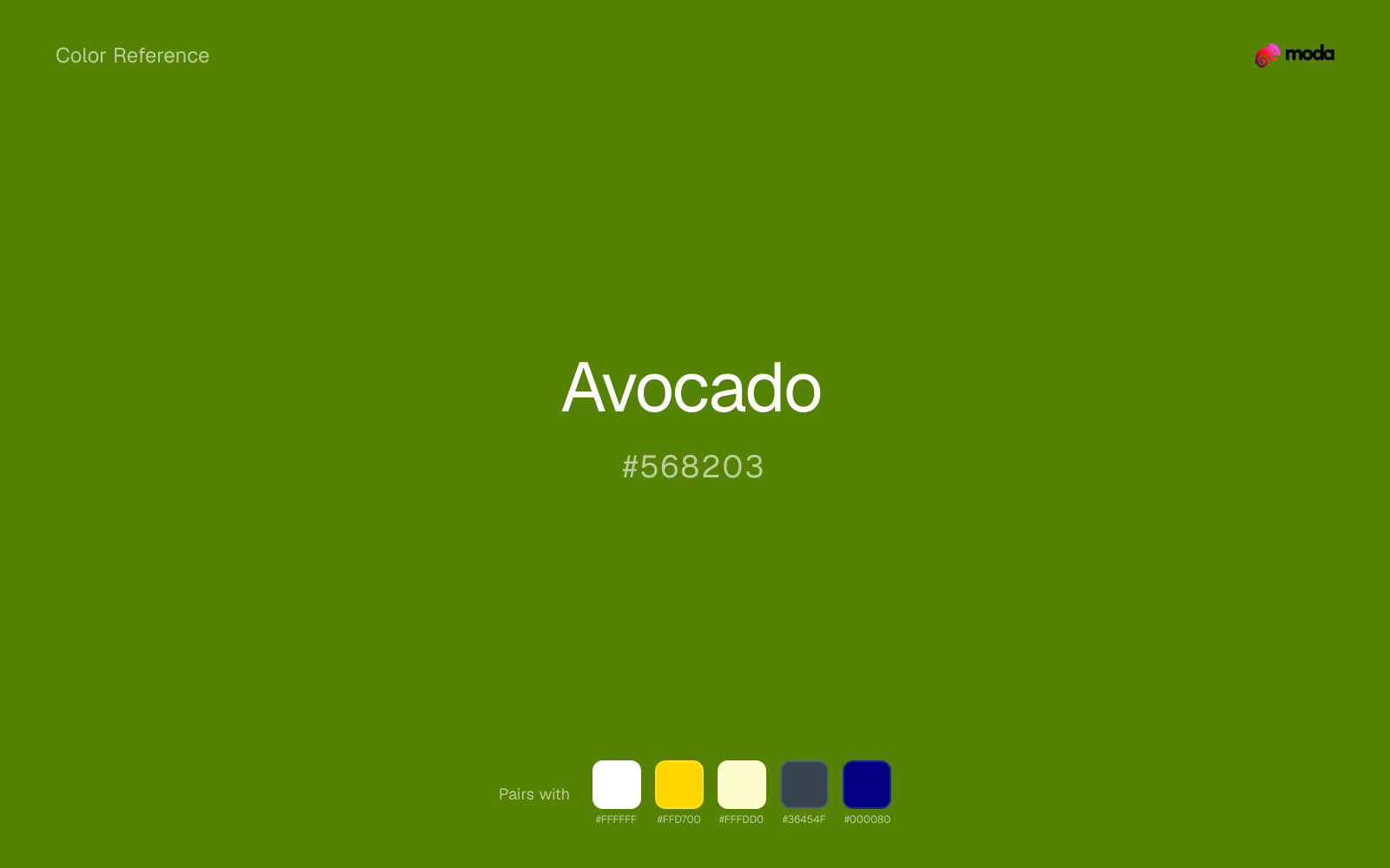
#568203
RGB
86, 130, 3
HSL
81°, 95%, 26%
HSV
81°, 98%, 51%
Avocado green is the 1970s kitchen resurrected — ripe, murky, and unapologetically domestic. #568203 is dark enough to pair with harvest gold and walnut, yellow enough to feel like produce rather than pine needles. It signals vintage comfort more than crisp minimalism.
Best for
Investor materials, annual reports, and financial dashboards.
Compare with
Accessibility
Avocado text on white passes AA at 4.58:1, which makes it usable for headings and short labels.
How does avocado compare to nearby colors?
What is the difference between avocado and army green?
Avocado (#568203) feels more signal-like on screen, while Army Green (#4B5320) pushes the family in the opposite direction. Army Green has more of the heavy-lifting, dark-surface role, while Avocado is freer to move around the layout. Use avocado when you want more pigment and immediate screen energy, and army green when the same family should feel calmer or more spreadable.
What color is avocado?
Mid-century appliances, automotive interiors, and fashion cycles revived "avocado" as a descriptor for yellow-leaning deep greens. Contemporary branding uses it for retro nostalgia and earthy food cues.
What is the hex code for avocado?
| Format | Value |
|---|---|
| HEX | #568203 |
| RGB | rgb(86, 130, 3) |
| HSL | hsl(81°, 95%, 26%) |
| HSV / HSB | hsv(81°, 98%, 51%) |
| CMYK (approx.) | cmyk(34%, 0%, 98%, 49%) |
Convert Avocado to other color formats
Open the color converter with Avocado (#568203) prefilled to copy RGB, HSL, HSV, CMYK, or OKLCH values.
Convert Avocado in the color converter →What does avocado mean in design?
Avocado is often associated with nostalgia, hominess, and unpretentious warmth. Next to hunter green it tends to read as more yellow and period-specific; compared with dark green it usually feels earthier.
How do I use avocado in code?
| CSS (hex) | color: #568203; |
| CSS (rgb) | color: rgb(86, 130, 3); |
| CSS (hsl) | color: hsl(81, 95%, 26%); |
| RGB % | rgb(34%, 51%, 1%) |
| Tailwind | text-[#568203] |
| SwiftUI | Color(red: 0.337, green: 0.510, blue: 0.012) |
| UIKit | UIColor(red: 0.337, green: 0.510, blue: 0.012, alpha: 1.0) |
| Android | Color.rgb(86, 130, 3) |
| Compose | Color(0xFF568203) |
| Web Safe | #669900 |
Is avocado accessible?
| Combination | Ratio | AA | AA lg | AAA | AAA lg | UI |
|---|---|---|---|---|---|---|
| AaWhite text on this color | 4.58:1 | ✓ | ✓ | ✗ | ✓ | ✓ |
| AaBlack text on this color | 4.59:1 | ✓ | ✓ | ✗ | ✓ | ✓ |
| AaThis color as text on white | 4.58:1 | ✓ | ✓ | ✗ | ✓ | ✓ |
| AaThis color as text on black | 4.59:1 | ✓ | ✓ | ✗ | ✓ | ✓ |
WCAG 2.1: AA normal ≥ 4.5:1, AA large text ≥ 3:1, AAA normal ≥ 7:1, AAA large ≥ 4.5:1, UI components ≥ 3:1.
How does avocado look with color blindness?
Simulated appearance for common types of color vision deficiency. Actual perception varies by individual.
What colors go with avocado
White sharpens avocado without cooling it off, which is useful when you need a clean interface or slide layout around the color.
With a cooler color like avocado, gold adds richness and turns the system toward premium packaging, hospitality, or ceremonial branding.
Cream takes the hard digital edge off avocado and makes the color feel more printed, paper-backed, and approachable.
What colors clash with avocado
Neon Green changes the meaning of avocado too abruptly, replacing the source color's finance, outdoors, and institutional systems cues with something much louder and less stable.
Magenta pushes avocado toward a nightclub or cosmetic register that is hard to square with calmer editorial or product work.
Orange changes the context around avocado so quickly that the palette can start looking campaign-specific rather than durable.
Pastel Pink can undercut avocado's authority by turning the combination more decorative than decisive.
How should I use avocado in design?
- •Avocado works well as a dark background with light text, or as a bold accent for headlines and callout bars in presentations and branded materials.
- •Avocado leans cool, so warm accents like gold, coral, or rust add the most energy. For a calm, professional palette, stay with other cool tones and use value contrast instead.
- •Vivid colors like avocado work best as punctuation in a layout: CTAs, key metrics, or a single hero element. Surrounding neutrals keep it from fatiguing the viewer.
What are good avocado palettes?
Design with avocado in Moda
Create a presentation or document using avocadoas your accent color. Moda's AI applies your color palette automatically.
Create a design with avocado →What are the shades and tints of avocado?
Shades (darker)
Tints (lighter)
Tones (desaturated)
Hue variations
What are the color harmonies for avocado?
Harmonies are calculated from the base swatch. When a harmony matches a named color page, it links there; otherwise it appears here as a computed reference swatch.
Similar colors
Olive Green
Olive Green occupies a similar depth to avocado, though it pushes the family toward a more warm-leaning reading and a different material feel.
Army Green
Army Green sits close to avocado on the wheel, but it carries less chroma, which makes it better for steadier surfaces and calmer long-form use than for sharper emphasis and quicker visual pickup.
Kelly Green
Kelly Green is close enough to avocado to keep the palette cohesive, yet the lighter-darker shift still decides whether the family behaves more like atmosphere or more like structure.
Fern
Fern keeps roughly the same visual weight as avocado but changes the undertone story, which is often enough to move a palette from warmer and tactile to cooler and more technical, or the reverse.
Green
Green keeps some overlap with avocado, but the shift in finish and association is enough to make one feel better suited to this particular layout than the other.
Frequently asked questions
What is the hex code for avocado?
The hex code for avocado is #568203. In RGB, that's 86 red, 130 green, and 3 blue. The approximate CMYK equivalent is 34% cyan, 0% magenta, 98% yellow, and 49% key (black).
Is avocado a warm or cool color?
Avocado sits near the center of the temperature scale but tips cool, which gives you room to steer the palette warmer or cooler with the surrounding accents.
Is avocado better as an accent or a full-palette color?
Avocado is usually best when it leads in short bursts rather than covering everything. It can headline a palette, but most layouts work better when the color handles accents, highlights, or one main hero role instead of every surface.
How should I use avocado in a design?
Avocado works well as a dark background with light text, or as a bold accent for headlines, callout bars, and key visuals. It adds weight and authority without the starkness of pure black.
Can I use avocado for text or backgrounds?
Avocado works better with dark text than white text. Black text reaches 4.59:1 contrast on the swatch, which makes the color more usable as a background or highlight surface than as a dark panel.
More green colors
Keep exploring color resources
All color pages
Browse the full library of color references, pairings, and palettes.
Green colors
Compare avocado with other green tones.
Blue colors
Explore nearby color families to build stronger palettes and contrasts.
Brown colors
Explore nearby color families to build stronger palettes and contrasts.
Neutral colors
Explore nearby color families to build stronger palettes and contrasts.
Last updated April 6, 2026
Color values are computed from the listed hex code using standard conversion formulas. RGB, HSL, and HSV are exact screen-ready conversions. CMYK is an approximate on-screen reference, not a press-ready print specification. Pairings, palettes, and use-case guidance are heuristic recommendations derived from color relationships, contrast behavior, and common presentation, document, and UI patterns.