Fern meaning and palette guide
HEX
#4F7942
RGB
79, 121, 66
HSL
106°, 29%, 37%
HSV
106°, 45%, 47%
Fern green is the forest floor's work uniform — medium depth, soft contrast, and believable in shade. #4F7942 reads like living foliage on an overcast day: green-forward, slightly grayed, never neon. A dependable choice for eco brands that want nature without cartoon leaves.
Best for
Corporate branding, executive reports, and enterprise-level web design.
Accessibility
Fern text on white passes AA at 5.07:1, which makes it usable for headings and short labels.
How does fern compare to nearby colors?
What is the difference between fern and hunter green?
Fern (#4F7942) and Hunter Green (#355E3B) are close in strength, but they point the eye toward different undertones and material cues. Fern shifts the system toward paper, tint, and background behavior more than Hunter Green does. Choose fern when the surrounding system aligns better with wellness, botanical, and lifestyle palettes, and move to hunter green when the stronger contextual fit is finance, outdoors, and institutional systems.
What color is fern?
Botanical naming appears in paint decks, garden-center branding, and outdoor apparel as a middle "woodland" green. It generally suggests understory plants rather than sunlit grass.
What is the hex code for fern?
| Format | Value |
|---|---|
| HEX | #4F7942 |
| RGB | rgb(79, 121, 66) |
| HSL | hsl(106°, 29%, 37%) |
| HSV / HSB | hsv(106°, 45%, 47%) |
| CMYK (approx.) | cmyk(35%, 0%, 45%, 53%) |
Convert Fern to other color formats
Open the color converter with Fern (#4F7942) prefilled to copy RGB, HSL, HSV, CMYK, or OKLCH values.
Convert Fern in the color converter →What does fern mean in design?
Fern is often associated with renewal, quiet growth, and approachable sustainability. Versus hunter green it tends to read as a touch brighter and less tweedy; beside moss it usually feels cleaner and less olive-dusty.
How do I use fern in code?
| CSS (hex) | color: #4F7942; |
| CSS (rgb) | color: rgb(79, 121, 66); |
| CSS (hsl) | color: hsl(106, 29%, 37%); |
| RGB % | rgb(31%, 47%, 26%) |
| Tailwind | text-[#4F7942] |
| SwiftUI | Color(red: 0.310, green: 0.475, blue: 0.259) |
| UIKit | UIColor(red: 0.310, green: 0.475, blue: 0.259, alpha: 1.0) |
| Android | Color.rgb(79, 121, 66) |
| Compose | Color(0xFF4F7942) |
| Web Safe | #666633 |
Is fern accessible?
| Combination | Ratio | AA | AA lg | AAA | AAA lg | UI |
|---|---|---|---|---|---|---|
| AaWhite text on this color | 5.07:1 | ✓ | ✓ | ✗ | ✓ | ✓ |
| AaBlack text on this color | 4.15:1 | ✗ | ✓ | ✗ | ✗ | ✓ |
| AaThis color as text on white | 5.07:1 | ✓ | ✓ | ✗ | ✓ | ✓ |
| AaThis color as text on black | 4.15:1 | ✗ | ✓ | ✗ | ✗ | ✓ |
WCAG 2.1: AA normal ≥ 4.5:1, AA large text ≥ 3:1, AAA normal ≥ 7:1, AAA large ≥ 4.5:1, UI components ≥ 3:1.
How does fern look with color blindness?
Simulated appearance for common types of color vision deficiency. Actual perception varies by individual.
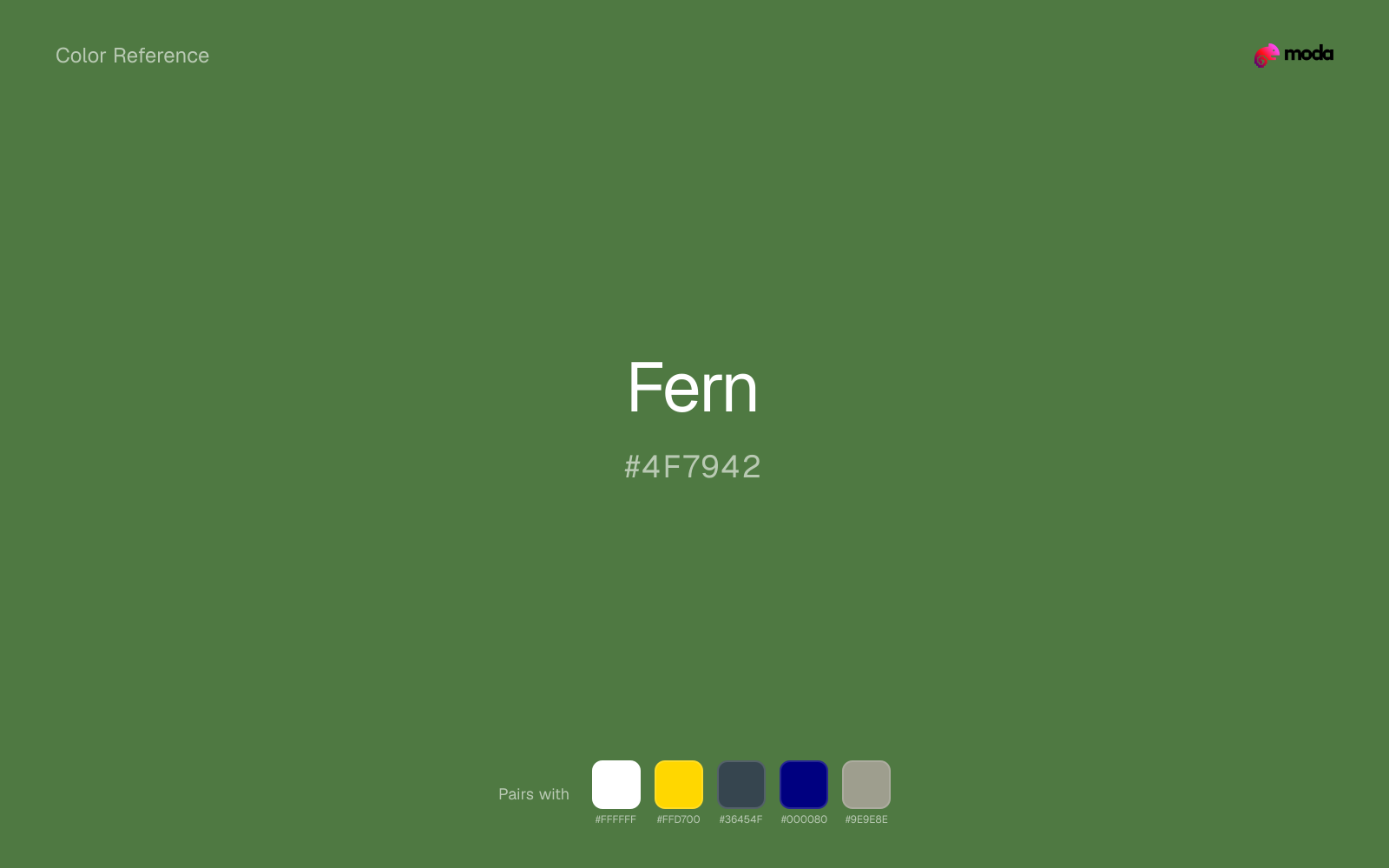
What colors go with fern
White helps fern stay legible in charts, labels, and UI states where a muddier light neutral would blur the edges.
Gold warms fern enough to keep the palette from feeling chilly or overly technical, while still reading intentional rather than decorative-for-its-own-sake.
Pairing fern with charcoal adds useful depth while keeping the palette flexible for interfaces, decks, and editorial layouts.
What colors clash with fern
Magenta remaps fern too aggressively, dragging it away from wellness, botanical, and lifestyle palettes and into a brighter, more performative palette.
With fern, orange creates a warm-cool collision that announces itself before it earns a compositional reason to exist.
With fern, Pastel Pink often steers the system toward nursery or confectionery cues instead of the more grounded mood the source color supports.
How should I use fern in design?
- •Use fern for headlines, sidebar accents, and key data points where you need strong presence without going full dark-mode.
- •Fern leans cool, so warm accents like gold, coral, or rust add the most energy. For a calm, professional palette, stay with other cool tones and use value contrast instead.
- •Fern fits finance dashboards, sustainability reports, and health-tech interfaces where the palette needs to communicate credibility and forward momentum.
What are good fern palettes?
Executive edge
Corporate branding, executive reports, and enterprise-level web design.
Design with fern in Moda
Create a presentation or document using fernas your accent color. Moda's AI applies your color palette automatically.
Create a design with fern →What are the shades and tints of fern?
Shades (darker)
Tints (lighter)
Tones (desaturated)
Hue variations
What are the color harmonies for fern?
Harmonies are calculated from the base swatch. When a harmony matches a named color page, it links there; otherwise it appears here as a computed reference swatch.
Similar colors
Hunter Green
Hunter Green keeps roughly the same visual weight as fern but changes the undertone story, which is often enough to move a palette from warmer and tactile to cooler and more technical, or the reverse.
Forest Green
Forest Green sits close to fern on the wheel, but it carries more pigment pressure, which makes it better for faster emphasis and brighter accent work than for broader coverage and quieter supporting roles.
Kelly Green
Kelly Green sits close to fern on the wheel, but it carries more pigment pressure, which makes it better for faster emphasis and brighter accent work than for broader coverage and quieter supporting roles.
Moss
Moss occupies a similar depth to fern, though it pushes the family toward a more warm-leaning reading and a different material feel.
Army Green
Army Green is a nearby alternative to fern when the palette needs a different undertone or material cue more than a dramatic contrast change.
Frequently asked questions
What is the hex code for fern?
The hex code for fern is #4F7942. In RGB, that's 79 red, 121 green, and 66 blue. The approximate CMYK equivalent is 35% cyan, 0% magenta, 45% yellow, and 53% key (black).
Is fern a warm or cool color?
Fern reads as cool. It settles naturally beside blues, greens, silver, and charcoal, and feels more animated when paired with warm accents like gold, coral, or rust.
Where does fern work best in a layout?
Fern is flexible enough to move between accents, section blocks, and supporting roles depending on the contrast around it. It works best when the rest of the palette gives it a clear job instead of asking it to do everything at once.
How should I use fern in a design?
Fern has enough restraint to hold large surfaces comfortably, which makes it useful for full theme systems, document backgrounds, or broad section color without constant visual fatigue.
Can I use fern for text or backgrounds?
Fern can work as text on white at 5.07:1 contrast, but it is usually safest in headings, labels, and accent moments rather than long body copy.
More green colors
Keep exploring color resources
All color pages
Browse the full library of color references, pairings, and palettes.
Green colors
Compare fern with other green tones.
Blue colors
Explore nearby color families to build stronger palettes and contrasts.
Brown colors
Explore nearby color families to build stronger palettes and contrasts.
Neutral colors
Explore nearby color families to build stronger palettes and contrasts.
Last updated April 6, 2026
Color values are computed from the listed hex code using standard conversion formulas. RGB, HSL, and HSV are exact screen-ready conversions. CMYK is an approximate on-screen reference, not a press-ready print specification. Pairings, palettes, and use-case guidance are heuristic recommendations derived from color relationships, contrast behavior, and common presentation, document, and UI patterns.