Forest Green color guide
HEX
#228B22
RGB
34, 139, 34
HSL
120°, 61%, 34%
HSV
120°, 76%, 55%
Forest green (#228B22) is a deep natural green that feels established, grounded, and trustworthy. It works well for outdoor, food, sustainability, and institution-facing materials that need warmth without softness.
Best for
SaaS dashboards, admin panels, and professional UI themes.
Compare with
Accessibility
Check contrast before using forest green for text-heavy layouts, especially on low-contrast backgrounds.
How does forest green compare to nearby colors?
What is the difference between forest green and green?
Forest Green (#228B22) feels more softened on screen, while Green (#008000) pushes the family in the opposite direction. Forest Green behaves more like a system color and Green more like a spotlight, so the decision changes how busy the layout feels. Use forest green for the more restrained version of the idea, and move to green when the palette needs a brighter front-facing accent.
What color is forest green?
Forest green is named for dense evergreen foliage and has long been associated with conservation, tradition, and field uniforms. It sits darker and cooler than standard green, which gives it more authority in brand systems and presentations.
What is the hex code for forest green?
| Format | Value |
|---|---|
| HEX | #228B22 |
| RGB | rgb(34, 139, 34) |
| HSL | hsl(120°, 61%, 34%) |
| HSV / HSB | hsv(120°, 76%, 55%) |
| CMYK (approx.) | cmyk(76%, 0%, 76%, 45%) |
Convert Forest Green to other color formats
Open the color converter with Forest Green (#228B22) prefilled to copy RGB, HSL, HSV, CMYK, or OKLCH values.
Convert Forest Green in the color converter →What does forest green mean in design?
Forest green communicates steadiness, resilience, and organic credibility. It feels more serious than bright green, so it is a better choice when you want growth-oriented associations without looking playful or overtly eco-generic.
How do I use forest green in code?
| CSS (hex) | color: #228B22; |
| CSS (rgb) | color: rgb(34, 139, 34); |
| CSS (hsl) | color: hsl(120, 61%, 34%); |
| RGB % | rgb(13%, 55%, 13%) |
| Tailwind | text-[#228B22] |
| SwiftUI | Color(red: 0.133, green: 0.545, blue: 0.133) |
| UIKit | UIColor(red: 0.133, green: 0.545, blue: 0.133, alpha: 1.0) |
| Android | Color.rgb(34, 139, 34) |
| Compose | Color(0xFF228B22) |
| Web Safe | #339933 |
Is forest green accessible?
| Combination | Ratio | AA | AA lg | AAA | AAA lg | UI |
|---|---|---|---|---|---|---|
| AaWhite text on this color | 4.39:1 | ✗ | ✓ | ✗ | ✗ | ✓ |
| AaBlack text on this color | 4.78:1 | ✓ | ✓ | ✗ | ✓ | ✓ |
| AaThis color as text on white | 4.39:1 | ✗ | ✓ | ✗ | ✗ | ✓ |
| AaThis color as text on black | 4.78:1 | ✓ | ✓ | ✗ | ✓ | ✓ |
WCAG 2.1: AA normal ≥ 4.5:1, AA large text ≥ 3:1, AAA normal ≥ 7:1, AAA large ≥ 4.5:1, UI components ≥ 3:1.
How does forest green look with color blindness?
Simulated appearance for common types of color vision deficiency. Actual perception varies by individual.
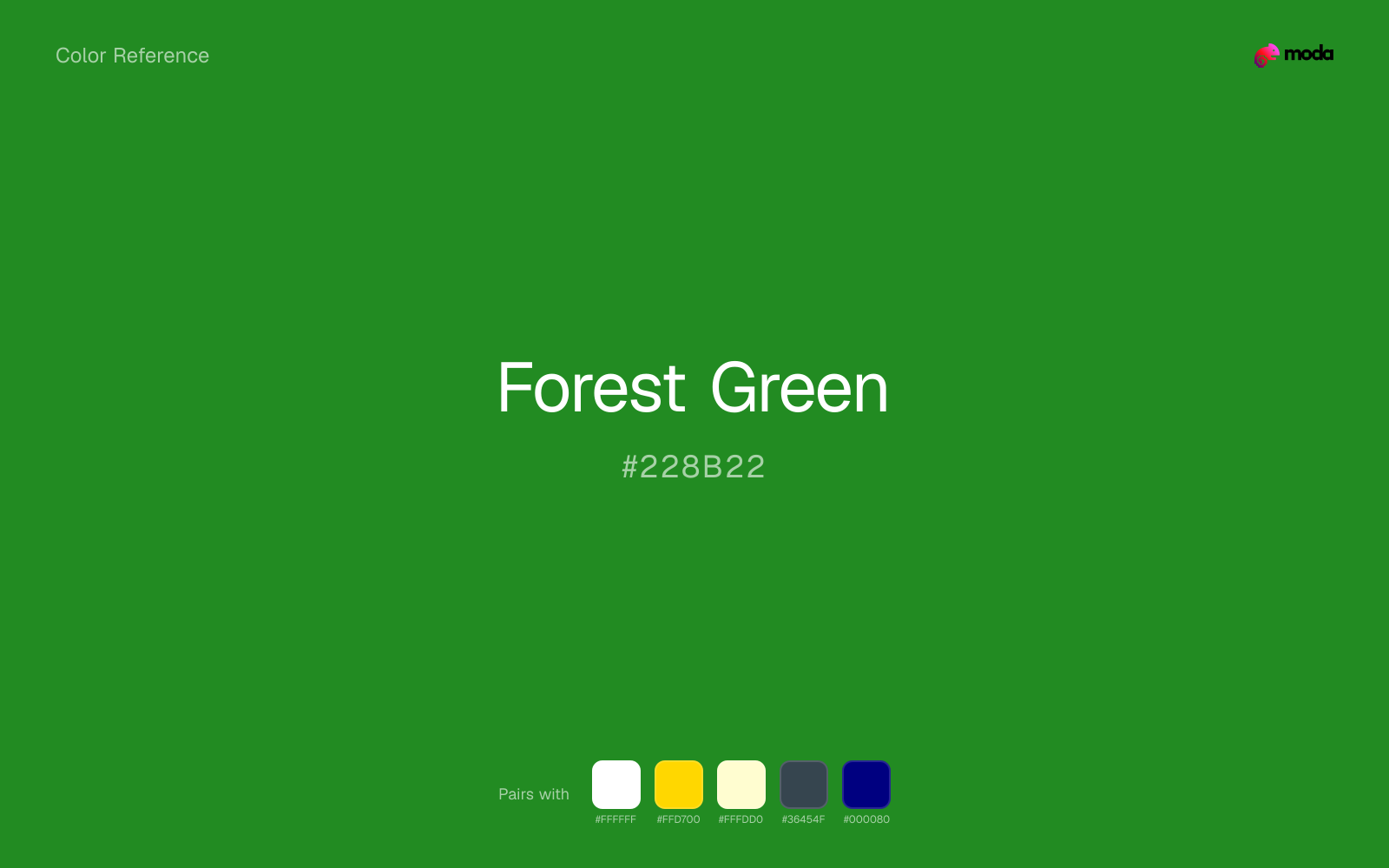
What colors go with forest green
Pairing forest green with white preserves readable hierarchy while keeping the swatch itself as the clear focal color.
Gold warms forest green enough to keep the palette from feeling chilly or overly technical, while still reading intentional rather than decorative-for-its-own-sake.
Cream makes forest green feel more tactile and less clinical, especially in layouts that want a paper or fabric quality.
What colors clash with forest green
Neon Green changes the meaning of forest green too abruptly, replacing the source color's finance, outdoors, and institutional systems cues with something much louder and less stable.
Magenta remaps forest green too aggressively, dragging it away from finance, outdoors, and institutional systems and into a brighter, more performative palette.
Orange lands abruptly next to forest green and can make the palette feel more promo-coded or team-coded than intended.
Pastel Pink can undercut forest green's authority by turning the combination more decorative than decisive.
How should I use forest green in design?
- •Use forest green as a dark brand anchor in place of navy when you want a more natural tone.
- •Pair it with cream or warm white for readability, then add gold or rust accents for depth.
- •Forest green works especially well in charts, cover slides, and packaging-inspired layouts.
What are good forest green palettes?
Executive edge
SaaS dashboards, admin panels, and professional UI themes.
Quiet contrast
Nonprofit campaigns, fundraising pages, and grant materials.
Design with forest green in Moda
Create a presentation or document using forest greenas your accent color. Moda's AI applies your color palette automatically.
Create a design with forest green →What are the shades and tints of forest green?
Shades (darker)
Tints (lighter)
Tones (desaturated)
Hue variations
What are the color harmonies for forest green?
Harmonies are calculated from the base swatch. When a harmony matches a named color page, it links there; otherwise it appears here as a computed reference swatch.
Similar colors
Green
Green stays very close to forest green in hue, but it lands darker, which makes it better for headlines, anchors, and darker sections than for lighter surfaces and more open applications.
Lime Green
Lime Green tracks close to forest green in hue, but the value shift changes where each one earns its place: lime green is easier to use for backgrounds, tints, and softer supporting areas, while forest green holds onto accents, stronger hierarchy, and firmer structure.
Hunter Green
Hunter Green sits close to forest green on the wheel, but it carries less chroma, which makes it better for steadier surfaces and calmer long-form use than for sharper emphasis and quicker visual pickup.
Dark Green
Dark Green tracks close to forest green in hue, but the value shift changes where each one earns its place: dark green is easier to use for headlines, anchors, and darker sections, while forest green holds onto lighter surfaces and more open applications.
Fern
Fern sits close to forest green on the wheel, but it carries less chroma, which makes it better for steadier surfaces and calmer long-form use than for sharper emphasis and quicker visual pickup.
Frequently asked questions
What is the hex code for forest green?
The hex code for forest green is #228B22. In RGB, that's 34 red, 139 green, and 34 blue. The approximate CMYK equivalent is 76% cyan, 0% magenta, 76% yellow, and 45% key (black).
Is forest green a warm or cool color?
Forest Green falls on the cool side of the palette, so warm companions create the clearest contrast while other cool tones keep the system more restrained.
Is forest green better for accents, structure, or surfaces?
Forest Green sits in the usable middle: strong enough to anchor a section or call attention to a key moment, but calm enough to support a broader system when the surrounding values are well managed.
Where does forest green work best in a layout?
Forest Green sits in the middle of the spectrum in a useful way: strong enough for emphasis, but controlled enough to support a broader brand or presentation system when the contrast is handled well.
Is forest green accessible?
Forest Green works better with dark text than white text. Black text reaches 4.78:1 contrast on the swatch, which makes the color more usable as a background or highlight surface than as a dark panel.
More green colors
Keep exploring color resources
All color pages
Browse the full library of color references, pairings, and palettes.
Green colors
Compare forest green with other green tones.
Blue colors
Explore nearby color families to build stronger palettes and contrasts.
Brown colors
Explore nearby color families to build stronger palettes and contrasts.
Neutral colors
Explore nearby color families to build stronger palettes and contrasts.
Last updated April 6, 2026
Color values are computed from the listed hex code using standard conversion formulas. RGB, HSL, and HSV are exact screen-ready conversions. CMYK is an approximate on-screen reference, not a press-ready print specification. Pairings, palettes, and use-case guidance are heuristic recommendations derived from color relationships, contrast behavior, and common presentation, document, and UI patterns.