What color is Moss?
HEX
#8A9A5B
RGB
138, 154, 91
HSL
75°, 26%, 48%
HSV
75°, 41%, 60%
Moss green is nature after it has aged a little — damp bark, lichen, and wool sweaters in fog. #8A9A5B is desaturated and yellowed, so it behaves like an olive-adjacent neutral with a botanical pulse. Ideal when you want organic texture without neon health clichés.
Best for
Financial services branding and client-facing digital experiences.
Accessibility
Check contrast before using moss for text-heavy layouts, especially on low-contrast backgrounds.
How does moss compare to nearby colors?
What is the difference between moss and pistachio?
The main visual split is undertone: Moss (#8A9A5B) feels more warm, while Pistachio (#93C572) pulls in a different direction. Moss gives the palette a more grounded center of gravity, which matters if headlines, UI chrome, or darker sections need to feel settled. Choose moss when the rest of the palette wants to lean warmer in undertone, and keep pistachio for a cooler interpretation of roughly the same strength.
What color is moss?
Cosmetics, outdoor lifestyle, and interior trends use "moss" for muted, earthy greens. The name maps loosely to lichen and forest-floor tones.
What is the hex code for moss?
| Format | Value |
|---|---|
| HEX | #8A9A5B |
| RGB | rgb(138, 154, 91) |
| HSL | hsl(75°, 26%, 48%) |
| HSV / HSB | hsv(75°, 41%, 60%) |
| CMYK (approx.) | cmyk(10%, 0%, 41%, 40%) |
Convert Moss to other color formats
Open the color converter with Moss (#8A9A5B) prefilled to copy RGB, HSL, HSV, CMYK, or OKLCH values.
Convert Moss in the color converter →What does moss mean in design?
Moss is often associated with groundedness, craft, and quiet outdoorsiness. Compared with olive or army greens it tends to read as greener and less military; beside fern it usually feels dustier and more yellow-brown.
How do I use moss in code?
| CSS (hex) | color: #8A9A5B; |
| CSS (rgb) | color: rgb(138, 154, 91); |
| CSS (hsl) | color: hsl(75, 26%, 48%); |
| RGB % | rgb(54%, 60%, 36%) |
| Tailwind | text-[#8A9A5B] |
| SwiftUI | Color(red: 0.541, green: 0.604, blue: 0.357) |
| UIKit | UIColor(red: 0.541, green: 0.604, blue: 0.357, alpha: 1.0) |
| Android | Color.rgb(138, 154, 91) |
| Compose | Color(0xFF8A9A5B) |
| Web Safe | #999966 |
Is moss accessible?
| Combination | Ratio | AA | AA lg | AAA | AAA lg | UI |
|---|---|---|---|---|---|---|
| AaWhite text on this color | 3.06:1 | ✗ | ✓ | ✗ | ✗ | ✓ |
| AaBlack text on this color | 6.85:1 | ✓ | ✓ | ✗ | ✓ | ✓ |
| AaThis color as text on white | 3.06:1 | ✗ | ✓ | ✗ | ✗ | ✓ |
| AaThis color as text on black | 6.85:1 | ✓ | ✓ | ✗ | ✓ | ✓ |
WCAG 2.1: AA normal ≥ 4.5:1, AA large text ≥ 3:1, AAA normal ≥ 7:1, AAA large ≥ 4.5:1, UI components ≥ 3:1.
How does moss look with color blindness?
Simulated appearance for common types of color vision deficiency. Actual perception varies by individual.
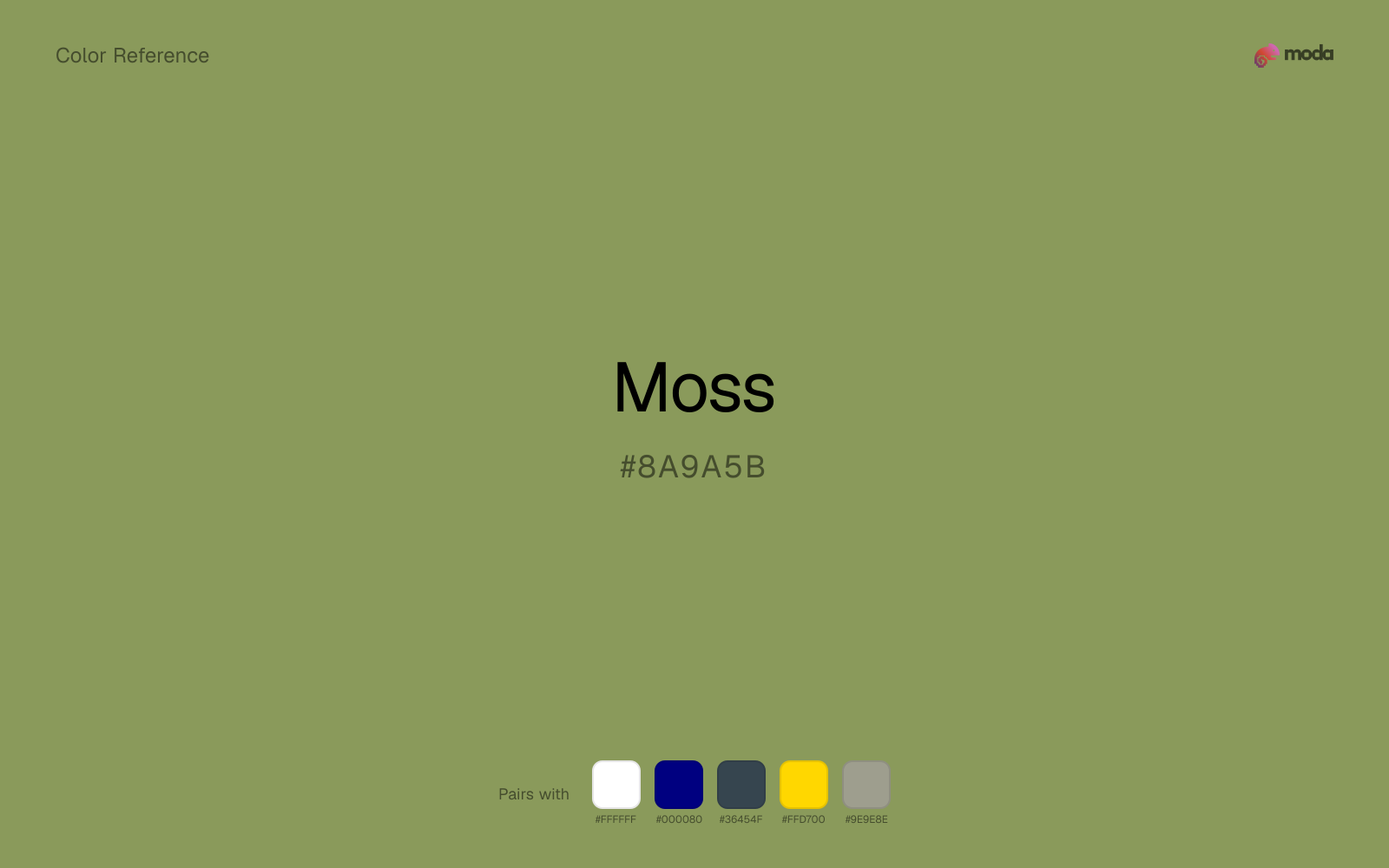
What colors go with moss
White makes moss feel clearer and more breathable without pulling it warmer or cooler than it already is.
Because moss already carries warmth, navy blue gives the pair a steadier backbone and keeps it closer to editorial systems than to one-note seasonal color.
Charcoal gives moss a modern dark partner that feels softer and more material than default black.
What colors clash with moss
With moss, magenta introduces a second emotional story instead of reinforcing the first one, so the palette can feel internally split.
Cyan redirects moss toward a more technical, backlit interpretation, which is risky when the goal is warmth, polish, or print-minded editorial work.
How should I use moss in design?
- •Moss works as either a primary or supporting color — it has enough presence to carry a layout but is restrained enough to share the stage with bolder accents.
- •Pair moss with cool accents (navy, sage, steel blue) for sharp contrast, or keep it with other warm tones (cream, gold, tan) for a cohesive, editorial feel.
- •Moss fits finance dashboards, sustainability reports, and health-tech interfaces where the palette needs to communicate credibility and forward momentum.
What are good moss palettes?
Onyx foundation
Financial services branding and client-facing digital experiences.
Soft structure
Startup branding, pitch materials, and product landing pages.
Design with moss in Moda
Create a presentation or document using mossas your accent color. Moda's AI applies your color palette automatically.
Create a design with moss →What are the shades and tints of moss?
Shades (darker)
Tints (lighter)
Tones (desaturated)
Hue variations
What are the color harmonies for moss?
Harmonies are calculated from the base swatch. When a harmony matches a named color page, it links there; otherwise it appears here as a computed reference swatch.
Similar colors
Pistachio
Pistachio is close enough to moss to keep the palette cohesive, yet the lighter-darker shift still decides whether the family behaves more like atmosphere or more like structure.
Sage Green
Sage Green is close enough to moss to keep the palette cohesive, yet the lighter-darker shift still decides whether the family behaves more like atmosphere or more like structure.
Fern
Fern keeps roughly the same visual weight as moss but changes the undertone story, which is often enough to move a palette from warmer and tactile to cooler and more technical, or the reverse.
Army Green
Army Green stays in the same color family as moss, but the change in value moves it into different layout jobs, especially once backgrounds, charts, or section dividers enter the system.
Avocado
Avocado tracks close to moss in hue, but the value shift changes where each one earns its place: avocado is easier to use for headlines, anchors, and darker sections, while moss holds onto lighter surfaces and more open applications.
Frequently asked questions
What is the hex code for moss?
The hex code for moss is #8A9A5B. In RGB, that's 138 red, 154 green, and 91 blue. The approximate CMYK equivalent is 10% cyan, 0% magenta, 41% yellow, and 40% key (black).
Is moss a warm or cool color?
Moss leans warm without feeling fully heat-driven, so you can push it warmer with cream, tan, or gold or balance it with cooler blues and slates.
Can moss carry a full palette without feeling too loud?
Moss is restrained enough to carry larger areas without becoming exhausting. That makes it useful for document systems, presentation themes, and site sections where louder colors would wear out their welcome.
Where does moss work best in a layout?
Moss is muted and versatile. It can carry a full presentation theme, document system, or website section without overwhelming the layout, and it pairs flexibly with both warm and cool accents.
Is moss accessible?
Moss works better with dark text than white text. Black text reaches 6.85:1 contrast on the swatch, which makes the color more usable as a background or highlight surface than as a dark panel.
More green colors
Keep exploring color resources
All color pages
Browse the full library of color references, pairings, and palettes.
Green colors
Compare moss with other green tones.
Blue colors
Explore nearby color families to build stronger palettes and contrasts.
Brown colors
Explore nearby color families to build stronger palettes and contrasts.
Neutral colors
Explore nearby color families to build stronger palettes and contrasts.
Last updated April 6, 2026
Color values are computed from the listed hex code using standard conversion formulas. RGB, HSL, and HSV are exact screen-ready conversions. CMYK is an approximate on-screen reference, not a press-ready print specification. Pairings, palettes, and use-case guidance are heuristic recommendations derived from color relationships, contrast behavior, and common presentation, document, and UI patterns.