What color is Seafoam?
HEX
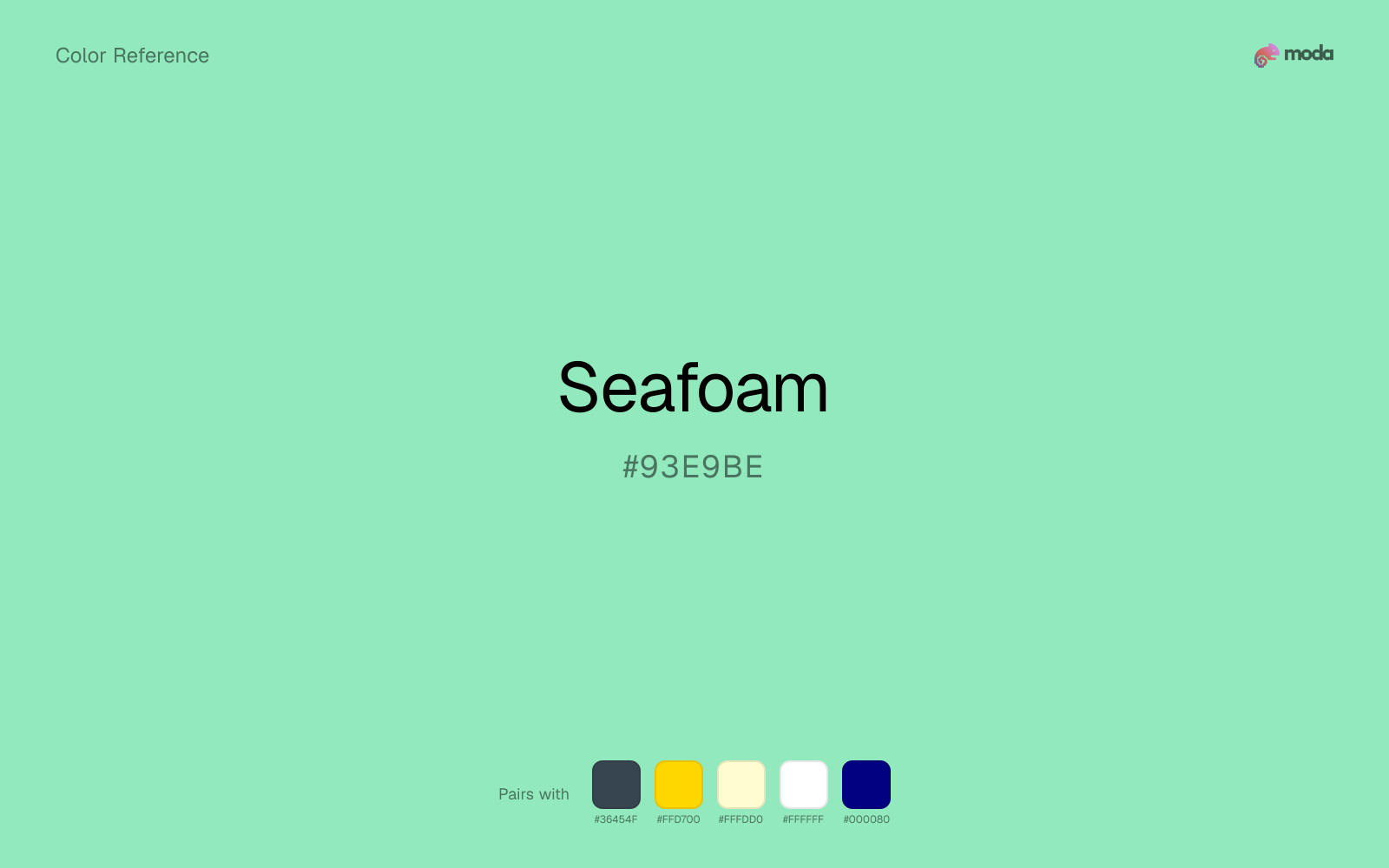
#93E9BE
RGB
147, 233, 190
HSL
150°, 66%, 75%
HSV
150°, 37%, 91%
Seafoam is the green that borrowed blue's wardrobe — cool, breezy, and slightly saline. #93E9BE feels like sunlit shallows: light, translucent, and modern in skincare and coastal hospitality. It adds freshness without the sterility of pure aqua.
Best for
Product launches, promotional banners, and e-commerce storefronts.
Accessibility
Check contrast before using seafoam for text-heavy layouts, especially on low-contrast backgrounds.
How does seafoam compare to nearby colors?
What is the difference between seafoam and aquamarine?
Aquamarine (#7FFFD4) carries more pigment punch than Seafoam (#93E9BE), so the pair separates by finish as much as hue. Seafoam keeps the overall palette calmer, while Aquamarine introduces more visual insistence with less area. Choose seafoam when the family should feel quieter, more material, or easier to live with across a full layout; use aquamarine when you need more punch.
What color is seafoam?
Retailers use "seafoam" for spa, beach house, and clean-beauty palettes. The term evokes ocean foam and shallow water rather than a single pigment standard.
What is the hex code for seafoam?
| Format | Value |
|---|---|
| HEX | #93E9BE |
| RGB | rgb(147, 233, 190) |
| HSL | hsl(150°, 66%, 75%) |
| HSV / HSB | hsv(150°, 37%, 91%) |
| CMYK (approx.) | cmyk(37%, 0%, 18%, 9%) |
Convert Seafoam to other color formats
Open the color converter with Seafoam (#93E9BE) prefilled to copy RGB, HSL, HSV, CMYK, or OKLCH values.
Convert Seafoam in the color converter →What does seafoam mean in design?
Seafoam is often associated with calm, cleanliness, and vacation ease. Versus aquamarine it tends to read as greener and less gemstone-bright; beside spring green it usually feels softer, cooler, and less synthetic.
How do I use seafoam in code?
| CSS (hex) | color: #93E9BE; |
| CSS (rgb) | color: rgb(147, 233, 190); |
| CSS (hsl) | color: hsl(150, 66%, 75%); |
| RGB % | rgb(58%, 91%, 75%) |
| Tailwind | text-[#93E9BE] |
| SwiftUI | Color(red: 0.576, green: 0.914, blue: 0.745) |
| UIKit | UIColor(red: 0.576, green: 0.914, blue: 0.745, alpha: 1.0) |
| Android | Color.rgb(147, 233, 190) |
| Compose | Color(0xFF93E9BE) |
| Web Safe | #99FFCC |
Is seafoam accessible?
| Combination | Ratio | AA | AA lg | AAA | AAA lg | UI |
|---|---|---|---|---|---|---|
| AaWhite text on this color | 1.43:1 | ✗ | ✗ | ✗ | ✗ | ✗ |
| AaBlack text on this color | 14.64:1 | ✓ | ✓ | ✓ | ✓ | ✓ |
| AaThis color as text on white | 1.43:1 | ✗ | ✗ | ✗ | ✗ | ✗ |
| AaThis color as text on black | 14.64:1 | ✓ | ✓ | ✓ | ✓ | ✓ |
WCAG 2.1: AA normal ≥ 4.5:1, AA large text ≥ 3:1, AAA normal ≥ 7:1, AAA large ≥ 4.5:1, UI components ≥ 3:1.
How does seafoam look with color blindness?
Simulated appearance for common types of color vision deficiency. Actual perception varies by individual.
What colors go with seafoam
Charcoal lets seafoam stay light and atmospheric while still giving the layout a readable dark value for text and hierarchy.
With a cooler color like seafoam, gold adds richness and turns the system toward premium packaging, hospitality, or ceremonial branding.
Cream helps seafoam read warmer, softer, and less screen-hard than it would beside pure white.
What colors clash with seafoam
With seafoam, Neon Green pushes the work toward novelty or screen-effect territory faster than most brand or editorial systems can tolerate.
Magenta pushes seafoam toward a nightclub or cosmetic register that is hard to square with calmer editorial or product work.
How should I use seafoam in design?
- •Seafoam works best as a background tint, card fill, or section divider — it adds warmth without competing with foreground content. Pair with dark text for readability.
- •Pair seafoam with warm accents (gold, rust, amber) when you need more energy, or stay in cool territory (navy, silver, sage) for a composed, professional look.
- •Seafoam fits finance dashboards, sustainability reports, and health-tech interfaces where the palette needs to communicate credibility and forward momentum.
What are good seafoam palettes?
Morning palette
Product launches, promotional banners, and e-commerce storefronts.
Design with seafoam in Moda
Create a presentation or document using seafoamas your accent color. Moda's AI applies your color palette automatically.
Create a design with seafoam →What are the shades and tints of seafoam?
Shades (darker)
Tints (lighter)
Tones (desaturated)
Hue variations
What are the color harmonies for seafoam?
Harmonies are calculated from the base swatch. When a harmony matches a named color page, it links there; otherwise it appears here as a computed reference swatch.
Similar colors
Aquamarine
Aquamarine is nearly adjacent to seafoam in hue; what separates them is intensity, with aquamarine reading cleaner and more assertive.
Celadon
Celadon is useful when seafoam is the right weight but the wrong mood: the swap changes temperature and finish more than contrast.
Light Green
Light Green keeps roughly the same visual weight as seafoam but changes the undertone story, which is often enough to move a palette from warmer and tactile to cooler and more technical, or the reverse.
Mint Green
Mint Green keeps roughly the same visual weight as seafoam but changes the undertone story, which is often enough to move a palette from warmer and tactile to cooler and more technical, or the reverse.
Ice Blue
Ice Blue keeps roughly the same visual weight as seafoam but changes the undertone story, which is often enough to move a palette from warmer and tactile to cooler and more technical, or the reverse.
Frequently asked questions
What is the hex code for seafoam?
The hex code for seafoam is #93E9BE. In RGB, that's 147 red, 233 green, and 190 blue. The approximate CMYK equivalent is 37% cyan, 0% magenta, 18% yellow, and 9% key (black).
Is seafoam a warm or cool color?
Seafoam falls on the cool side of the palette, so warm companions create the clearest contrast while other cool tones keep the system more restrained.
Is seafoam better for accents, structure, or surfaces?
Seafoam sits in the usable middle: strong enough to anchor a section or call attention to a key moment, but calm enough to support a broader system when the surrounding values are well managed.
Where does seafoam work best in a layout?
Seafoam is better on broad surfaces than in tiny details, so treat it as a background or support color and let darker accents carry the sharp hierarchy.
Is seafoam accessible?
Seafoam works better with dark text than white text. Black text reaches 14.64:1 contrast on the swatch, which makes the color more usable as a background or highlight surface than as a dark panel.
More green colors
Keep exploring color resources
All color pages
Browse the full library of color references, pairings, and palettes.
Green colors
Compare seafoam with other green tones.
Blue colors
Explore nearby color families to build stronger palettes and contrasts.
Brown colors
Explore nearby color families to build stronger palettes and contrasts.
Neutral colors
Explore nearby color families to build stronger palettes and contrasts.
Last updated April 6, 2026
Color values are computed from the listed hex code using standard conversion formulas. RGB, HSL, and HSV are exact screen-ready conversions. CMYK is an approximate on-screen reference, not a press-ready print specification. Pairings, palettes, and use-case guidance are heuristic recommendations derived from color relationships, contrast behavior, and common presentation, document, and UI patterns.