Celadon meaning and palette guide
HEX
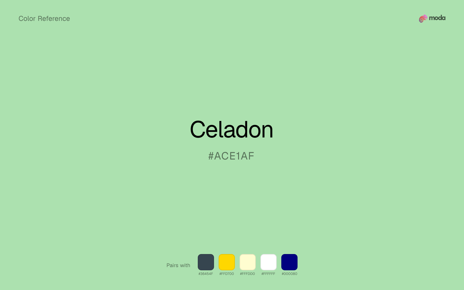
#ACE1AF
RGB
172, 225, 175
HSL
123°, 47%, 78%
HSV
123°, 24%, 88%
Celadon is green seen through morning mist — pale, grayed, and quietly luxurious. #ACE1AF recalls glazed porcelain: botanical but tempered by stone and smoke. Excellent when you want nature whispered instead of announced.
Best for
Product launches, promotional banners, and e-commerce storefronts.
Accessibility
Check contrast before using celadon for text-heavy layouts, especially on low-contrast backgrounds.
How does celadon compare to nearby colors?
What is the difference between celadon and light green?
Light Green (#90EE90) carries more pigment punch than Celadon (#ACE1AF), so the pair separates by finish as much as hue. Celadon opens more space around content, while Light Green can still carry clearer emphasis and stronger edges. Choose celadon when the family should feel quieter, more material, or easier to live with across a full layout; use light green when you need more punch.
What color is celadon?
The term comes from celadon ceramics, especially East Asian stoneware with iron-based green glazes. Interior and fashion copy uses it for sophisticated gray-greens.
What is the hex code for celadon?
| Format | Value |
|---|---|
| HEX | #ACE1AF |
| RGB | rgb(172, 225, 175) |
| HSL | hsl(123°, 47%, 78%) |
| HSV / HSB | hsv(123°, 24%, 88%) |
| CMYK (approx.) | cmyk(24%, 0%, 22%, 12%) |
Convert Celadon to other color formats
Open the color converter with Celadon (#ACE1AF) prefilled to copy RGB, HSL, HSV, CMYK, or OKLCH values.
Convert Celadon in the color converter →What does celadon mean in design?
Celadon is often associated with refinement, serenity, and museum-caliber taste. Next to light green it tends to read as more mineral and reserved; compared with seafoam it usually feels grayer and less overtly aquatic.
How do I use celadon in code?
| CSS (hex) | color: #ACE1AF; |
| CSS (rgb) | color: rgb(172, 225, 175); |
| CSS (hsl) | color: hsl(123, 47%, 78%); |
| RGB % | rgb(67%, 88%, 69%) |
| Tailwind | text-[#ACE1AF] |
| SwiftUI | Color(red: 0.675, green: 0.882, blue: 0.686) |
| UIKit | UIColor(red: 0.675, green: 0.882, blue: 0.686, alpha: 1.0) |
| Android | Color.rgb(172, 225, 175) |
| Compose | Color(0xFFACE1AF) |
| Web Safe | #99CC99 |
Is celadon accessible?
| Combination | Ratio | AA | AA lg | AAA | AAA lg | UI |
|---|---|---|---|---|---|---|
| AaWhite text on this color | 1.48:1 | ✗ | ✗ | ✗ | ✗ | ✗ |
| AaBlack text on this color | 14.14:1 | ✓ | ✓ | ✓ | ✓ | ✓ |
| AaThis color as text on white | 1.48:1 | ✗ | ✗ | ✗ | ✗ | ✗ |
| AaThis color as text on black | 14.14:1 | ✓ | ✓ | ✓ | ✓ | ✓ |
WCAG 2.1: AA normal ≥ 4.5:1, AA large text ≥ 3:1, AAA normal ≥ 7:1, AAA large ≥ 4.5:1, UI components ≥ 3:1.
How does celadon look with color blindness?
Simulated appearance for common types of color vision deficiency. Actual perception varies by individual.
What colors go with celadon
With celadon on broader surfaces, charcoal adds enough depth to keep the system legible without the harsher edge of pure black.
Gold warms celadon enough to keep the palette from feeling chilly or overly technical, while still reading intentional rather than decorative-for-its-own-sake.
Cream helps celadon read warmer, softer, and less screen-hard than it would beside pure white.
What colors clash with celadon
Neon Green changes the meaning of celadon too abruptly, replacing the source color's product UI, sustainability, and general brand work cues with something much louder and less stable.
Magenta remaps celadon too aggressively, dragging it away from product UI, sustainability, and general brand work and into a brighter, more performative palette.
Orange changes the context around celadon so quickly that the palette can start looking campaign-specific rather than durable.
Light Gray sits too close to celadon in value, so the palette can wash out before it ever establishes a clear hierarchy.
How should I use celadon in design?
- •Use celadon for soft backgrounds and supporting surfaces rather than foreground text — it creates a gentle atmosphere while keeping the layout open and readable.
- •Warm touches like gold or coral bring out celadon's cooler character by contrast, while staying with cool neighbors creates a calmer, more unified feel.
- •Light tones like celadon work best for card backgrounds, section tints, and gentle emphasis — they add color without competing with the content.
What are good celadon palettes?
Design with celadon in Moda
Create a presentation or document using celadonas your accent color. Moda's AI applies your color palette automatically.
Create a design with celadon →What are the shades and tints of celadon?
Shades (darker)
Tints (lighter)
Tones (desaturated)
Hue variations
What are the color harmonies for celadon?
Harmonies are calculated from the base swatch. When a harmony matches a named color page, it links there; otherwise it appears here as a computed reference swatch.
Similar colors
Light Green
Light Green sits close to celadon on the wheel, but it carries more pigment pressure, which makes it better for faster emphasis and brighter accent work than for broader coverage and quieter supporting roles.
Mint Green
Mint Green sits close to celadon on the wheel, but it carries more pigment pressure, which makes it better for faster emphasis and brighter accent work than for broader coverage and quieter supporting roles.
Seafoam
Seafoam keeps roughly the same visual weight as celadon but changes the undertone story, which is often enough to move a palette from warmer and tactile to cooler and more technical, or the reverse.
Pistachio
Pistachio tracks close to celadon in hue, but the value shift changes where each one earns its place: pistachio is easier to use for headlines, anchors, and darker sections, while celadon holds onto lighter surfaces and more open applications.
Aquamarine
Aquamarine turns the same general family toward a different energy level, which matters if the palette should feel punchier, dustier, more cosmetic, or more editorial.
Frequently asked questions
What is the hex code for celadon?
The hex code for celadon is #ACE1AF. In RGB, that's 172 red, 225 green, and 175 blue. The approximate CMYK equivalent is 24% cyan, 0% magenta, 22% yellow, and 12% key (black).
Is celadon a warm or cool color?
Celadon falls on the cool side of the palette, so warm companions create the clearest contrast while other cool tones keep the system more restrained.
Is celadon better for accents, structure, or surfaces?
Celadon sits in the usable middle: strong enough to anchor a section or call attention to a key moment, but calm enough to support a broader system when the surrounding values are well managed.
Where does celadon work best in a layout?
Celadon is better on broad surfaces than in tiny details, so treat it as a background or support color and let darker accents carry the sharp hierarchy.
Is celadon accessible?
Celadon works better with dark text than white text. Black text reaches 14.14:1 contrast on the swatch, which makes the color more usable as a background or highlight surface than as a dark panel.
More green colors
Keep exploring color resources
All color pages
Browse the full library of color references, pairings, and palettes.
Green colors
Compare celadon with other green tones.
Blue colors
Explore nearby color families to build stronger palettes and contrasts.
Brown colors
Explore nearby color families to build stronger palettes and contrasts.
Neutral colors
Explore nearby color families to build stronger palettes and contrasts.
Last updated April 6, 2026
Color values are computed from the listed hex code using standard conversion formulas. RGB, HSL, and HSV are exact screen-ready conversions. CMYK is an approximate on-screen reference, not a press-ready print specification. Pairings, palettes, and use-case guidance are heuristic recommendations derived from color relationships, contrast behavior, and common presentation, document, and UI patterns.