Using Aquamarine in design
HEX
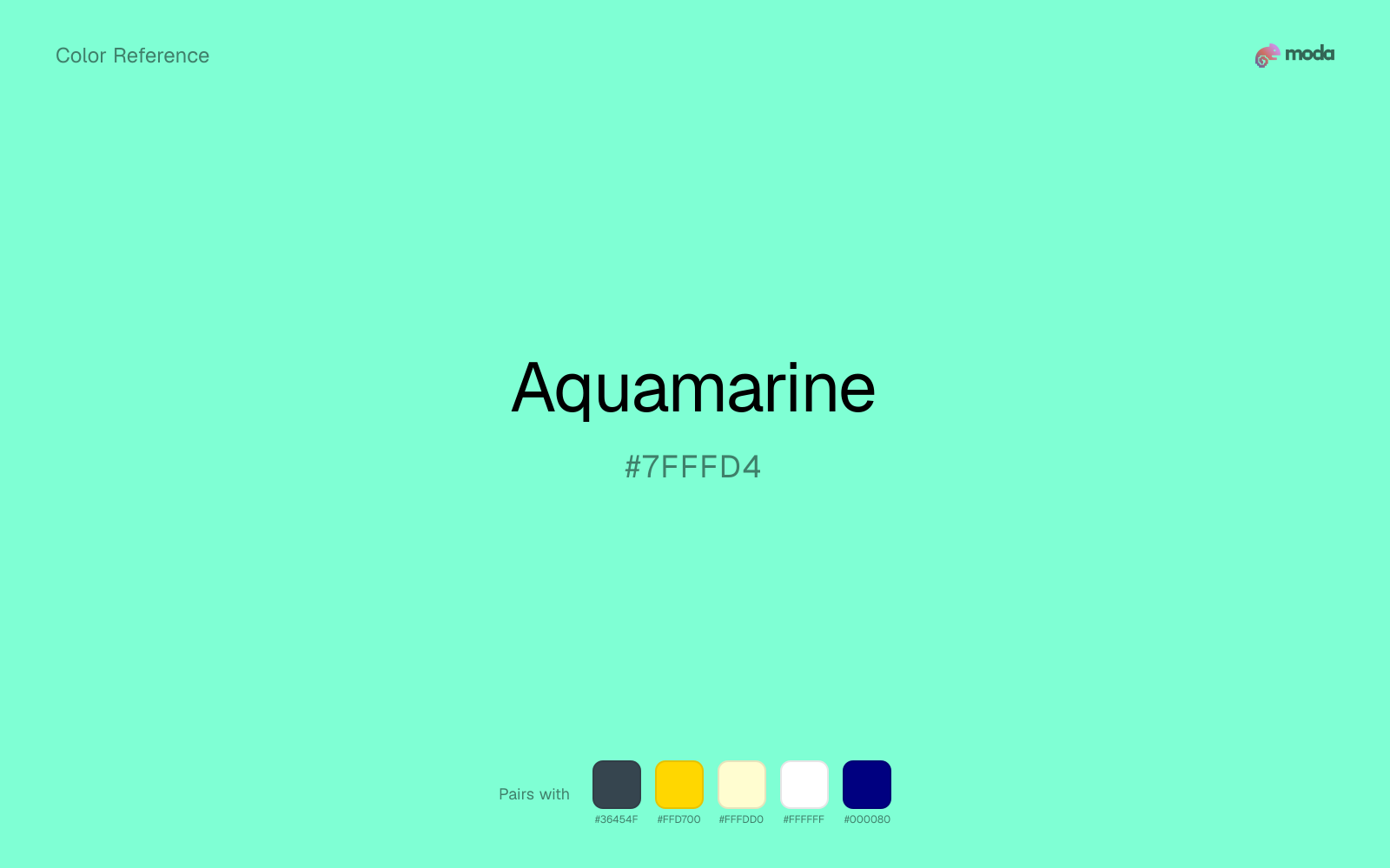
#7FFFD4
RGB
127, 255, 212
HSL
160°, 100%, 75%
HSV
160°, 50%, 100%
Aquamarine is seawater held up to the sky — light, crystalline, and unmistakably gemmy. #7FFFD4 balances cyan sparkle with a green anchor, so it reads tropical without sliding into pure turquoise neon. It flatters summer travel, jewelry, and airy tech skins.
Best for
Mobile app interfaces, onboarding screens, and light-mode UI themes.
Compare with
Accessibility
Check contrast before using aquamarine for text-heavy layouts, especially on low-contrast backgrounds.
How does aquamarine compare to nearby colors?
What is the difference between aquamarine and seafoam?
Seafoam (#93E9BE) carries less pigment punch than Aquamarine (#7FFFD4), so the pair separates by finish as much as hue. Aquamarine pushes the palette toward sharper emphasis, while Seafoam leaves more room for typography, photography, or adjacent accents. Choose aquamarine when the color needs to register quickly and act like the headline accent; keep seafoam when the rest of the layout needs a quieter companion.
What color is aquamarine?
The name references the beryl gemstone aquamarine and is common in cosmetics, resort branding, and digital palettes including CSS "aquamarine."
What is the hex code for aquamarine?
| Format | Value |
|---|---|
| HEX | #7FFFD4 |
| RGB | rgb(127, 255, 212) |
| HSL | hsl(160°, 100%, 75%) |
| HSV / HSB | hsv(160°, 50%, 100%) |
| CMYK (approx.) | cmyk(50%, 0%, 17%, 0%) |
Convert Aquamarine to other color formats
Open the color converter with Aquamarine (#7FFFD4) prefilled to copy RGB, HSL, HSV, CMYK, or OKLCH values.
Convert Aquamarine in the color converter →What does aquamarine mean in design?
Aquamarine is often associated with clarity, leisure, and breezy optimism. Next to seafoam it tends to read as brighter and more jewel-like; compared with spring green it usually feels bluer, softer, and less electric.
How do I use aquamarine in code?
| CSS (hex) | color: #7FFFD4; |
| CSS (rgb) | color: rgb(127, 255, 212); |
| CSS (hsl) | color: hsl(160, 100%, 75%); |
| RGB % | rgb(50%, 100%, 83%) |
| Tailwind | text-[#7FFFD4] |
| SwiftUI | Color(red: 0.498, green: 1.000, blue: 0.831) |
| UIKit | UIColor(red: 0.498, green: 1.000, blue: 0.831, alpha: 1.0) |
| Android | Color.rgb(127, 255, 212) |
| Compose | Color(0xFF7FFFD4) |
| Web Safe | #66FFCC |
Is aquamarine accessible?
| Combination | Ratio | AA | AA lg | AAA | AAA lg | UI |
|---|---|---|---|---|---|---|
| AaWhite text on this color | 1.22:1 | ✗ | ✗ | ✗ | ✗ | ✗ |
| AaBlack text on this color | 17.16:1 | ✓ | ✓ | ✓ | ✓ | ✓ |
| AaThis color as text on white | 1.22:1 | ✗ | ✗ | ✗ | ✗ | ✗ |
| AaThis color as text on black | 17.16:1 | ✓ | ✓ | ✓ | ✓ | ✓ |
WCAG 2.1: AA normal ≥ 4.5:1, AA large text ≥ 3:1, AAA normal ≥ 7:1, AAA large ≥ 4.5:1, UI components ≥ 3:1.
How does aquamarine look with color blindness?
Simulated appearance for common types of color vision deficiency. Actual perception varies by individual.
What colors go with aquamarine
Charcoal balances aquamarine by turning the palette into a usable light-dark system rather than a field of soft midtones.
With a cooler color like aquamarine, gold adds richness and turns the system toward premium packaging, hospitality, or ceremonial branding.
Cream lets aquamarine stay expressive without turning the whole composition stark; the result feels closer to editorial or packaging work than to raw UI default.
What colors clash with aquamarine
Neon Green competes with aquamarine so aggressively that the palette never really settles into a clear primary-secondary relationship.
Magenta remaps aquamarine too aggressively, dragging it away from sports, agritech, and momentum-led dashboards and into a brighter, more performative palette.
How should I use aquamarine in design?
- •Aquamarine works best as a background tint, card fill, or section divider — it adds warmth without competing with foreground content. Pair with dark text for readability.
- •Aquamarine leans cool, so warm accents like gold, coral, or rust add the most energy. For a calm, professional palette, stay with other cool tones and use value contrast instead.
- •Aquamarine's high saturation makes it most effective in small doses — buttons, chart highlights, notification badges, and social media accents.
What are good aquamarine palettes?
Vivid clarity
Mobile app interfaces, onboarding screens, and light-mode UI themes.
Honey and cream
Startup branding, pitch materials, and product landing pages.
Design with aquamarine in Moda
Create a presentation or document using aquamarineas your accent color. Moda's AI applies your color palette automatically.
Create a design with aquamarine →What are the shades and tints of aquamarine?
Shades (darker)
Tints (lighter)
Tones (desaturated)
Hue variations
What are the color harmonies for aquamarine?
Harmonies are calculated from the base swatch. When a harmony matches a named color page, it links there; otherwise it appears here as a computed reference swatch.
Similar colors
Seafoam
Seafoam is nearly adjacent to aquamarine in hue; what separates them is intensity, with seafoam reading dustier and easier to extend across a layout.
Electric Blue
Electric Blue occupies a similar depth to aquamarine, though it pushes the family toward a more cool reading and a different material feel.
Mint Green
Mint Green is a nearby alternative to aquamarine when the palette needs a different undertone or material cue more than a dramatic contrast change.
Turquoise
Turquoise is close enough to aquamarine to keep the palette cohesive, yet the lighter-darker shift still decides whether the family behaves more like atmosphere or more like structure.
Powder Blue
Powder Blue is useful when aquamarine is the right weight but the wrong mood: the swap changes temperature and finish more than contrast.
Frequently asked questions
What is the hex code for aquamarine?
The hex code for aquamarine is #7FFFD4. In RGB, that's 127 red, 255 green, and 212 blue. The approximate CMYK equivalent is 50% cyan, 0% magenta, 17% yellow, and 0% key (black).
Is aquamarine a warm or cool color?
Aquamarine falls on the cool side of the palette, so warm companions create the clearest contrast while other cool tones keep the system more restrained.
Should aquamarine lead the palette or stay in supporting roles?
Aquamarine has enough chroma to take the lead, but it usually performs best when the surrounding system stays quieter. Treat it as the voice of emphasis, not the answer to every layout need.
Where does aquamarine work best in a layout?
Aquamarine is better on broad surfaces than in tiny details, so treat it as a background or support color and let darker accents carry the sharp hierarchy.
Is aquamarine accessible?
Aquamarine works better with dark text than white text. Black text reaches 17.16:1 contrast on the swatch, which makes the color more usable as a background or highlight surface than as a dark panel.
More green colors
Keep exploring color resources
All color pages
Browse the full library of color references, pairings, and palettes.
Green colors
Compare aquamarine with other green tones.
Blue colors
Explore nearby color families to build stronger palettes and contrasts.
Brown colors
Explore nearby color families to build stronger palettes and contrasts.
Neutral colors
Explore nearby color families to build stronger palettes and contrasts.
Last updated April 6, 2026
Color values are computed from the listed hex code using standard conversion formulas. RGB, HSL, and HSV are exact screen-ready conversions. CMYK is an approximate on-screen reference, not a press-ready print specification. Pairings, palettes, and use-case guidance are heuristic recommendations derived from color relationships, contrast behavior, and common presentation, document, and UI patterns.