Turquoise meaning and palette guide
HEX
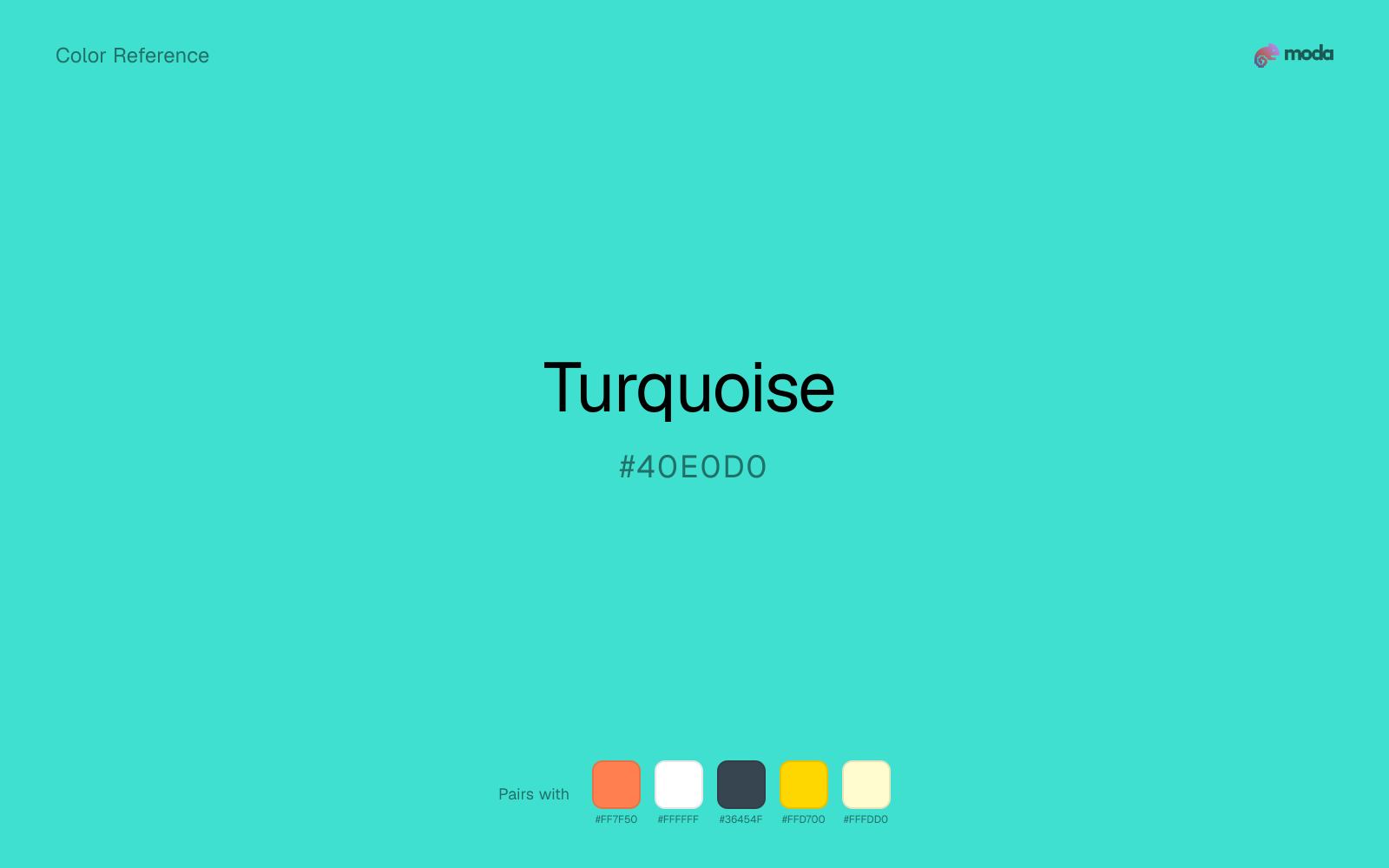
#40E0D0
RGB
64, 224, 208
HSL
174°, 72%, 56%
HSV
174°, 71%, 88%
Turquoise (#40E0D0) is a bright blue-green that feels energetic, fresh, and distinctive. It works well for brands in travel, wellness, and creative industries that want to stand out from the sea of corporate blues.
Best for
Marketing websites, social media graphics, and campaign landing pages.
Compare with
Accessibility
Check contrast before using turquoise for text-heavy layouts, especially on low-contrast backgrounds.
How does turquoise compare to nearby colors?
What is the difference between turquoise and electric blue?
Turquoise (#40E0D0) lands deeper on the value scale than Electric Blue (#7DF9FF), so the first impression is about darkness before hue. Turquoise behaves more like a system color and Electric Blue more like a spotlight, so the decision changes how busy the layout feels. Choose turquoise when the design needs a darker base color that can hold text, framing, or heavier contrast work; keep electric blue for lighter-facing surfaces.
What color is turquoise?
Turquoise is named after the gemstone, which has been prized for thousands of years. It holds deep significance in Southwest and Native American art and jewelry, and is the national gemstone of Iran, where some of the finest specimens originate.
What is the hex code for turquoise?
| Format | Value |
|---|---|
| HEX | #40E0D0 |
| RGB | rgb(64, 224, 208) |
| HSL | hsl(174°, 72%, 56%) |
| HSV / HSB | hsv(174°, 71%, 88%) |
| CMYK (approx.) | cmyk(71%, 0%, 7%, 12%) |
Convert Turquoise to other color formats
Open the color converter with Turquoise (#40E0D0) prefilled to copy RGB, HSL, HSV, CMYK, or OKLCH values.
Convert Turquoise in the color converter →What does turquoise mean in design?
Turquoise combines blue's trustworthiness with green's freshness, creating a color that feels both calming and energizing. It is associated with tropical waters, clear skies, and healing. In design, turquoise signals creativity, openness, and a forward-thinking mindset.
How do I use turquoise in code?
| CSS (hex) | color: #40E0D0; |
| CSS (rgb) | color: rgb(64, 224, 208); |
| CSS (hsl) | color: hsl(174, 72%, 56%); |
| RGB % | rgb(25%, 88%, 82%) |
| Tailwind | text-[#40E0D0] |
| SwiftUI | Color(red: 0.251, green: 0.878, blue: 0.816) |
| UIKit | UIColor(red: 0.251, green: 0.878, blue: 0.816, alpha: 1.0) |
| Android | Color.rgb(64, 224, 208) |
| Compose | Color(0xFF40E0D0) |
| Web Safe | #33CCCC |
Is turquoise accessible?
| Combination | Ratio | AA | AA lg | AAA | AAA lg | UI |
|---|---|---|---|---|---|---|
| AaWhite text on this color | 1.64:1 | ✗ | ✗ | ✗ | ✗ | ✗ |
| AaBlack text on this color | 12.79:1 | ✓ | ✓ | ✓ | ✓ | ✓ |
| AaThis color as text on white | 1.64:1 | ✗ | ✗ | ✗ | ✗ | ✗ |
| AaThis color as text on black | 12.79:1 | ✓ | ✓ | ✓ | ✓ | ✓ |
WCAG 2.1: AA normal ≥ 4.5:1, AA large text ≥ 3:1, AAA normal ≥ 7:1, AAA large ≥ 4.5:1, UI components ≥ 3:1.
How does turquoise look with color blindness?
Simulated appearance for common types of color vision deficiency. Actual perception varies by individual.
What colors go with turquoise
Coral changes the temperature story around turquoise: aqua-blue on its own, more food, promotion, and social-first graphics once the cooler or warmer partner is introduced.
White gives turquoise enough open space that the color can feel vivid without turning the whole palette noisy.
Charcoal turns turquoise from purely energetic into something more adult and controlled by adding depth without another hue fight.
What colors clash with turquoise
With turquoise, Neon Green pulls the palette toward LED signage and away from the signal-blue quality that makes the source color usable.
With turquoise, magenta introduces a second emotional story instead of reinforcing the first one, so the palette can feel internally split.
How should I use turquoise in design?
- •Turquoise stands out against both light and dark backgrounds — use it as a primary accent for CTAs and key UI elements.
- •Pair turquoise with coral for a vibrant complementary palette, or with white and gray for a cleaner look.
- •Use turquoise sparingly in corporate contexts — it can feel too casual for conservative industries.
What are good turquoise palettes?
Light touch
Marketing websites, social media graphics, and campaign landing pages.
Design with turquoise in Moda
Create a presentation or document using turquoiseas your accent color. Moda's AI applies your color palette automatically.
Create a design with turquoise →What are the shades and tints of turquoise?
Shades (darker)
Tints (lighter)
Tones (desaturated)
Hue variations
What are the color harmonies for turquoise?
Harmonies are calculated from the base swatch. When a harmony matches a named color page, it links there; otherwise it appears here as a computed reference swatch.
Similar colors
Cyan
Cyan is almost the same hue as turquoise; the real difference is value, with cyan feeling more grounded and anchor-ready.
Electric Blue
Electric Blue stays in the same color family as turquoise, but the change in value moves it into different layout jobs, especially once backgrounds, charts, or section dividers enter the system.
Ice Blue
Ice Blue tracks close to turquoise in hue, but the value shift changes where each one earns its place: ice blue is easier to use for backgrounds, tints, and softer supporting areas, while turquoise holds onto accents, stronger hierarchy, and firmer structure.
Sky Blue
Sky Blue tracks close to turquoise in hue, but the value shift changes where each one earns its place: sky blue is easier to use for backgrounds, tints, and softer supporting areas, while turquoise holds onto accents, stronger hierarchy, and firmer structure.
Aquamarine
Aquamarine tracks close to turquoise in hue, but the value shift changes where each one earns its place: aquamarine is easier to use for backgrounds, tints, and softer supporting areas, while turquoise holds onto accents, stronger hierarchy, and firmer structure.
Frequently asked questions
What is the hex code for turquoise?
The hex code for turquoise is #40E0D0. In RGB, that's 64 red, 224 green, and 208 blue. The approximate CMYK equivalent is 71% cyan, 0% magenta, 7% yellow, and 12% key (black).
Is turquoise a warm or cool color?
Turquoise reads as cool. It settles naturally beside blues, greens, silver, and charcoal, and feels more animated when paired with warm accents like gold, coral, or rust.
Where does turquoise work best in a layout?
Turquoise is flexible enough to move between accents, section blocks, and supporting roles depending on the contrast around it. It works best when the rest of the palette gives it a clear job instead of asking it to do everything at once.
How should I use turquoise in a design?
Turquoise is versatile enough for headlines, accent bars, buttons, charts, or section backgrounds depending on the contrast around it. It works as either a primary or supporting color in decks, documents, and brand systems.
Can I use turquoise for text or backgrounds?
Turquoise works better with dark text than white text. Black text reaches 12.79:1 contrast on the swatch, which makes the color more usable as a background or highlight surface than as a dark panel.
More blue colors
Keep exploring color resources
All color pages
Browse the full library of color references, pairings, and palettes.
Blue colors
Compare turquoise with other blue tones.
Green colors
Explore nearby color families to build stronger palettes and contrasts.
Neutral colors
Explore nearby color families to build stronger palettes and contrasts.
Purple colors
Explore nearby color families to build stronger palettes and contrasts.
Last updated April 6, 2026
Color values are computed from the listed hex code using standard conversion formulas. RGB, HSL, and HSV are exact screen-ready conversions. CMYK is an approximate on-screen reference, not a press-ready print specification. Pairings, palettes, and use-case guidance are heuristic recommendations derived from color relationships, contrast behavior, and common presentation, document, and UI patterns.