Royal Blue color guide
HEX
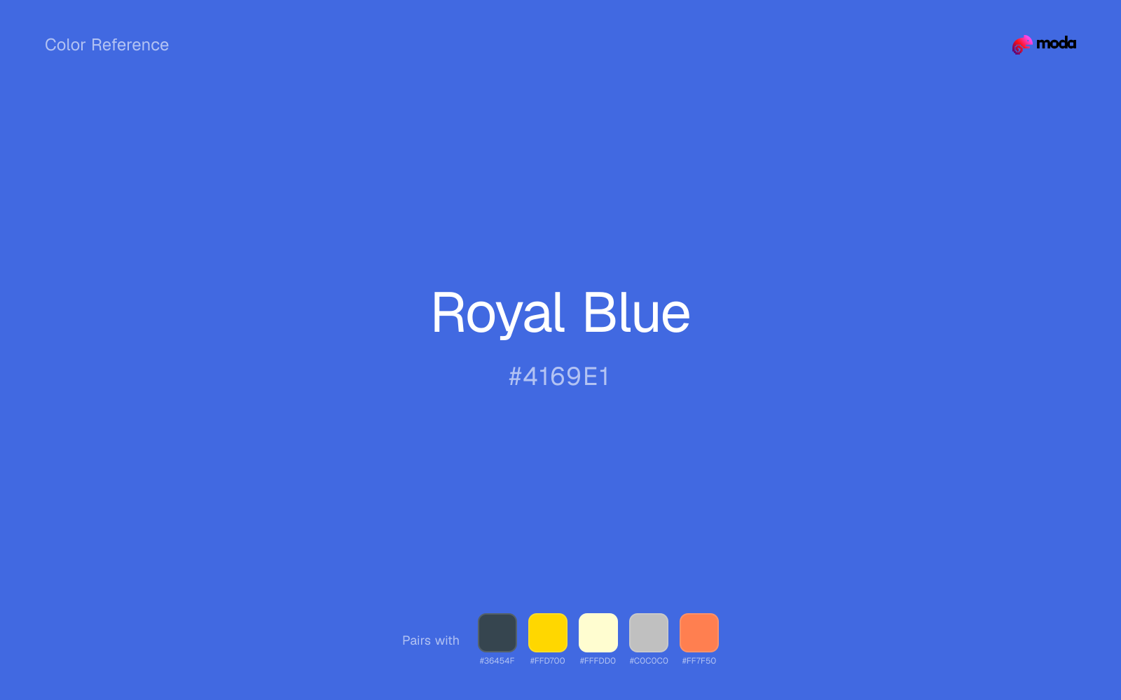
#4169E1
RGB
65, 105, 225
HSL
225°, 73%, 57%
HSV
225°, 71%, 88%
Royal blue (#4169E1) is a vivid medium-deep blue that feels more energetic than navy while still reading as trustworthy. It works for product marketing, sports-adjacent branding, and presentations that need authority with more visual lift.
Best for
Event branding, newsletters, and customer-facing web pages.
Compare with
Accessibility
Royal Blue text on white passes AA at 4.85:1, which makes it usable for headings and short labels.
How does royal blue compare to nearby colors?
What is the difference between royal blue and iris?
Royal Blue (#4169E1) bends more toward blue-ink, while Iris (#5A4FCF) carries more of a blue-ink cast. The practical difference is not raw contrast so much as project fit: Royal Blue reads more naturally in app UI, charts, and digital-native branding, while Iris fits more easily into vintage editorial and art-school palettes. Begin with royal blue when the family needs its current undertone and surface character; keep iris for the nearby alternative that shifts the mood without leaving the same hue neighborhood.
What color is royal blue?
Royal blue has long been associated with ceremonial dress, uniforms, and national branding. Compared with navy, it feels brighter and more outward-facing, which is why it often appears in sports, consumer tech, and public-sector design.
What is the hex code for royal blue?
| Format | Value |
|---|---|
| HEX | #4169E1 |
| RGB | rgb(65, 105, 225) |
| HSL | hsl(225°, 73%, 57%) |
| HSV / HSB | hsv(225°, 71%, 88%) |
| CMYK (approx.) | cmyk(71%, 53%, 0%, 12%) |
Convert Royal Blue to other color formats
Open the color converter with Royal Blue (#4169E1) prefilled to copy RGB, HSL, HSV, CMYK, or OKLCH values.
Convert Royal Blue in the color converter →What does royal blue mean in design?
Royal blue communicates confidence, visibility, and momentum. It carries the trust of blue but feels more active than navy, making it a strong choice when a layout needs to feel polished and energetic at the same time.
How do I use royal blue in code?
| CSS (hex) | color: #4169E1; |
| CSS (rgb) | color: rgb(65, 105, 225); |
| CSS (hsl) | color: hsl(225, 73%, 57%); |
| RGB % | rgb(25%, 41%, 88%) |
| Tailwind | text-[#4169E1] |
| SwiftUI | Color(red: 0.255, green: 0.412, blue: 0.882) |
| UIKit | UIColor(red: 0.255, green: 0.412, blue: 0.882, alpha: 1.0) |
| Android | Color.rgb(65, 105, 225) |
| Compose | Color(0xFF4169E1) |
| Web Safe | #3366CC |
Is royal blue accessible?
| Combination | Ratio | AA | AA lg | AAA | AAA lg | UI |
|---|---|---|---|---|---|---|
| AaWhite text on this color | 4.85:1 | ✓ | ✓ | ✗ | ✓ | ✓ |
| AaBlack text on this color | 4.33:1 | ✗ | ✓ | ✗ | ✗ | ✓ |
| AaThis color as text on white | 4.85:1 | ✓ | ✓ | ✗ | ✓ | ✓ |
| AaThis color as text on black | 4.33:1 | ✗ | ✓ | ✗ | ✗ | ✓ |
WCAG 2.1: AA normal ≥ 4.5:1, AA large text ≥ 3:1, AAA normal ≥ 7:1, AAA large ≥ 4.5:1, UI components ≥ 3:1.
How does royal blue look with color blindness?
Simulated appearance for common types of color vision deficiency. Actual perception varies by individual.
What colors go with royal blue
Charcoal turns royal blue from purely energetic into something more adult and controlled by adding depth without another hue fight.
Gold gives royal blue a warmer highlight, which helps the palette feel more tactile and less screen-native than it would with only neutrals.
Cream lets royal blue stay expressive without turning the whole composition stark; the result feels closer to editorial or packaging work than to raw UI default.
What colors clash with royal blue
With royal blue, Neon Green pulls the palette toward LED signage and away from the signal-blue quality that makes the source color usable.
With royal blue, magenta introduces a second emotional story instead of reinforcing the first one, so the palette can feel internally split.
How should I use royal blue in design?
- •Use royal blue for section headers, callout bars, and charts when navy feels too conservative.
- •Pair royal blue with white and charcoal for a clean interface, or with gold for a more ceremonial, premium feel.
- •Keep royal blue away from equally bright competing accents unless you want a louder, consumer-facing palette.
What are good royal blue palettes?
Design with royal blue in Moda
Create a presentation or document using royal blueas your accent color. Moda's AI applies your color palette automatically.
Create a design with royal blue →What are the shades and tints of royal blue?
Shades (darker)
Tints (lighter)
Tones (desaturated)
Hue variations
What are the color harmonies for royal blue?
Harmonies are calculated from the base swatch. When a harmony matches a named color page, it links there; otherwise it appears here as a computed reference swatch.
Similar colors
Cornflower
Cornflower is almost the same hue as royal blue; the real difference is value, with cornflower feeling more open and surface-friendly.
Iris
Iris is useful when royal blue is the right weight but the wrong mood: the swap changes temperature and finish more than contrast.
Slate Blue
Slate Blue keeps roughly the same visual weight as royal blue but changes the undertone story, which is often enough to move a palette from warmer and tactile to cooler and more technical, or the reverse.
Denim
Denim tracks close to royal blue in hue, but the value shift changes where each one earns its place: denim is easier to use for headlines, anchors, and darker sections, while royal blue holds onto lighter surfaces and more open applications.
Steel Blue
Steel Blue occupies a similar depth to royal blue, though it pushes the family toward a more cool reading and a different material feel.
Frequently asked questions
What is the hex code for royal blue?
The hex code for royal blue is #4169E1. In RGB, that's 65 red, 105 green, and 225 blue. The approximate CMYK equivalent is 71% cyan, 53% magenta, 0% yellow, and 12% key (black).
Is royal blue a warm or cool color?
Royal Blue reads as cool. It settles naturally beside blues, greens, silver, and charcoal, and feels more animated when paired with warm accents like gold, coral, or rust.
Is royal blue better as an accent or a full-palette color?
Royal Blue is usually best when it leads in short bursts rather than covering everything. It can headline a palette, but most layouts work better when the color handles accents, highlights, or one main hero role instead of every surface.
How should I use royal blue in a design?
Royal Blue is versatile enough for headlines, accent bars, buttons, charts, or section backgrounds depending on the contrast around it. It works as either a primary or supporting color in decks, documents, and brand systems.
Can I use royal blue for text or backgrounds?
Royal Blue can work as text on white at 4.85:1 contrast, but it is usually safest in headings, labels, and accent moments rather than long body copy.
More blue colors
Keep exploring color resources
All color pages
Browse the full library of color references, pairings, and palettes.
Blue colors
Compare royal blue with other blue tones.
Green colors
Explore nearby color families to build stronger palettes and contrasts.
Neutral colors
Explore nearby color families to build stronger palettes and contrasts.
Purple colors
Explore nearby color families to build stronger palettes and contrasts.
Last updated April 6, 2026
Color values are computed from the listed hex code using standard conversion formulas. RGB, HSL, and HSV are exact screen-ready conversions. CMYK is an approximate on-screen reference, not a press-ready print specification. Pairings, palettes, and use-case guidance are heuristic recommendations derived from color relationships, contrast behavior, and common presentation, document, and UI patterns.