Iris meaning and palette guide
HEX
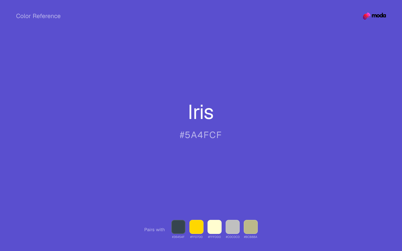
#5A4FCF
RGB
90, 79, 207
HSL
245°, 57%, 56%
HSV
245°, 62%, 81%
Iris leans into blue-purple the way actual irises do — vivid, electric, and slightly aristocratic. #5D3FD3 can substitute for indigo when you still want floral personality. On dark backgrounds it glows with a cool voltage that warm magentas do not share.
Best for
Event branding, newsletters, and customer-facing web pages.
Accessibility
Iris text on white passes AA at 6.08:1, which makes it usable for headings and short labels.
How does iris compare to nearby colors?
What is the difference between iris and royal blue?
Iris (#5A4FCF) bends more toward blue-ink, while Royal Blue (#4169E1) carries more of a blue-ink cast. Iris and Royal Blue can fill many of the same slots, but one steers the palette toward dusky violet and the other toward signal-blue. Begin with iris when the family needs its current undertone and surface character; keep royal blue for the nearby alternative that shifts the mood without leaving the same hue neighborhood.
What color is iris?
Named for Iris flowers. Common in floral branding, premium tech accents, and palettes that want "periwinkle meets purple."
What is the hex code for iris?
| Format | Value |
|---|---|
| HEX | #5A4FCF |
| RGB | rgb(90, 79, 207) |
| HSL | hsl(245°, 57%, 56%) |
| HSV / HSB | hsv(245°, 62%, 81%) |
| CMYK (approx.) | cmyk(57%, 62%, 0%, 19%) |
Convert Iris to other color formats
Open the color converter with Iris (#5A4FCF) prefilled to copy RGB, HSL, HSV, CMYK, or OKLCH values.
Convert Iris in the color converter →What does iris mean in design?
Iris is often associated with vision, imagination, and crisp modern confidence. Next to royal purple, iris tends to read bluer and more luminous; next to magenta, it feels cooler and less aggressively pink.
How do I use iris in code?
| CSS (hex) | color: #5A4FCF; |
| CSS (rgb) | color: rgb(90, 79, 207); |
| CSS (hsl) | color: hsl(245, 57%, 56%); |
| RGB % | rgb(35%, 31%, 81%) |
| Tailwind | text-[#5A4FCF] |
| SwiftUI | Color(red: 0.353, green: 0.310, blue: 0.812) |
| UIKit | UIColor(red: 0.353, green: 0.310, blue: 0.812, alpha: 1.0) |
| Android | Color.rgb(90, 79, 207) |
| Compose | Color(0xFF5A4FCF) |
| Web Safe | #6666CC |
Is iris accessible?
| Combination | Ratio | AA | AA lg | AAA | AAA lg | UI |
|---|---|---|---|---|---|---|
| AaWhite text on this color | 6.08:1 | ✓ | ✓ | ✗ | ✓ | ✓ |
| AaBlack text on this color | 3.45:1 | ✗ | ✓ | ✗ | ✗ | ✓ |
| AaThis color as text on white | 6.08:1 | ✓ | ✓ | ✗ | ✓ | ✓ |
| AaThis color as text on black | 3.45:1 | ✗ | ✓ | ✗ | ✗ | ✓ |
WCAG 2.1: AA normal ≥ 4.5:1, AA large text ≥ 3:1, AAA normal ≥ 7:1, AAA large ≥ 4.5:1, UI components ≥ 3:1.
How does iris look with color blindness?
Simulated appearance for common types of color vision deficiency. Actual perception varies by individual.
What colors go with iris
Charcoal gives iris a modern dark partner that feels softer and more material than default black.
Gold warms iris enough to keep the palette from feeling chilly or overly technical, while still reading intentional rather than decorative-for-its-own-sake.
Pairing iris with cream keeps the palette relaxed and material, which is useful when a bright white would feel too crisp.
Silver acts more like structure than spectacle beside iris, which is often exactly what a stronger source color needs.
Sage Green shifts iris away from a purely cool read and makes the combination feel more considered in real layouts.
What colors clash with iris
Neon Green turns iris into something closer to screen glow than surface color, which is a mismatch for most editorial, product, or deck work.
With iris, magenta introduces a second emotional story instead of reinforcing the first one, so the palette can feel internally split.
How should I use iris in design?
- •Try iris for section backgrounds, card fills, or brand-secondary roles where you want color without overpowering the content.
- •Warm touches like gold or coral bring out iris's cooler character by contrast, while staying with cool neighbors creates a calmer, more unified feel.
- •Iris works in beauty, creative-agency, and premium-product contexts where the brand wants to feel distinctive without resorting to standard corporate blue.
What are good iris palettes?
Bright horizon
Event branding, newsletters, and customer-facing web pages.
Soft landing
Brand guidelines, design systems, and visual identity documents.
Design with iris in Moda
Create a presentation or document using irisas your accent color. Moda's AI applies your color palette automatically.
Create a design with iris →What are the shades and tints of iris?
Shades (darker)
Tints (lighter)
Tones (desaturated)
Hue variations
What are the color harmonies for iris?
Harmonies are calculated from the base swatch. When a harmony matches a named color page, it links there; otherwise it appears here as a computed reference swatch.
Similar colors
Slate Blue
Slate Blue lives in the same neighborhood as iris, but the finish shift is enough to make one feel better for technical documentation and steady editorial work and the other for vintage editorial and art-school palettes.
Royal Blue
Royal Blue occupies a similar depth to iris, though it pushes the family toward a more cool reading and a different material feel.
Royal Purple
Royal Purple keeps roughly the same visual weight as iris but changes the undertone story, which is often enough to move a palette from warmer and tactile to cooler and more technical, or the reverse.
Amethyst
Amethyst is useful when iris is the right weight but the wrong mood: the swap changes temperature and finish more than contrast.
Grape
Grape tracks close to iris in hue, but the value shift changes where each one earns its place: grape is easier to use for headlines, anchors, and darker sections, while iris holds onto lighter surfaces and more open applications.
Frequently asked questions
What is the hex code for iris?
The hex code for iris is #5A4FCF. In RGB, that's 90 red, 79 green, and 207 blue. The approximate CMYK equivalent is 57% cyan, 62% magenta, 0% yellow, and 19% key (black).
Is iris a warm or cool color?
Iris reads as cool. It settles naturally beside blues, greens, silver, and charcoal, and feels more animated when paired with warm accents like gold, coral, or rust.
Where does iris work best in a layout?
Iris is flexible enough to move between accents, section blocks, and supporting roles depending on the contrast around it. It works best when the rest of the palette gives it a clear job instead of asking it to do everything at once.
How should I use iris in a design?
Iris is versatile enough for headlines, accent bars, buttons, charts, or section backgrounds depending on the contrast around it. It works as either a primary or supporting color in decks, documents, and brand systems.
Can I use iris for text or backgrounds?
Iris can work as text on white at 6.08:1 contrast, but it is usually safest in headings, labels, and accent moments rather than long body copy.
More purple colors
Keep exploring color resources
All color pages
Browse the full library of color references, pairings, and palettes.
Purple colors
Compare iris with other purple tones.
Blue colors
Explore nearby color families to build stronger palettes and contrasts.
Neutral colors
Explore nearby color families to build stronger palettes and contrasts.
Pink colors
Explore nearby color families to build stronger palettes and contrasts.
Last updated April 6, 2026
Color values are computed from the listed hex code using standard conversion formulas. RGB, HSL, and HSV are exact screen-ready conversions. CMYK is an approximate on-screen reference, not a press-ready print specification. Pairings, palettes, and use-case guidance are heuristic recommendations derived from color relationships, contrast behavior, and common presentation, document, and UI patterns.