Slate Blue color guide
HEX
#6A5ACD
RGB
106, 90, 205
HSL
248°, 53%, 58%
HSV
248°, 56%, 80%
A mid-tone that drifts toward violet, like dusk light on stone. #6A5ACD can feel academic or indie before it feels sporty. It darkens gracefully, holding character where flatter blues go muddy.
Best for
Educational platforms, course materials, and infographic designs.
Compare with
Accessibility
Slate Blue text on white passes AA at 5.31:1, which makes it usable for headings and short labels.
How does slate blue compare to nearby colors?
What is the difference between slate blue and royal blue?
Slate Blue (#6A5ACD) looks dustier and more restrained than Royal Blue (#4169E1) when the two are shown together. The practical difference is not raw contrast so much as project fit: Slate Blue reads more naturally in technical documentation and steady editorial work, while Royal Blue fits more easily into app UI, charts, and digital-native branding. Begin with slate blue when the family needs its current undertone and surface character; keep royal blue for the nearby alternative that shifts the mood without leaving the same hue neighborhood.
What color is slate blue?
The name references slate rock's cool, purplish cast. It is used in web-safe palettes, interior textiles, and stationery aimed at "thoughtful" positioning.
What is the hex code for slate blue?
| Format | Value |
|---|---|
| HEX | #6A5ACD |
| RGB | rgb(106, 90, 205) |
| HSL | hsl(248°, 53%, 58%) |
| HSV / HSB | hsv(248°, 56%, 80%) |
| CMYK (approx.) | cmyk(48%, 56%, 0%, 20%) |
Convert Slate Blue to other color formats
Open the color converter with Slate Blue (#6A5ACD) prefilled to copy RGB, HSL, HSV, CMYK, or OKLCH values.
Convert Slate Blue in the color converter →What does slate blue mean in design?
Slate blue is often associated with contemplation, sophistication, and subdued creativity. Compared with cornflower or periwinkle, it tends to read as deeper, more purple, and less skylike.
How do I use slate blue in code?
| CSS (hex) | color: #6A5ACD; |
| CSS (rgb) | color: rgb(106, 90, 205); |
| CSS (hsl) | color: hsl(248, 53%, 58%); |
| RGB % | rgb(42%, 35%, 80%) |
| Tailwind | text-[#6A5ACD] |
| SwiftUI | Color(red: 0.416, green: 0.353, blue: 0.804) |
| UIKit | UIColor(red: 0.416, green: 0.353, blue: 0.804, alpha: 1.0) |
| Android | Color.rgb(106, 90, 205) |
| Compose | Color(0xFF6A5ACD) |
| Web Safe | #6666CC |
Is slate blue accessible?
| Combination | Ratio | AA | AA lg | AAA | AAA lg | UI |
|---|---|---|---|---|---|---|
| AaWhite text on this color | 5.31:1 | ✓ | ✓ | ✗ | ✓ | ✓ |
| AaBlack text on this color | 3.96:1 | ✗ | ✓ | ✗ | ✗ | ✓ |
| AaThis color as text on white | 5.31:1 | ✓ | ✓ | ✗ | ✓ | ✓ |
| AaThis color as text on black | 3.96:1 | ✗ | ✓ | ✗ | ✗ | ✓ |
WCAG 2.1: AA normal ≥ 4.5:1, AA large text ≥ 3:1, AAA normal ≥ 7:1, AAA large ≥ 4.5:1, UI components ≥ 3:1.
How does slate blue look with color blindness?
Simulated appearance for common types of color vision deficiency. Actual perception varies by individual.
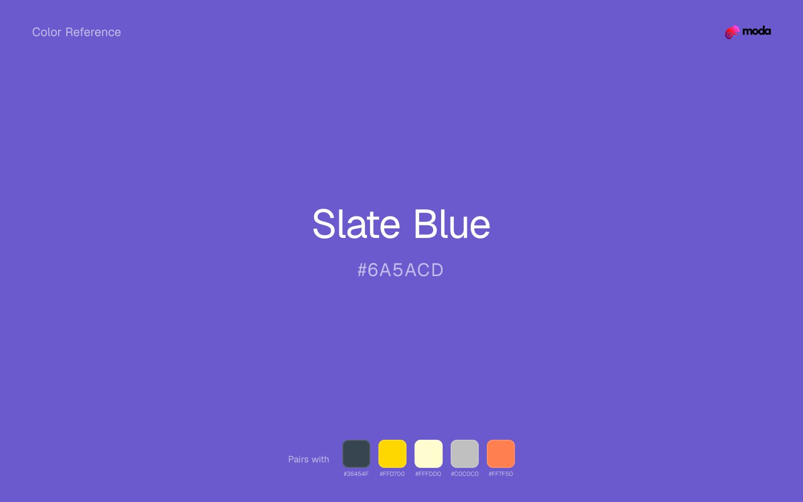
What colors go with slate blue
Charcoal helps slate blue feel grounded and architectural, especially when the design needs a darker value that still reads refined.
Gold warms slate blue enough to keep the palette from feeling chilly or overly technical, while still reading intentional rather than decorative-for-its-own-sake.
Pairing slate blue with cream keeps the palette relaxed and material, which is useful when a bright white would feel too crisp.
What colors clash with slate blue
Neon Green beside slate blue tends to vibrate on bright displays, so the pair reads more like a HUD effect than a considered brand palette.
Magenta pushes slate blue toward a nightclub or cosmetic register that is hard to square with calmer editorial or product work.
How should I use slate blue in design?
- •Try slate blue for section backgrounds, card fills, or brand-secondary roles where you want color without overpowering the content.
- •Pair slate blue with warm accents (gold, rust, amber) when you need more energy, or stay in cool territory (navy, silver, sage) for a composed, professional look.
- •Slate Blue is a safe choice for corporate decks, SaaS dashboards, and enterprise UI — contexts where trustworthiness is the first design requirement.
What are good slate blue palettes?
Light touch
Educational platforms, course materials, and infographic designs.
Sunlit warmth
Workshop handouts, training guides, and presentation templates.
Design with slate blue in Moda
Create a presentation or document using slate blueas your accent color. Moda's AI applies your color palette automatically.
Create a design with slate blue →What are the shades and tints of slate blue?
Shades (darker)
Tints (lighter)
Tones (desaturated)
Hue variations
What are the color harmonies for slate blue?
Harmonies are calculated from the base swatch. When a harmony matches a named color page, it links there; otherwise it appears here as a computed reference swatch.
Similar colors
Iris
Iris is near enough to slate blue to swap into the same palette, yet the undertone shift still decides whether the family reads warmer or cooler overall.
Royal Blue
Royal Blue occupies a similar depth to slate blue, though it pushes the family toward a more cool reading and a different material feel.
Amethyst
Amethyst keeps roughly the same visual weight as slate blue but changes the undertone story, which is often enough to move a palette from warmer and tactile to cooler and more technical, or the reverse.
Royal Purple
Royal Purple is useful when slate blue is the right weight but the wrong mood: the swap changes temperature and finish more than contrast.
Grape
Grape is close enough to slate blue to keep the palette cohesive, yet the lighter-darker shift still decides whether the family behaves more like atmosphere or more like structure.
Frequently asked questions
What is the hex code for slate blue?
The hex code for slate blue is #6A5ACD. In RGB, that's 106 red, 90 green, and 205 blue. The approximate CMYK equivalent is 48% cyan, 56% magenta, 0% yellow, and 20% key (black).
Is slate blue a warm or cool color?
Slate Blue reads as cool. It settles naturally beside blues, greens, silver, and charcoal, and feels more animated when paired with warm accents like gold, coral, or rust.
Where does slate blue work best in a layout?
Slate Blue is flexible enough to move between accents, section blocks, and supporting roles depending on the contrast around it. It works best when the rest of the palette gives it a clear job instead of asking it to do everything at once.
How should I use slate blue in a design?
Slate Blue is versatile enough for headlines, accent bars, buttons, charts, or section backgrounds depending on the contrast around it. It works as either a primary or supporting color in decks, documents, and brand systems.
Can I use slate blue for text or backgrounds?
Slate Blue can work as text on white at 5.31:1 contrast, but it is usually safest in headings, labels, and accent moments rather than long body copy.
More blue colors
Keep exploring color resources
All color pages
Browse the full library of color references, pairings, and palettes.
Blue colors
Compare slate blue with other blue tones.
Green colors
Explore nearby color families to build stronger palettes and contrasts.
Neutral colors
Explore nearby color families to build stronger palettes and contrasts.
Purple colors
Explore nearby color families to build stronger palettes and contrasts.
Last updated April 6, 2026
Color values are computed from the listed hex code using standard conversion formulas. RGB, HSL, and HSV are exact screen-ready conversions. CMYK is an approximate on-screen reference, not a press-ready print specification. Pairings, palettes, and use-case guidance are heuristic recommendations derived from color relationships, contrast behavior, and common presentation, document, and UI patterns.