Using Lavender as a surface color
HEX
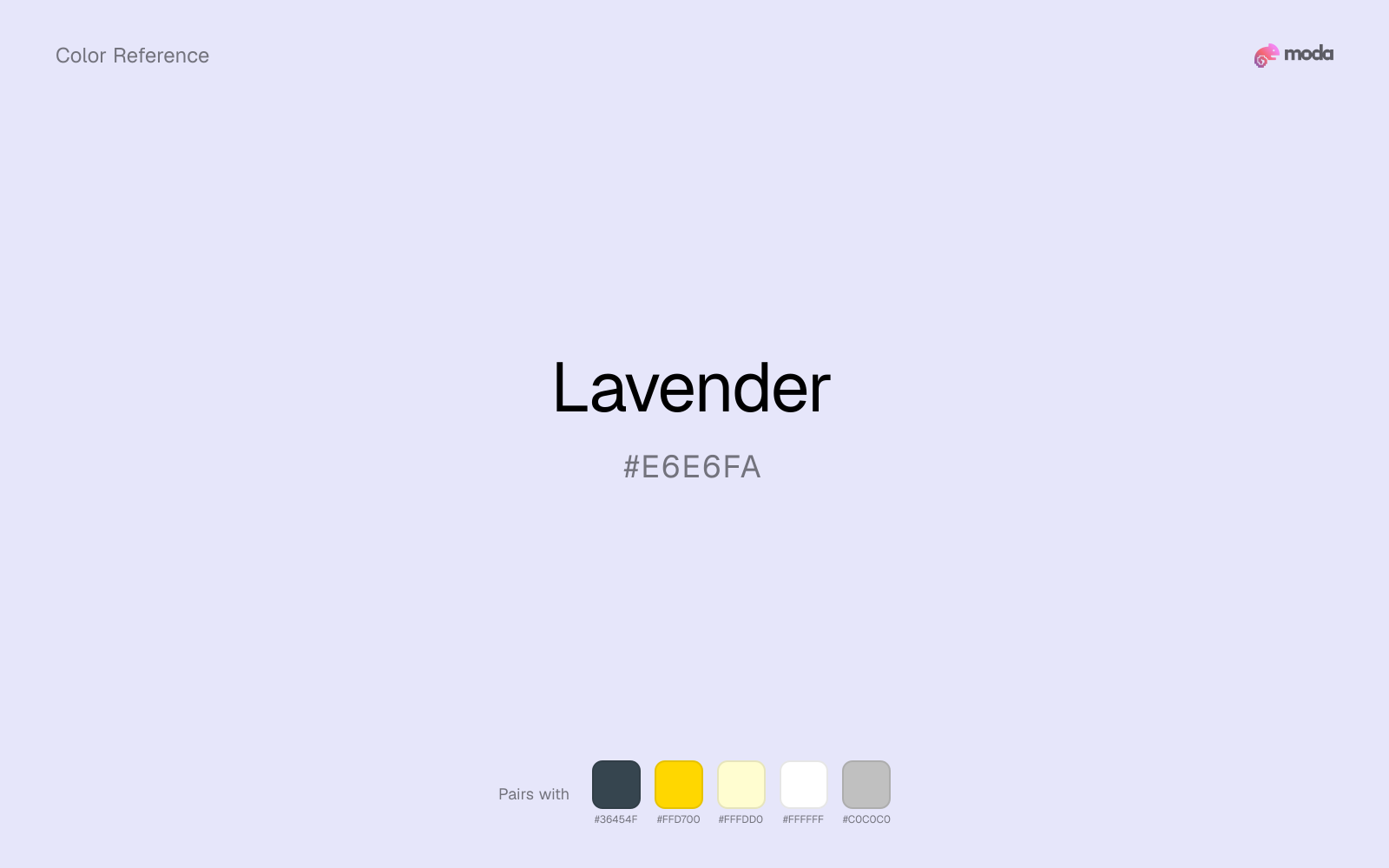
#E6E6FA
RGB
230, 230, 250
HSL
240°, 67%, 94%
HSV
240°, 8%, 98%
Lavender (#E6E6FA) is a pale blue-violet that behaves more like tinted light than like a strong color block. It is useful when you want purple atmosphere without the density of lilac, violet, or grape, especially on backgrounds and secondary surfaces.
Best for
Educational platforms, course materials, and infographic designs.
Accessibility
Check contrast before using lavender for text-heavy layouts, especially on low-contrast backgrounds.
How does lavender compare to nearby colors?
What is the difference between lavender and periwinkle?
Lavender (#E6E6FA) looks dustier and more restrained than Periwinkle (#CCCCFF) when the two are shown together. Lavender keeps the overall palette calmer, while Periwinkle introduces more visual insistence with less area. Reach for lavender when you want less chroma pressure on the page; keep periwinkle for the version that announces itself more readily.
What color is lavender?
The name comes from the lavender flower, but the digital swatch usually reads cooler and cleaner than the plant itself. In interface and brand work it often functions as a softer alternative to pale blue or blush when you want a background with a little more personality.
What is the hex code for lavender?
| Format | Value |
|---|---|
| HEX | #E6E6FA |
| RGB | rgb(230, 230, 250) |
| HSL | hsl(240°, 67%, 94%) |
| HSV / HSB | hsv(240°, 8%, 98%) |
| CMYK (approx.) | cmyk(8%, 8%, 0%, 2%) |
Convert Lavender to other color formats
Open the color converter with Lavender (#E6E6FA) prefilled to copy RGB, HSL, HSV, CMYK, or OKLCH values.
Convert Lavender in the color converter →What does lavender mean in design?
Lavender is often associated with calm, softness, and a slightly dreamlike polish. It reads gentler than violet and less sugary than pink, which is why it works well when a layout needs to feel airy, delicate, or quietly premium.
How do I use lavender in code?
| CSS (hex) | color: #E6E6FA; |
| CSS (rgb) | color: rgb(230, 230, 250); |
| CSS (hsl) | color: hsl(240, 67%, 94%); |
| RGB % | rgb(90%, 90%, 98%) |
| Tailwind | text-[#E6E6FA] |
| SwiftUI | Color(red: 0.902, green: 0.902, blue: 0.980) |
| UIKit | UIColor(red: 0.902, green: 0.902, blue: 0.980, alpha: 1.0) |
| Android | Color.rgb(230, 230, 250) |
| Compose | Color(0xFFE6E6FA) |
| Web Safe | #FFFFFF |
Is lavender accessible?
| Combination | Ratio | AA | AA lg | AAA | AAA lg | UI |
|---|---|---|---|---|---|---|
| AaWhite text on this color | 1.23:1 | ✗ | ✗ | ✗ | ✗ | ✗ |
| AaBlack text on this color | 17.06:1 | ✓ | ✓ | ✓ | ✓ | ✓ |
| AaThis color as text on white | 1.23:1 | ✗ | ✗ | ✗ | ✗ | ✗ |
| AaThis color as text on black | 17.06:1 | ✓ | ✓ | ✓ | ✓ | ✓ |
WCAG 2.1: AA normal ≥ 4.5:1, AA large text ≥ 3:1, AAA normal ≥ 7:1, AAA large ≥ 4.5:1, UI components ≥ 3:1.
How does lavender look with color blindness?
Simulated appearance for common types of color vision deficiency. Actual perception varies by individual.
What colors go with lavender
Charcoal keeps very light lavender from disappearing into the canvas and adds the structure needed for documents, interfaces, and tables.
Gold gives lavender a warmer highlight, which helps the palette feel more tactile and less screen-native than it would with only neutrals.
Pairing lavender with cream keeps the palette relaxed and material, which is useful when a bright white would feel too crisp.
What colors clash with lavender
With lavender, Neon Green pulls the palette toward LED signage and away from the powdery lilac quality that makes the source color usable.
Magenta pushes lavender toward a nightclub or cosmetic register that is hard to square with calmer editorial or product work.
Orange lands abruptly next to lavender and can make the palette feel more promo-coded or team-coded than intended.
Light Gray sits too close to lavender in value, so the palette can wash out before it ever establishes a clear hierarchy.
How should I use lavender in design?
- •Lavender works as a slide background for creative and wellness presentations — pair with charcoal text for readability.
- •Use lavender as a secondary color alongside a stronger primary (navy, charcoal, or deep purple) to add softness.
- •Avoid using lavender for text — it lacks contrast on both light and dark backgrounds.
What are good lavender palettes?
Clear signal
Educational platforms, course materials, and infographic designs.
Design with lavender in Moda
Create a presentation or document using lavenderas your accent color. Moda's AI applies your color palette automatically.
Create a design with lavender →What are the shades and tints of lavender?
Shades (darker)
Tints (lighter)
Tones (desaturated)
Hue variations
What are the color harmonies for lavender?
Harmonies are calculated from the base swatch. When a harmony matches a named color page, it links there; otherwise it appears here as a computed reference swatch.
Similar colors
Periwinkle
Periwinkle sits close to lavender on the wheel, but it carries more pigment pressure, which makes it better for faster emphasis and brighter accent work than for broader coverage and quieter supporting roles.
Mauve
Mauve changes the chroma more than the hue, so the decision is really about temperament: more immediate and screen-bright, or more restrained and spreadable.
Heather
Heather stays in the same color family as lavender, but the change in value moves it into different layout jobs, especially once backgrounds, charts, or section dividers enter the system.
Light Blue
Light Blue is a nearby alternative to lavender when the palette needs a different undertone or material cue more than a dramatic contrast change.
Wisteria
Wisteria pushes the family darker than lavender, so it can handle anchors, headlines, and heavier surfaces that would overpower the original color.
Frequently asked questions
What is the hex code for lavender?
The hex code for lavender is #E6E6FA. In RGB, that's 230 red, 230 green, and 250 blue. The approximate CMYK equivalent is 8% cyan, 8% magenta, 0% yellow, and 2% key (black).
Is lavender a warm or cool color?
Lavender reads as cool. It settles naturally beside blues, greens, silver, and charcoal, and feels more animated when paired with warm accents like gold, coral, or rust.
Is lavender better for backgrounds or accents?
Lavender is usually stronger as a background, card tint, or section surface than as a sharp accent. It works best when darker typography or controls can sit on top and do the hierarchy work.
How should I use lavender in a design?
Lavender is light enough that it belongs on surfaces rather than in small text. Use it for backgrounds, soft section breaks, or gentle table shading and keep dark typography on top.
Can I use lavender for text or backgrounds?
Lavender works better with dark text than white text. Black text reaches 17.06:1 contrast on the swatch, which makes the color more usable as a background or highlight surface than as a dark panel.
More purple colors
Keep exploring color resources
All color pages
Browse the full library of color references, pairings, and palettes.
Purple colors
Compare lavender with other purple tones.
Blue colors
Explore nearby color families to build stronger palettes and contrasts.
Neutral colors
Explore nearby color families to build stronger palettes and contrasts.
Pink colors
Explore nearby color families to build stronger palettes and contrasts.
Last updated April 6, 2026
Color values are computed from the listed hex code using standard conversion formulas. RGB, HSL, and HSV are exact screen-ready conversions. CMYK is an approximate on-screen reference, not a press-ready print specification. Pairings, palettes, and use-case guidance are heuristic recommendations derived from color relationships, contrast behavior, and common presentation, document, and UI patterns.