Heather color guide
HEX
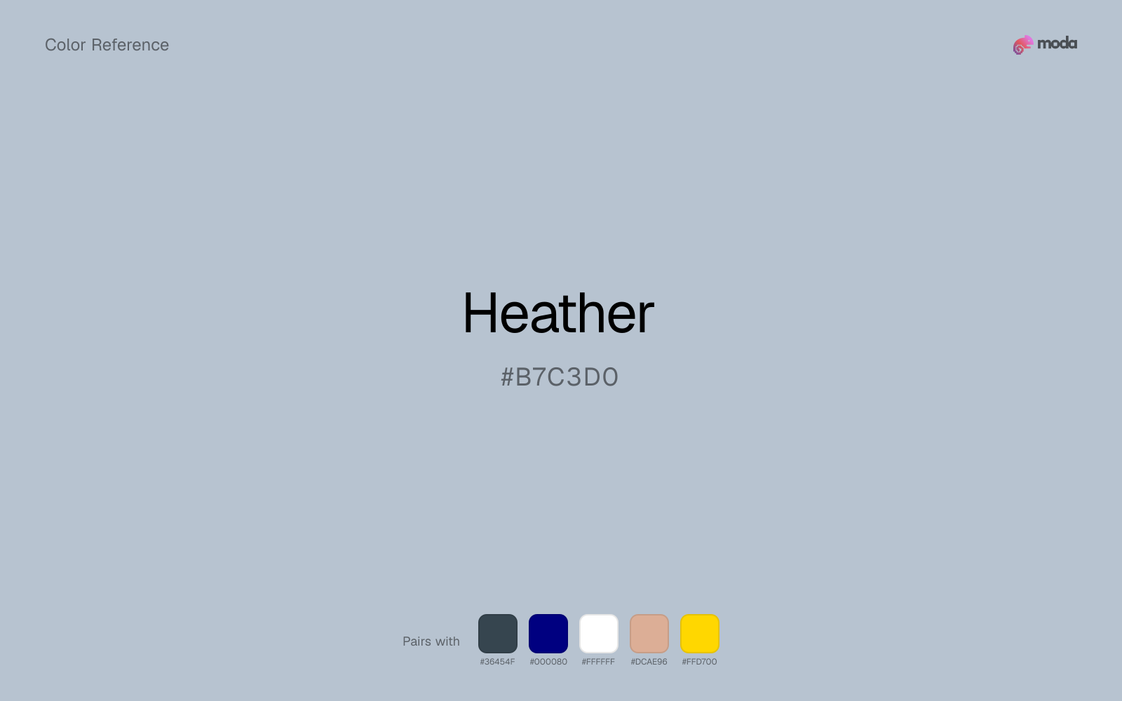
#B7C3D0
RGB
183, 195, 208
HSL
211°, 21%, 77%
HSV
211°, 12%, 82%
Heather (#B7C3D0) is a soft gray-blue with a muted, airy feel. It works well as a calming background color or understated supporting accent in editorial, wellness, and presentation design.
Best for
Editorial presentations, wellness decks, and soft modern brand systems.
Accessibility
Check contrast before using heather for text-heavy layouts, especially on low-contrast backgrounds.
How does heather compare to nearby colors?
What is the difference between heather and lavender?
Heather (#B7C3D0) lands deeper on the value scale than Lavender (#E6E6FA), so the first impression is about darkness before hue. Heather behaves more like a system color and Lavender more like a spotlight, so the decision changes how busy the layout feels. Use heather if the palette needs to feel more anchored; switch to lavender when the darker version starts to close the page down too much.
What color is heather?
Heather is usually used to describe softened blue-gray or lavender-gray tones rather than a single universal hex. This version leans more blue than purple, which makes it feel cooler, cleaner, and more restrained than floral lavenders.
What is the hex code for heather?
| Format | Value |
|---|---|
| HEX | #B7C3D0 |
| RGB | rgb(183, 195, 208) |
| HSL | hsl(211°, 21%, 77%) |
| HSV / HSB | hsv(211°, 12%, 82%) |
| CMYK (approx.) | cmyk(12%, 6%, 0%, 18%) |
Convert Heather to other color formats
Open the color converter with Heather (#B7C3D0) prefilled to copy RGB, HSL, HSV, CMYK, or OKLCH values.
Convert Heather in the color converter →What does heather mean in design?
Heather communicates softness, calm, and low-pressure sophistication. Because it sits between blue and gray, it carries some of blue's clarity without the formality of stronger corporate blues, making it useful for quiet, modern brand systems.
How do I use heather in code?
| CSS (hex) | color: #B7C3D0; |
| CSS (rgb) | color: rgb(183, 195, 208); |
| CSS (hsl) | color: hsl(211, 21%, 77%); |
| RGB % | rgb(72%, 76%, 82%) |
| Tailwind | text-[#B7C3D0] |
| SwiftUI | Color(red: 0.718, green: 0.765, blue: 0.816) |
| UIKit | UIColor(red: 0.718, green: 0.765, blue: 0.816, alpha: 1.0) |
| Android | Color.rgb(183, 195, 208) |
| Compose | Color(0xFFB7C3D0) |
| Web Safe | #CCCCCC |
Is heather accessible?
| Combination | Ratio | AA | AA lg | AAA | AAA lg | UI |
|---|---|---|---|---|---|---|
| AaWhite text on this color | 1.79:1 | ✗ | ✗ | ✗ | ✗ | ✗ |
| AaBlack text on this color | 11.73:1 | ✓ | ✓ | ✓ | ✓ | ✓ |
| AaThis color as text on white | 1.79:1 | ✗ | ✗ | ✗ | ✗ | ✗ |
| AaThis color as text on black | 11.73:1 | ✓ | ✓ | ✓ | ✓ | ✓ |
WCAG 2.1: AA normal ≥ 4.5:1, AA large text ≥ 3:1, AAA normal ≥ 7:1, AAA large ≥ 4.5:1, UI components ≥ 3:1.
How does heather look with color blindness?
Simulated appearance for common types of color vision deficiency. Actual perception varies by individual.
What colors go with heather
Charcoal balances heather by turning the palette into a usable light-dark system rather than a field of soft midtones.
Navy blue gives bright heather the dark counterpart it needs for headings, controls, and chart labels to read cleanly.
White is a reliable partner for heather when the goal is clarity: it adds separation, preserves brightness, and avoids extra mood-shifting.
Dusty Rose helps heather feel more complete in practice because the pairing combines sky-washed qualities with powder blush support instead of leaving the source color to do every job alone.
What colors clash with heather
Light Gray sits too close to heather in value, so the palette can wash out before it ever establishes a clear hierarchy.
Neon Green beside heather tends to vibrate on bright displays, so the pair reads more like a HUD effect than a considered brand palette.
How should I use heather in design?
- •Use heather for section backgrounds, presentation canvases, and supporting surfaces where white feels too stark.
- •Pair it with charcoal or navy for readable text and structure, then add one warmer accent if the layout needs more energy.
- •Avoid relying on heather for small text or primary CTAs because its lightness makes it better as a support color than a focal action color.
What are good heather palettes?
Quiet editorial
Editorial presentations, wellness decks, and soft modern brand systems.
Cool calm
Presentation templates, product one-pagers, and understated interface palettes.
Design with heather in Moda
Create a presentation or document using heatheras your accent color. Moda's AI applies your color palette automatically.
Create a design with heather →What are the shades and tints of heather?
Shades (darker)
Tints (lighter)
Tones (desaturated)
Hue variations
What are the color harmonies for heather?
Harmonies are calculated from the base swatch. When a harmony matches a named color page, it links there; otherwise it appears here as a computed reference swatch.
Similar colors
Lavender
Lavender is close enough to heather to keep the palette cohesive, yet the lighter-darker shift still decides whether the family behaves more like atmosphere or more like structure.
Powder Blue
Powder Blue keeps roughly the same visual weight as heather but changes the undertone story, which is often enough to move a palette from warmer and tactile to cooler and more technical, or the reverse.
Slate Gray
Slate Gray stays in the same color family as heather, but the change in value moves it into different layout jobs, especially once backgrounds, charts, or section dividers enter the system.
Light Blue
Light Blue sits close to heather on the wheel, but it carries more pigment pressure, which makes it better for faster emphasis and brighter accent work than for broader coverage and quieter supporting roles.
Frequently asked questions
What is the hex code for heather?
The hex code for heather is #B7C3D0. In RGB, that's 183 red, 195 green, and 208 blue. The approximate CMYK equivalent is 12% cyan, 6% magenta, 0% yellow, and 18% key (black).
Is heather a warm or cool color?
Heather reads as cool. It settles naturally beside blues, greens, silver, and charcoal, and feels more animated when paired with warm accents like gold, coral, or rust.
Is heather suitable for broader surfaces and long-form layouts?
Heather can hold broader surfaces comfortably because it does not demand attention on every glance. It is a better candidate for full-theme use than a brighter or more electric neighbor would be.
How should I use heather in a design?
Heather works as a soft background or supporting color for slide canvases, section panels, and marketing surfaces. Use dark text for readability and reserve stronger accents for buttons, charts, and key takeaways.
Can I use heather for text or backgrounds?
Heather works better with dark text than white text. Black text reaches 11.73:1 contrast on the swatch, which makes the color more usable as a background or highlight surface than as a dark panel.
More blue colors
Keep exploring color resources
All color pages
Browse the full library of color references, pairings, and palettes.
Blue colors
Compare heather with other blue tones.
Green colors
Explore nearby color families to build stronger palettes and contrasts.
Neutral colors
Explore nearby color families to build stronger palettes and contrasts.
Purple colors
Explore nearby color families to build stronger palettes and contrasts.
Last updated April 6, 2026
Color values are computed from the listed hex code using standard conversion formulas. RGB, HSL, and HSV are exact screen-ready conversions. CMYK is an approximate on-screen reference, not a press-ready print specification. Pairings, palettes, and use-case guidance are heuristic recommendations derived from color relationships, contrast behavior, and common presentation, document, and UI patterns.