Dusty Rose meaning and palette guide
HEX
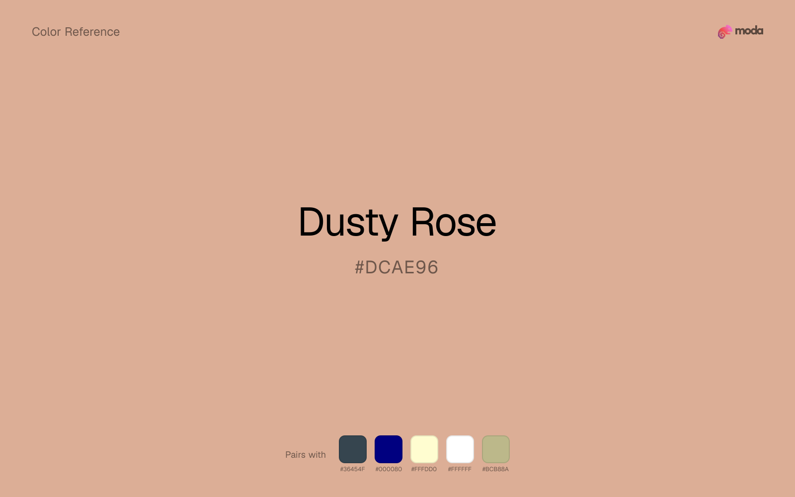
#DCAE96
RGB
220, 174, 150
HSL
21°, 50%, 73%
HSV
21°, 32%, 86%
Dusty rose (#DCAE96) is a muted, vintage pink that feels sophisticated and warm without the intensity of brighter pinks. It works for lifestyle, beauty, and wedding brands.
Best for
Product launches, promotional banners, and e-commerce storefronts.
Compare with
Accessibility
Check contrast before using dusty rose for text-heavy layouts, especially on low-contrast backgrounds.
How does dusty rose compare to nearby colors?
What is the difference between dusty rose and tangerine?
Tangerine (#FF9966) carries more pigment punch than Dusty Rose (#DCAE96), so the pair separates by finish as much as hue. Dusty Rose keeps the overall palette calmer, while Tangerine introduces more visual insistence with less area. Choose dusty rose when the family should feel quieter, more material, or easier to live with across a full layout; use tangerine when you need more punch.
What color is dusty rose?
Dusty rose became a defining color of millennial aesthetics and wedding design in the 2010s. Its muted, vintage quality distinguishes it from brighter pinks, making it a popular choice for bridesmaid dresses, event decor, and lifestyle branding.
What is the hex code for dusty rose?
| Format | Value |
|---|---|
| HEX | #DCAE96 |
| RGB | rgb(220, 174, 150) |
| HSL | hsl(21°, 50%, 73%) |
| HSV / HSB | hsv(21°, 32%, 86%) |
| CMYK (approx.) | cmyk(0%, 21%, 32%, 14%) |
Convert Dusty Rose to other color formats
Open the color converter with Dusty Rose (#DCAE96) prefilled to copy RGB, HSL, HSV, CMYK, or OKLCH values.
Convert Dusty Rose in the color converter →What does dusty rose mean in design?
Dusty rose communicates romantic warmth, vintage elegance, and approachable femininity. Its muted quality gives it a timeless feel that avoids the trendiness of brighter pinks, making it a safe choice for brands seeking warmth without childishness.
How do I use dusty rose in code?
| CSS (hex) | color: #DCAE96; |
| CSS (rgb) | color: rgb(220, 174, 150); |
| CSS (hsl) | color: hsl(21, 50%, 73%); |
| RGB % | rgb(86%, 68%, 59%) |
| Tailwind | text-[#DCAE96] |
| SwiftUI | Color(red: 0.863, green: 0.682, blue: 0.588) |
| UIKit | UIColor(red: 0.863, green: 0.682, blue: 0.588, alpha: 1.0) |
| Android | Color.rgb(220, 174, 150) |
| Compose | Color(0xFFDCAE96) |
| Web Safe | #CC9999 |
Is dusty rose accessible?
| Combination | Ratio | AA | AA lg | AAA | AAA lg | UI |
|---|---|---|---|---|---|---|
| AaWhite text on this color | 1.99:1 | ✗ | ✗ | ✗ | ✗ | ✗ |
| AaBlack text on this color | 10.54:1 | ✓ | ✓ | ✓ | ✓ | ✓ |
| AaThis color as text on white | 1.99:1 | ✗ | ✗ | ✗ | ✗ | ✗ |
| AaThis color as text on black | 10.54:1 | ✓ | ✓ | ✓ | ✓ | ✓ |
WCAG 2.1: AA normal ≥ 4.5:1, AA large text ≥ 3:1, AAA normal ≥ 7:1, AAA large ≥ 4.5:1, UI components ≥ 3:1.
How does dusty rose look with color blindness?
Simulated appearance for common types of color vision deficiency. Actual perception varies by individual.
What colors go with dusty rose
Charcoal balances dusty rose by turning the palette into a usable light-dark system rather than a field of soft midtones.
Navy blue keeps dusty rose from reading too sugary by adding a darker, steadier counterweight.
Cream helps dusty rose read warmer, softer, and less screen-hard than it would beside pure white.
White is a reliable partner for dusty rose when the goal is clarity: it adds separation, preserves brightness, and avoids extra mood-shifting.
Sage Green helps dusty rose feel more complete in practice because the pairing combines powder blush qualities with sage and moss support instead of leaving the source color to do every job alone.
What colors clash with dusty rose
Neon Green changes the meaning of dusty rose too abruptly, replacing the source color's beauty packaging, weddings, and soft UI cues with something much louder and less stable.
Magenta pushes dusty rose toward a nightclub or cosmetic register that is hard to square with calmer editorial or product work.
How should I use dusty rose in design?
- •Dusty rose works as a warm background alternative to beige — pair with charcoal or dark green text for readability.
- •Use dusty rose alongside gold and cream for wedding and event materials.
- •Pair dusty rose with navy or forest green for a more balanced, less overtly feminine palette.
What are good dusty rose palettes?
Bright horizon
Product launches, promotional banners, and e-commerce storefronts.
Honey and cream
Startup branding, pitch materials, and product landing pages.
Design with dusty rose in Moda
Create a presentation or document using dusty roseas your accent color. Moda's AI applies your color palette automatically.
Create a design with dusty rose →What are the shades and tints of dusty rose?
Shades (darker)
Tints (lighter)
Tones (desaturated)
Hue variations
What are the color harmonies for dusty rose?
Harmonies are calculated from the base swatch. When a harmony matches a named color page, it links there; otherwise it appears here as a computed reference swatch.
Similar colors
Tangerine
Tangerine sits close to dusty rose on the wheel, but it carries more pigment pressure, which makes it better for faster emphasis and brighter accent work than for broader coverage and quieter supporting roles.
Apricot
Apricot is almost the same hue as dusty rose; the real difference is value, with apricot feeling more open and surface-friendly.
Millennial Pink
Millennial Pink stays in the same color family as dusty rose, but the change in value moves it into different layout jobs, especially once backgrounds, charts, or section dividers enter the system.
Peach
Peach stays very close to dusty rose in hue, but it lands lighter, which makes it better for backgrounds, tints, and softer supporting areas than for accents, stronger hierarchy, and firmer structure.
Coral Pink
Coral Pink sits close to dusty rose on the wheel, but it carries more pigment pressure, which makes it better for faster emphasis and brighter accent work than for broader coverage and quieter supporting roles.
Frequently asked questions
What is the hex code for dusty rose?
The hex code for dusty rose is #DCAE96. In RGB, that's 220 red, 174 green, and 150 blue. The approximate CMYK equivalent is 0% cyan, 21% magenta, 32% yellow, and 14% key (black).
Is dusty rose a warm or cool color?
Dusty Rose sits on the warm side of the palette, so it pairs easily with other warm tones and becomes more energetic when you place it against cooler blues or blue-grays.
Is dusty rose better for accents, structure, or surfaces?
Dusty Rose sits in the usable middle: strong enough to anchor a section or call attention to a key moment, but calm enough to support a broader system when the surrounding values are well managed.
Where does dusty rose work best in a layout?
Dusty Rose is better on broad surfaces than in tiny details, so treat it as a background or support color and let darker accents carry the sharp hierarchy.
Is dusty rose accessible?
Dusty Rose works better with dark text than white text. Black text reaches 10.54:1 contrast on the swatch, which makes the color more usable as a background or highlight surface than as a dark panel.
More pink colors
Keep exploring color resources
All color pages
Browse the full library of color references, pairings, and palettes.
Pink colors
Compare dusty rose with other pink tones.
Neutral colors
Explore nearby color families to build stronger palettes and contrasts.
Orange colors
Explore nearby color families to build stronger palettes and contrasts.
Purple colors
Explore nearby color families to build stronger palettes and contrasts.
Last updated April 6, 2026
Color values are computed from the listed hex code using standard conversion formulas. RGB, HSL, and HSV are exact screen-ready conversions. CMYK is an approximate on-screen reference, not a press-ready print specification. Pairings, palettes, and use-case guidance are heuristic recommendations derived from color relationships, contrast behavior, and common presentation, document, and UI patterns.