Using Coral Pink in design
HEX
#F88379
RGB
248, 131, 121
HSL
5°, 90%, 72%
HSV
5°, 51%, 97%
A pink-orange hybrid that feels like seafoam's louder cousin — tropical, sun-warmed, and slightly tangy. #F88379 carries vacation and citrus without the full punch of pure orange. That hybridity makes it read as friendly but not childish.
Best for
Educational platforms, course materials, and infographic designs.
Compare with
Accessibility
Check contrast before using coral pink for text-heavy layouts, especially on low-contrast backgrounds.
How does coral pink compare to nearby colors?
What is the difference between coral pink and tangerine?
The visible difference between Coral Pink (#F88379) and Tangerine (#FF9966) is subtle, but it still nudges the family from powder blush toward citrus-bright. Coral Pink and Tangerine can fill many of the same slots, but one steers the palette toward powder blush and the other toward citrus-bright. Start with coral pink when the palette wants more powder blush; switch to tangerine when the better fit is citrus-bright.
What color is coral pink?
The coral name comes from marine coral tones used in resort wear, cosmetics, and hospitality design. It is a frequent accent in summer campaigns and coastal branding.
What is the hex code for coral pink?
| Format | Value |
|---|---|
| HEX | #F88379 |
| RGB | rgb(248, 131, 121) |
| HSL | hsl(5°, 90%, 72%) |
| HSV / HSB | hsv(5°, 51%, 97%) |
| CMYK (approx.) | cmyk(0%, 47%, 51%, 3%) |
Convert Coral Pink to other color formats
Open the color converter with Coral Pink (#F88379) prefilled to copy RGB, HSL, HSV, CMYK, or OKLCH values.
Convert Coral Pink in the color converter →What does coral pink mean in design?
Coral pink is often associated with warmth, optimism, and social ease. Next to salmon pink it can skew more orange-forward; next to flamingo it usually feels less rosy and more citrus.
How do I use coral pink in code?
| CSS (hex) | color: #F88379; |
| CSS (rgb) | color: rgb(248, 131, 121); |
| CSS (hsl) | color: hsl(5, 90%, 72%); |
| RGB % | rgb(97%, 51%, 47%) |
| Tailwind | text-[#F88379] |
| SwiftUI | Color(red: 0.973, green: 0.514, blue: 0.475) |
| UIKit | UIColor(red: 0.973, green: 0.514, blue: 0.475, alpha: 1.0) |
| Android | Color.rgb(248, 131, 121) |
| Compose | Color(0xFFF88379) |
| Web Safe | #FF9966 |
Is coral pink accessible?
| Combination | Ratio | AA | AA lg | AAA | AAA lg | UI |
|---|---|---|---|---|---|---|
| AaWhite text on this color | 2.47:1 | ✗ | ✗ | ✗ | ✗ | ✗ |
| AaBlack text on this color | 8.51:1 | ✓ | ✓ | ✓ | ✓ | ✓ |
| AaThis color as text on white | 2.47:1 | ✗ | ✗ | ✗ | ✗ | ✗ |
| AaThis color as text on black | 8.51:1 | ✓ | ✓ | ✓ | ✓ | ✓ |
WCAG 2.1: AA normal ≥ 4.5:1, AA large text ≥ 3:1, AAA normal ≥ 7:1, AAA large ≥ 4.5:1, UI components ≥ 3:1.
How does coral pink look with color blindness?
Simulated appearance for common types of color vision deficiency. Actual perception varies by individual.
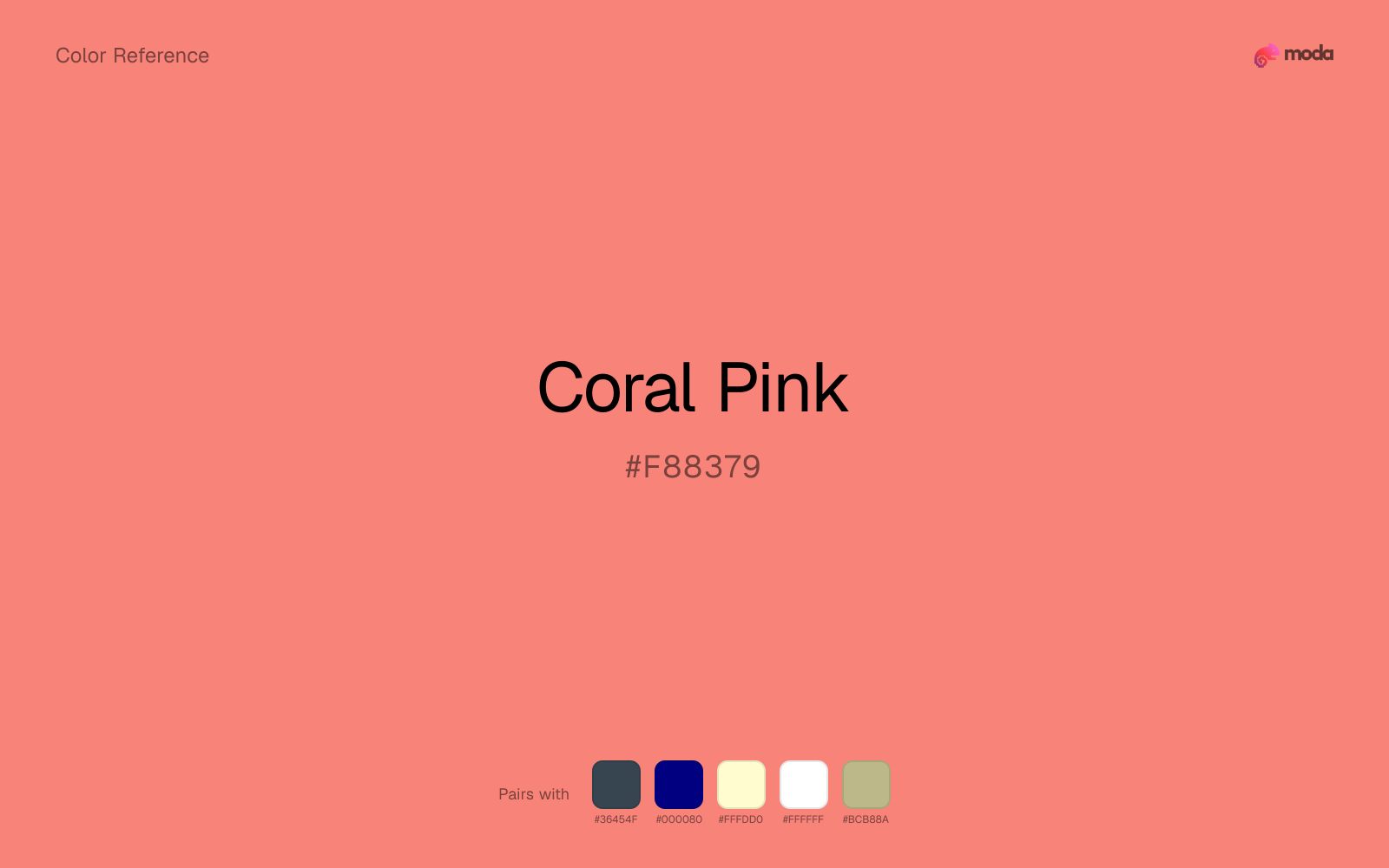
What colors go with coral pink
Charcoal balances coral pink by turning the palette into a usable light-dark system rather than a field of soft midtones.
Navy blue keeps coral pink from reading too sugary by adding a darker, steadier counterweight.
Cream takes the hard digital edge off coral pink and makes the color feel more printed, paper-backed, and approachable.
White keeps coral pink poster-clean instead of crowded, which is especially useful when the color already arrives with a strong screen presence.
Sage Green helps coral pink feel more complete in practice because the pairing combines powder blush qualities with sage and moss support instead of leaving the source color to do every job alone.
What colors clash with coral pink
Neon Green changes the meaning of coral pink too abruptly, replacing the source color's beauty packaging, weddings, and soft UI cues with something much louder and less stable.
Magenta remaps coral pink too aggressively, dragging it away from beauty packaging, weddings, and soft UI and into a brighter, more performative palette.
How should I use coral pink in design?
- •Coral Pink works as a primary accent or highlight color — bright enough to draw attention but check contrast carefully if using it for text on white backgrounds.
- •Coral Pink leans warm, so cool counterparts like navy, teal, or slate create the cleanest contrast. For a softer, tonal look, stay within neighboring warm hues and let value differences do the work.
- •Vivid colors like coral pink work best as punctuation in a layout: CTAs, key metrics, or a single hero element. Surrounding neutrals keep it from fatiguing the viewer.
What are good coral pink palettes?
Morning palette
Educational platforms, course materials, and infographic designs.
Honey and cream
Workshop handouts, training guides, and presentation templates.
Design with coral pink in Moda
Create a presentation or document using coral pinkas your accent color. Moda's AI applies your color palette automatically.
Create a design with coral pink →What are the shades and tints of coral pink?
Shades (darker)
Tints (lighter)
Tones (desaturated)
Hue variations
What are the color harmonies for coral pink?
Harmonies are calculated from the base swatch. When a harmony matches a named color page, it links there; otherwise it appears here as a computed reference swatch.
Similar colors
Salmon
Salmon lives in the same neighborhood as coral pink, but the finish shift is enough to make one feel better for beauty, lifestyle, and soft campaign backgrounds and the other for beauty packaging, weddings, and soft UI.
Tangerine
Tangerine is nearly adjacent to coral pink in hue; what separates them is intensity, with tangerine reading cleaner and more assertive.
Terracotta
Terracotta is almost the same hue as coral pink; the real difference is value, with terracotta feeling more grounded and anchor-ready.
Salmon Pink
Salmon Pink stays very close to coral pink in hue, but it lands lighter, which makes it better for backgrounds, tints, and softer supporting areas than for accents, stronger hierarchy, and firmer structure.
Coral
Coral is almost the same hue as coral pink; the real difference is value, with coral feeling more grounded and anchor-ready.
Frequently asked questions
What is the hex code for coral pink?
The hex code for coral pink is #F88379. In RGB, that's 248 red, 131 green, and 121 blue. The approximate CMYK equivalent is 0% cyan, 47% magenta, 51% yellow, and 3% key (black).
Is coral pink a warm or cool color?
Coral Pink reads as warm. It feels most natural with creams, golds, rusts, and other warm accents, while cooler partners like navy or teal create sharper contrast.
Is coral pink better as an accent or a full-palette color?
Coral Pink is usually best when it leads in short bursts rather than covering everything. It can headline a palette, but most layouts work better when the color handles accents, highlights, or one main hero role instead of every surface.
How should I use coral pink in a design?
Coral Pink works as a soft background or supporting color for slide canvases, section panels, and marketing surfaces. Use dark text for readability and reserve stronger accents for buttons, charts, and key takeaways.
Can I use coral pink for text or backgrounds?
Coral Pink works better with dark text than white text. Black text reaches 8.51:1 contrast on the swatch, which makes the color more usable as a background or highlight surface than as a dark panel.
More pink colors
Keep exploring color resources
All color pages
Browse the full library of color references, pairings, and palettes.
Pink colors
Compare coral pink with other pink tones.
Neutral colors
Explore nearby color families to build stronger palettes and contrasts.
Orange colors
Explore nearby color families to build stronger palettes and contrasts.
Purple colors
Explore nearby color families to build stronger palettes and contrasts.
Last updated April 6, 2026
Color values are computed from the listed hex code using standard conversion formulas. RGB, HSL, and HSV are exact screen-ready conversions. CMYK is an approximate on-screen reference, not a press-ready print specification. Pairings, palettes, and use-case guidance are heuristic recommendations derived from color relationships, contrast behavior, and common presentation, document, and UI patterns.