Using Rose in design
HEX
#FF007F
RGB
255, 0, 127
HSL
330°, 100%, 50%
HSV
330°, 100%, 100%
Rose (#FF007F) is a vivid pink-red that feels more assertive than blush and more polished than hot pink. It works when a brand needs warmth, personality, and visible contrast without crossing into neon territory.
Best for
Product launches, promotional banners, and e-commerce storefronts.
Accessibility
Check contrast before using rose for text-heavy layouts, especially on low-contrast backgrounds.
How does rose compare to nearby colors?
What is the difference between rose and ruby?
Rose (#FF007F) and Ruby (#E0115F) may look neighboring at first glance, yet their surface character diverges once they sit next to whites, charcoals, and other real layout neutrals. Rose and Ruby are close enough to substitute for each other, but they do not create the same supporting cast once typography, photography, and neutrals are added. Choose rose when the surrounding system aligns better with cosmetics, pop culture, and youth campaigns, and move to ruby when the stronger contextual fit is retail, sports, and high-urgency graphics.
What color is rose?
Rose has roots in fashion, cosmetics, and print design, where it often appears as a richer, more saturated alternative to standard pink. Its balance of red energy and pink softness makes it useful across beauty, culture, and lifestyle work.
What is the hex code for rose?
| Format | Value |
|---|---|
| HEX | #FF007F |
| RGB | rgb(255, 0, 127) |
| HSL | hsl(330°, 100%, 50%) |
| HSV / HSB | hsv(330°, 100%, 100%) |
| CMYK (approx.) | cmyk(0%, 100%, 50%, 0%) |
Convert Rose to other color formats
Open the color converter with Rose (#FF007F) prefilled to copy RGB, HSL, HSV, CMYK, or OKLCH values.
Convert Rose in the color converter →What does rose mean in design?
Rose communicates charisma, emotional energy, and contemporary confidence. It is expressive without feeling unserious, which makes it useful for bold accents, campaign moments, and brands that want warmth with edge.
How do I use rose in code?
| CSS (hex) | color: #FF007F; |
| CSS (rgb) | color: rgb(255, 0, 127); |
| CSS (hsl) | color: hsl(330, 100%, 50%); |
| RGB % | rgb(100%, 0%, 50%) |
| Tailwind | text-[#FF007F] |
| SwiftUI | Color(red: 1.000, green: 0.000, blue: 0.498) |
| UIKit | UIColor(red: 1.000, green: 0.000, blue: 0.498, alpha: 1.0) |
| Android | Color.rgb(255, 0, 127) |
| Compose | Color(0xFFFF007F) |
| Web Safe | #FF0066 |
Is rose accessible?
| Combination | Ratio | AA | AA lg | AAA | AAA lg | UI |
|---|---|---|---|---|---|---|
| AaWhite text on this color | 3.78:1 | ✗ | ✓ | ✗ | ✗ | ✓ |
| AaBlack text on this color | 5.56:1 | ✓ | ✓ | ✗ | ✓ | ✓ |
| AaThis color as text on white | 3.78:1 | ✗ | ✓ | ✗ | ✗ | ✓ |
| AaThis color as text on black | 5.56:1 | ✓ | ✓ | ✗ | ✓ | ✓ |
WCAG 2.1: AA normal ≥ 4.5:1, AA large text ≥ 3:1, AAA normal ≥ 7:1, AAA large ≥ 4.5:1, UI components ≥ 3:1.
How does rose look with color blindness?
Simulated appearance for common types of color vision deficiency. Actual perception varies by individual.
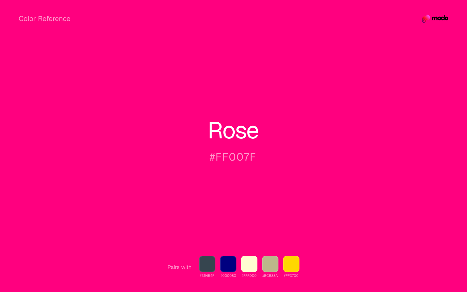
What colors go with rose
Charcoal gives rose a darker, quieter partner, which helps vivid accents look deliberate instead of loud for their own sake.
Beside rose, navy blue shifts the palette away from novelty sweetness and toward something more composed.
Cream takes the hard digital edge off rose and makes the color feel more printed, paper-backed, and approachable.
Sage Green gives rose a second note that is different enough to feel intentional but not so different that the palette loses coherence.
What colors clash with rose
With rose, Neon Green pushes the work toward novelty or screen-effect territory faster than most brand or editorial systems can tolerate.
Magenta pushes rose toward a nightclub or cosmetic register that is hard to square with calmer editorial or product work.
How should I use rose in design?
- •Use rose sparingly for highlights, CTAs, and campaign headlines so it keeps its punch.
- •Pair rose with charcoal or navy when you need structure around the color.
- •Keep supporting colors quieter than rose or it will lose its focal role in the layout.
What are good rose palettes?
Vivid clarity
Product launches, promotional banners, and e-commerce storefronts.
Design with rose in Moda
Create a presentation or document using roseas your accent color. Moda's AI applies your color palette automatically.
Create a design with rose →What are the shades and tints of rose?
Shades (darker)
Tints (lighter)
Tones (desaturated)
Hue variations
What are the color harmonies for rose?
Harmonies are calculated from the base swatch. When a harmony matches a named color page, it links there; otherwise it appears here as a computed reference swatch.
Similar colors
Ruby
Ruby sits close to rose on the wheel, but it carries less chroma, which makes it better for steadier surfaces and calmer long-form use than for sharper emphasis and quicker visual pickup.
Cherry
Cherry is nearly adjacent to rose in hue; what separates them is intensity, with cherry reading dustier and easier to extend across a layout.
Crimson
Crimson occupies a similar depth to rose, though it pushes the family toward a more warm reading and a different material feel.
Mulberry
Mulberry sits close to rose on the wheel, but it carries less chroma, which makes it better for steadier surfaces and calmer long-form use than for sharper emphasis and quicker visual pickup.
Hot Pink
Hot Pink is close enough to rose to keep the palette cohesive, yet the lighter-darker shift still decides whether the family behaves more like atmosphere or more like structure.
Frequently asked questions
What is the hex code for rose?
The hex code for rose is #FF007F. In RGB, that's 255 red, 0 green, and 127 blue. The approximate CMYK equivalent is 0% cyan, 100% magenta, 50% yellow, and 0% key (black).
Is rose a warm or cool color?
Rose reads as warm. It feels most natural with creams, golds, rusts, and other warm accents, while cooler partners like navy or teal create sharper contrast.
Is rose better as an accent or a full-palette color?
Rose is usually best when it leads in short bursts rather than covering everything. It can headline a palette, but most layouts work better when the color handles accents, highlights, or one main hero role instead of every surface.
How should I use rose in a design?
Rose is vivid enough to work best in controlled doses such as CTAs, highlighted metrics, chart accents, or a single hero element. Surround it with quieter neutrals so it does not exhaust the layout.
Can I use rose for text or backgrounds?
Rose works better with dark text than white text. Black text reaches 5.56:1 contrast on the swatch, which makes the color more usable as a background or highlight surface than as a dark panel.
More pink colors
Keep exploring color resources
All color pages
Browse the full library of color references, pairings, and palettes.
Pink colors
Compare rose with other pink tones.
Neutral colors
Explore nearby color families to build stronger palettes and contrasts.
Orange colors
Explore nearby color families to build stronger palettes and contrasts.
Purple colors
Explore nearby color families to build stronger palettes and contrasts.
Last updated April 6, 2026
Color values are computed from the listed hex code using standard conversion formulas. RGB, HSL, and HSV are exact screen-ready conversions. CMYK is an approximate on-screen reference, not a press-ready print specification. Pairings, palettes, and use-case guidance are heuristic recommendations derived from color relationships, contrast behavior, and common presentation, document, and UI patterns.