Using Ruby in design
HEX
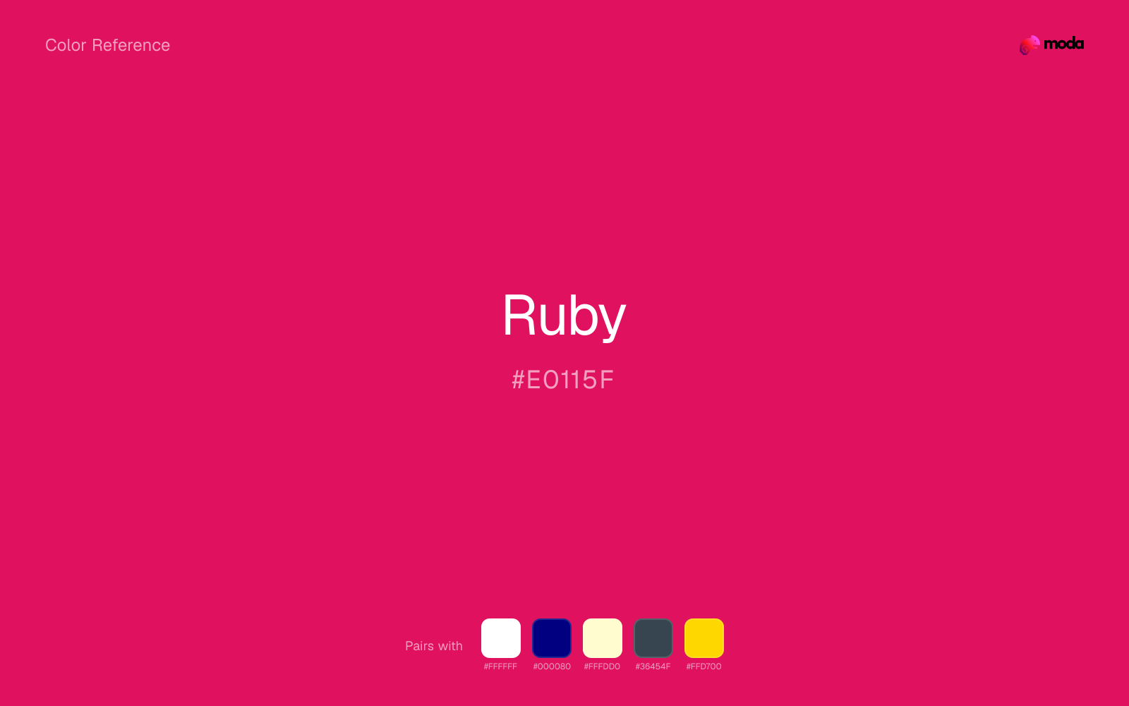
#E0115F
RGB
224, 17, 95
HSL
337°, 86%, 47%
HSV
337°, 92%, 88%
Ruby sits in the deep pink-red range — jewel-like, slightly cool, and glossy in the mind's eye even when flat on screen. #E0115F works for beauty, fashion, and premium digital surfaces where you want red heat with a refined shimmer. It separates itself from scarlet by feeling more couture, more gemstone than traffic.
Best for
Legal and institutional branding across web and print.
Accessibility
Ruby text on white passes AA at 4.76:1, which makes it usable for headings and short labels.
How does ruby compare to nearby colors?
What is the difference between ruby and rose?
Ruby (#E0115F) and Rose (#FF007F) may look neighboring at first glance, yet their surface character diverges once they sit next to whites, charcoals, and other real layout neutrals. Ruby and Rose are close enough to substitute for each other, but they do not create the same supporting cast once typography, photography, and neutrals are added. Choose ruby when the surrounding system aligns better with retail, sports, and high-urgency graphics, and move to rose when the stronger contextual fit is cosmetics, pop culture, and youth campaigns.
What color is ruby?
The name comes from the ruby gemstone. The color label appears widely in cosmetics, jewelry retail, and luxury-adjacent product naming.
What is the hex code for ruby?
| Format | Value |
|---|---|
| HEX | #E0115F |
| RGB | rgb(224, 17, 95) |
| HSL | hsl(337°, 86%, 47%) |
| HSV / HSB | hsv(337°, 92%, 88%) |
| CMYK (approx.) | cmyk(0%, 92%, 58%, 12%) |
Convert Ruby to other color formats
Open the color converter with Ruby (#E0115F) prefilled to copy RGB, HSL, HSV, CMYK, or OKLCH values.
Convert Ruby in the color converter →What does ruby mean in design?
Ruby red is often associated with romance, rarity, and polished glamour. It tends to read more precious and slightly cooler than cherry, and less orange than vermillion or coral red. For campaigns, it can signal aspiration.
How do I use ruby in code?
| CSS (hex) | color: #E0115F; |
| CSS (rgb) | color: rgb(224, 17, 95); |
| CSS (hsl) | color: hsl(337, 86%, 47%); |
| RGB % | rgb(88%, 7%, 37%) |
| Tailwind | text-[#E0115F] |
| SwiftUI | Color(red: 0.878, green: 0.067, blue: 0.373) |
| UIKit | UIColor(red: 0.878, green: 0.067, blue: 0.373, alpha: 1.0) |
| Android | Color.rgb(224, 17, 95) |
| Compose | Color(0xFFE0115F) |
| Web Safe | #CC0066 |
Is ruby accessible?
| Combination | Ratio | AA | AA lg | AAA | AAA lg | UI |
|---|---|---|---|---|---|---|
| AaWhite text on this color | 4.76:1 | ✓ | ✓ | ✗ | ✓ | ✓ |
| AaBlack text on this color | 4.41:1 | ✗ | ✓ | ✗ | ✗ | ✓ |
| AaThis color as text on white | 4.76:1 | ✓ | ✓ | ✗ | ✓ | ✓ |
| AaThis color as text on black | 4.41:1 | ✗ | ✓ | ✗ | ✗ | ✓ |
WCAG 2.1: AA normal ≥ 4.5:1, AA large text ≥ 3:1, AAA normal ≥ 7:1, AAA large ≥ 4.5:1, UI components ≥ 3:1.
How does ruby look with color blindness?
Simulated appearance for common types of color vision deficiency. Actual perception varies by individual.
What colors go with ruby
White gives ruby enough open space that the color can feel vivid without turning the whole palette noisy.
Beside ruby, navy blue supplies structure that keeps the palette from drifting into event-poster or promotional red territory.
With a vivid ruby, cream is gentler than white, so the palette keeps warmth and avoids looking overlit.
What colors clash with ruby
With ruby, Neon Green pushes the work toward novelty or screen-effect territory faster than most brand or editorial systems can tolerate.
Magenta remaps ruby too aggressively, dragging it away from retail, sports, and high-urgency graphics and into a brighter, more performative palette.
Cyan can make ruby feel more software-default than designed, especially when the rest of the palette is trying to hold onto material nuance.
Pastel Pink can make ruby feel softer and sweeter than intended, which weakens palettes that rely on gravity or structure.
How should I use ruby in design?
- •Ruby has the saturation to lead a brand palette — strong enough for buttons, headers, and packaging without drifting into pastel or dark territory.
- •Pair ruby with cool accents (navy, sage, steel blue) for sharp contrast, or keep it with other warm tones (cream, gold, tan) for a cohesive, editorial feel.
- •Ruby's high saturation makes it most effective in small doses — buttons, chart highlights, notification badges, and social media accents.
What are good ruby palettes?
Design with ruby in Moda
Create a presentation or document using rubyas your accent color. Moda's AI applies your color palette automatically.
Create a design with ruby →What are the shades and tints of ruby?
Shades (darker)
Tints (lighter)
Tones (desaturated)
Hue variations
What are the color harmonies for ruby?
Harmonies are calculated from the base swatch. When a harmony matches a named color page, it links there; otherwise it appears here as a computed reference swatch.
Similar colors
Crimson
Crimson sits close to ruby in hue, but its red-hot cast changes the mood of the palette even when the contrast shift is small.
Cherry
Cherry stays very close to ruby in hue, but it lands lighter, which makes it better for backgrounds, tints, and softer supporting areas than for accents, stronger hierarchy, and firmer structure.
Rose
Rose sits close to ruby on the wheel, but it carries more pigment pressure, which makes it better for faster emphasis and brighter accent work than for broader coverage and quieter supporting roles.
Cardinal
Cardinal is nearly adjacent to ruby in hue; what separates them is intensity, with cardinal reading dustier and easier to extend across a layout.
Fire Engine Red
Fire Engine Red is useful when ruby is the right weight but the wrong mood: the swap changes temperature and finish more than contrast.
Frequently asked questions
What is the hex code for ruby?
The hex code for ruby is #E0115F. In RGB, that's 224 red, 17 green, and 95 blue. The approximate CMYK equivalent is 0% cyan, 92% magenta, 58% yellow, and 12% key (black).
Is ruby a warm or cool color?
Ruby sits on the warm side of the palette, so it pairs easily with other warm tones and becomes more energetic when you place it against cooler blues or blue-grays.
Should ruby lead the palette or stay in supporting roles?
Ruby has enough chroma to take the lead, but it usually performs best when the surrounding system stays quieter. Treat it as the voice of emphasis, not the answer to every layout need.
Where does ruby work best in a layout?
Ruby carries a lot of chroma, so it is usually strongest as punctuation rather than wallpaper. Use it for focal accents and let low-saturation surfaces do the balancing.
Is ruby accessible?
Ruby can work as text on white at 4.76:1 contrast, but it is usually safest in headings, labels, and accent moments rather than long body copy.
More red colors
Keep exploring color resources
All color pages
Browse the full library of color references, pairings, and palettes.
Red colors
Compare ruby with other red tones.
Brown colors
Explore nearby color families to build stronger palettes and contrasts.
Neutral colors
Explore nearby color families to build stronger palettes and contrasts.
Orange colors
Explore nearby color families to build stronger palettes and contrasts.
Last updated April 6, 2026
Color values are computed from the listed hex code using standard conversion formulas. RGB, HSL, and HSV are exact screen-ready conversions. CMYK is an approximate on-screen reference, not a press-ready print specification. Pairings, palettes, and use-case guidance are heuristic recommendations derived from color relationships, contrast behavior, and common presentation, document, and UI patterns.