Cardinal color guide
HEX
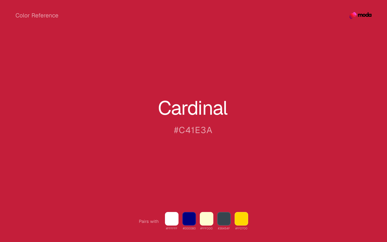
#C41E3A
RGB
196, 30, 58
HSL
350°, 73%, 44%
HSV
350°, 85%, 77%
Cardinal is a clean, medium-deep red with enough saturation to feel sporty and proud, but enough body to hold up on uniforms and large fields of color. #C41E3A is a dependable team-and-school red: readable, confident, not as pink as cherry and not as brown as brick.
Best for
Editorial design, magazine spreads, and premium print collateral.
Compare with
Accessibility
Cardinal text on white passes AA at 5.84:1, which makes it usable for headings and short labels.
How does cardinal compare to nearby colors?
What is the difference between cardinal and brick red?
Cardinal (#C41E3A) and Brick Red (#CB4154) may look neighboring at first glance, yet their surface character diverges once they sit next to whites, charcoals, and other real layout neutrals. Cardinal brings more shadow to the system, so it handles contrast-heavy jobs more naturally than Brick Red. Choose cardinal when the surrounding system aligns better with retail, sports, and high-urgency graphics, and move to brick red when the stronger contextual fit is brand accents and editorial emphasis.
What color is cardinal?
The name is widely used for the Northern Cardinal bird and is familiar in North American sports branding. It also overlaps with ecclesiastical red vestments in Catholic contexts, where vivid red carries specific liturgical meaning.
What is the hex code for cardinal?
| Format | Value |
|---|---|
| HEX | #C41E3A |
| RGB | rgb(196, 30, 58) |
| HSL | hsl(350°, 73%, 44%) |
| HSV / HSB | hsv(350°, 85%, 77%) |
| CMYK (approx.) | cmyk(0%, 85%, 70%, 23%) |
Convert Cardinal to other color formats
Open the color converter with Cardinal (#C41E3A) prefilled to copy RGB, HSL, HSV, CMYK, or OKLCH values.
Convert Cardinal in the color converter →What does cardinal mean in design?
Cardinal red is often associated with school spirit, loyalty, and competitive pride. It tends to read more institutional than coral red's tropical warmth, and less electric than scarlet. In mixed palettes, it pairs naturally with white, gold, or navy for a crisp, emblem-like look.
How do I use cardinal in code?
| CSS (hex) | color: #C41E3A; |
| CSS (rgb) | color: rgb(196, 30, 58); |
| CSS (hsl) | color: hsl(350, 73%, 44%); |
| RGB % | rgb(77%, 12%, 23%) |
| Tailwind | text-[#C41E3A] |
| SwiftUI | Color(red: 0.769, green: 0.118, blue: 0.227) |
| UIKit | UIColor(red: 0.769, green: 0.118, blue: 0.227, alpha: 1.0) |
| Android | Color.rgb(196, 30, 58) |
| Compose | Color(0xFFC41E3A) |
| Web Safe | #CC3333 |
Is cardinal accessible?
| Combination | Ratio | AA | AA lg | AAA | AAA lg | UI |
|---|---|---|---|---|---|---|
| AaWhite text on this color | 5.84:1 | ✓ | ✓ | ✗ | ✓ | ✓ |
| AaBlack text on this color | 3.59:1 | ✗ | ✓ | ✗ | ✗ | ✓ |
| AaThis color as text on white | 5.84:1 | ✓ | ✓ | ✗ | ✓ | ✓ |
| AaThis color as text on black | 3.59:1 | ✗ | ✓ | ✗ | ✗ | ✓ |
WCAG 2.1: AA normal ≥ 4.5:1, AA large text ≥ 3:1, AAA normal ≥ 7:1, AAA large ≥ 4.5:1, UI components ≥ 3:1.
How does cardinal look with color blindness?
Simulated appearance for common types of color vision deficiency. Actual perception varies by individual.
What colors go with cardinal
White helps cardinal stay legible in charts, labels, and UI states where a muddier light neutral would blur the edges.
Because cardinal already carries warmth, navy blue gives the pair a steadier backbone and keeps it closer to sports and momentum-led graphics than to one-note seasonal color.
Cream takes the hard digital edge off cardinal and makes the color feel more printed, paper-backed, and approachable.
What colors clash with cardinal
Neon Green changes the meaning of cardinal too abruptly, replacing the source color's retail, sports, and high-urgency graphics cues with something much louder and less stable.
With cardinal, magenta introduces a second emotional story instead of reinforcing the first one, so the palette can feel internally split.
Cyan redirects cardinal toward a more technical, backlit interpretation, which is risky when the goal is warmth, polish, or print-minded editorial work.
With cardinal, Pastel Pink often steers the system toward nursery or confectionery cues instead of the more grounded mood the source color supports.
How should I use cardinal in design?
- •Cardinal carries enough visual weight for headlines, key UI elements, and section anchors — dark enough to command attention but clearly distinct from black.
- •Pair cardinal with cool accents (navy, sage, steel blue) for sharp contrast, or keep it with other warm tones (cream, gold, tan) for a cohesive, editorial feel.
- •Cardinal works in sales materials, alert UI, and anywhere that calls for confident energy — balance it with neutral space so the emphasis stays focused.
What are good cardinal palettes?
Design with cardinal in Moda
Create a presentation or document using cardinalas your accent color. Moda's AI applies your color palette automatically.
Create a design with cardinal →What are the shades and tints of cardinal?
Shades (darker)
Tints (lighter)
Tones (desaturated)
Hue variations
What are the color harmonies for cardinal?
Harmonies are calculated from the base swatch. When a harmony matches a named color page, it links there; otherwise it appears here as a computed reference swatch.
Similar colors
Fire Engine Red
Fire Engine Red is near enough to cardinal to swap into the same palette, yet the undertone shift still decides whether the family reads warmer or cooler overall.
Crimson
Crimson sits close to cardinal on the wheel, but it carries more pigment pressure, which makes it better for faster emphasis and brighter accent work than for broader coverage and quieter supporting roles.
Brick Red
Brick Red is almost the same hue as cardinal; the real difference is value, with brick red feeling more open and surface-friendly.
Cherry
Cherry stays very close to cardinal in hue, but it lands lighter, which makes it better for backgrounds, tints, and softer supporting areas than for accents, stronger hierarchy, and firmer structure.
Ruby
Ruby is nearly adjacent to cardinal in hue; what separates them is intensity, with ruby reading cleaner and more assertive.
Frequently asked questions
What is the hex code for cardinal?
The hex code for cardinal is #C41E3A. In RGB, that's 196 red, 30 green, and 58 blue. The approximate CMYK equivalent is 0% cyan, 85% magenta, 70% yellow, and 23% key (black).
Is cardinal a warm or cool color?
Cardinal sits on the warm side of the palette, so it pairs easily with other warm tones and becomes more energetic when you place it against cooler blues or blue-grays.
Should cardinal lead the palette or stay in supporting roles?
Cardinal has enough chroma to take the lead, but it usually performs best when the surrounding system stays quieter. Treat it as the voice of emphasis, not the answer to every layout need.
Where does cardinal work best in a layout?
Cardinal sits in the middle of the spectrum in a useful way: strong enough for emphasis, but controlled enough to support a broader brand or presentation system when the contrast is handled well.
Is cardinal accessible?
Cardinal can work as text on white at 5.84:1 contrast, but it is usually safest in headings, labels, and accent moments rather than long body copy.
More red colors
Keep exploring color resources
All color pages
Browse the full library of color references, pairings, and palettes.
Red colors
Compare cardinal with other red tones.
Brown colors
Explore nearby color families to build stronger palettes and contrasts.
Neutral colors
Explore nearby color families to build stronger palettes and contrasts.
Orange colors
Explore nearby color families to build stronger palettes and contrasts.
Last updated April 6, 2026
Color values are computed from the listed hex code using standard conversion formulas. RGB, HSL, and HSV are exact screen-ready conversions. CMYK is an approximate on-screen reference, not a press-ready print specification. Pairings, palettes, and use-case guidance are heuristic recommendations derived from color relationships, contrast behavior, and common presentation, document, and UI patterns.