What color is Cherry?
HEX
#DE3163
RGB
222, 49, 99
HSL
343°, 72%, 53%
HSV
343°, 78%, 87%
Cherry is a punchy red with a clear pink lift — sweet and juicy rather than smoky or rusty. #DE3163 feels playful on apparel graphics and appetizing near food photography because it echoes ripe fruit without going full bubblegum. It is a practical "bright accent" red when you want sparkle that still reads unmistakably red.
Best for
Event branding, newsletters, and customer-facing web pages.
Accessibility
Check contrast before using cherry for text-heavy layouts, especially on low-contrast backgrounds.
How does cherry compare to nearby colors?
What is the difference between cherry and brick red?
The visible difference between Cherry (#DE3163) and Brick Red (#CB4154) is subtle, but it still nudges the family from poster-bright toward ripe and polished. The practical difference is not raw contrast so much as project fit: Cherry reads more naturally in retail, sports, and high-urgency graphics, while Brick Red fits more easily into brand accents and editorial emphasis. Start with cherry when the palette wants more poster-bright; switch to brick red when the better fit is ripe and polished.
What color is cherry?
The color name references the fruit. Similar names appear in automotive finishes, nail polish, and dessert marketing where a vivid red-pink reads as fresh and familiar.
What is the hex code for cherry?
| Format | Value |
|---|---|
| HEX | #DE3163 |
| RGB | rgb(222, 49, 99) |
| HSL | hsl(343°, 72%, 53%) |
| HSV / HSB | hsv(343°, 78%, 87%) |
| CMYK (approx.) | cmyk(0%, 78%, 55%, 13%) |
Convert Cherry to other color formats
Open the color converter with Cherry (#DE3163) prefilled to copy RGB, HSL, HSV, CMYK, or OKLCH values.
Convert Cherry in the color converter →What does cherry mean in design?
Cherry red is often associated with youthfulness, flirtation, and indulgence. It tends to read lighter and more flirtatious than fire-engine or scarlet, and less gemstone-serious than ruby. Choose it when the story is fun and appetizing rather than stern or institutional.
How do I use cherry in code?
| CSS (hex) | color: #DE3163; |
| CSS (rgb) | color: rgb(222, 49, 99); |
| CSS (hsl) | color: hsl(343, 72%, 53%); |
| RGB % | rgb(87%, 19%, 39%) |
| Tailwind | text-[#DE3163] |
| SwiftUI | Color(red: 0.871, green: 0.192, blue: 0.388) |
| UIKit | UIColor(red: 0.871, green: 0.192, blue: 0.388, alpha: 1.0) |
| Android | Color.rgb(222, 49, 99) |
| Compose | Color(0xFFDE3163) |
| Web Safe | #CC3366 |
Is cherry accessible?
| Combination | Ratio | AA | AA lg | AAA | AAA lg | UI |
|---|---|---|---|---|---|---|
| AaWhite text on this color | 4.44:1 | ✗ | ✓ | ✗ | ✗ | ✓ |
| AaBlack text on this color | 4.73:1 | ✓ | ✓ | ✗ | ✓ | ✓ |
| AaThis color as text on white | 4.44:1 | ✗ | ✓ | ✗ | ✗ | ✓ |
| AaThis color as text on black | 4.73:1 | ✓ | ✓ | ✗ | ✓ | ✓ |
WCAG 2.1: AA normal ≥ 4.5:1, AA large text ≥ 3:1, AAA normal ≥ 7:1, AAA large ≥ 4.5:1, UI components ≥ 3:1.
How does cherry look with color blindness?
Simulated appearance for common types of color vision deficiency. Actual perception varies by individual.
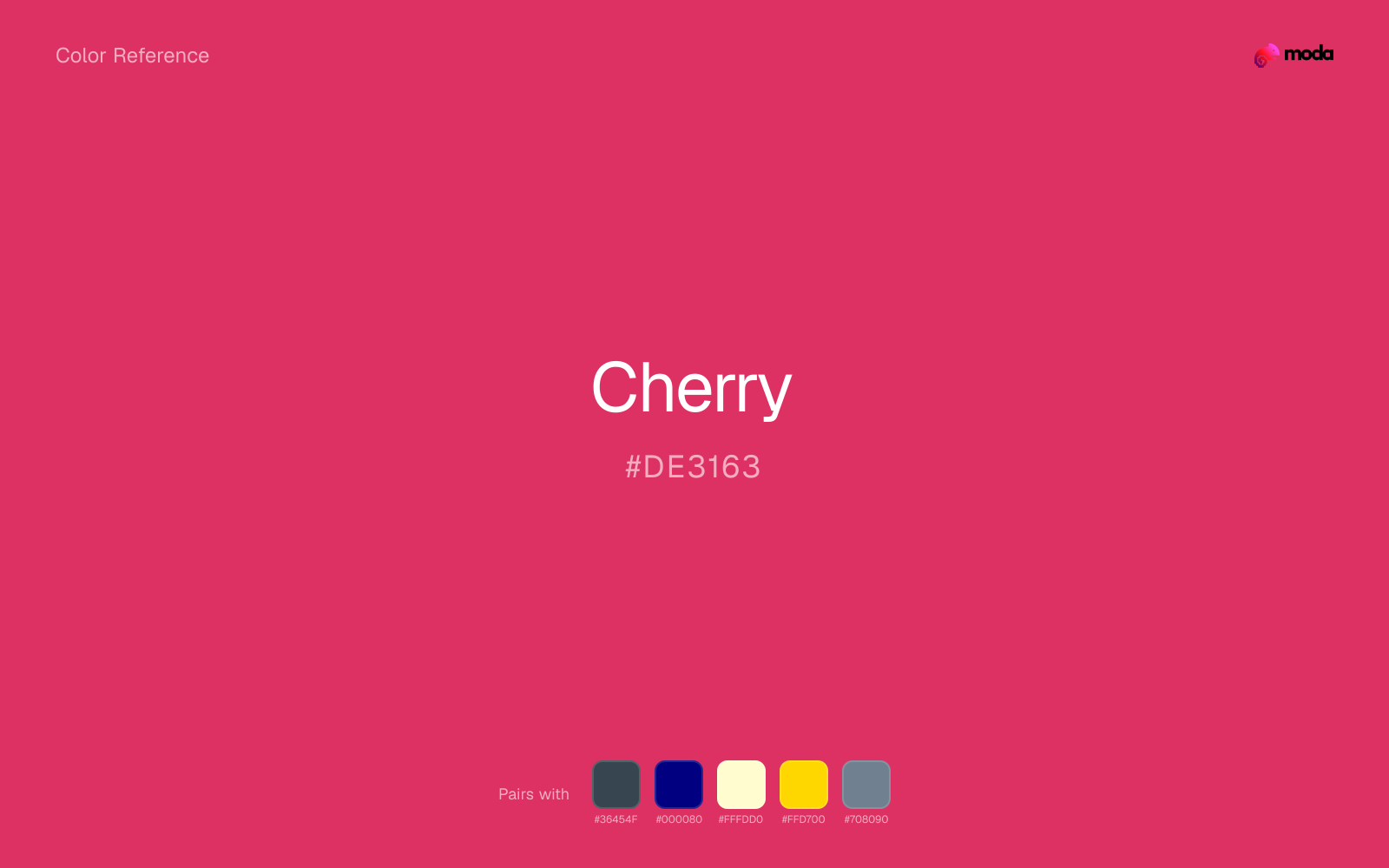
What colors go with cherry
Charcoal turns cherry from purely energetic into something more adult and controlled by adding depth without another hue fight.
Beside cherry, navy blue supplies structure that keeps the palette from drifting into event-poster or promotional red territory.
Cream takes the hard digital edge off cherry and makes the color feel more printed, paper-backed, and approachable.
Gold gives cherry a ceremonial or premium edge, especially when the design needs more warmth than silver or charcoal would provide.
Slate Gray stays quiet enough to frame cherry instead of competing with it, which is useful for text, dividers, and supporting surfaces.
What colors clash with cherry
With cherry, Neon Green pushes the work toward novelty or screen-effect territory faster than most brand or editorial systems can tolerate.
Magenta pushes cherry toward a nightclub or cosmetic register that is hard to square with calmer editorial or product work.
Cyan redirects cherry toward a more technical, backlit interpretation, which is risky when the goal is warmth, polish, or print-minded editorial work.
Pastel Pink can undercut cherry's authority by turning the combination more decorative than decisive.
How should I use cherry in design?
- •Cherry has the saturation to lead a brand palette — strong enough for buttons, headers, and packaging without drifting into pastel or dark territory.
- •Pair cherry with cool accents (navy, sage, steel blue) for sharp contrast, or keep it with other warm tones (cream, gold, tan) for a cohesive, editorial feel.
- •Cherry works in sales materials, alert UI, and anywhere that calls for confident energy — balance it with neutral space so the emphasis stays focused.
What are good cherry palettes?
Bright horizon
Event branding, newsletters, and customer-facing web pages.
Design with cherry in Moda
Create a presentation or document using cherryas your accent color. Moda's AI applies your color palette automatically.
Create a design with cherry →What are the shades and tints of cherry?
Shades (darker)
Tints (lighter)
Tones (desaturated)
Hue variations
What are the color harmonies for cherry?
Harmonies are calculated from the base swatch. When a harmony matches a named color page, it links there; otherwise it appears here as a computed reference swatch.
Similar colors
Brick Red
Brick Red sits close to cherry on the wheel, but it carries less chroma, which makes it better for steadier surfaces and calmer long-form use than for sharper emphasis and quicker visual pickup.
Ruby
Ruby stays very close to cherry in hue, but it lands darker, which makes it better for headlines, anchors, and darker sections than for lighter surfaces and more open applications.
Crimson
Crimson is almost the same hue as cherry; the real difference is value, with crimson feeling more grounded and anchor-ready.
Cardinal
Cardinal stays very close to cherry in hue, but it lands darker, which makes it better for headlines, anchors, and darker sections than for lighter surfaces and more open applications.
Indian Red
Indian Red sits close to cherry on the wheel, but it carries less chroma, which makes it better for steadier surfaces and calmer long-form use than for sharper emphasis and quicker visual pickup.
Frequently asked questions
What is the hex code for cherry?
The hex code for cherry is #DE3163. In RGB, that's 222 red, 49 green, and 99 blue. The approximate CMYK equivalent is 0% cyan, 78% magenta, 55% yellow, and 13% key (black).
Is cherry a warm or cool color?
Cherry reads as warm. It feels most natural with creams, golds, rusts, and other warm accents, while cooler partners like navy or teal create sharper contrast.
Where does cherry work best in a layout?
Cherry is flexible enough to move between accents, section blocks, and supporting roles depending on the contrast around it. It works best when the rest of the palette gives it a clear job instead of asking it to do everything at once.
How should I use cherry in a design?
Cherry is versatile enough for headlines, accent bars, buttons, charts, or section backgrounds depending on the contrast around it. It works as either a primary or supporting color in decks, documents, and brand systems.
Can I use cherry for text or backgrounds?
Cherry works better with dark text than white text. Black text reaches 4.73:1 contrast on the swatch, which makes the color more usable as a background or highlight surface than as a dark panel.
More red colors
Keep exploring color resources
All color pages
Browse the full library of color references, pairings, and palettes.
Red colors
Compare cherry with other red tones.
Brown colors
Explore nearby color families to build stronger palettes and contrasts.
Neutral colors
Explore nearby color families to build stronger palettes and contrasts.
Orange colors
Explore nearby color families to build stronger palettes and contrasts.
Last updated April 6, 2026
Color values are computed from the listed hex code using standard conversion formulas. RGB, HSL, and HSV are exact screen-ready conversions. CMYK is an approximate on-screen reference, not a press-ready print specification. Pairings, palettes, and use-case guidance are heuristic recommendations derived from color relationships, contrast behavior, and common presentation, document, and UI patterns.