Vermillion color guide
HEX
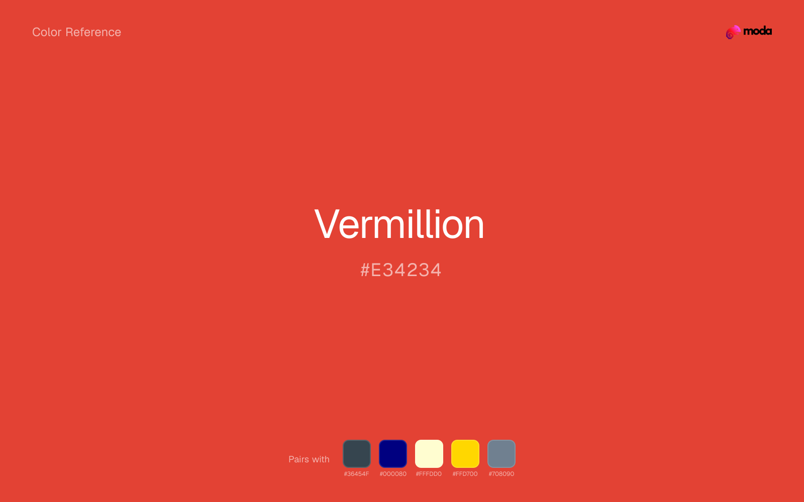
#E34234
RGB
227, 66, 52
HSL
5°, 76%, 55%
HSV
5°, 77%, 89%
Vermillion is a saturated red-orange that feels ink-bright and poster-clean, closer to a stamp pad than a brick. #E34234 is useful when you want a red that snaps forward on white and still pairs cleanly with black typography. It reads as a classic "graphic red" for logos, icons, and print accents.
Best for
Email templates, blog headers, and content marketing visuals.
Compare with
Accessibility
Check contrast before using vermillion for text-heavy layouts, especially on low-contrast backgrounds.
How does vermillion compare to nearby colors?
What is the difference between vermillion and coral red?
Coral Red (#FF4040) carries more pigment punch than Vermillion (#E34234), so the pair separates by finish as much as hue. Vermillion is easier to live with across large areas, because it carries less chroma pressure than Coral Red. Start with vermillion when the palette wants more bright chroma; switch to coral red when the better fit is electric chroma.
What color is vermillion?
Historically, "vermilion" denotes a vivid red pigment derived from cinnabar, long prized in painting and decoration across cultures. The modern digital swatch preserves that bright, orange-red character.
What is the hex code for vermillion?
| Format | Value |
|---|---|
| HEX | #E34234 |
| RGB | rgb(227, 66, 52) |
| HSL | hsl(5°, 76%, 55%) |
| HSV / HSB | hsv(5°, 77%, 89%) |
| CMYK (approx.) | cmyk(0%, 71%, 77%, 11%) |
Convert Vermillion to other color formats
Open the color converter with Vermillion (#E34234) prefilled to copy RGB, HSL, HSV, CMYK, or OKLCH values.
Convert Vermillion in the color converter →What does vermillion mean in design?
Vermillion is often associated with bold marks, festivals, and graphic impact. It tends to read sharper and more orange than ruby or cherry, and less dusty than brick red. In UI patterns, its brightness can parallel "error" or "record" cues.
How do I use vermillion in code?
| CSS (hex) | color: #E34234; |
| CSS (rgb) | color: rgb(227, 66, 52); |
| CSS (hsl) | color: hsl(5, 76%, 55%); |
| RGB % | rgb(89%, 26%, 20%) |
| Tailwind | text-[#E34234] |
| SwiftUI | Color(red: 0.890, green: 0.259, blue: 0.204) |
| UIKit | UIColor(red: 0.890, green: 0.259, blue: 0.204, alpha: 1.0) |
| Android | Color.rgb(227, 66, 52) |
| Compose | Color(0xFFE34234) |
| Web Safe | #CC3333 |
Is vermillion accessible?
| Combination | Ratio | AA | AA lg | AAA | AAA lg | UI |
|---|---|---|---|---|---|---|
| AaWhite text on this color | 4.12:1 | ✗ | ✓ | ✗ | ✗ | ✓ |
| AaBlack text on this color | 5.1:1 | ✓ | ✓ | ✗ | ✓ | ✓ |
| AaThis color as text on white | 4.12:1 | ✗ | ✓ | ✗ | ✗ | ✓ |
| AaThis color as text on black | 5.1:1 | ✓ | ✓ | ✗ | ✓ | ✓ |
WCAG 2.1: AA normal ≥ 4.5:1, AA large text ≥ 3:1, AAA normal ≥ 7:1, AAA large ≥ 4.5:1, UI components ≥ 3:1.
How does vermillion look with color blindness?
Simulated appearance for common types of color vision deficiency. Actual perception varies by individual.
What colors go with vermillion
Charcoal gives vermillion a darker, quieter partner, which helps vivid accents look deliberate instead of loud for their own sake.
Navy blue gives vermillion a cooler counterweight, so the red family reads more deliberate and less locked into urgency.
Cream lets vermillion stay expressive without turning the whole composition stark; the result feels closer to editorial or packaging work than to raw UI default.
Gold works with vermillion when you want the system to feel richer and more intentional, not just higher-contrast.
Slate Gray brings a different temperature cue than vermillion, which helps the palette feel more layered and less one-note.
What colors clash with vermillion
Neon Green competes with vermillion so aggressively that the palette never really settles into a clear primary-secondary relationship.
Magenta remaps vermillion too aggressively, dragging it away from retail, sports, and high-urgency graphics and into a brighter, more performative palette.
Cyan can make vermillion feel more software-default than designed, especially when the rest of the palette is trying to hold onto material nuance.
Pastel Pink can make vermillion feel softer and sweeter than intended, which weakens palettes that rely on gravity or structure.
How should I use vermillion in design?
- •Use vermillion where you need a clear, ownable color — logos, primary CTAs, and hero sections where it carries the visual identity.
- •Cool neutrals like charcoal and slate sharpen vermillion's warm character, while warm companions like cream and gold amplify its inviting quality.
- •Vivid colors like vermillion work best as punctuation in a layout: CTAs, key metrics, or a single hero element. Surrounding neutrals keep it from fatiguing the viewer.
What are good vermillion palettes?
Design with vermillion in Moda
Create a presentation or document using vermillionas your accent color. Moda's AI applies your color palette automatically.
Create a design with vermillion →What are the shades and tints of vermillion?
Shades (darker)
Tints (lighter)
Tones (desaturated)
Hue variations
What are the color harmonies for vermillion?
Harmonies are calculated from the base swatch. When a harmony matches a named color page, it links there; otherwise it appears here as a computed reference swatch.
Similar colors
Coral Red
Coral Red stays very close to vermillion in hue, but it lands lighter, which makes it better for backgrounds, tints, and softer supporting areas than for accents, stronger hierarchy, and firmer structure.
Fire Engine Red
Fire Engine Red is almost the same hue as vermillion; the real difference is value, with fire engine red feeling more grounded and anchor-ready.
Brick Red
Brick Red sits close to vermillion on the wheel, but it carries less chroma, which makes it better for steadier surfaces and calmer long-form use than for sharper emphasis and quicker visual pickup.
Indian Red
Indian Red sits close to vermillion on the wheel, but it carries less chroma, which makes it better for steadier surfaces and calmer long-form use than for sharper emphasis and quicker visual pickup.
Scarlet
Scarlet sits close to vermillion on the wheel, but it carries more pigment pressure, which makes it better for faster emphasis and brighter accent work than for broader coverage and quieter supporting roles.
Frequently asked questions
What is the hex code for vermillion?
The hex code for vermillion is #E34234. In RGB, that's 227 red, 66 green, and 52 blue. The approximate CMYK equivalent is 0% cyan, 71% magenta, 77% yellow, and 11% key (black).
Is vermillion a warm or cool color?
Vermillion reads as warm. It feels most natural with creams, golds, rusts, and other warm accents, while cooler partners like navy or teal create sharper contrast.
Is vermillion better as an accent or a full-palette color?
Vermillion is usually best when it leads in short bursts rather than covering everything. It can headline a palette, but most layouts work better when the color handles accents, highlights, or one main hero role instead of every surface.
How should I use vermillion in a design?
Vermillion is versatile enough for headlines, accent bars, buttons, charts, or section backgrounds depending on the contrast around it. It works as either a primary or supporting color in decks, documents, and brand systems.
Can I use vermillion for text or backgrounds?
Vermillion works better with dark text than white text. Black text reaches 5.1:1 contrast on the swatch, which makes the color more usable as a background or highlight surface than as a dark panel.
More red colors
Keep exploring color resources
All color pages
Browse the full library of color references, pairings, and palettes.
Red colors
Compare vermillion with other red tones.
Brown colors
Explore nearby color families to build stronger palettes and contrasts.
Neutral colors
Explore nearby color families to build stronger palettes and contrasts.
Orange colors
Explore nearby color families to build stronger palettes and contrasts.
Last updated April 6, 2026
Color values are computed from the listed hex code using standard conversion formulas. RGB, HSL, and HSV are exact screen-ready conversions. CMYK is an approximate on-screen reference, not a press-ready print specification. Pairings, palettes, and use-case guidance are heuristic recommendations derived from color relationships, contrast behavior, and common presentation, document, and UI patterns.