Coral Red palettes and pairings
HEX
#FF4040
RGB
255, 64, 64
HSL
0°, 100%, 63%
HSV
0°, 75%, 100%
Coral red is a warm, high-key red with a soft pink undertow — sunburn bright, not brick dusty. #FF4040 feels tropical and friendly on social templates and summer campaigns where pure red can look harsh. Compared with scarlet, it is softer around the edges; compared with cherry, it is less magenta and more straight-ahead warm.
Best for
Educational platforms, course materials, and infographic designs.
Compare with
Accessibility
Check contrast before using coral red for text-heavy layouts, especially on low-contrast backgrounds.
How does coral red compare to nearby colors?
What is the difference between coral red and vermillion?
Vermillion (#E34234) carries less pigment punch than Coral Red (#FF4040), so the pair separates by finish as much as hue. Coral Red reads faster on screen, so it changes the palette from steady to attention-seeking more quickly than Vermillion does. Start with coral red when the palette wants more electric chroma; switch to vermillion when the better fit is bright chroma.
What color is coral red?
The name references coral organisms and reef-associated hues. Digital palettes often distinguish coral-red from orange-leaning corals.
What is the hex code for coral red?
| Format | Value |
|---|---|
| HEX | #FF4040 |
| RGB | rgb(255, 64, 64) |
| HSL | hsl(0°, 100%, 63%) |
| HSV / HSB | hsv(0°, 75%, 100%) |
| CMYK (approx.) | cmyk(0%, 75%, 75%, 0%) |
Convert Coral Red to other color formats
Open the color converter with Coral Red (#FF4040) prefilled to copy RGB, HSL, HSV, CMYK, or OKLCH values.
Convert Coral Red in the color converter →What does coral red mean in design?
Coral red is often associated with warmth, vacation ease, and approachable energy. It tends to read gentler and more playful than fire-engine red's emergency connotations, and sunnier than wine or carmine.
How do I use coral red in code?
| CSS (hex) | color: #FF4040; |
| CSS (rgb) | color: rgb(255, 64, 64); |
| CSS (hsl) | color: hsl(0, 100%, 63%); |
| RGB % | rgb(100%, 25%, 25%) |
| Tailwind | text-[#FF4040] |
| SwiftUI | Color(red: 1.000, green: 0.251, blue: 0.251) |
| UIKit | UIColor(red: 1.000, green: 0.251, blue: 0.251, alpha: 1.0) |
| Android | Color.rgb(255, 64, 64) |
| Compose | Color(0xFFFF4040) |
| Web Safe | #FF3333 |
Is coral red accessible?
| Combination | Ratio | AA | AA lg | AAA | AAA lg | UI |
|---|---|---|---|---|---|---|
| AaWhite text on this color | 3.47:1 | ✗ | ✓ | ✗ | ✗ | ✓ |
| AaBlack text on this color | 6.06:1 | ✓ | ✓ | ✗ | ✓ | ✓ |
| AaThis color as text on white | 3.47:1 | ✗ | ✓ | ✗ | ✗ | ✓ |
| AaThis color as text on black | 6.06:1 | ✓ | ✓ | ✗ | ✓ | ✓ |
WCAG 2.1: AA normal ≥ 4.5:1, AA large text ≥ 3:1, AAA normal ≥ 7:1, AAA large ≥ 4.5:1, UI components ≥ 3:1.
How does coral red look with color blindness?
Simulated appearance for common types of color vision deficiency. Actual perception varies by individual.
What colors go with coral red
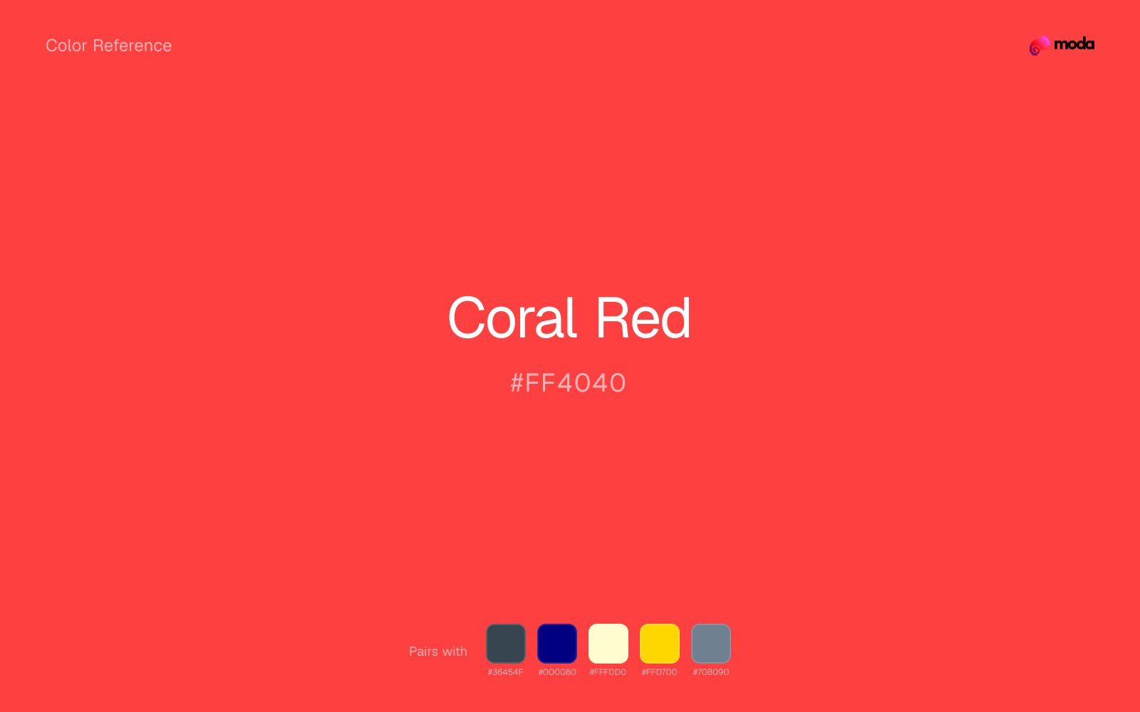
Charcoal balances coral red by turning the palette into a usable light-dark system rather than a field of soft midtones.
Navy blue steadies coral red by adding a sober dark value, which is why the pair can work beyond alerts and sports-style emphasis.
Cream takes the hard digital edge off coral red and makes the color feel more printed, paper-backed, and approachable.
Pairing coral red with gold shifts the palette toward a more dressed-up register and away from plain utilitarian color.
Slate Gray gives coral red a second note that is different enough to feel intentional but not so different that the palette loses coherence.
What colors clash with coral red
Neon Green changes the meaning of coral red too abruptly, replacing the source color's retail, sports, and high-urgency graphics cues with something much louder and less stable.
Magenta remaps coral red too aggressively, dragging it away from retail, sports, and high-urgency graphics and into a brighter, more performative palette.
Cyan redirects coral red toward a more technical, backlit interpretation, which is risky when the goal is warmth, polish, or print-minded editorial work.
Pastel Pink can undercut coral red's authority by turning the combination more decorative than decisive.
How should I use coral red in design?
- •Use coral red for buttons, badges, and chart accents where it can stand out. Test text contrast with WCAG tools before using it for body copy on light backgrounds.
- •Pair coral red with cool accents (navy, sage, steel blue) for sharp contrast, or keep it with other warm tones (cream, gold, tan) for a cohesive, editorial feel.
- •Coral Red's high saturation makes it most effective in small doses — buttons, chart highlights, notification badges, and social media accents.
What are good coral red palettes?
Bright horizon
Educational platforms, course materials, and infographic designs.
Design with coral red in Moda
Create a presentation or document using coral redas your accent color. Moda's AI applies your color palette automatically.
Create a design with coral red →What are the shades and tints of coral red?
Shades (darker)
Tints (lighter)
Tones (desaturated)
Hue variations
What are the color harmonies for coral red?
Harmonies are calculated from the base swatch. When a harmony matches a named color page, it links there; otherwise it appears here as a computed reference swatch.
Similar colors
Vermillion
Vermillion stays very close to coral red in hue, but it lands darker, which makes it better for headlines, anchors, and darker sections than for lighter surfaces and more open applications.
Indian Red
Indian Red is nearly adjacent to coral red in hue; what separates them is intensity, with indian red reading dustier and easier to extend across a layout.
Scarlet
Scarlet is close enough to coral red to keep the palette cohesive, yet the lighter-darker shift still decides whether the family behaves more like atmosphere or more like structure.
Fire Engine Red
Fire Engine Red tracks close to coral red in hue, but the value shift changes where each one earns its place: fire engine red is easier to use for headlines, anchors, and darker sections, while coral red holds onto lighter surfaces and more open applications.
Brick Red
Brick Red is almost the same hue as coral red; the real difference is value, with brick red feeling more grounded and anchor-ready.
Frequently asked questions
What is the hex code for coral red?
The hex code for coral red is #FF4040. In RGB, that's 255 red, 64 green, and 64 blue. The approximate CMYK equivalent is 0% cyan, 75% magenta, 75% yellow, and 0% key (black).
Is coral red a warm or cool color?
Coral Red sits on the warm side of the palette, so it pairs easily with other warm tones and becomes more energetic when you place it against cooler blues or blue-grays.
Should coral red lead the palette or stay in supporting roles?
Coral Red has enough chroma to take the lead, but it usually performs best when the surrounding system stays quieter. Treat it as the voice of emphasis, not the answer to every layout need.
Where does coral red work best in a layout?
Coral Red carries a lot of chroma, so it is usually strongest as punctuation rather than wallpaper. Use it for focal accents and let low-saturation surfaces do the balancing.
Is coral red accessible?
Coral Red works better with dark text than white text. Black text reaches 6.06:1 contrast on the swatch, which makes the color more usable as a background or highlight surface than as a dark panel.
More red colors
Keep exploring color resources
All color pages
Browse the full library of color references, pairings, and palettes.
Red colors
Compare coral red with other red tones.
Brown colors
Explore nearby color families to build stronger palettes and contrasts.
Neutral colors
Explore nearby color families to build stronger palettes and contrasts.
Orange colors
Explore nearby color families to build stronger palettes and contrasts.
Last updated April 6, 2026
Color values are computed from the listed hex code using standard conversion formulas. RGB, HSL, and HSV are exact screen-ready conversions. CMYK is an approximate on-screen reference, not a press-ready print specification. Pairings, palettes, and use-case guidance are heuristic recommendations derived from color relationships, contrast behavior, and common presentation, document, and UI patterns.