Wine color guide
HEX
#722F37
RGB
114, 47, 55
HSL
353°, 42%, 32%
HSV
353°, 59%, 45%
Wine is a moody, brown-tinged red that sinks into shadow instead of shouting — closer to a dimly lit glass of merlot than a neon sign. #722F37 behaves like a neutral-leaning red: rich on velvet and leather textures, steady on packaging, and forgiving on screens where pure reds can feel electric.
Best for
Investor materials, annual reports, and financial dashboards.
Accessibility
White text on wine passes AAA at 9.65:1, so it is safe for dark backgrounds and section headers.
How does wine compare to nearby colors?
What is the difference between wine and chestnut?
Wine (#722F37) and Chestnut (#954535) are close enough that the split is more about finish than headline contrast: Wine feels more lacquered and formal, while Chestnut reads more warm wood. Wine gives the palette a more grounded center of gravity, which matters if headlines, UI chrome, or darker sections need to feel settled. Begin with wine when the family needs its current undertone and surface character; keep chestnut for the nearby alternative that shifts the mood without leaving the same hue neighborhood.
What color is wine?
The name is straightforwardly descriptive of red wine's typical hue, and the term shows up routinely in fashion, interiors, and cosmetics as shorthand for sophisticated dark red.
What is the hex code for wine?
| Format | Value |
|---|---|
| HEX | #722F37 |
| RGB | rgb(114, 47, 55) |
| HSL | hsl(353°, 42%, 32%) |
| HSV / HSB | hsv(353°, 59%, 45%) |
| CMYK (approx.) | cmyk(0%, 59%, 52%, 55%) |
Convert Wine to other color formats
Open the color converter with Wine (#722F37) prefilled to copy RGB, HSL, HSV, CMYK, or OKLCH values.
Convert Wine in the color converter →What does wine mean in design?
Wine tones are often associated with evening formality, intimacy, and a slightly vintage luxury. They tend to read as grounded and adult compared with brighter reds, and less brown-heavy than many maroons. In branding, wine can suggest craft and restraint.
How do I use wine in code?
| CSS (hex) | color: #722F37; |
| CSS (rgb) | color: rgb(114, 47, 55); |
| CSS (hsl) | color: hsl(353, 42%, 32%); |
| RGB % | rgb(45%, 18%, 22%) |
| Tailwind | text-[#722F37] |
| SwiftUI | Color(red: 0.447, green: 0.184, blue: 0.216) |
| UIKit | UIColor(red: 0.447, green: 0.184, blue: 0.216, alpha: 1.0) |
| Android | Color.rgb(114, 47, 55) |
| Compose | Color(0xFF722F37) |
| Web Safe | #663333 |
Is wine accessible?
| Combination | Ratio | AA | AA lg | AAA | AAA lg | UI |
|---|---|---|---|---|---|---|
| AaWhite text on this color | 9.65:1 | ✓ | ✓ | ✓ | ✓ | ✓ |
| AaBlack text on this color | 2.18:1 | ✗ | ✗ | ✗ | ✗ | ✗ |
| AaThis color as text on white | 9.65:1 | ✓ | ✓ | ✓ | ✓ | ✓ |
| AaThis color as text on black | 2.18:1 | ✗ | ✗ | ✗ | ✗ | ✗ |
WCAG 2.1: AA normal ≥ 4.5:1, AA large text ≥ 3:1, AAA normal ≥ 7:1, AAA large ≥ 4.5:1, UI components ≥ 3:1.
How does wine look with color blindness?
Simulated appearance for common types of color vision deficiency. Actual perception varies by individual.
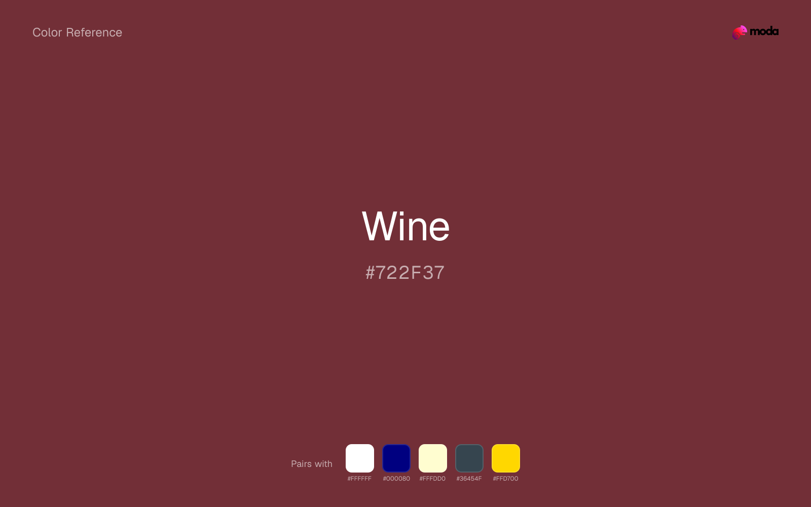
What colors go with wine
White sharpens wine without cooling it off, which is useful when you need a clean interface or slide layout around the color.
Navy blue reins in wine without deadening it, which is useful when you want warmth to stay present but not dominate every part of the page.
Cream preserves strong contrast against wine but feels warmer and more human than white, which suits darker colors especially well.
What colors clash with wine
Neon Green changes the meaning of wine too abruptly, replacing the source color's premium retail and sport cues with something much louder and less stable.
Magenta remaps wine too aggressively, dragging it away from premium retail and sport and into a brighter, more performative palette.
Cyan redirects wine toward a more technical, backlit interpretation, which is risky when the goal is warmth, polish, or print-minded editorial work.
Pastel Pink can undercut wine's authority by turning the combination more decorative than decisive.
How should I use wine in design?
- •Wine carries enough visual weight for headlines, key UI elements, and section anchors — dark enough to command attention but clearly distinct from black.
- •Pair wine with cool accents (navy, sage, steel blue) for sharp contrast, or keep it with other warm tones (cream, gold, tan) for a cohesive, editorial feel.
- •Wine works in sales materials, alert UI, and anywhere that calls for confident energy — balance it with neutral space so the emphasis stays focused.
What are good wine palettes?
Noir refinement
Investor materials, annual reports, and financial dashboards.
Design with wine in Moda
Create a presentation or document using wineas your accent color. Moda's AI applies your color palette automatically.
Create a design with wine →What are the shades and tints of wine?
Shades (darker)
Tints (lighter)
Tones (desaturated)
Hue variations
What are the color harmonies for wine?
Harmonies are calculated from the base swatch. When a harmony matches a named color page, it links there; otherwise it appears here as a computed reference swatch.
Similar colors
Chestnut
Chestnut stays very close to wine in hue, but it lands lighter, which makes it better for backgrounds, tints, and softer supporting areas than for accents, stronger hierarchy, and firmer structure.
Carmine
Carmine is nearly adjacent to wine in hue; what separates them is intensity, with carmine reading cleaner and more assertive.
Burgundy
Burgundy stays very close to wine in hue, but it lands darker, which makes it better for headlines, anchors, and darker sections than for lighter surfaces and more open applications.
Coffee
Coffee is useful when wine is the right weight but the wrong mood: the swap changes temperature and finish more than contrast.
Umber
Umber keeps roughly the same visual weight as wine but changes the undertone story, which is often enough to move a palette from warmer and tactile to cooler and more technical, or the reverse.
Frequently asked questions
What is the hex code for wine?
The hex code for wine is #722F37. In RGB, that's 114 red, 47 green, and 55 blue. The approximate CMYK equivalent is 0% cyan, 59% magenta, 52% yellow, and 55% key (black).
Is wine a warm or cool color?
Wine reads as warm. It feels most natural with creams, golds, rusts, and other warm accents, while cooler partners like navy or teal create sharper contrast.
Where does wine work best in a layout?
Wine is flexible enough to move between accents, section blocks, and supporting roles depending on the contrast around it. It works best when the rest of the palette gives it a clear job instead of asking it to do everything at once.
How should I use wine in a design?
Wine is versatile enough for headlines, accent bars, buttons, charts, or section backgrounds depending on the contrast around it. It works as either a primary or supporting color in decks, documents, and brand systems.
Can I use wine for text or backgrounds?
Wine is strong enough for white text at 9.65:1 contrast, so it can handle dark panels, tags, and section headers without much trouble. As text on white, though, it is usually better reserved for larger headings or short accents than for long paragraphs.
More red colors
Keep exploring color resources
All color pages
Browse the full library of color references, pairings, and palettes.
Red colors
Compare wine with other red tones.
Brown colors
Explore nearby color families to build stronger palettes and contrasts.
Neutral colors
Explore nearby color families to build stronger palettes and contrasts.
Orange colors
Explore nearby color families to build stronger palettes and contrasts.
Last updated April 6, 2026
Color values are computed from the listed hex code using standard conversion formulas. RGB, HSL, and HSV are exact screen-ready conversions. CMYK is an approximate on-screen reference, not a press-ready print specification. Pairings, palettes, and use-case guidance are heuristic recommendations derived from color relationships, contrast behavior, and common presentation, document, and UI patterns.