Crimson color guide
HEX
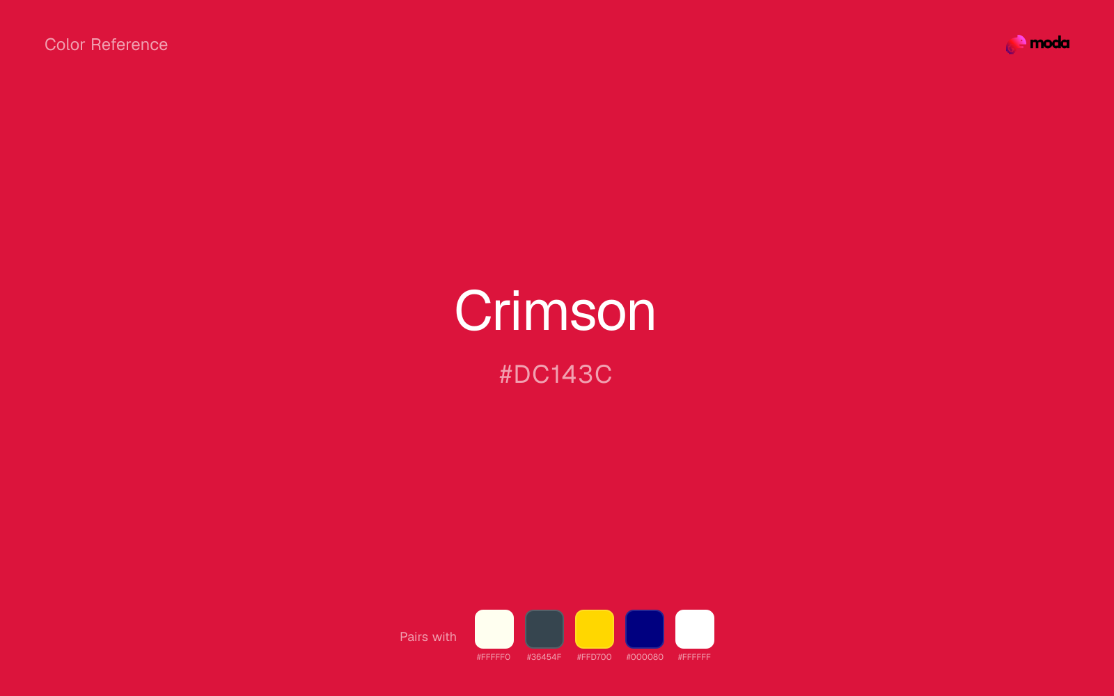
#DC143C
RGB
220, 20, 60
HSL
348°, 83%, 47%
HSV
348°, 91%, 86%
Crimson (#DC143C) is a deep, rich red with blue undertones that reads as more refined than pure red. It's a natural fit for premium presentations and formal business documents where you want energy without aggression.
Best for
Executive presentations and annual reports for established institutions.
Accessibility
Crimson text on white passes AA at 4.99:1, which makes it usable for headings and short labels.
How does crimson compare to nearby colors?
What is the difference between crimson and burgundy?
Side by side, Crimson (#DC143C) carries more lift and air than Burgundy (#800020). Crimson shifts the system toward paper, tint, and background behavior more than Burgundy does. Use crimson when you want more daylight in the palette, and move to burgundy when the layout needs the family to carry more presence.
What color is crimson?
Crimson derives its name from the kermes insect, which produced a prized red dye in medieval Europe. It is the official color of Harvard University and appears in numerous institutional identities where deep red signals tradition and prestige.
What is the hex code for crimson?
| Format | Value |
|---|---|
| HEX | #DC143C |
| RGB | rgb(220, 20, 60) |
| HSL | hsl(348°, 83%, 47%) |
| HSV / HSB | hsv(348°, 91%, 86%) |
| CMYK (approx.) | cmyk(0%, 91%, 73%, 14%) |
Convert Crimson to other color formats
Open the color converter with Crimson (#DC143C) prefilled to copy RGB, HSL, HSV, CMYK, or OKLCH values.
Convert Crimson in the color converter →What does crimson mean in design?
Crimson carries the passion of red but tempers it with blue undertones that add refinement. It tends to read as more serious and institutional than pure red — prestigious rather than urgent. In design, crimson works where you want red's energy with a more polished, less aggressive edge.
How do I use crimson in code?
| CSS (hex) | color: #DC143C; |
| CSS (rgb) | color: rgb(220, 20, 60); |
| CSS (hsl) | color: hsl(348, 83%, 47%); |
| RGB % | rgb(86%, 8%, 24%) |
| Tailwind | text-[#DC143C] |
| SwiftUI | Color(red: 0.863, green: 0.078, blue: 0.235) |
| UIKit | UIColor(red: 0.863, green: 0.078, blue: 0.235, alpha: 1.0) |
| Android | Color.rgb(220, 20, 60) |
| Compose | Color(0xFFDC143C) |
| Web Safe | #CC0033 |
Is crimson accessible?
| Combination | Ratio | AA | AA lg | AAA | AAA lg | UI |
|---|---|---|---|---|---|---|
| AaWhite text on this color | 4.99:1 | ✓ | ✓ | ✗ | ✓ | ✓ |
| AaBlack text on this color | 4.21:1 | ✗ | ✓ | ✗ | ✗ | ✓ |
| AaThis color as text on white | 4.99:1 | ✓ | ✓ | ✗ | ✓ | ✓ |
| AaThis color as text on black | 4.21:1 | ✗ | ✓ | ✗ | ✗ | ✓ |
WCAG 2.1: AA normal ≥ 4.5:1, AA large text ≥ 3:1, AAA normal ≥ 7:1, AAA large ≥ 4.5:1, UI components ≥ 3:1.
How does crimson look with color blindness?
Simulated appearance for common types of color vision deficiency. Actual perception varies by individual.
What colors go with crimson
Ivory changes the temperature story around crimson: red-hot on its own, more inviting editorial surfaces once the cooler or warmer partner is introduced.
When crimson is already bright, charcoal absorbs some of the visual heat and keeps the combination closer to retail, sports, and high-urgency graphics than to novelty graphics.
Gold works with crimson when you want the system to feel richer and more intentional, not just higher-contrast.
What colors clash with crimson
Hot Pink sits so close to crimson in hue that the pair blends together before it establishes any useful contrast or emphasis.
Tangerine brings a second high-energy note into the palette, so the layout can start feeling noisy before it finds a clear focal point.
Neon Green competes with crimson so aggressively that the palette never really settles into a clear primary-secondary relationship.
How should I use crimson in design?
- •Crimson works as a primary brand color — it's intense enough to anchor a palette but refined enough for corporate use.
- •Pair with ivory or cream for a warm, sophisticated look in pitch decks.
- •Use crimson for headlines and key data points against a white or light gray background.
What are good crimson palettes?
Regal authority
Executive presentations and annual reports for established institutions.
Warm professional
Brand guidelines and one-pagers for professional services firms.
Design with crimson in Moda
Create a presentation or document using crimsonas your accent color. Moda's AI applies your color palette automatically.
Create a design with crimson →What are the shades and tints of crimson?
Shades (darker)
Tints (lighter)
Tones (desaturated)
Hue variations
What are the color harmonies for crimson?
Harmonies are calculated from the base swatch. When a harmony matches a named color page, it links there; otherwise it appears here as a computed reference swatch.
Similar colors
Red
Red is nearly adjacent to crimson in hue; what separates them is intensity, with red reading cleaner and more assertive.
Ruby
Ruby sits close to crimson in hue, but its berry-magenta cast changes the mood of the palette even when the contrast shift is small.
Burgundy
Burgundy tracks close to crimson in hue, but the value shift changes where each one earns its place: burgundy is easier to use for headlines, anchors, and darker sections, while crimson holds onto lighter surfaces and more open applications.
Cherry
Cherry is almost the same hue as crimson; the real difference is value, with cherry feeling more open and surface-friendly.
Frequently asked questions
What is the hex code for crimson?
The hex code for crimson is #DC143C. In RGB, that's 220 red, 20 green, and 60 blue. The approximate CMYK equivalent is 0% cyan, 91% magenta, 73% yellow, and 14% key (black).
Is crimson a warm or cool color?
Crimson reads as warm. It feels most natural with creams, golds, rusts, and other warm accents, while cooler partners like navy or teal create sharper contrast.
Is crimson better as an accent or a full-palette color?
Crimson is usually best when it leads in short bursts rather than covering everything. It can headline a palette, but most layouts work better when the color handles accents, highlights, or one main hero role instead of every surface.
How should I use crimson in a design?
Crimson is vivid enough to work best in controlled doses such as CTAs, highlighted metrics, chart accents, or a single hero element. Surround it with quieter neutrals so it does not exhaust the layout.
Can I use crimson for text or backgrounds?
Crimson can work as text on white at 4.99:1 contrast, but it is usually safest in headings, labels, and accent moments rather than long body copy.
More red colors
Keep exploring color resources
All color pages
Browse the full library of color references, pairings, and palettes.
Red colors
Compare crimson with other red tones.
Brown colors
Explore nearby color families to build stronger palettes and contrasts.
Neutral colors
Explore nearby color families to build stronger palettes and contrasts.
Orange colors
Explore nearby color families to build stronger palettes and contrasts.
Last updated April 6, 2026
Color values are computed from the listed hex code using standard conversion formulas. RGB, HSL, and HSV are exact screen-ready conversions. CMYK is an approximate on-screen reference, not a press-ready print specification. Pairings, palettes, and use-case guidance are heuristic recommendations derived from color relationships, contrast behavior, and common presentation, document, and UI patterns.