Scarlet palettes and pairings
HEX
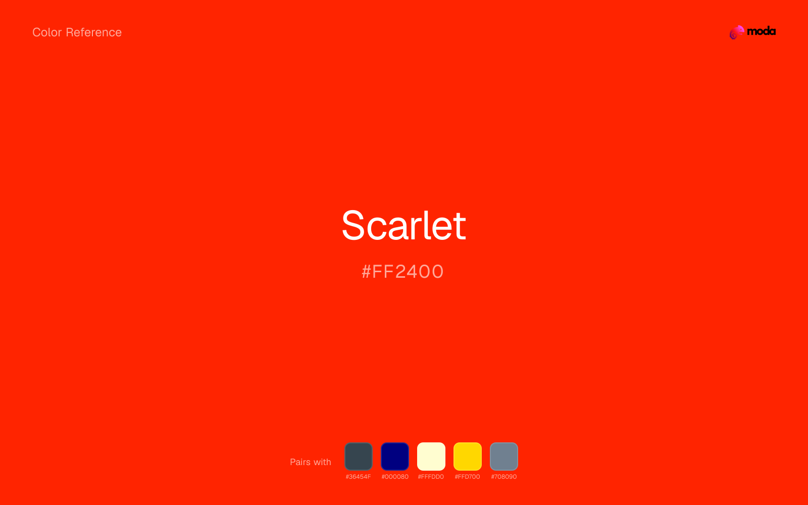
#FF2400
RGB
255, 36, 0
HSL
8°, 100%, 50%
HSV
8°, 100%, 100%
Scarlet reads as a hot, forward red that leans into orange, brighter and more theatrical than a "true" red without drifting into coral territory. #FF2400 stays readable at small sizes and still feels dramatic on large fields — useful for posters, sale strips, and sports graphics where you need unmistakable heat without the heavier cast of deeper crimsons.
Best for
Marketing websites, social media graphics, and campaign landing pages.
Accessibility
Check contrast before using scarlet for text-heavy layouts, especially on low-contrast backgrounds.
How does scarlet compare to nearby colors?
What is the difference between scarlet and persimmon?
Scarlet (#FF2400) and Persimmon (#EC5800) may look neighboring at first glance, yet their surface character diverges once they sit next to whites, charcoals, and other real layout neutrals. Scarlet and Persimmon are close enough to substitute for each other, but they do not create the same supporting cast once typography, photography, and neutrals are added. Choose scarlet when the surrounding system aligns better with retail, sports, and high-urgency graphics, and move to persimmon when the stronger contextual fit is food, promotion, and social-first graphics.
What color is scarlet?
The English name "scarlet" originally referred to a fine wool cloth, and the color became tied to ceremonial dress and uniform traditions. In literature and education, "scarlet" carries a well-known association through Hawthorne's novel that many readers still recognize.
What is the hex code for scarlet?
| Format | Value |
|---|---|
| HEX | #FF2400 |
| RGB | rgb(255, 36, 0) |
| HSL | hsl(8°, 100%, 50%) |
| HSV / HSB | hsv(8°, 100%, 100%) |
| CMYK (approx.) | cmyk(0%, 86%, 100%, 0%) |
Convert Scarlet to other color formats
Open the color converter with Scarlet (#FF2400) prefilled to copy RGB, HSL, HSV, CMYK, or OKLCH values.
Convert Scarlet in the color converter →What does scarlet mean in design?
Scarlet is often associated with urgency, celebration, and high visibility. It tends to read as more aggressive and "lit from within" than cardinal or brick red, and less pink than cherry or ruby. Pairing it with calm neutrals usually keeps the tone from feeling shrill.
How do I use scarlet in code?
| CSS (hex) | color: #FF2400; |
| CSS (rgb) | color: rgb(255, 36, 0); |
| CSS (hsl) | color: hsl(8, 100%, 50%); |
| RGB % | rgb(100%, 14%, 0%) |
| Tailwind | text-[#FF2400] |
| SwiftUI | Color(red: 1.000, green: 0.141, blue: 0.000) |
| UIKit | UIColor(red: 1.000, green: 0.141, blue: 0.000, alpha: 1.0) |
| Android | Color.rgb(255, 36, 0) |
| Compose | Color(0xFFFF2400) |
| Web Safe | #FF3300 |
Is scarlet accessible?
| Combination | Ratio | AA | AA lg | AAA | AAA lg | UI |
|---|---|---|---|---|---|---|
| AaWhite text on this color | 3.82:1 | ✗ | ✓ | ✗ | ✗ | ✓ |
| AaBlack text on this color | 5.5:1 | ✓ | ✓ | ✗ | ✓ | ✓ |
| AaThis color as text on white | 3.82:1 | ✗ | ✓ | ✗ | ✗ | ✓ |
| AaThis color as text on black | 5.5:1 | ✓ | ✓ | ✗ | ✓ | ✓ |
WCAG 2.1: AA normal ≥ 4.5:1, AA large text ≥ 3:1, AAA normal ≥ 7:1, AAA large ≥ 4.5:1, UI components ≥ 3:1.
How does scarlet look with color blindness?
Simulated appearance for common types of color vision deficiency. Actual perception varies by individual.
What colors go with scarlet
When scarlet is already bright, charcoal absorbs some of the visual heat and keeps the combination closer to retail, sports, and high-urgency graphics than to novelty graphics.
Navy blue reins in scarlet without deadening it, which is useful when you want warmth to stay present but not dominate every part of the page.
Cream lets scarlet stay expressive without turning the whole composition stark; the result feels closer to editorial or packaging work than to raw UI default.
Pairing scarlet with gold shifts the palette toward a more dressed-up register and away from plain utilitarian color.
Slate Gray helps scarlet feel more complete in practice because the pairing combines poster-bright qualities with brushed gray support instead of leaving the source color to do every job alone.
What colors clash with scarlet
Neon Green competes with scarlet so aggressively that the palette never really settles into a clear primary-secondary relationship.
Magenta remaps scarlet too aggressively, dragging it away from retail, sports, and high-urgency graphics and into a brighter, more performative palette.
With scarlet, cyan introduces a colder display-driven cast that strips away some of the source color's tactile character.
Pastel Pink can make scarlet feel softer and sweeter than intended, which weakens palettes that rely on gravity or structure.
How should I use scarlet in design?
- •Scarlet has the saturation to lead a brand palette — strong enough for buttons, headers, and packaging without drifting into pastel or dark territory.
- •Scarlet leans warm, so cool counterparts like navy, teal, or slate create the cleanest contrast. For a softer, tonal look, stay within neighboring warm hues and let value differences do the work.
- •Scarlet's high saturation makes it most effective in small doses — buttons, chart highlights, notification badges, and social media accents.
What are good scarlet palettes?
Open air
Marketing websites, social media graphics, and campaign landing pages.
Sunlit warmth
Brand guidelines, design systems, and visual identity documents.
Design with scarlet in Moda
Create a presentation or document using scarletas your accent color. Moda's AI applies your color palette automatically.
Create a design with scarlet →What are the shades and tints of scarlet?
Shades (darker)
Tints (lighter)
Tones (desaturated)
Hue variations
What are the color harmonies for scarlet?
Harmonies are calculated from the base swatch. When a harmony matches a named color page, it links there; otherwise it appears here as a computed reference swatch.
Similar colors
Red
Red is near enough to scarlet to swap into the same palette, yet the undertone shift still decides whether the family reads warmer or cooler overall.
Vermillion
Vermillion sits close to scarlet on the wheel, but it carries less chroma, which makes it better for steadier surfaces and calmer long-form use than for sharper emphasis and quicker visual pickup.
Persimmon
Persimmon is near enough to scarlet to swap into the same palette, yet the undertone shift still decides whether the family reads warmer or cooler overall.
Fire Engine Red
Fire Engine Red sits close to scarlet on the wheel, but it carries less chroma, which makes it better for steadier surfaces and calmer long-form use than for sharper emphasis and quicker visual pickup.
Coral Red
Coral Red stays in the same color family as scarlet, but the change in value moves it into different layout jobs, especially once backgrounds, charts, or section dividers enter the system.
Frequently asked questions
What is the hex code for scarlet?
The hex code for scarlet is #FF2400. In RGB, that's 255 red, 36 green, and 0 blue. The approximate CMYK equivalent is 0% cyan, 86% magenta, 100% yellow, and 0% key (black).
Is scarlet a warm or cool color?
Scarlet sits on the warm side of the palette, so it pairs easily with other warm tones and becomes more energetic when you place it against cooler blues or blue-grays.
Should scarlet lead the palette or stay in supporting roles?
Scarlet has enough chroma to take the lead, but it usually performs best when the surrounding system stays quieter. Treat it as the voice of emphasis, not the answer to every layout need.
Where does scarlet work best in a layout?
Scarlet carries a lot of chroma, so it is usually strongest as punctuation rather than wallpaper. Use it for focal accents and let low-saturation surfaces do the balancing.
Is scarlet accessible?
Scarlet works better with dark text than white text. Black text reaches 5.5:1 contrast on the swatch, which makes the color more usable as a background or highlight surface than as a dark panel.
More red colors
Keep exploring color resources
All color pages
Browse the full library of color references, pairings, and palettes.
Red colors
Compare scarlet with other red tones.
Brown colors
Explore nearby color families to build stronger palettes and contrasts.
Neutral colors
Explore nearby color families to build stronger palettes and contrasts.
Orange colors
Explore nearby color families to build stronger palettes and contrasts.
Last updated April 6, 2026
Color values are computed from the listed hex code using standard conversion formulas. RGB, HSL, and HSV are exact screen-ready conversions. CMYK is an approximate on-screen reference, not a press-ready print specification. Pairings, palettes, and use-case guidance are heuristic recommendations derived from color relationships, contrast behavior, and common presentation, document, and UI patterns.