Using Burgundy in design
HEX
#800020
RGB
128, 0, 32
HSL
345°, 100%, 25%
HSV
345°, 100%, 50%
Burgundy (#800020) is a deep wine-red with subtle purple undertones that signals luxury and sophistication. It's the go-to dark red for premium brand materials, pitch decks, and executive presentations.
Best for
Brand guidelines, product brochures, and pitch decks for premium consumer brands.
Accessibility
White text on burgundy passes AAA at 10.83:1, so it is safe for dark backgrounds and section headers.
How does burgundy compare to nearby colors?
What is the difference between burgundy and wine?
Wine (#722F37) carries less pigment punch than Burgundy (#800020), so the pair separates by finish as much as hue. Burgundy is more useful when the color itself needs to do some signaling; Wine is easier to keep in longer-running surfaces. Choose burgundy when the color needs to register quickly and act like the headline accent; keep wine when the rest of the layout needs a quieter companion.
What color is burgundy?
Burgundy is named after the wine-producing Burgundy region of France. The color has long been associated with wealth and refinement, appearing in luxury fashion, fine wine labels, and premium automotive interiors.
Also known as: Wine Red. Some sources cite: #900020.
What is the hex code for burgundy?
| Format | Value |
|---|---|
| HEX | #800020 |
| RGB | rgb(128, 0, 32) |
| HSL | hsl(345°, 100%, 25%) |
| HSV / HSB | hsv(345°, 100%, 50%) |
| CMYK (approx.) | cmyk(0%, 100%, 75%, 50%) |
Convert Burgundy to other color formats
Open the color converter with Burgundy (#800020) prefilled to copy RGB, HSL, HSV, CMYK, or OKLCH values.
Convert Burgundy in the color converter →What does burgundy mean in design?
Burgundy communicates quiet luxury and sophistication. Its deep value and purple undertones make it feel aged, cultured, and premium — closer to fine wine than fire trucks. In branding, burgundy is the default "luxury red" for fashion, hospitality, and premium consumer goods.
How do I use burgundy in code?
| CSS (hex) | color: #800020; |
| CSS (rgb) | color: rgb(128, 0, 32); |
| CSS (hsl) | color: hsl(345, 100%, 25%); |
| RGB % | rgb(50%, 0%, 13%) |
| Tailwind | text-[#800020] |
| SwiftUI | Color(red: 0.502, green: 0.000, blue: 0.125) |
| UIKit | UIColor(red: 0.502, green: 0.000, blue: 0.125, alpha: 1.0) |
| Android | Color.rgb(128, 0, 32) |
| Compose | Color(0xFF800020) |
| Web Safe | #990033 |
Is burgundy accessible?
| Combination | Ratio | AA | AA lg | AAA | AAA lg | UI |
|---|---|---|---|---|---|---|
| AaWhite text on this color | 10.83:1 | ✓ | ✓ | ✓ | ✓ | ✓ |
| AaBlack text on this color | 1.94:1 | ✗ | ✗ | ✗ | ✗ | ✗ |
| AaThis color as text on white | 10.83:1 | ✓ | ✓ | ✓ | ✓ | ✓ |
| AaThis color as text on black | 1.94:1 | ✗ | ✗ | ✗ | ✗ | ✗ |
WCAG 2.1: AA normal ≥ 4.5:1, AA large text ≥ 3:1, AAA normal ≥ 7:1, AAA large ≥ 4.5:1, UI components ≥ 3:1.
How does burgundy look with color blindness?
Simulated appearance for common types of color vision deficiency. Actual perception varies by individual.
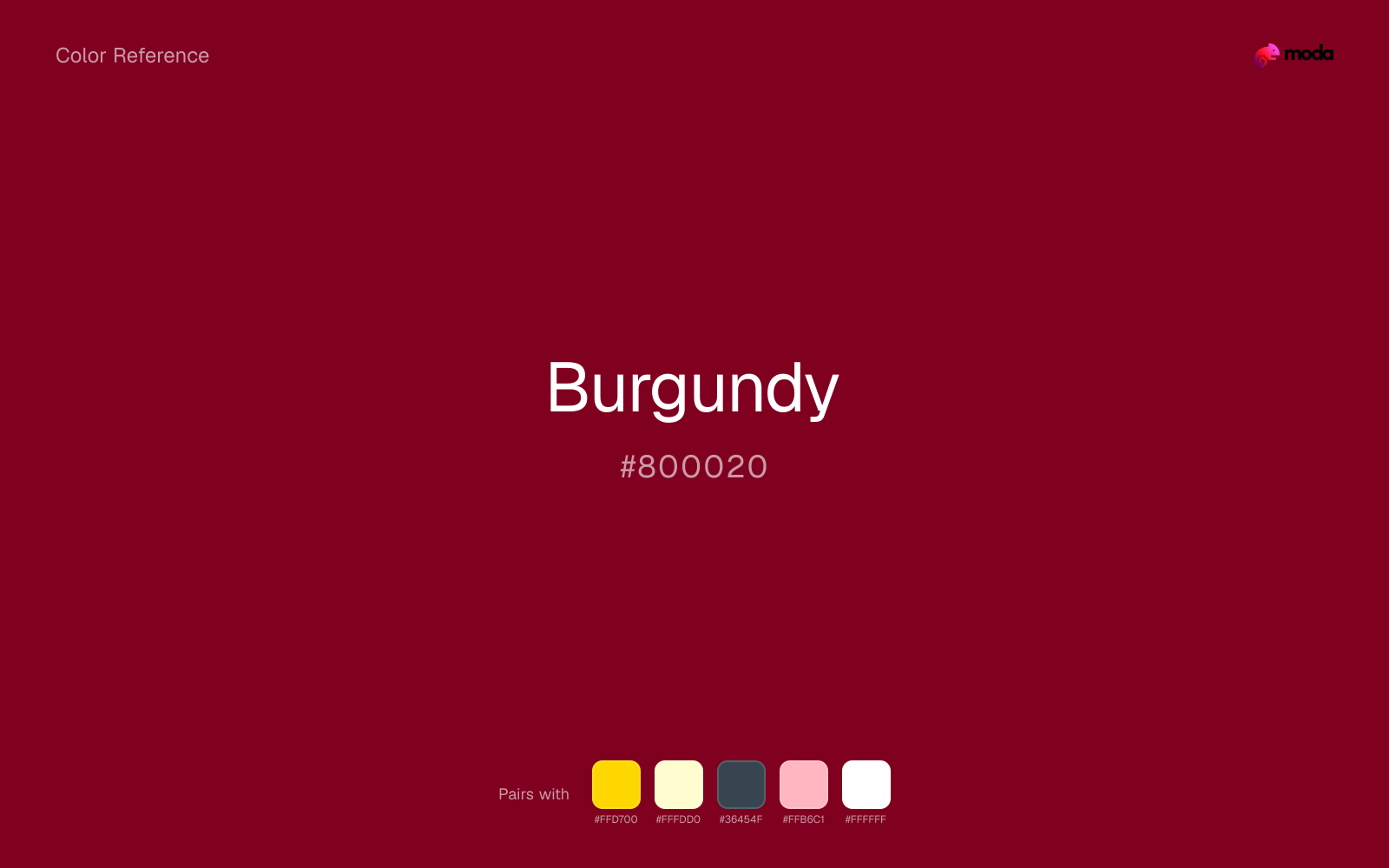
What colors go with burgundy
Gold lifts burgundy without trying to outrun it; the result feels premium because the contrast is more about sheen and warmth than raw brightness.
Cream takes the hard digital edge off burgundy and makes the color feel more printed, paper-backed, and approachable.
Charcoal turns burgundy from purely energetic into something more adult and controlled by adding depth without another hue fight.
What colors clash with burgundy
Red can pull burgundy toward warning-sign or promo energy, which is usually too specific if the rest of the layout wants range.
Hot Pink sits so close to burgundy in hue that the pair blends together before it establishes any useful contrast or emphasis.
Neon Green changes the meaning of burgundy too abruptly, replacing the source color's premium retail and sport cues with something much louder and less stable.
How should I use burgundy in design?
- •Burgundy makes an excellent slide background — pair with white or gold text for a premium feel.
- •Use burgundy as your primary dark color instead of black for a warmer, more distinctive look.
- •Combine with cream and gold for a luxury brand palette that works across all materials.
What are good burgundy palettes?
Luxury brand
Brand guidelines, product brochures, and pitch decks for premium consumer brands.
Modern elegance
Fashion and beauty brand presentations, event materials, and social media templates.
Design with burgundy in Moda
Create a presentation or document using burgundyas your accent color. Moda's AI applies your color palette automatically.
Create a design with burgundy →What are the shades and tints of burgundy?
Shades (darker)
Tints (lighter)
Tones (desaturated)
Hue variations
What are the color harmonies for burgundy?
Harmonies are calculated from the base swatch. When a harmony matches a named color page, it links there; otherwise it appears here as a computed reference swatch.
Similar colors
Maroon
Maroon is near enough to burgundy to swap into the same palette, yet the undertone shift still decides whether the family reads warmer or cooler overall.
Wine
Wine stays very close to burgundy in hue, but it lands lighter, which makes it better for backgrounds, tints, and softer supporting areas than for accents, stronger hierarchy, and firmer structure.
Oxblood
Oxblood stays very close to burgundy in hue, but it lands darker, which makes it better for headlines, anchors, and darker sections than for lighter surfaces and more open applications.
Crimson
Crimson is close enough to burgundy to keep the palette cohesive, yet the lighter-darker shift still decides whether the family behaves more like atmosphere or more like structure.
Frequently asked questions
What is the hex code for burgundy?
The hex code for burgundy is #800020. In RGB, that's 128 red, 0 green, and 32 blue. The approximate CMYK equivalent is 0% cyan, 100% magenta, 75% yellow, and 50% key (black).
Is burgundy a warm or cool color?
Burgundy sits on the warm side of the palette, so it pairs easily with other warm tones and becomes more energetic when you place it against cooler blues or blue-grays.
Should burgundy lead the palette or stay in supporting roles?
Burgundy has enough chroma to take the lead, but it usually performs best when the surrounding system stays quieter. Treat it as the voice of emphasis, not the answer to every layout need.
Where does burgundy work best in a layout?
Burgundy has enough depth to anchor a layout while still reading as a color, which makes it useful for dark section blocks, headlines, and heavier accents.
Is burgundy accessible?
Burgundy is strong enough for white text at 10.83:1 contrast, so it can handle dark panels, tags, and section headers without much trouble. As text on white, though, it is usually better reserved for larger headings or short accents than for long paragraphs.
More red colors
Keep exploring color resources
All color pages
Browse the full library of color references, pairings, and palettes.
Red colors
Compare burgundy with other red tones.
Brown colors
Explore nearby color families to build stronger palettes and contrasts.
Neutral colors
Explore nearby color families to build stronger palettes and contrasts.
Orange colors
Explore nearby color families to build stronger palettes and contrasts.
Last updated April 6, 2026
Color values are computed from the listed hex code using standard conversion formulas. RGB, HSL, and HSV are exact screen-ready conversions. CMYK is an approximate on-screen reference, not a press-ready print specification. Pairings, palettes, and use-case guidance are heuristic recommendations derived from color relationships, contrast behavior, and common presentation, document, and UI patterns.