Umber undertones and palettes
HEX
#635147
RGB
99, 81, 71
HSL
21°, 16%, 33%
HSV
21°, 28%, 39%
Shadow brown — cool, sooty, and slightly green-gray in temperament even when it still reads as brown. #635147 is the tone of tree bark in low light. It adds depth without the redness of brick.
Best for
Legal and institutional branding across web and print.
Accessibility
White text on umber passes AAA at 7.5:1, so it is safe for dark backgrounds and section headers.
How does umber compare to nearby colors?
What is the difference between umber and sienna?
Umber (#635147) feels more softened on screen, while Sienna (#A0522D) pushes the family in the opposite direction. Umber is easier to live with across large areas, because it carries less chroma pressure than Sienna. Use umber for the more restrained version of the idea, and move to sienna when the palette needs a brighter front-facing accent.
What color is umber?
Raw and burnt umber are classic artist pigments. Umber browns appear in charcoal-heavy illustration palettes, masculine grooming branding, and industrial material photography.
What is the hex code for umber?
| Format | Value |
|---|---|
| HEX | #635147 |
| RGB | rgb(99, 81, 71) |
| HSL | hsl(21°, 16%, 33%) |
| HSV / HSB | hsv(21°, 28%, 39%) |
| CMYK (approx.) | cmyk(0%, 18%, 28%, 61%) |
Convert Umber to other color formats
Open the color converter with Umber (#635147) prefilled to copy RGB, HSL, HSV, CMYK, or OKLCH values.
Convert Umber in the color converter →What does umber mean in design?
Umber is often associated with seriousness, endurance, and understated strength. Next to taupe it can feel slightly warmer; next to sepia it is typically less golden and less "old photograph."
How do I use umber in code?
| CSS (hex) | color: #635147; |
| CSS (rgb) | color: rgb(99, 81, 71); |
| CSS (hsl) | color: hsl(21, 16%, 33%); |
| RGB % | rgb(39%, 32%, 28%) |
| Tailwind | text-[#635147] |
| SwiftUI | Color(red: 0.388, green: 0.318, blue: 0.278) |
| UIKit | UIColor(red: 0.388, green: 0.318, blue: 0.278, alpha: 1.0) |
| Android | Color.rgb(99, 81, 71) |
| Compose | Color(0xFF635147) |
| Web Safe | #666633 |
Is umber accessible?
| Combination | Ratio | AA | AA lg | AAA | AAA lg | UI |
|---|---|---|---|---|---|---|
| AaWhite text on this color | 7.5:1 | ✓ | ✓ | ✓ | ✓ | ✓ |
| AaBlack text on this color | 2.8:1 | ✗ | ✗ | ✗ | ✗ | ✗ |
| AaThis color as text on white | 7.5:1 | ✓ | ✓ | ✓ | ✓ | ✓ |
| AaThis color as text on black | 2.8:1 | ✗ | ✗ | ✗ | ✗ | ✗ |
WCAG 2.1: AA normal ≥ 4.5:1, AA large text ≥ 3:1, AAA normal ≥ 7:1, AAA large ≥ 4.5:1, UI components ≥ 3:1.
How does umber look with color blindness?
Simulated appearance for common types of color vision deficiency. Actual perception varies by individual.
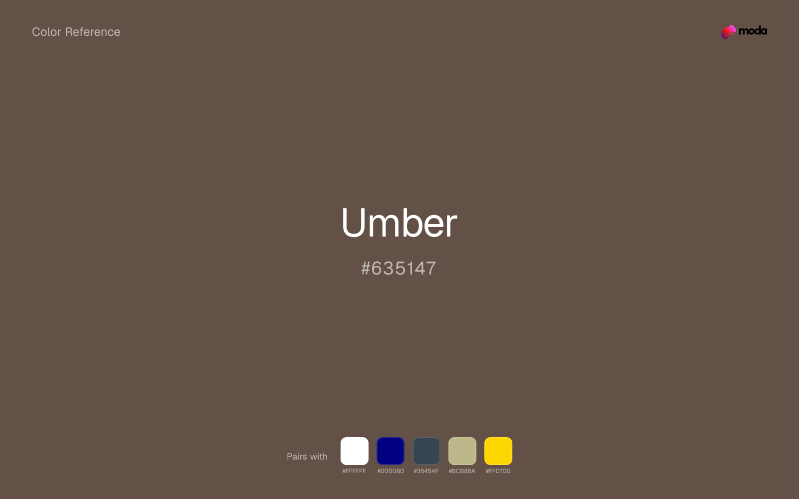
What colors go with umber
Pairing umber with white preserves readable hierarchy while keeping the swatch itself as the clear focal color.
Because umber already carries warmth, navy blue gives the pair a steadier backbone and keeps it closer to packaging and campaign work than to one-note seasonal color.
Pairing umber with charcoal adds useful depth while keeping the palette flexible for interfaces, decks, and editorial layouts.
Sage Green helps umber feel more complete in practice because the pairing combines coffee, leather, and wood qualities with sage and moss support instead of leaving the source color to do every job alone.
What colors clash with umber
Magenta remaps umber too aggressively, dragging it away from hospitality, food, and grounded heritage brands and into a brighter, more performative palette.
With umber, cyan introduces a colder display-driven cast that strips away some of the source color's tactile character.
Pastel Pink can make umber feel softer and sweeter than intended, which weakens palettes that rely on gravity or structure.
How should I use umber in design?
- •Umber carries enough visual weight for headlines, key UI elements, and section anchors — dark enough to command attention but clearly distinct from black.
- •Umber leans warm, so cool counterparts like navy, teal, or slate create the cleanest contrast. For a softer, tonal look, stay within neighboring warm hues and let value differences do the work.
- •Quieter tones like umber carry layouts without demanding attention, which makes them useful for documents, templates, and interfaces that prioritize readability.
What are good umber palettes?
Clean slate
Brand guidelines, design systems, and visual identity documents.
Design with umber in Moda
Create a presentation or document using umberas your accent color. Moda's AI applies your color palette automatically.
Create a design with umber →What are the shades and tints of umber?
Shades (darker)
Tints (lighter)
Tones (desaturated)
Hue variations
What are the color harmonies for umber?
Harmonies are calculated from the base swatch. When a harmony matches a named color page, it links there; otherwise it appears here as a computed reference swatch.
Similar colors
Coffee
Coffee sits close to umber on the wheel, but it carries more pigment pressure, which makes it better for faster emphasis and brighter accent work than for broader coverage and quieter supporting roles.
Taupe
Taupe is almost the same hue as umber; the real difference is value, with taupe feeling more grounded and anchor-ready.
Sienna
Sienna stays very close to umber in hue, but it lands lighter, which makes it better for backgrounds, tints, and softer supporting areas than for accents, stronger hierarchy, and firmer structure.
Chestnut
Chestnut stays very close to umber in hue, but it lands lighter, which makes it better for backgrounds, tints, and softer supporting areas than for accents, stronger hierarchy, and firmer structure.
Sepia
Sepia stays very close to umber in hue, but it lands darker, which makes it better for headlines, anchors, and darker sections than for lighter surfaces and more open applications.
Frequently asked questions
What is the hex code for umber?
The hex code for umber is #635147. In RGB, that's 99 red, 81 green, and 71 blue. The approximate CMYK equivalent is 0% cyan, 18% magenta, 28% yellow, and 61% key (black).
Is umber a warm or cool color?
Umber reads as warm. It feels most natural with creams, golds, rusts, and other warm accents, while cooler partners like navy or teal create sharper contrast.
Is umber suitable for broader surfaces and long-form layouts?
Umber can hold broader surfaces comfortably because it does not demand attention on every glance. It is a better candidate for full-theme use than a brighter or more electric neighbor would be.
How should I use umber in a design?
Umber has enough restraint to hold large surfaces comfortably, which makes it useful for full theme systems, document backgrounds, or broad section color without constant visual fatigue.
Can I use umber for text or backgrounds?
Umber is strong enough for white text at 7.5:1 contrast, so it can handle dark panels, tags, and section headers without much trouble. As text on white, though, it is usually better reserved for larger headings or short accents than for long paragraphs.
More brown colors
Keep exploring color resources
All color pages
Browse the full library of color references, pairings, and palettes.
Brown colors
Compare umber with other brown tones.
Neutral colors
Explore nearby color families to build stronger palettes and contrasts.
Orange colors
Explore nearby color families to build stronger palettes and contrasts.
Red colors
Explore nearby color families to build stronger palettes and contrasts.
Last updated April 6, 2026
Color values are computed from the listed hex code using standard conversion formulas. RGB, HSL, and HSV are exact screen-ready conversions. CMYK is an approximate on-screen reference, not a press-ready print specification. Pairings, palettes, and use-case guidance are heuristic recommendations derived from color relationships, contrast behavior, and common presentation, document, and UI patterns.