Taupe color guide
HEX
#483C32
RGB
72, 60, 50
HSL
27°, 18%, 24%
HSV
27°, 31%, 28%
Brown that negotiates with gray — quiet, expensive-feeling, and stubbornly hard to name out loud. #483C32 is the color of concrete wool and minimalist apartments. It whispers "tasteful" where beige might yawn.
Best for
Editorial design, magazine spreads, and premium print collateral.
Accessibility
White text on taupe passes AAA at 10.67:1, so it is safe for dark backgrounds and section headers.
How does taupe compare to nearby colors?
What is the difference between taupe and graphite?
Taupe (#483C32) bends more toward orange-warm, while Graphite (#383838) carries more of a smoky gray cast. Taupe and Graphite can fill many of the same slots, but one steers the palette toward coffee, leather, and wood and the other toward ink, graphite, and architectural shadow. Begin with taupe when the family needs its current undertone and surface character; keep graphite for the nearby alternative that shifts the mood without leaving the same hue neighborhood.
What color is taupe?
Taupe is a staple in interior paint lines, luxury fashion neutrals, and corporate rebrands seeking warmth without obvious color. It appears heavily in cosmetics "nude" ranges and architectural renderings.
What is the hex code for taupe?
| Format | Value |
|---|---|
| HEX | #483C32 |
| RGB | rgb(72, 60, 50) |
| HSL | hsl(27°, 18%, 24%) |
| HSV / HSB | hsv(27°, 31%, 28%) |
| CMYK (approx.) | cmyk(0%, 17%, 31%, 72%) |
Convert Taupe to other color formats
Open the color converter with Taupe (#483C32) prefilled to copy RGB, HSL, HSV, CMYK, or OKLCH values.
Convert Taupe in the color converter →What does taupe mean in design?
Taupe is often associated with restraint, modern elegance, and calm authority. Next to khaki it is deeper and less yellow; next to umber it is typically grayer and less organic-red.
How do I use taupe in code?
| CSS (hex) | color: #483C32; |
| CSS (rgb) | color: rgb(72, 60, 50); |
| CSS (hsl) | color: hsl(27, 18%, 24%); |
| RGB % | rgb(28%, 24%, 20%) |
| Tailwind | text-[#483C32] |
| SwiftUI | Color(red: 0.282, green: 0.235, blue: 0.196) |
| UIKit | UIColor(red: 0.282, green: 0.235, blue: 0.196, alpha: 1.0) |
| Android | Color.rgb(72, 60, 50) |
| Compose | Color(0xFF483C32) |
| Web Safe | #333333 |
Is taupe accessible?
| Combination | Ratio | AA | AA lg | AAA | AAA lg | UI |
|---|---|---|---|---|---|---|
| AaWhite text on this color | 10.67:1 | ✓ | ✓ | ✓ | ✓ | ✓ |
| AaBlack text on this color | 1.97:1 | ✗ | ✗ | ✗ | ✗ | ✗ |
| AaThis color as text on white | 10.67:1 | ✓ | ✓ | ✓ | ✓ | ✓ |
| AaThis color as text on black | 1.97:1 | ✗ | ✗ | ✗ | ✗ | ✗ |
WCAG 2.1: AA normal ≥ 4.5:1, AA large text ≥ 3:1, AAA normal ≥ 7:1, AAA large ≥ 4.5:1, UI components ≥ 3:1.
How does taupe look with color blindness?
Simulated appearance for common types of color vision deficiency. Actual perception varies by individual.
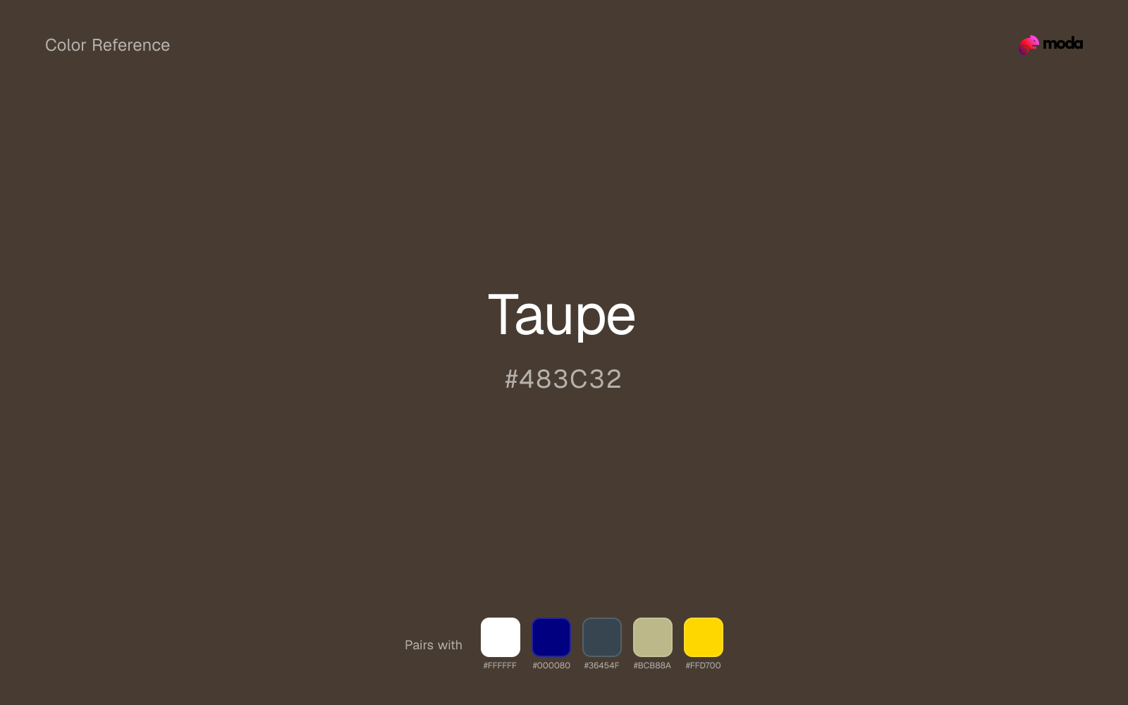
What colors go with taupe
White is the easiest way to keep taupe usable in covers, dashboards, and dark sections because the contrast still holds at presentation distance.
With taupe, navy blue adds a cleaner dark note than black and keeps the pair usable in more modern systems.
Charcoal helps taupe feel grounded and architectural, especially when the design needs a darker value that still reads refined.
Sage Green gives taupe a second note that is different enough to feel intentional but not so different that the palette loses coherence.
What colors clash with taupe
Magenta pushes taupe toward a nightclub or cosmetic register that is hard to square with calmer editorial or product work.
With taupe, cyan introduces a colder display-driven cast that strips away some of the source color's tactile character.
With taupe, Pastel Pink often steers the system toward nursery or confectionery cues instead of the more grounded mood the source color supports.
How should I use taupe in design?
- •Taupe works well as a dark background with light text, or as a bold accent for headlines and callout bars in presentations and branded materials.
- •Taupe leans warm, so cool counterparts like navy, teal, or slate create the cleanest contrast. For a softer, tonal look, stay within neighboring warm hues and let value differences do the work.
- •Dark browns tones like taupe tend to feel serious and anchoring — useful when the design brief calls for weight and restraint.
What are good taupe palettes?
Ink and gold
Editorial design, magazine spreads, and premium print collateral.
Design with taupe in Moda
Create a presentation or document using taupeas your accent color. Moda's AI applies your color palette automatically.
Create a design with taupe →What are the shades and tints of taupe?
Shades (darker)
Tints (lighter)
Tones (desaturated)
Hue variations
What are the color harmonies for taupe?
Harmonies are calculated from the base swatch. When a harmony matches a named color page, it links there; otherwise it appears here as a computed reference swatch.
Similar colors
Umber
Umber is almost the same hue as taupe; the real difference is value, with umber feeling more open and surface-friendly.
Coffee
Coffee stays very close to taupe in hue, but it lands lighter, which makes it better for backgrounds, tints, and softer supporting areas than for accents, stronger hierarchy, and firmer structure.
Sepia
Sepia sits close to taupe on the wheel, but it carries more pigment pressure, which makes it better for faster emphasis and brighter accent work than for broader coverage and quieter supporting roles.
Graphite
Graphite occupies a similar depth to taupe, though it pushes the family toward a more neutral reading and a different material feel.
Chocolate
Chocolate sits close to taupe on the wheel, but it carries more pigment pressure, which makes it better for faster emphasis and brighter accent work than for broader coverage and quieter supporting roles.
Frequently asked questions
What is the hex code for taupe?
The hex code for taupe is #483C32. In RGB, that's 72 red, 60 green, and 50 blue. The approximate CMYK equivalent is 0% cyan, 17% magenta, 31% yellow, and 72% key (black).
Is taupe a warm or cool color?
Taupe reads as warm. It feels most natural with creams, golds, rusts, and other warm accents, while cooler partners like navy or teal create sharper contrast.
Is taupe suitable for broader surfaces and long-form layouts?
Taupe can hold broader surfaces comfortably because it does not demand attention on every glance. It is a better candidate for full-theme use than a brighter or more electric neighbor would be.
How should I use taupe in a design?
Taupe works well as a dark background with light text, or as a bold accent for headlines, callout bars, and key visuals. It adds weight and authority without the starkness of pure black.
Can I use taupe for text or backgrounds?
Taupe is strong enough for white text at 10.67:1 contrast, so it can handle dark panels, tags, and section headers without much trouble. As text on white, though, it is usually better reserved for larger headings or short accents than for long paragraphs.
More brown colors
Keep exploring color resources
All color pages
Browse the full library of color references, pairings, and palettes.
Brown colors
Compare taupe with other brown tones.
Neutral colors
Explore nearby color families to build stronger palettes and contrasts.
Orange colors
Explore nearby color families to build stronger palettes and contrasts.
Red colors
Explore nearby color families to build stronger palettes and contrasts.
Last updated April 6, 2026
Color values are computed from the listed hex code using standard conversion formulas. RGB, HSL, and HSV are exact screen-ready conversions. CMYK is an approximate on-screen reference, not a press-ready print specification. Pairings, palettes, and use-case guidance are heuristic recommendations derived from color relationships, contrast behavior, and common presentation, document, and UI patterns.