Using Beige as a surface color
HEX
#F5F5DC
RGB
245, 245, 220
HSL
60°, 56%, 91%
HSV
60°, 10%, 96%
Beige (#F5F5DC) is a warm neutral that serves as a foundation for virtually any palette. It provides structure and warmth without competing with accent colors, making it essential for editorial, interior, and brand design.
Best for
Marketing websites, social media graphics, and campaign landing pages.
Accessibility
Check contrast before using beige for text-heavy layouts, especially on low-contrast backgrounds.
How does beige compare to nearby colors?
What is the difference between beige and cream?
Beige (#F5F5DC) looks dustier and more restrained than Cream (#FFFDD0) when the two are shown together. Beige is easier to live with across large areas, because it carries less chroma pressure than Cream. Reach for beige when you want less chroma pressure on the page; keep cream for the version that announces itself more readily.
What color is beige?
Beige is a cornerstone of interior design, valued for its neutrality and warmth. The word comes from French, originally describing the natural color of undyed wool. It became synonymous with understated elegance in mid-century modern design.
What is the hex code for beige?
| Format | Value |
|---|---|
| HEX | #F5F5DC |
| RGB | rgb(245, 245, 220) |
| HSL | hsl(60°, 56%, 91%) |
| HSV / HSB | hsv(60°, 10%, 96%) |
| CMYK (approx.) | cmyk(0%, 0%, 10%, 4%) |
Convert Beige to other color formats
Open the color converter with Beige (#F5F5DC) prefilled to copy RGB, HSL, HSV, CMYK, or OKLCH values.
Convert Beige in the color converter →What does beige mean in design?
Beige communicates reliability, warmth, and timelessness. It is the color of natural materials — linen, sand, undyed wool — and carries associations of comfort and organic simplicity. In design, beige signals a confident restraint that lets other elements shine.
How do I use beige in code?
| CSS (hex) | color: #F5F5DC; |
| CSS (rgb) | color: rgb(245, 245, 220); |
| CSS (hsl) | color: hsl(60, 56%, 91%); |
| RGB % | rgb(96%, 96%, 86%) |
| Tailwind | text-[#F5F5DC] |
| SwiftUI | Color(red: 0.961, green: 0.961, blue: 0.863) |
| UIKit | UIColor(red: 0.961, green: 0.961, blue: 0.863, alpha: 1.0) |
| Android | Color.rgb(245, 245, 220) |
| Compose | Color(0xFFF5F5DC) |
| Web Safe | #FFFFCC |
Is beige accessible?
| Combination | Ratio | AA | AA lg | AAA | AAA lg | UI |
|---|---|---|---|---|---|---|
| AaWhite text on this color | 1.11:1 | ✗ | ✗ | ✗ | ✗ | ✗ |
| AaBlack text on this color | 18.98:1 | ✓ | ✓ | ✓ | ✓ | ✓ |
| AaThis color as text on white | 1.11:1 | ✗ | ✗ | ✗ | ✗ | ✗ |
| AaThis color as text on black | 18.98:1 | ✓ | ✓ | ✓ | ✓ | ✓ |
WCAG 2.1: AA normal ≥ 4.5:1, AA large text ≥ 3:1, AAA normal ≥ 7:1, AAA large ≥ 4.5:1, UI components ≥ 3:1.
How does beige look with color blindness?
Simulated appearance for common types of color vision deficiency. Actual perception varies by individual.
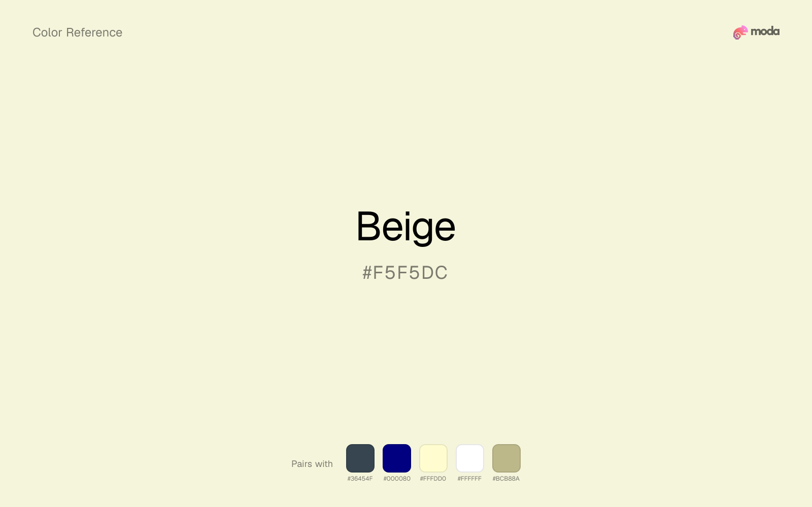
What colors go with beige
Charcoal keeps very light beige from disappearing into the canvas and adds the structure needed for documents, interfaces, and tables.
Because beige already carries warmth, navy blue gives the pair a steadier backbone and keeps it closer to packaging and campaign work than to one-note seasonal color.
Cream gives beige a quieter backdrop and preserves a more natural editorial feel than a colder off-white would.
Pairing beige with white keeps the layout open and lets the color's sunlit yellow cast stay easy to read.
Sage Green keeps the palette in the same neighborhood as beige, which is handy when you want related colors that do not feel cloned.
What colors clash with beige
Neon Green is so artificial beside beige that the source color starts to look accidental instead of rooted and deliberate.
Magenta pushes beige toward a nightclub or cosmetic register that is hard to square with calmer editorial or product work.
With beige, cyan introduces a colder display-driven cast that strips away some of the source color's tactile character.
Light Gray sits too close to beige in value, so the palette can wash out before it ever establishes a clear hierarchy.
How should I use beige in design?
- •Beige works as a warm background alternative to white — it reduces eye strain and feels more editorial.
- •Pair beige with charcoal and one strong accent color (burgundy, navy, forest green) for a sophisticated palette.
- •Use beige for card backgrounds, section dividers, and large surface areas where white would feel too stark.
What are good beige palettes?
Clear signal
Marketing websites, social media graphics, and campaign landing pages.
Design with beige in Moda
Create a presentation or document using beigeas your accent color. Moda's AI applies your color palette automatically.
Create a design with beige →What are the shades and tints of beige?
Shades (darker)
Tints (lighter)
Tones (desaturated)
Hue variations
What are the color harmonies for beige?
Harmonies are calculated from the base swatch. When a harmony matches a named color page, it links there; otherwise it appears here as a computed reference swatch.
Similar colors
Cream
Cream is nearly adjacent to beige in hue; what separates them is intensity, with cream reading cleaner and more assertive.
Ivory
Ivory stays very close to beige in hue, but it lands lighter, which makes it better for backgrounds, tints, and softer supporting areas than for accents, stronger hierarchy, and firmer structure.
Alabaster
Alabaster sits close to beige on the wheel, but it carries less chroma, which makes it better for steadier surfaces and calmer long-form use than for sharper emphasis and quicker visual pickup.
Champagne
Champagne is useful when beige is the right weight but the wrong mood: the swap changes temperature and finish more than contrast.
Off-White
Off-White stays very close to beige in hue, but it lands lighter, which makes it better for backgrounds, tints, and softer supporting areas than for accents, stronger hierarchy, and firmer structure.
Frequently asked questions
What is the hex code for beige?
The hex code for beige is #F5F5DC. In RGB, that's 245 red, 245 green, and 220 blue. The approximate CMYK equivalent is 0% cyan, 0% magenta, 10% yellow, and 4% key (black).
Is beige a warm or cool color?
Beige leans warm without feeling fully heat-driven, so you can push it warmer with cream, tan, or gold or balance it with cooler blues and slates.
Should beige be used as a surface color or an accent?
Beige belongs more naturally on surfaces than in tiny accent moments. Use it to open space, soften sections, or tint large areas, then let darker colors carry the emphasis.
Where does beige work best in a layout?
Beige is very light, so it works best as a background, card fill, or table tint in slides, documents, and landing pages. Pair it with dark text such as charcoal or navy for readability.
Is beige accessible?
Beige works better with dark text than white text. Black text reaches 18.98:1 contrast on the swatch, which makes the color more usable as a background or highlight surface than as a dark panel.
More brown colors
Keep exploring color resources
All color pages
Browse the full library of color references, pairings, and palettes.
Brown colors
Compare beige with other brown tones.
Neutral colors
Explore nearby color families to build stronger palettes and contrasts.
Orange colors
Explore nearby color families to build stronger palettes and contrasts.
Red colors
Explore nearby color families to build stronger palettes and contrasts.
Last updated April 6, 2026
Color values are computed from the listed hex code using standard conversion formulas. RGB, HSL, and HSV are exact screen-ready conversions. CMYK is an approximate on-screen reference, not a press-ready print specification. Pairings, palettes, and use-case guidance are heuristic recommendations derived from color relationships, contrast behavior, and common presentation, document, and UI patterns.