Where Champagne works best
HEX
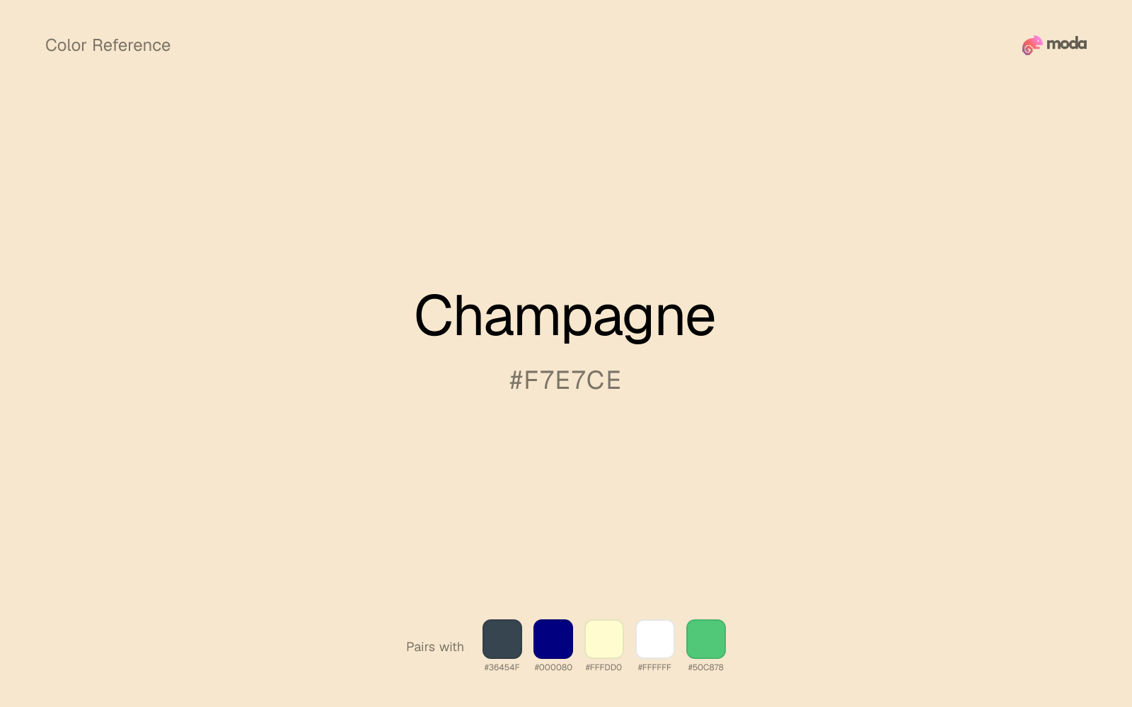
#F7E7CE
RGB
247, 231, 206
HSL
37°, 72%, 89%
HSV
37°, 17%, 97%
Champagne (#F7E7CE) is a pale warm neutral that feels more elevated than beige and more luminous than cream. It works especially well for premium editorial systems, event materials, and understated luxury palettes.
Best for
Internal tools, team dashboards, and knowledge-base layouts.
Compare with
Accessibility
Check contrast before using champagne for text-heavy layouts, especially on low-contrast backgrounds.
How does champagne compare to nearby colors?
What is the difference between champagne and champagne gold?
Champagne Gold (#E8D5B7) carries less pigment punch than Champagne (#F7E7CE), so the pair separates by finish as much as hue. Champagne shifts the system toward paper, tint, and background behavior more than Champagne Gold does. Start with champagne when the palette wants more paper, plaster, and interface chrome; switch to champagne gold when the better fit is foil warmth.
What color is champagne?
Champagne takes its name from the sparkling wine and shares its associations with ceremony, celebration, and refinement. In design it often functions as a luxury background neutral rather than an attention-seeking accent.
What is the hex code for champagne?
| Format | Value |
|---|---|
| HEX | #F7E7CE |
| RGB | rgb(247, 231, 206) |
| HSL | hsl(37°, 72%, 89%) |
| HSV / HSB | hsv(37°, 17%, 97%) |
| CMYK (approx.) | cmyk(0%, 6%, 17%, 3%) |
Convert Champagne to other color formats
Open the color converter with Champagne (#F7E7CE) prefilled to copy RGB, HSL, HSV, CMYK, or OKLCH values.
Convert Champagne in the color converter →What does champagne mean in design?
Champagne communicates understatement, refinement, and quiet celebration. It gives layouts warmth and polish without adding obvious color pressure, making it useful for hospitality, beauty, and high-end presentation design.
How do I use champagne in code?
| CSS (hex) | color: #F7E7CE; |
| CSS (rgb) | color: rgb(247, 231, 206); |
| CSS (hsl) | color: hsl(37, 72%, 89%); |
| RGB % | rgb(97%, 91%, 81%) |
| Tailwind | text-[#F7E7CE] |
| SwiftUI | Color(red: 0.969, green: 0.906, blue: 0.808) |
| UIKit | UIColor(red: 0.969, green: 0.906, blue: 0.808, alpha: 1.0) |
| Android | Color.rgb(247, 231, 206) |
| Compose | Color(0xFFF7E7CE) |
| Web Safe | #FFFFCC |
Is champagne accessible?
| Combination | Ratio | AA | AA lg | AAA | AAA lg | UI |
|---|---|---|---|---|---|---|
| AaWhite text on this color | 1.22:1 | ✗ | ✗ | ✗ | ✗ | ✗ |
| AaBlack text on this color | 17.28:1 | ✓ | ✓ | ✓ | ✓ | ✓ |
| AaThis color as text on white | 1.22:1 | ✗ | ✗ | ✗ | ✗ | ✗ |
| AaThis color as text on black | 17.28:1 | ✓ | ✓ | ✓ | ✓ | ✓ |
WCAG 2.1: AA normal ≥ 4.5:1, AA large text ≥ 3:1, AAA normal ≥ 7:1, AAA large ≥ 4.5:1, UI components ≥ 3:1.
How does champagne look with color blindness?
Simulated appearance for common types of color vision deficiency. Actual perception varies by individual.
What colors go with champagne
Charcoal gives champagne the dark frame it is missing, so pale surfaces do not drift into a washed-out page.
Navy blue reins in champagne without deadening it, which is useful when you want warmth to stay present but not dominate every part of the page.
Cream lets champagne stay expressive without turning the whole composition stark; the result feels closer to editorial or packaging work than to raw UI default.
What colors clash with champagne
Against champagne, Neon Green introduces a fluorescent sports-drink brightness that overwhelms any quieter, tactile palette intention.
With champagne, magenta introduces a second emotional story instead of reinforcing the first one, so the palette can feel internally split.
With champagne, cyan introduces a colder display-driven cast that strips away some of the source color's tactile character.
Light Gray sits too close to champagne in value, so the palette can wash out before it ever establishes a clear hierarchy.
How should I use champagne in design?
- •Use champagne as a premium background color when white feels too plain and beige feels too earthy.
- •Pair it with navy, charcoal, or burgundy for elegant contrast and hierarchy.
- •Champagne works best on larger surfaces and supporting elements, not as a high-contrast accent.
What are good champagne palettes?
Bright horizon
Internal tools, team dashboards, and knowledge-base layouts.
Golden hour
Startup branding, pitch materials, and product landing pages.
Design with champagne in Moda
Create a presentation or document using champagneas your accent color. Moda's AI applies your color palette automatically.
Create a design with champagne →What are the shades and tints of champagne?
Shades (darker)
Tints (lighter)
Tones (desaturated)
Hue variations
What are the color harmonies for champagne?
Harmonies are calculated from the base swatch. When a harmony matches a named color page, it links there; otherwise it appears here as a computed reference swatch.
Similar colors
Champagne Gold
Champagne Gold is almost the same hue as champagne; the real difference is value, with champagne gold feeling more grounded and anchor-ready.
Alabaster
Alabaster sits close to champagne on the wheel, but it carries less chroma, which makes it better for steadier surfaces and calmer long-form use than for sharper emphasis and quicker visual pickup.
Platinum
Platinum is nearly adjacent to champagne in hue; what separates them is intensity, with platinum reading dustier and easier to extend across a layout.
Cream
Cream occupies a similar depth to champagne, though it pushes the family toward a more warm reading and a different material feel.
Beige
Beige keeps roughly the same visual weight as champagne but changes the undertone story, which is often enough to move a palette from warmer and tactile to cooler and more technical, or the reverse.
Frequently asked questions
What is the hex code for champagne?
The hex code for champagne is #F7E7CE. In RGB, that's 247 red, 231 green, and 206 blue. The approximate CMYK equivalent is 0% cyan, 6% magenta, 17% yellow, and 3% key (black).
Is champagne a warm or cool color?
Champagne sits on the warm side of the palette, so it pairs easily with other warm tones and becomes more energetic when you place it against cooler blues or blue-grays.
Should champagne be used as a surface color or an accent?
Champagne belongs more naturally on surfaces than in tiny accent moments. Use it to open space, soften sections, or tint large areas, then let darker colors carry the emphasis.
Where does champagne work best in a layout?
Champagne is very light, so it works best as a background, card fill, or table tint in slides, documents, and landing pages. Pair it with dark text such as charcoal or navy for readability.
Is champagne accessible?
Champagne works better with dark text than white text. Black text reaches 17.28:1 contrast on the swatch, which makes the color more usable as a background or highlight surface than as a dark panel.
More neutral colors
Keep exploring color resources
All color pages
Browse the full library of color references, pairings, and palettes.
Neutral colors
Compare champagne with other neutral tones.
Blue colors
Explore nearby color families to build stronger palettes and contrasts.
Brown colors
Explore nearby color families to build stronger palettes and contrasts.
Green colors
Explore nearby color families to build stronger palettes and contrasts.
Last updated April 6, 2026
Color values are computed from the listed hex code using standard conversion formulas. RGB, HSL, and HSV are exact screen-ready conversions. CMYK is an approximate on-screen reference, not a press-ready print specification. Pairings, palettes, and use-case guidance are heuristic recommendations derived from color relationships, contrast behavior, and common presentation, document, and UI patterns.