Gray design guide
HEX
#808080
RGB
128, 128, 128
HSL
0°, 0%, 50%
HSV
0°, 0%, 50%
True mid-gray sits where neither warm nor cool wins — a neutral baseline rather than a mood. #808080 is the workhorse that recedes until you need structure without drama. It pairs cleanly with almost any palette because it refuses to pick a temperature fight.
Best for
Marketing websites, social media graphics, and campaign landing pages.
Accessibility
Check contrast before using gray for text-heavy layouts, especially on low-contrast backgrounds.
How does gray compare to nearby colors?
What is the difference between gray and rose gold?
Gray (#808080) feels more softened on screen, while Rose Gold (#B76E79) pushes the family in the opposite direction. Gray is easier to live with across large areas, because it carries less chroma pressure than Rose Gold. Use gray for the more restrained version of the idea, and move to rose gold when the palette needs a brighter front-facing accent.
What color is gray?
#808080 is the canonical 50% gray midpoint on sRGB displays. It appears in accessibility contrast examples, calibration references, and neutral UI chrome.
What is the hex code for gray?
| Format | Value |
|---|---|
| HEX | #808080 |
| RGB | rgb(128, 128, 128) |
| HSL | hsl(0°, 0%, 50%) |
| HSV / HSB | hsv(0°, 0%, 50%) |
| CMYK (approx.) | cmyk(0%, 0%, 0%, 50%) |
Convert Gray to other color formats
Open the color converter with Gray (#808080) prefilled to copy RGB, HSL, HSV, CMYK, or OKLCH values.
Convert Gray in the color converter →What does gray mean in design?
Gray is often associated with practicality, understatement, and steadiness. Compared with warmer grays, it reads as more detached; next to blue-tinted grays it can feel less atmospheric.
How do I use gray in code?
| CSS (hex) | color: #808080; |
| CSS (rgb) | color: rgb(128, 128, 128); |
| CSS (hsl) | color: hsl(0, 0%, 50%); |
| RGB % | rgb(50%, 50%, 50%) |
| Tailwind | text-[#808080] |
| SwiftUI | Color(red: 0.502, green: 0.502, blue: 0.502) |
| UIKit | UIColor(red: 0.502, green: 0.502, blue: 0.502, alpha: 1.0) |
| Android | Color.rgb(128, 128, 128) |
| Compose | Color(0xFF808080) |
| Web Safe | #999999 |
Is gray accessible?
| Combination | Ratio | AA | AA lg | AAA | AAA lg | UI |
|---|---|---|---|---|---|---|
| AaWhite text on this color | 3.95:1 | ✗ | ✓ | ✗ | ✗ | ✓ |
| AaBlack text on this color | 5.32:1 | ✓ | ✓ | ✗ | ✓ | ✓ |
| AaThis color as text on white | 3.95:1 | ✗ | ✓ | ✗ | ✗ | ✓ |
| AaThis color as text on black | 5.32:1 | ✓ | ✓ | ✗ | ✓ | ✓ |
WCAG 2.1: AA normal ≥ 4.5:1, AA large text ≥ 3:1, AAA normal ≥ 7:1, AAA large ≥ 4.5:1, UI components ≥ 3:1.
How does gray look with color blindness?
Simulated appearance for common types of color vision deficiency. Actual perception varies by individual.
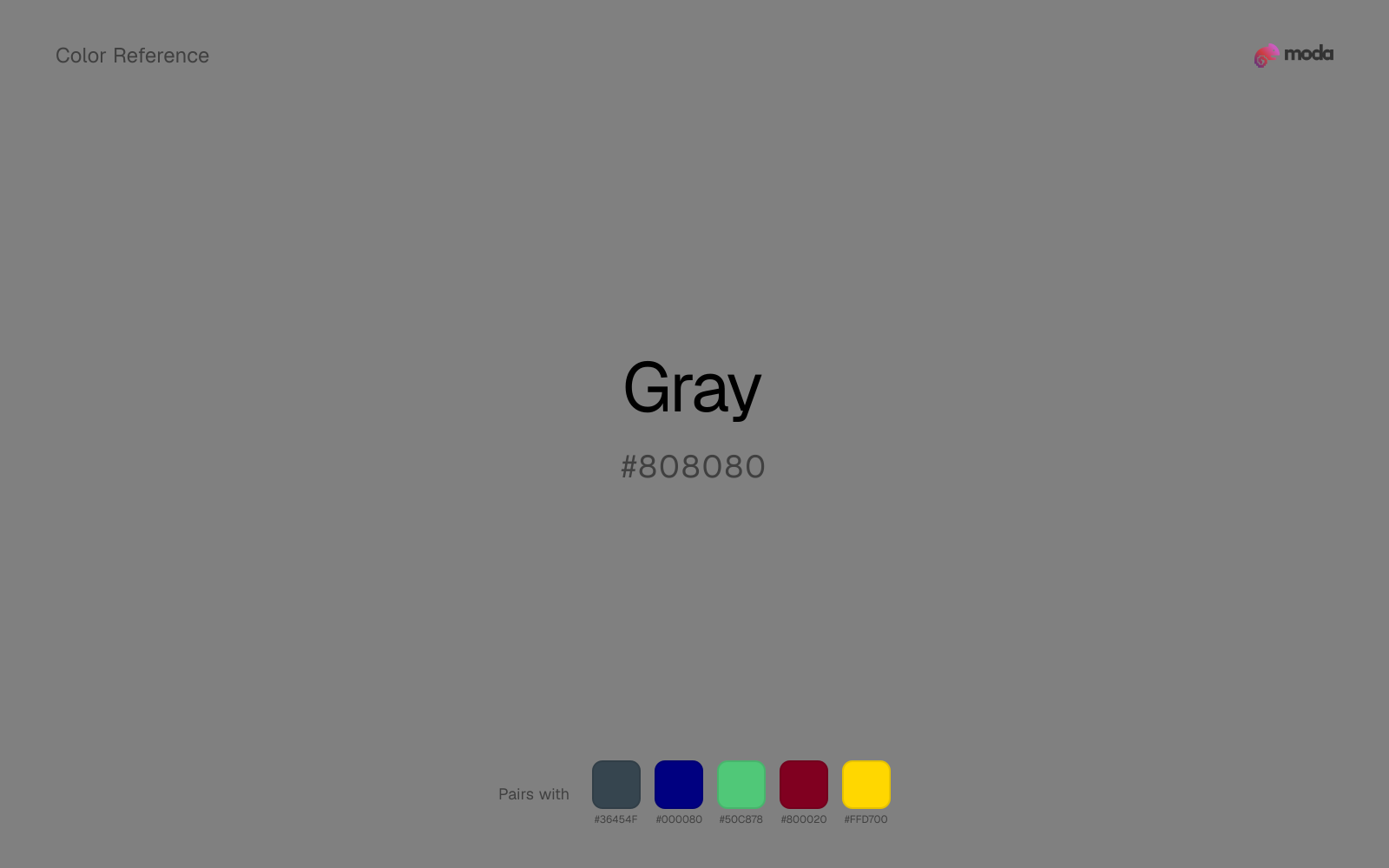
What colors go with gray
Charcoal gives gray a modern dark partner that feels softer and more material than default black.
Navy blue gives gray a cooler anchor, which helps the palette feel settled enough for documents, decks, and interface work.
Emerald gives gray a second note that is different enough to feel intentional but not so different that the palette loses coherence.
What colors clash with gray
Magenta injects more cosmetic or nightlife energy than gray can comfortably absorb, so restrained neutral palettes start to feel accidental.
Light Gray sits too close to gray in value, so the palette can wash out before it ever establishes a clear hierarchy.
How should I use gray in design?
- •Gray works as either a primary or supporting color — it has enough presence to carry a layout but is restrained enough to share the stage with bolder accents.
- •As a neutral, gray pairs with virtually any accent color — add one warm and one cool accent to build visual interest around it.
- •Use gray where you need structure without personality: table borders, input fields, disabled states, and background scaffolding.
What are good gray palettes?
Open air
Marketing websites, social media graphics, and campaign landing pages.
Design with gray in Moda
Create a presentation or document using grayas your accent color. Moda's AI applies your color palette automatically.
Create a design with gray →What are the shades and tints of gray?
Shades (darker)
Tints (lighter)
Tones (desaturated)
Similar colors
Pewter
Pewter and gray do nearly the same structural job, so the decision comes down to whether the neutral should feel more smoky gray or more smoky gray.
Dark Gray
Dark Gray stays neutral like gray, yet the lighter-or-darker move changes how much hierarchy the palette gets before any accent color enters.
Rose Gold
Rose Gold does what gray cannot: it nudges the palette toward a warm mood while still behaving like a supporting color.
Silver
Silver stays neutral like gray, yet the lighter-or-darker move changes how much hierarchy the palette gets before any accent color enters.
Graphite
Graphite keeps the neutral character of gray but shifts the value enough to change the job, moving it toward headlines, anchors, and darker sections.
Frequently asked questions
What is the hex code for gray?
The hex code for gray is #808080. In RGB, that's 128 red, 128 green, and 128 blue. The approximate CMYK equivalent is 0% cyan, 0% magenta, 0% yellow, and 50% key (black).
Is gray a warm or cool color?
Gray behaves like a neutral with very little chromatic push, so surrounding colors do more to set the palette temperature than the swatch itself.
Is gray suitable for broader surfaces and long-form layouts?
Gray can hold broader surfaces comfortably because it does not demand attention on every glance. It is a better candidate for full-theme use than a brighter or more electric neighbor would be.
How should I use gray in a design?
Gray has enough restraint to hold large surfaces comfortably, which makes it useful for full theme systems, document backgrounds, or broad section color without constant visual fatigue.
Can I use gray for text or backgrounds?
Gray works better with dark text than white text. Black text reaches 5.32:1 contrast on the swatch, which makes the color more usable as a background or highlight surface than as a dark panel.
More neutral colors
Keep exploring color resources
All color pages
Browse the full library of color references, pairings, and palettes.
Neutral colors
Compare gray with other neutral tones.
Blue colors
Explore nearby color families to build stronger palettes and contrasts.
Brown colors
Explore nearby color families to build stronger palettes and contrasts.
Green colors
Explore nearby color families to build stronger palettes and contrasts.
Last updated April 6, 2026
Color values are computed from the listed hex code using standard conversion formulas. RGB, HSL, and HSV are exact screen-ready conversions. CMYK is an approximate on-screen reference, not a press-ready print specification. Pairings, palettes, and use-case guidance are heuristic recommendations derived from color relationships, contrast behavior, and common presentation, document, and UI patterns.