Using Pewter in design
HEX
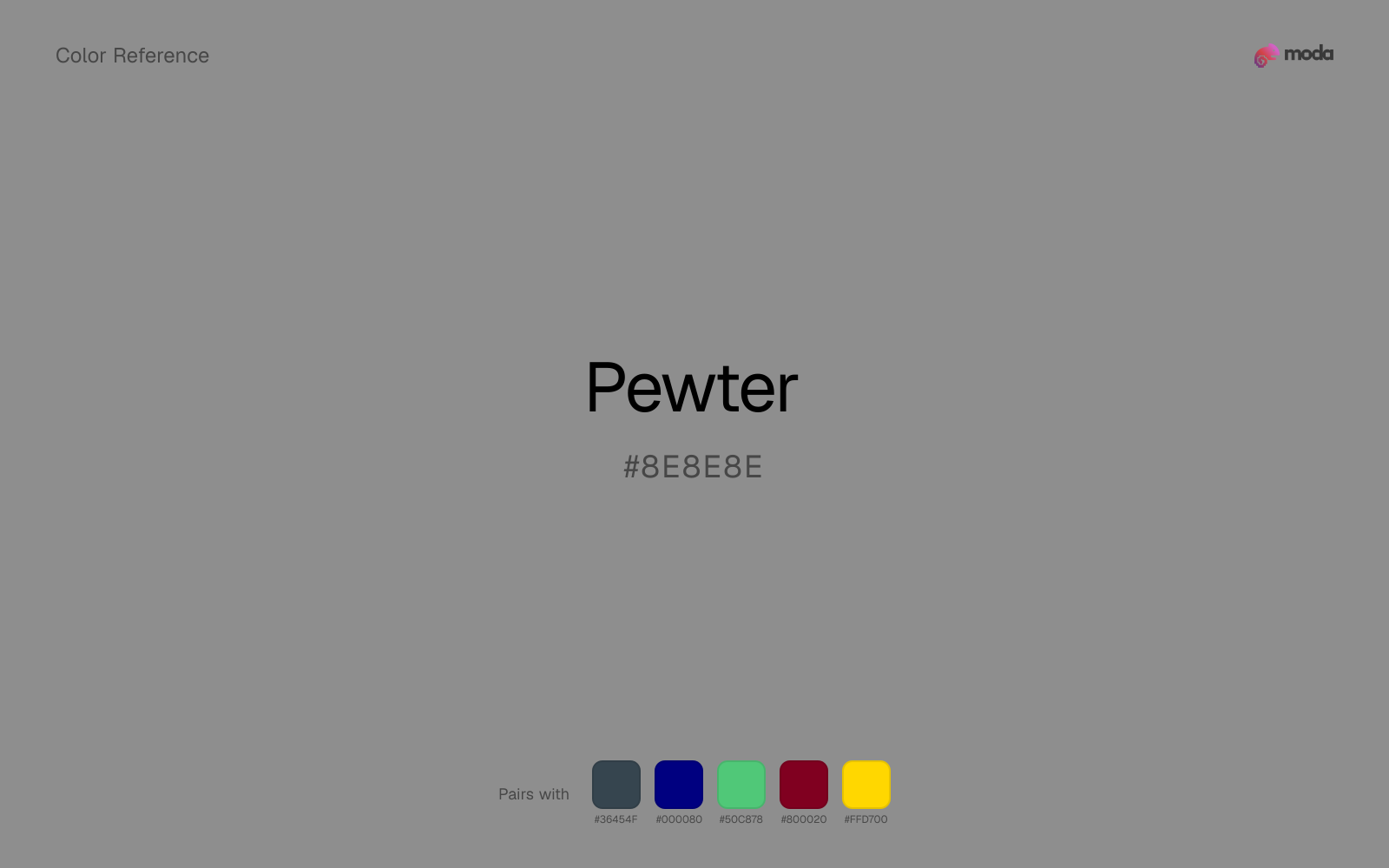
#8E8E8E
RGB
142, 142, 142
HSL
0°, 0%, 56%
HSV
0°, 0%, 56%
Muted metal without the mirror — an alloy mood more than a shine. #899B8D has a green undertone that reads like oxidized tin beside rain-soaked stone. A sophisticated neutral when silver feels too bright and graphite too heavy.
Best for
Email templates, blog headers, and content marketing visuals.
Accessibility
Check contrast before using pewter for text-heavy layouts, especially on low-contrast backgrounds.
How does pewter compare to nearby colors?
What is the difference between pewter and rose gold?
Rose Gold (#B76E79) carries more pigment punch than Pewter (#8E8E8E), so the pair separates by finish as much as hue. Pewter behaves more like a system color and Rose Gold more like a spotlight, so the decision changes how busy the layout feels. Use pewter for the more restrained version of the idea, and move to rose gold when the palette needs a brighter front-facing accent.
What color is pewter?
Pewter is a tin-based alloy historically used for tableware. The color name implies a soft, gray-green metallic patina. In home decor, "pewter" often labels mid grays that harmonize with sage and olive.
What is the hex code for pewter?
| Format | Value |
|---|---|
| HEX | #8E8E8E |
| RGB | rgb(142, 142, 142) |
| HSL | hsl(0°, 0%, 56%) |
| HSV / HSB | hsv(0°, 0%, 56%) |
| CMYK (approx.) | cmyk(0%, 0%, 0%, 44%) |
Convert Pewter to other color formats
Open the color converter with Pewter (#8E8E8E) prefilled to copy RGB, HSL, HSV, CMYK, or OKLCH values.
Convert Pewter in the color converter →What does pewter mean in design?
Pewter is often associated with heritage, durability, and understated tactility. Compared with cool gray it reads as more organic; compared with smoke it can feel more "metal workshop" than "mist."
How do I use pewter in code?
| CSS (hex) | color: #8E8E8E; |
| CSS (rgb) | color: rgb(142, 142, 142); |
| CSS (hsl) | color: hsl(0, 0%, 56%); |
| RGB % | rgb(56%, 56%, 56%) |
| Tailwind | text-[#8E8E8E] |
| SwiftUI | Color(red: 0.557, green: 0.557, blue: 0.557) |
| UIKit | UIColor(red: 0.557, green: 0.557, blue: 0.557, alpha: 1.0) |
| Android | Color.rgb(142, 142, 142) |
| Compose | Color(0xFF8E8E8E) |
| Web Safe | #999999 |
Is pewter accessible?
| Combination | Ratio | AA | AA lg | AAA | AAA lg | UI |
|---|---|---|---|---|---|---|
| AaWhite text on this color | 3.28:1 | ✗ | ✓ | ✗ | ✗ | ✓ |
| AaBlack text on this color | 6.41:1 | ✓ | ✓ | ✗ | ✓ | ✓ |
| AaThis color as text on white | 3.28:1 | ✗ | ✓ | ✗ | ✗ | ✓ |
| AaThis color as text on black | 6.41:1 | ✓ | ✓ | ✗ | ✓ | ✓ |
WCAG 2.1: AA normal ≥ 4.5:1, AA large text ≥ 3:1, AAA normal ≥ 7:1, AAA large ≥ 4.5:1, UI components ≥ 3:1.
How does pewter look with color blindness?
Simulated appearance for common types of color vision deficiency. Actual perception varies by individual.
What colors go with pewter
Charcoal gives pewter a modern dark partner that feels softer and more material than default black.
Pairing pewter with navy blue adds structure without flattening the source color into something generic.
Emerald helps pewter feel more complete in practice because the pairing combines brushed gray qualities with leafy and balanced support instead of leaving the source color to do every job alone.
What colors clash with pewter
Magenta injects more cosmetic or nightlife energy than pewter can comfortably absorb, so restrained neutral palettes start to feel accidental.
Light Gray sits too close to pewter in value, so the palette can wash out before it ever establishes a clear hierarchy.
How should I use pewter in design?
- •Try pewter for section backgrounds, card fills, or brand-secondary roles where you want color without overpowering the content.
- •Pewter is versatile enough to support any palette direction. Pair it with one saturated accent for emphasis and one lighter neutral for breathing room.
- •Use pewter where you need structure without personality: table borders, input fields, disabled states, and background scaffolding.
What are good pewter palettes?
Design with pewter in Moda
Create a presentation or document using pewteras your accent color. Moda's AI applies your color palette automatically.
Create a design with pewter →What are the shades and tints of pewter?
Shades (darker)
Tints (lighter)
Tones (desaturated)
Similar colors
Gray
Gray and pewter do nearly the same structural job, so the decision comes down to whether the neutral should feel more smoky gray or more smoky gray.
Dark Gray
Dark Gray stays neutral like pewter, yet the lighter-or-darker move changes how much hierarchy the palette gets before any accent color enters.
Rose Gold
Rose Gold does what pewter cannot: it nudges the palette toward a warm mood while still behaving like a supporting color.
Silver
Silver stays neutral like pewter, yet the lighter-or-darker move changes how much hierarchy the palette gets before any accent color enters.
Warm Gray
Warm Gray lives in almost the same neutral band as pewter, but its smoky gray lean can make woods, metals, and off-whites read differently around it.
Frequently asked questions
What is the hex code for pewter?
The hex code for pewter is #8E8E8E. In RGB, that's 142 red, 142 green, and 142 blue. The approximate CMYK equivalent is 0% cyan, 0% magenta, 0% yellow, and 44% key (black).
Is pewter a warm or cool color?
Pewter behaves like a neutral with very little chromatic push, so surrounding colors do more to set the palette temperature than the swatch itself.
Is pewter suitable for broader surfaces and long-form layouts?
Pewter can hold broader surfaces comfortably because it does not demand attention on every glance. It is a better candidate for full-theme use than a brighter or more electric neighbor would be.
How should I use pewter in a design?
Pewter has enough restraint to hold large surfaces comfortably, which makes it useful for full theme systems, document backgrounds, or broad section color without constant visual fatigue.
Can I use pewter for text or backgrounds?
Pewter works better with dark text than white text. Black text reaches 6.41:1 contrast on the swatch, which makes the color more usable as a background or highlight surface than as a dark panel.
More neutral colors
Keep exploring color resources
All color pages
Browse the full library of color references, pairings, and palettes.
Neutral colors
Compare pewter with other neutral tones.
Blue colors
Explore nearby color families to build stronger palettes and contrasts.
Brown colors
Explore nearby color families to build stronger palettes and contrasts.
Green colors
Explore nearby color families to build stronger palettes and contrasts.
Last updated April 6, 2026
Color values are computed from the listed hex code using standard conversion formulas. RGB, HSL, and HSV are exact screen-ready conversions. CMYK is an approximate on-screen reference, not a press-ready print specification. Pairings, palettes, and use-case guidance are heuristic recommendations derived from color relationships, contrast behavior, and common presentation, document, and UI patterns.