What color is Tan?
HEX
#D2B48C
RGB
210, 180, 140
HSL
34°, 44%, 69%
HSV
34°, 33%, 82%
Sun-on-sand brown — light enough to behave like a warm neutral in UI and apparel. #D2B48C carries beach and safari without the drama of deep chocolate. It is the brown people use when they want warmth that still feels airy.
Best for
Product launches, promotional banners, and e-commerce storefronts.
Accessibility
Check contrast before using tan for text-heavy layouts, especially on low-contrast backgrounds.
How does tan compare to nearby colors?
What is the difference between tan and khaki?
Tan (#D2B48C) and Khaki (#C3B091) are close enough that the split is more about finish than headline contrast: Tan feels more warm wood, while Khaki reads more earth and clay. Tan and Khaki can fill many of the same slots, but one steers the palette toward warm wood and the other toward earth and clay. Start with tan when the palette wants more warm wood; switch to khaki when the better fit is earth and clay.
What color is tan?
Tan derives from tannin-related leather tanning associations and is standard in chinos, desert uniforms, and natural-fiber interiors.
What is the hex code for tan?
| Format | Value |
|---|---|
| HEX | #D2B48C |
| RGB | rgb(210, 180, 140) |
| HSL | hsl(34°, 44%, 69%) |
| HSV / HSB | hsv(34°, 33%, 82%) |
| CMYK (approx.) | cmyk(0%, 14%, 33%, 18%) |
Convert Tan to other color formats
Open the color converter with Tan (#D2B48C) prefilled to copy RGB, HSL, HSV, CMYK, or OKLCH values.
Convert Tan in the color converter →What does tan mean in design?
Tan is often associated with ease, casual polish, and approachable utility. Next to khaki it can appear slightly rosier; next to caramel it is usually less golden-amber.
How do I use tan in code?
| CSS (hex) | color: #D2B48C; |
| CSS (rgb) | color: rgb(210, 180, 140); |
| CSS (hsl) | color: hsl(34, 44%, 69%); |
| RGB % | rgb(82%, 71%, 55%) |
| Tailwind | text-[#D2B48C] |
| SwiftUI | Color(red: 0.824, green: 0.706, blue: 0.549) |
| UIKit | UIColor(red: 0.824, green: 0.706, blue: 0.549, alpha: 1.0) |
| Android | Color.rgb(210, 180, 140) |
| Compose | Color(0xFFD2B48C) |
| Web Safe | #CCCC99 |
Is tan accessible?
| Combination | Ratio | AA | AA lg | AAA | AAA lg | UI |
|---|---|---|---|---|---|---|
| AaWhite text on this color | 1.97:1 | ✗ | ✗ | ✗ | ✗ | ✗ |
| AaBlack text on this color | 10.65:1 | ✓ | ✓ | ✓ | ✓ | ✓ |
| AaThis color as text on white | 1.97:1 | ✗ | ✗ | ✗ | ✗ | ✗ |
| AaThis color as text on black | 10.65:1 | ✓ | ✓ | ✓ | ✓ | ✓ |
WCAG 2.1: AA normal ≥ 4.5:1, AA large text ≥ 3:1, AAA normal ≥ 7:1, AAA large ≥ 4.5:1, UI components ≥ 3:1.
How does tan look with color blindness?
Simulated appearance for common types of color vision deficiency. Actual perception varies by individual.
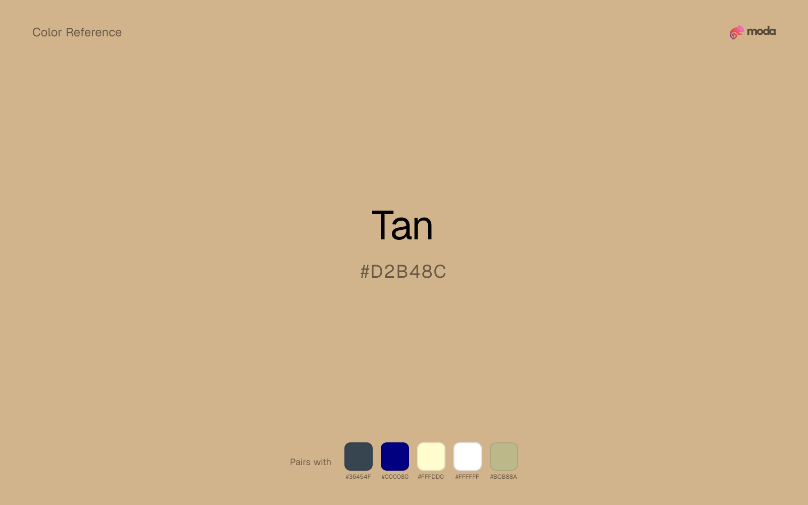
What colors go with tan
Charcoal balances tan by turning the palette into a usable light-dark system rather than a field of soft midtones.
Navy blue gives tan a cooler anchor that keeps the palette from turning too sepia or overly heritage-coded.
Pairing tan with cream keeps the palette relaxed and material, which is useful when a bright white would feel too crisp.
White makes tan feel clearer and more breathable without pulling it warmer or cooler than it already is.
Sage Green gives tan a second note that is different enough to feel intentional but not so different that the palette loses coherence.
What colors clash with tan
Neon Green makes tan feel cheaper and less material, which is exactly the opposite of what these grounded colors usually contribute.
Magenta remaps tan too aggressively, dragging it away from outdoor, food, and lifestyle systems and into a brighter, more performative palette.
Cyan can make tan feel more software-default than designed, especially when the rest of the palette is trying to hold onto material nuance.
Pastel Pink can make tan feel softer and sweeter than intended, which weakens palettes that rely on gravity or structure.
How should I use tan in design?
- •Use tan for buttons, badges, and chart accents where it can stand out. Test text contrast with WCAG tools before using it for body copy on light backgrounds.
- •Pair tan with cool accents (navy, sage, steel blue) for sharp contrast, or keep it with other warm tones (cream, gold, tan) for a cohesive, editorial feel.
- •Tan fits food packaging, hospitality branding, and editorial layouts where natural warmth and material texture are more important than synthetic brightness.
What are good tan palettes?
Clear signal
Product launches, promotional banners, and e-commerce storefronts.
Cozy neutral
Nonprofit campaigns, fundraising pages, and grant materials.
Design with tan in Moda
Create a presentation or document using tanas your accent color. Moda's AI applies your color palette automatically.
Create a design with tan →What are the shades and tints of tan?
Shades (darker)
Tints (lighter)
Tones (desaturated)
Hue variations
What are the color harmonies for tan?
Harmonies are calculated from the base swatch. When a harmony matches a named color page, it links there; otherwise it appears here as a computed reference swatch.
Similar colors
Khaki
Khaki sits close to tan on the wheel, but it carries less chroma, which makes it better for steadier surfaces and calmer long-form use than for sharper emphasis and quicker visual pickup.
Fawn
Fawn sits close to tan on the wheel, but it carries more pigment pressure, which makes it better for faster emphasis and brighter accent work than for broader coverage and quieter supporting roles.
Caramel
Caramel is almost the same hue as tan; the real difference is value, with caramel feeling more open and surface-friendly.
Peach
Peach is close enough to tan to keep the palette cohesive, yet the lighter-darker shift still decides whether the family behaves more like atmosphere or more like structure.
Tangerine
Tangerine is nearly adjacent to tan in hue; what separates them is intensity, with tangerine reading cleaner and more assertive.
Frequently asked questions
What is the hex code for tan?
The hex code for tan is #D2B48C. In RGB, that's 210 red, 180 green, and 140 blue. The approximate CMYK equivalent is 0% cyan, 14% magenta, 33% yellow, and 18% key (black).
Is tan a warm or cool color?
Tan reads as warm. It feels most natural with creams, golds, rusts, and other warm accents, while cooler partners like navy or teal create sharper contrast.
Where does tan work best in a layout?
Tan is flexible enough to move between accents, section blocks, and supporting roles depending on the contrast around it. It works best when the rest of the palette gives it a clear job instead of asking it to do everything at once.
How should I use tan in a design?
Tan is versatile enough for headlines, accent bars, buttons, charts, or section backgrounds depending on the contrast around it. It works as either a primary or supporting color in decks, documents, and brand systems.
Can I use tan for text or backgrounds?
Tan works better with dark text than white text. Black text reaches 10.65:1 contrast on the swatch, which makes the color more usable as a background or highlight surface than as a dark panel.
More brown colors
Keep exploring color resources
All color pages
Browse the full library of color references, pairings, and palettes.
Brown colors
Compare tan with other brown tones.
Neutral colors
Explore nearby color families to build stronger palettes and contrasts.
Orange colors
Explore nearby color families to build stronger palettes and contrasts.
Red colors
Explore nearby color families to build stronger palettes and contrasts.
Last updated April 6, 2026
Color values are computed from the listed hex code using standard conversion formulas. RGB, HSL, and HSV are exact screen-ready conversions. CMYK is an approximate on-screen reference, not a press-ready print specification. Pairings, palettes, and use-case guidance are heuristic recommendations derived from color relationships, contrast behavior, and common presentation, document, and UI patterns.