Khaki color guide
HEX
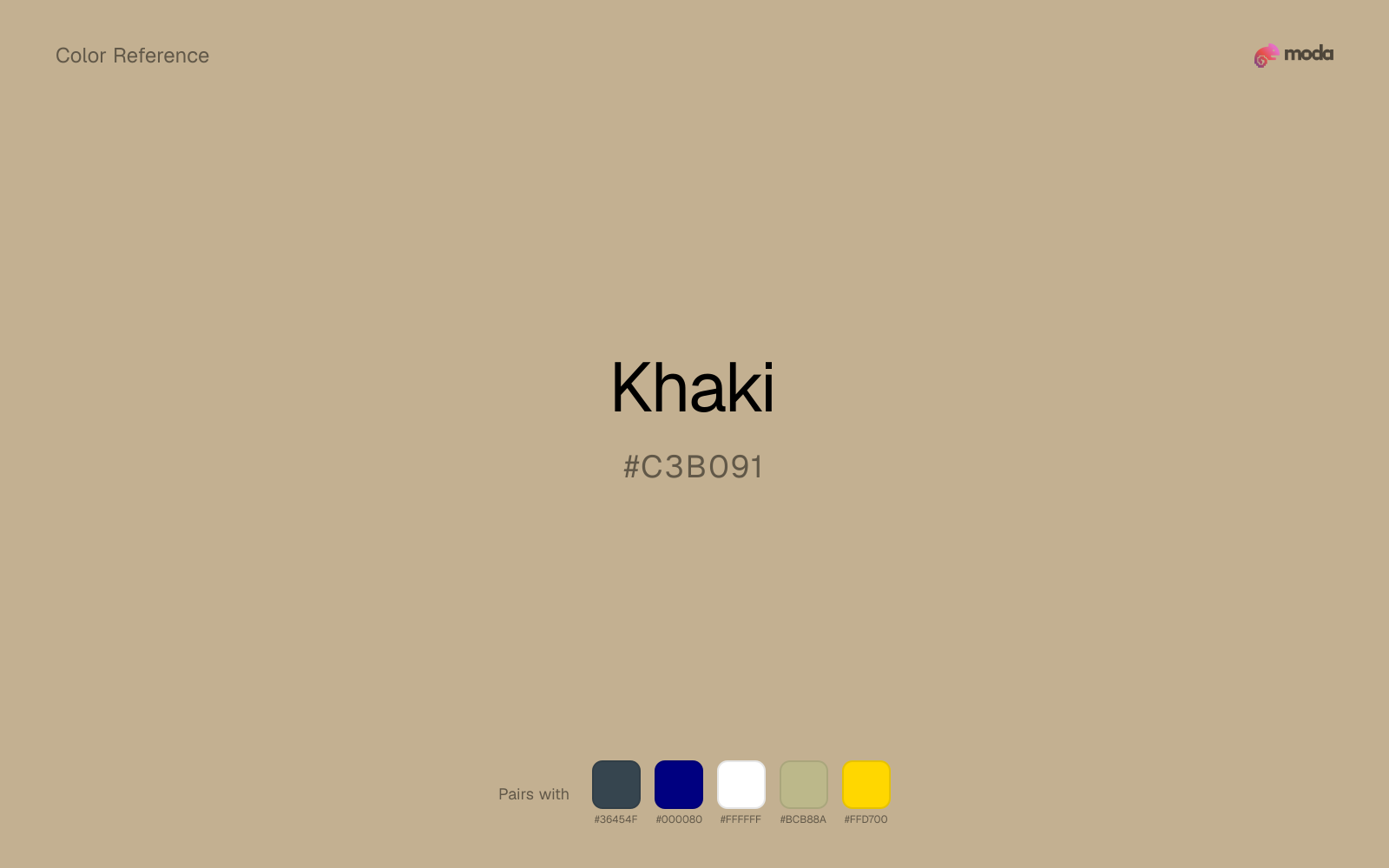
#C3B091
RGB
195, 176, 145
HSL
37°, 29%, 67%
HSV
37°, 26%, 76%
Utility tan with a yellow compass — dusty, field-ready, and instantly uniform-adjacent. #C3B091 reads as practical color: pockets, canvas, and sunlight bleaching fabric. Warm, but in a disciplined way.
Best for
Mobile app interfaces, onboarding screens, and light-mode UI themes.
Accessibility
Check contrast before using khaki for text-heavy layouts, especially on low-contrast backgrounds.
How does khaki compare to nearby colors?
What is the difference between khaki and tan?
Khaki (#C3B091) and Tan (#D2B48C) may look neighboring at first glance, yet their surface character diverges once they sit next to whites, charcoals, and other real layout neutrals. The practical difference is not raw contrast so much as project fit: Khaki reads more naturally in handmade goods and material-focused editorial work, while Tan fits more easily into outdoor, food, and lifestyle systems. Choose khaki when the surrounding system aligns better with handmade goods and material-focused editorial work, and move to tan when the stronger contextual fit is outdoor, food, and lifestyle systems.
What color is khaki?
Khaki is strongly associated with military and workwear histories and remains standard in outdoor apparel, safari fashion, and casual chino palettes.
What is the hex code for khaki?
| Format | Value |
|---|---|
| HEX | #C3B091 |
| RGB | rgb(195, 176, 145) |
| HSL | hsl(37°, 29%, 67%) |
| HSV / HSB | hsv(37°, 26%, 76%) |
| CMYK (approx.) | cmyk(0%, 10%, 26%, 24%) |
Convert Khaki to other color formats
Open the color converter with Khaki (#C3B091) prefilled to copy RGB, HSL, HSV, CMYK, or OKLCH values.
Convert Khaki in the color converter →What does khaki mean in design?
Khaki is often associated with readiness, simplicity, and unpretentious durability. Compared with tan it can skew more green-yellow; compared with fawn it is usually less orange.
How do I use khaki in code?
| CSS (hex) | color: #C3B091; |
| CSS (rgb) | color: rgb(195, 176, 145); |
| CSS (hsl) | color: hsl(37, 29%, 67%); |
| RGB % | rgb(76%, 69%, 57%) |
| Tailwind | text-[#C3B091] |
| SwiftUI | Color(red: 0.765, green: 0.690, blue: 0.569) |
| UIKit | UIColor(red: 0.765, green: 0.690, blue: 0.569, alpha: 1.0) |
| Android | Color.rgb(195, 176, 145) |
| Compose | Color(0xFFC3B091) |
| Web Safe | #CC9999 |
Is khaki accessible?
| Combination | Ratio | AA | AA lg | AAA | AAA lg | UI |
|---|---|---|---|---|---|---|
| AaWhite text on this color | 2.11:1 | ✗ | ✗ | ✗ | ✗ | ✗ |
| AaBlack text on this color | 9.94:1 | ✓ | ✓ | ✓ | ✓ | ✓ |
| AaThis color as text on white | 2.11:1 | ✗ | ✗ | ✗ | ✗ | ✗ |
| AaThis color as text on black | 9.94:1 | ✓ | ✓ | ✓ | ✓ | ✓ |
WCAG 2.1: AA normal ≥ 4.5:1, AA large text ≥ 3:1, AAA normal ≥ 7:1, AAA large ≥ 4.5:1, UI components ≥ 3:1.
How does khaki look with color blindness?
Simulated appearance for common types of color vision deficiency. Actual perception varies by individual.
What colors go with khaki
Charcoal lets khaki stay light and atmospheric while still giving the layout a readable dark value for text and hierarchy.
Navy blue reins in khaki without deadening it, which is useful when you want warmth to stay present but not dominate every part of the page.
White makes khaki feel clearer and more breathable without pulling it warmer or cooler than it already is.
Sage Green helps khaki feel more complete in practice because the pairing combines earth and clay qualities with sage and moss support instead of leaving the source color to do every job alone.
What colors clash with khaki
With khaki, magenta introduces a second emotional story instead of reinforcing the first one, so the palette can feel internally split.
Cyan can make khaki feel more software-default than designed, especially when the rest of the palette is trying to hold onto material nuance.
With khaki, Pastel Pink often steers the system toward nursery or confectionery cues instead of the more grounded mood the source color supports.
How should I use khaki in design?
- •Khaki works as a primary accent or highlight color — bright enough to draw attention but check contrast carefully if using it for text on white backgrounds.
- •Pair khaki with cool accents (navy, sage, steel blue) for sharp contrast, or keep it with other warm tones (cream, gold, tan) for a cohesive, editorial feel.
- •Khaki fits food packaging, hospitality branding, and editorial layouts where natural warmth and material texture are more important than synthetic brightness.
What are good khaki palettes?
Bright horizon
Mobile app interfaces, onboarding screens, and light-mode UI themes.
Design with khaki in Moda
Create a presentation or document using khakias your accent color. Moda's AI applies your color palette automatically.
Create a design with khaki →What are the shades and tints of khaki?
Shades (darker)
Tints (lighter)
Tones (desaturated)
Hue variations
What are the color harmonies for khaki?
Harmonies are calculated from the base swatch. When a harmony matches a named color page, it links there; otherwise it appears here as a computed reference swatch.
Similar colors
Tan
Tan sits close to khaki on the wheel, but it carries more pigment pressure, which makes it better for faster emphasis and brighter accent work than for broader coverage and quieter supporting roles.
Fawn
Fawn is nearly adjacent to khaki in hue; what separates them is intensity, with fawn reading cleaner and more assertive.
Warm Gray
Warm Gray is useful when khaki is the right weight but the wrong mood: the swap changes temperature and finish more than contrast.
Caramel
Caramel stays in the same color family as khaki, but the change in value moves it into different layout jobs, especially once backgrounds, charts, or section dividers enter the system.
Dark Gray
Dark Gray changes the chroma more than the hue, so the decision is really about temperament: more immediate and screen-bright, or more restrained and spreadable.
Frequently asked questions
What is the hex code for khaki?
The hex code for khaki is #C3B091. In RGB, that's 195 red, 176 green, and 145 blue. The approximate CMYK equivalent is 0% cyan, 10% magenta, 26% yellow, and 24% key (black).
Is khaki a warm or cool color?
Khaki sits on the warm side of the palette, so it pairs easily with other warm tones and becomes more energetic when you place it against cooler blues or blue-grays.
Is khaki better for accents, structure, or surfaces?
Khaki sits in the usable middle: strong enough to anchor a section or call attention to a key moment, but calm enough to support a broader system when the surrounding values are well managed.
Where does khaki work best in a layout?
Khaki is muted and versatile. It can carry a full presentation theme, document system, or website section without overwhelming the layout, and it pairs flexibly with both warm and cool accents.
Is khaki accessible?
Khaki works better with dark text than white text. Black text reaches 9.94:1 contrast on the swatch, which makes the color more usable as a background or highlight surface than as a dark panel.
More brown colors
Keep exploring color resources
All color pages
Browse the full library of color references, pairings, and palettes.
Brown colors
Compare khaki with other brown tones.
Neutral colors
Explore nearby color families to build stronger palettes and contrasts.
Orange colors
Explore nearby color families to build stronger palettes and contrasts.
Red colors
Explore nearby color families to build stronger palettes and contrasts.
Last updated April 6, 2026
Color values are computed from the listed hex code using standard conversion formulas. RGB, HSL, and HSV are exact screen-ready conversions. CMYK is an approximate on-screen reference, not a press-ready print specification. Pairings, palettes, and use-case guidance are heuristic recommendations derived from color relationships, contrast behavior, and common presentation, document, and UI patterns.