Using Azure in design
HEX
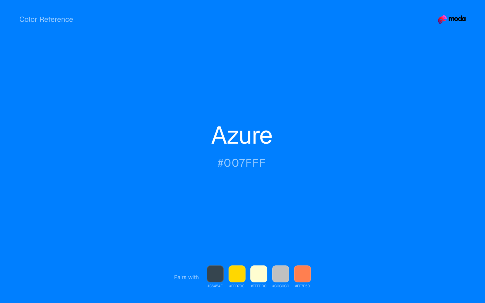
#007FFF
RGB
0, 127, 255
HSL
210°, 100%, 50%
HSV
210°, 100%, 100%
A punchy blue that feels like open water under sun — luminous without crossing into cyan territory. #007FFF scans as energetic and modern on screens. It is a strong CTA color when you want optimism with momentum.
Best for
Marketing websites, social media graphics, and campaign landing pages.
Accessibility
Check contrast before using azure for text-heavy layouts, especially on low-contrast backgrounds.
How does azure compare to nearby colors?
What is the difference between azure and denim?
Azure (#007FFF) looks cleaner and more charged than Denim (#1560BD) when the two are shown together. Azure lightens the palette overall and makes it easier to keep the page feeling open rather than heavy. Begin with azure when the family needs its current undertone and surface character; keep denim for the nearby alternative that shifts the mood without leaving the same hue neighborhood.
What color is azure?
The term derives from lapis lazuli and labels bright blues in Microsoft's product naming and many cloud/tech brands. Also common in sports kits.
What is the hex code for azure?
| Format | Value |
|---|---|
| HEX | #007FFF |
| RGB | rgb(0, 127, 255) |
| HSL | hsl(210°, 100%, 50%) |
| HSV / HSB | hsv(210°, 100%, 100%) |
| CMYK (approx.) | cmyk(100%, 50%, 0%, 0%) |
Convert Azure to other color formats
Open the color converter with Azure (#007FFF) prefilled to copy RGB, HSL, HSV, CMYK, or OKLCH values.
Convert Azure in the color converter →What does azure mean in design?
Azure is often associated with clarity, speed, and cloud-era technology. Compared with pure blue (#0000FF), it tends to read as slightly lighter, more radiant, and less "default primary."
How do I use azure in code?
| CSS (hex) | color: #007FFF; |
| CSS (rgb) | color: rgb(0, 127, 255); |
| CSS (hsl) | color: hsl(210, 100%, 50%); |
| RGB % | rgb(0%, 50%, 100%) |
| Tailwind | text-[#007FFF] |
| SwiftUI | Color(red: 0.000, green: 0.498, blue: 1.000) |
| UIKit | UIColor(red: 0.000, green: 0.498, blue: 1.000, alpha: 1.0) |
| Android | Color.rgb(0, 127, 255) |
| Compose | Color(0xFF007FFF) |
| Web Safe | #0066FF |
Is azure accessible?
| Combination | Ratio | AA | AA lg | AAA | AAA lg | UI |
|---|---|---|---|---|---|---|
| AaWhite text on this color | 3.83:1 | ✗ | ✓ | ✗ | ✗ | ✓ |
| AaBlack text on this color | 5.48:1 | ✓ | ✓ | ✗ | ✓ | ✓ |
| AaThis color as text on white | 3.83:1 | ✗ | ✓ | ✗ | ✗ | ✓ |
| AaThis color as text on black | 5.48:1 | ✓ | ✓ | ✗ | ✓ | ✓ |
WCAG 2.1: AA normal ≥ 4.5:1, AA large text ≥ 3:1, AAA normal ≥ 7:1, AAA large ≥ 4.5:1, UI components ≥ 3:1.
How does azure look with color blindness?
Simulated appearance for common types of color vision deficiency. Actual perception varies by individual.
What colors go with azure
Charcoal turns azure from purely energetic into something more adult and controlled by adding depth without another hue fight.
Gold gives azure a warmer highlight, which helps the palette feel more tactile and less screen-native than it would with only neutrals.
Cream takes the hard digital edge off azure and makes the color feel more printed, paper-backed, and approachable.
What colors clash with azure
With azure, Neon Green pulls the palette toward LED signage and away from the signal-blue quality that makes the source color usable.
With azure, magenta introduces a second emotional story instead of reinforcing the first one, so the palette can feel internally split.
How should I use azure in design?
- •Azure has the saturation to lead a brand palette — strong enough for buttons, headers, and packaging without drifting into pastel or dark territory.
- •Pair azure with warm accents (gold, rust, amber) when you need more energy, or stay in cool territory (navy, silver, sage) for a composed, professional look.
- •Vivid colors like azure work best as punctuation in a layout: CTAs, key metrics, or a single hero element. Surrounding neutrals keep it from fatiguing the viewer.
What are good azure palettes?
Light touch
Marketing websites, social media graphics, and campaign landing pages.
Autumn light
Startup branding, pitch materials, and product landing pages.
Design with azure in Moda
Create a presentation or document using azureas your accent color. Moda's AI applies your color palette automatically.
Create a design with azure →What are the shades and tints of azure?
Shades (darker)
Tints (lighter)
Tones (desaturated)
Hue variations
What are the color harmonies for azure?
Harmonies are calculated from the base swatch. When a harmony matches a named color page, it links there; otherwise it appears here as a computed reference swatch.
Similar colors
Ocean Blue
Ocean Blue tracks close to azure in hue, but the value shift changes where each one earns its place: ocean blue is easier to use for headlines, anchors, and darker sections, while azure holds onto lighter surfaces and more open applications.
Denim
Denim is almost the same hue as azure; the real difference is value, with denim feeling more grounded and anchor-ready.
Sapphire
Sapphire stays very close to azure in hue, but it lands darker, which makes it better for headlines, anchors, and darker sections than for lighter surfaces and more open applications.
Royal Blue
Royal Blue is almost the same hue as azure; the real difference is value, with royal blue feeling more open and surface-friendly.
Cobalt
Cobalt is close enough to azure to keep the palette cohesive, yet the lighter-darker shift still decides whether the family behaves more like atmosphere or more like structure.
Frequently asked questions
What is the hex code for azure?
The hex code for azure is #007FFF. In RGB, that's 0 red, 127 green, and 255 blue. The approximate CMYK equivalent is 100% cyan, 50% magenta, 0% yellow, and 0% key (black).
Is azure a warm or cool color?
Azure reads as cool. It settles naturally beside blues, greens, silver, and charcoal, and feels more animated when paired with warm accents like gold, coral, or rust.
Is azure better as an accent or a full-palette color?
Azure is usually best when it leads in short bursts rather than covering everything. It can headline a palette, but most layouts work better when the color handles accents, highlights, or one main hero role instead of every surface.
How should I use azure in a design?
Azure is vivid enough to work best in controlled doses such as CTAs, highlighted metrics, chart accents, or a single hero element. Surround it with quieter neutrals so it does not exhaust the layout.
Can I use azure for text or backgrounds?
Azure works better with dark text than white text. Black text reaches 5.48:1 contrast on the swatch, which makes the color more usable as a background or highlight surface than as a dark panel.
More blue colors
Keep exploring color resources
All color pages
Browse the full library of color references, pairings, and palettes.
Blue colors
Compare azure with other blue tones.
Green colors
Explore nearby color families to build stronger palettes and contrasts.
Neutral colors
Explore nearby color families to build stronger palettes and contrasts.
Purple colors
Explore nearby color families to build stronger palettes and contrasts.
Last updated April 6, 2026
Color values are computed from the listed hex code using standard conversion formulas. RGB, HSL, and HSV are exact screen-ready conversions. CMYK is an approximate on-screen reference, not a press-ready print specification. Pairings, palettes, and use-case guidance are heuristic recommendations derived from color relationships, contrast behavior, and common presentation, document, and UI patterns.