Using Sapphire in design
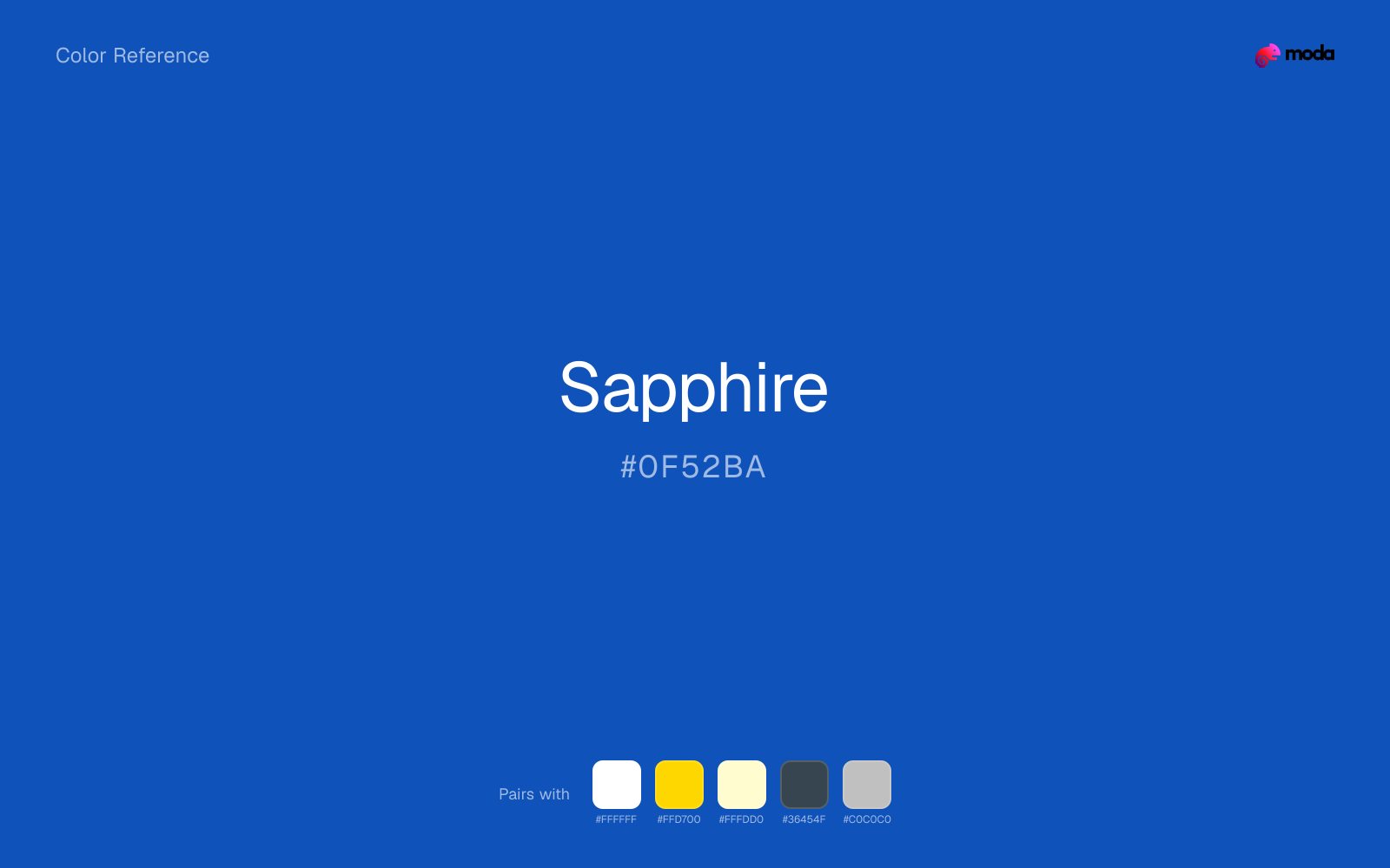
HEX
#0F52BA
RGB
15, 82, 186
HSL
216°, 85%, 39%
HSV
216°, 92%, 73%
Gemstone language signals depth, richness, and a touch of prestige — this is blue you could imagine faceted. #0F52BA holds saturation in a way that still feels regal rather than electric. On gold foil, it reads instantly "jewelry counter."
Best for
SaaS dashboards, admin panels, and professional UI themes.
Accessibility
White text on sapphire passes AAA at 7.15:1, so it is safe for dark backgrounds and section headers.
How does sapphire compare to nearby colors?
What is the difference between sapphire and cobalt?
The visible difference between Sapphire (#0F52BA) and Cobalt (#0047AB) is subtle, but it still nudges the family from signal-blue toward navy ink. Sapphire and Cobalt can fill many of the same slots, but one steers the palette toward signal-blue and the other toward navy ink. Start with sapphire when the palette wants more signal-blue; switch to cobalt when the better fit is navy ink.
What color is sapphire?
Named for the corundum gem. Appears in fine jewelry marketing, awards programs, finance, and premium consumer goods seeking a "precious" cue.
What is the hex code for sapphire?
| Format | Value |
|---|---|
| HEX | #0F52BA |
| RGB | rgb(15, 82, 186) |
| HSL | hsl(216°, 85%, 39%) |
| HSV / HSB | hsv(216°, 92%, 73%) |
| CMYK (approx.) | cmyk(92%, 56%, 0%, 27%) |
Convert Sapphire to other color formats
Open the color converter with Sapphire (#0F52BA) prefilled to copy RGB, HSL, HSV, CMYK, or OKLCH values.
Convert Sapphire in the color converter →What does sapphire mean in design?
Sapphire is often associated with loyalty, luxury, and enduring value. Versus azure or electric blue, it tends to read as deeper, more classical, and less neon or aquatic.
How do I use sapphire in code?
| CSS (hex) | color: #0F52BA; |
| CSS (rgb) | color: rgb(15, 82, 186); |
| CSS (hsl) | color: hsl(216, 85%, 39%); |
| RGB % | rgb(6%, 32%, 73%) |
| Tailwind | text-[#0F52BA] |
| SwiftUI | Color(red: 0.059, green: 0.322, blue: 0.729) |
| UIKit | UIColor(red: 0.059, green: 0.322, blue: 0.729, alpha: 1.0) |
| Android | Color.rgb(15, 82, 186) |
| Compose | Color(0xFF0F52BA) |
| Web Safe | #0066CC |
Is sapphire accessible?
| Combination | Ratio | AA | AA lg | AAA | AAA lg | UI |
|---|---|---|---|---|---|---|
| AaWhite text on this color | 7.15:1 | ✓ | ✓ | ✓ | ✓ | ✓ |
| AaBlack text on this color | 2.94:1 | ✗ | ✗ | ✗ | ✗ | ✗ |
| AaThis color as text on white | 7.15:1 | ✓ | ✓ | ✓ | ✓ | ✓ |
| AaThis color as text on black | 2.94:1 | ✗ | ✗ | ✗ | ✗ | ✗ |
WCAG 2.1: AA normal ≥ 4.5:1, AA large text ≥ 3:1, AAA normal ≥ 7:1, AAA large ≥ 4.5:1, UI components ≥ 3:1.
How does sapphire look with color blindness?
Simulated appearance for common types of color vision deficiency. Actual perception varies by individual.
What colors go with sapphire
White helps sapphire stay legible in charts, labels, and UI states where a muddier light neutral would blur the edges.
Gold gives sapphire a warmer highlight, which helps the palette feel more tactile and less screen-native than it would with only neutrals.
Cream takes the hard digital edge off sapphire and makes the color feel more printed, paper-backed, and approachable.
What colors clash with sapphire
Neon Green turns sapphire into something closer to screen glow than surface color, which is a mismatch for most editorial, product, or deck work.
Magenta pushes sapphire toward a nightclub or cosmetic register that is hard to square with calmer editorial or product work.
Orange changes the context around sapphire so quickly that the palette can start looking campaign-specific rather than durable.
Pastel Pink can undercut sapphire's authority by turning the combination more decorative than decisive.
How should I use sapphire in design?
- •Use sapphire for headlines, sidebar accents, and key data points where you need strong presence without going full dark-mode.
- •Warm touches like gold or coral bring out sapphire's cooler character by contrast, while staying with cool neighbors creates a calmer, more unified feel.
- •Sapphire's high saturation makes it most effective in small doses — buttons, chart highlights, notification badges, and social media accents.
What are good sapphire palettes?
Noir refinement
SaaS dashboards, admin panels, and professional UI themes.
Bare essentials
Startup branding, pitch materials, and product landing pages.
Design with sapphire in Moda
Create a presentation or document using sapphireas your accent color. Moda's AI applies your color palette automatically.
Create a design with sapphire →What are the shades and tints of sapphire?
Shades (darker)
Tints (lighter)
Tones (desaturated)
Hue variations
What are the color harmonies for sapphire?
Harmonies are calculated from the base swatch. When a harmony matches a named color page, it links there; otherwise it appears here as a computed reference swatch.
Similar colors
Denim
Denim sits close to sapphire in hue, but its blue-ink cast changes the mood of the palette even when the contrast shift is small.
Cobalt
Cobalt sits close to sapphire on the wheel, but it carries more pigment pressure, which makes it better for faster emphasis and brighter accent work than for broader coverage and quieter supporting roles.
Ocean Blue
Ocean Blue is nearly adjacent to sapphire in hue; what separates them is intensity, with ocean blue reading cleaner and more assertive.
Cerulean
Cerulean is useful when sapphire is the right weight but the wrong mood: the swap changes temperature and finish more than contrast.
Royal Blue
Royal Blue is close enough to sapphire to keep the palette cohesive, yet the lighter-darker shift still decides whether the family behaves more like atmosphere or more like structure.
Frequently asked questions
What is the hex code for sapphire?
The hex code for sapphire is #0F52BA. In RGB, that's 15 red, 82 green, and 186 blue. The approximate CMYK equivalent is 92% cyan, 56% magenta, 0% yellow, and 27% key (black).
Is sapphire a warm or cool color?
Sapphire falls on the cool side of the palette, so warm companions create the clearest contrast while other cool tones keep the system more restrained.
Should sapphire lead the palette or stay in supporting roles?
Sapphire has enough chroma to take the lead, but it usually performs best when the surrounding system stays quieter. Treat it as the voice of emphasis, not the answer to every layout need.
Where does sapphire work best in a layout?
Sapphire carries a lot of chroma, so it is usually strongest as punctuation rather than wallpaper. Use it for focal accents and let low-saturation surfaces do the balancing.
Is sapphire accessible?
Sapphire is strong enough for white text at 7.15:1 contrast, so it can handle dark panels, tags, and section headers without much trouble. As text on white, though, it is usually better reserved for larger headings or short accents than for long paragraphs.
More blue colors
Keep exploring color resources
All color pages
Browse the full library of color references, pairings, and palettes.
Blue colors
Compare sapphire with other blue tones.
Green colors
Explore nearby color families to build stronger palettes and contrasts.
Neutral colors
Explore nearby color families to build stronger palettes and contrasts.
Purple colors
Explore nearby color families to build stronger palettes and contrasts.
Last updated April 6, 2026
Color values are computed from the listed hex code using standard conversion formulas. RGB, HSL, and HSV are exact screen-ready conversions. CMYK is an approximate on-screen reference, not a press-ready print specification. Pairings, palettes, and use-case guidance are heuristic recommendations derived from color relationships, contrast behavior, and common presentation, document, and UI patterns.