Cobalt palettes and pairings
HEX
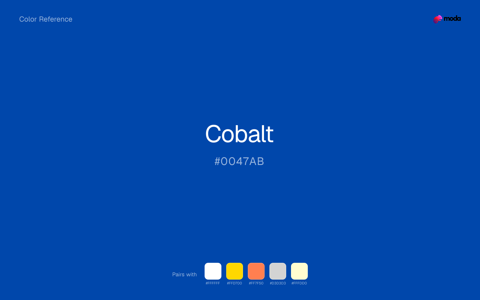
#0047AB
RGB
0, 71, 171
HSL
215°, 100%, 34%
HSV
215°, 100%, 67%
Cobalt (#0047AB) is an intense, vivid blue that commands attention while maintaining trust. It works as a more energetic alternative to navy for tech, consumer, and creative brands.
Best for
SaaS dashboards, admin panels, and professional UI themes.
Accessibility
White text on cobalt passes AAA at 8.44:1, so it is safe for dark backgrounds and section headers.
How does cobalt compare to nearby colors?
What is the difference between cobalt and sapphire?
Cobalt (#0047AB) and Sapphire (#0F52BA) may look neighboring at first glance, yet their surface character diverges once they sit next to whites, charcoals, and other real layout neutrals. Cobalt and Sapphire can fill many of the same slots, but one steers the palette toward navy ink and the other toward signal-blue. Choose cobalt when the surrounding system aligns better with enterprise, finance, and tailored corporate systems, and move to sapphire when the stronger contextual fit is app UI, charts, and digital-native branding.
What color is cobalt?
Cobalt blue has a centuries-long history in ceramics and pottery, from Chinese porcelain to Delft tiles. The pigment, derived from cobalt ore, produces an intense, stable blue that has been prized by artists and craftspeople since the Middle Ages.
What is the hex code for cobalt?
| Format | Value |
|---|---|
| HEX | #0047AB |
| RGB | rgb(0, 71, 171) |
| HSL | hsl(215°, 100%, 34%) |
| HSV / HSB | hsv(215°, 100%, 67%) |
| CMYK (approx.) | cmyk(100%, 58%, 0%, 33%) |
Convert Cobalt to other color formats
Open the color converter with Cobalt (#0047AB) prefilled to copy RGB, HSL, HSV, CMYK, or OKLCH values.
Convert Cobalt in the color converter →What does cobalt mean in design?
Cobalt conveys confidence, innovation, and vibrant professionalism. It is bolder than navy but more trustworthy than electric blue, occupying a sweet spot for brands that want to feel both established and forward-looking.
How do I use cobalt in code?
| CSS (hex) | color: #0047AB; |
| CSS (rgb) | color: rgb(0, 71, 171); |
| CSS (hsl) | color: hsl(215, 100%, 34%); |
| RGB % | rgb(0%, 28%, 67%) |
| Tailwind | text-[#0047AB] |
| SwiftUI | Color(red: 0.000, green: 0.278, blue: 0.671) |
| UIKit | UIColor(red: 0.000, green: 0.278, blue: 0.671, alpha: 1.0) |
| Android | Color.rgb(0, 71, 171) |
| Compose | Color(0xFF0047AB) |
| Web Safe | #003399 |
Is cobalt accessible?
| Combination | Ratio | AA | AA lg | AAA | AAA lg | UI |
|---|---|---|---|---|---|---|
| AaWhite text on this color | 8.44:1 | ✓ | ✓ | ✓ | ✓ | ✓ |
| AaBlack text on this color | 2.49:1 | ✗ | ✗ | ✗ | ✗ | ✗ |
| AaThis color as text on white | 8.44:1 | ✓ | ✓ | ✓ | ✓ | ✓ |
| AaThis color as text on black | 2.49:1 | ✗ | ✗ | ✗ | ✗ | ✗ |
WCAG 2.1: AA normal ≥ 4.5:1, AA large text ≥ 3:1, AAA normal ≥ 7:1, AAA large ≥ 4.5:1, UI components ≥ 3:1.
How does cobalt look with color blindness?
Simulated appearance for common types of color vision deficiency. Actual perception varies by individual.
What colors go with cobalt
White sharpens cobalt without cooling it off, which is useful when you need a clean interface or slide layout around the color.
Gold warms cobalt enough to keep the palette from feeling chilly or overly technical, while still reading intentional rather than decorative-for-its-own-sake.
Coral changes the temperature story around cobalt: blue-ink on its own, more food, promotion, and social-first graphics once the cooler or warmer partner is introduced.
Light Gray changes how cobalt comes across: more product and UI scaffolding in mood, and less likely to feel isolated or unfinished.
What colors clash with cobalt
With cobalt, Neon Green pulls the palette toward LED signage and away from the navy ink quality that makes the source color usable.
Magenta remaps cobalt too aggressively, dragging it away from enterprise, finance, and tailored corporate systems and into a brighter, more performative palette.
Orange changes the context around cobalt so quickly that the palette can start looking campaign-specific rather than durable.
Pastel Pink can undercut cobalt's authority by turning the combination more decorative than decisive.
How should I use cobalt in design?
- •Cobalt works as a primary brand color for tech and consumer brands — it is more distinctive than navy but equally professional.
- •Pair cobalt with white and light gray for a clean, modern tech palette.
- •Use cobalt for CTAs and interactive elements in UI design — its intensity draws the eye naturally.
What are good cobalt palettes?
Executive edge
SaaS dashboards, admin panels, and professional UI themes.
Paper and ink
Startup branding, pitch materials, and product landing pages.
Design with cobalt in Moda
Create a presentation or document using cobaltas your accent color. Moda's AI applies your color palette automatically.
Create a design with cobalt →What are the shades and tints of cobalt?
Shades (darker)
Tints (lighter)
Tones (desaturated)
Hue variations
What are the color harmonies for cobalt?
Harmonies are calculated from the base swatch. When a harmony matches a named color page, it links there; otherwise it appears here as a computed reference swatch.
Similar colors
Sapphire
Sapphire sits close to cobalt on the wheel, but it carries less chroma, which makes it better for steadier surfaces and calmer long-form use than for sharper emphasis and quicker visual pickup.
Denim
Denim is almost the same hue as cobalt; the real difference is value, with denim feeling more open and surface-friendly.
Ocean Blue
Ocean Blue lives in the same neighborhood as cobalt, but the finish shift is enough to make one feel better for app UI, charts, and digital-native branding and the other for enterprise, finance, and tailored corporate systems.
Cerulean
Cerulean occupies a similar depth to cobalt, though it pushes the family toward a more cool reading and a different material feel.
Azure
Azure tracks close to cobalt in hue, but the value shift changes where each one earns its place: azure is easier to use for backgrounds, tints, and softer supporting areas, while cobalt holds onto accents, stronger hierarchy, and firmer structure.
Frequently asked questions
What is the hex code for cobalt?
The hex code for cobalt is #0047AB. In RGB, that's 0 red, 71 green, and 171 blue. The approximate CMYK equivalent is 100% cyan, 58% magenta, 0% yellow, and 33% key (black).
Is cobalt a warm or cool color?
Cobalt reads as cool. It settles naturally beside blues, greens, silver, and charcoal, and feels more animated when paired with warm accents like gold, coral, or rust.
Is cobalt better as an accent or a full-palette color?
Cobalt is usually best when it leads in short bursts rather than covering everything. It can headline a palette, but most layouts work better when the color handles accents, highlights, or one main hero role instead of every surface.
How should I use cobalt in a design?
Cobalt is vivid enough to work best in controlled doses such as CTAs, highlighted metrics, chart accents, or a single hero element. Surround it with quieter neutrals so it does not exhaust the layout.
Can I use cobalt for text or backgrounds?
Cobalt is strong enough for white text at 8.44:1 contrast, so it can handle dark panels, tags, and section headers without much trouble. As text on white, though, it is usually better reserved for larger headings or short accents than for long paragraphs.
More blue colors
Keep exploring color resources
All color pages
Browse the full library of color references, pairings, and palettes.
Blue colors
Compare cobalt with other blue tones.
Green colors
Explore nearby color families to build stronger palettes and contrasts.
Neutral colors
Explore nearby color families to build stronger palettes and contrasts.
Purple colors
Explore nearby color families to build stronger palettes and contrasts.
Last updated April 6, 2026
Color values are computed from the listed hex code using standard conversion formulas. RGB, HSL, and HSV are exact screen-ready conversions. CMYK is an approximate on-screen reference, not a press-ready print specification. Pairings, palettes, and use-case guidance are heuristic recommendations derived from color relationships, contrast behavior, and common presentation, document, and UI patterns.